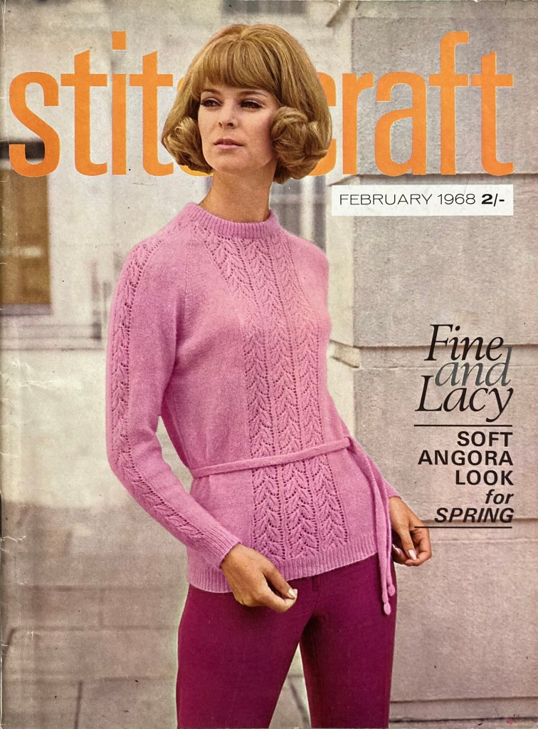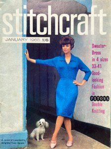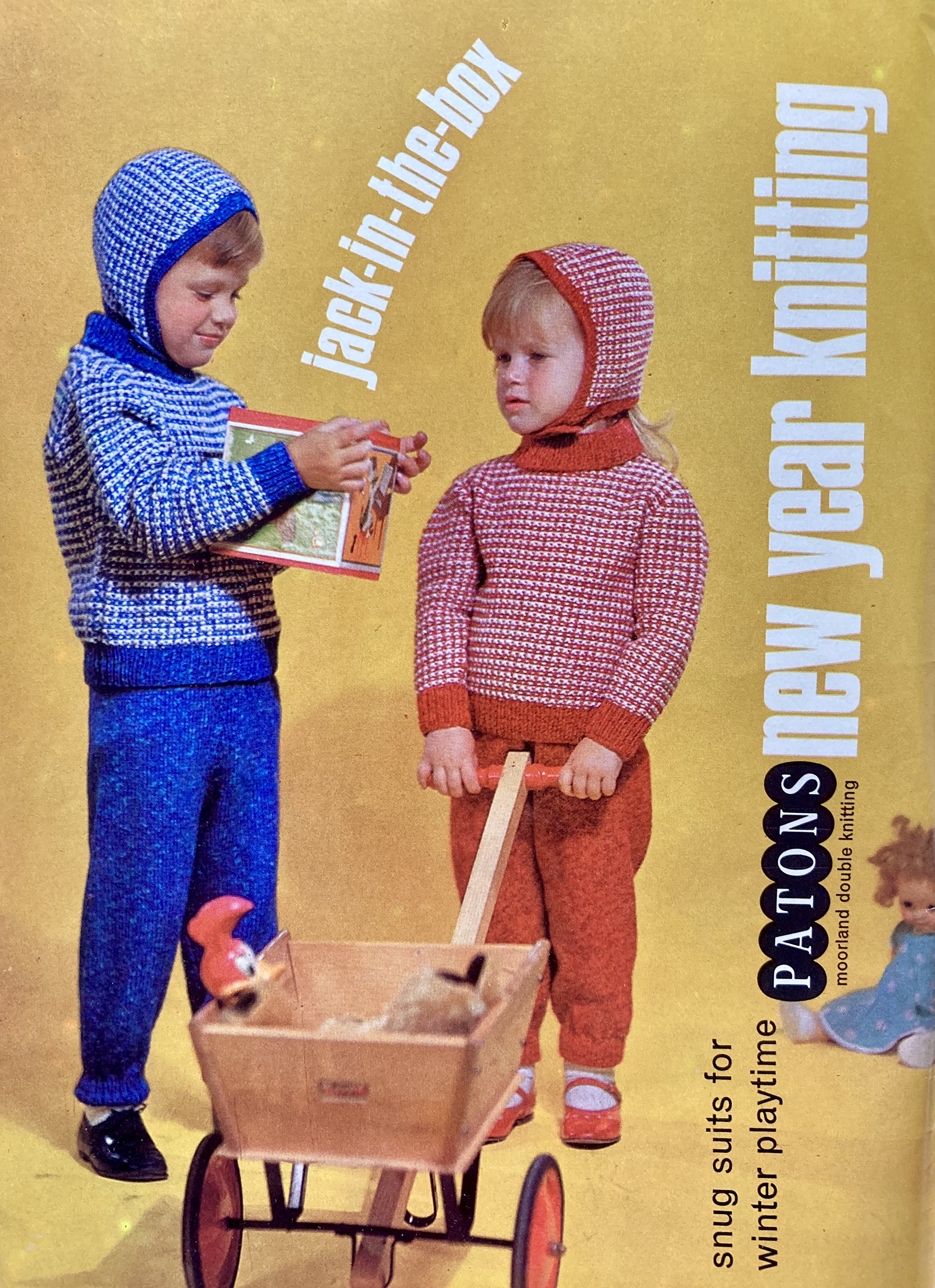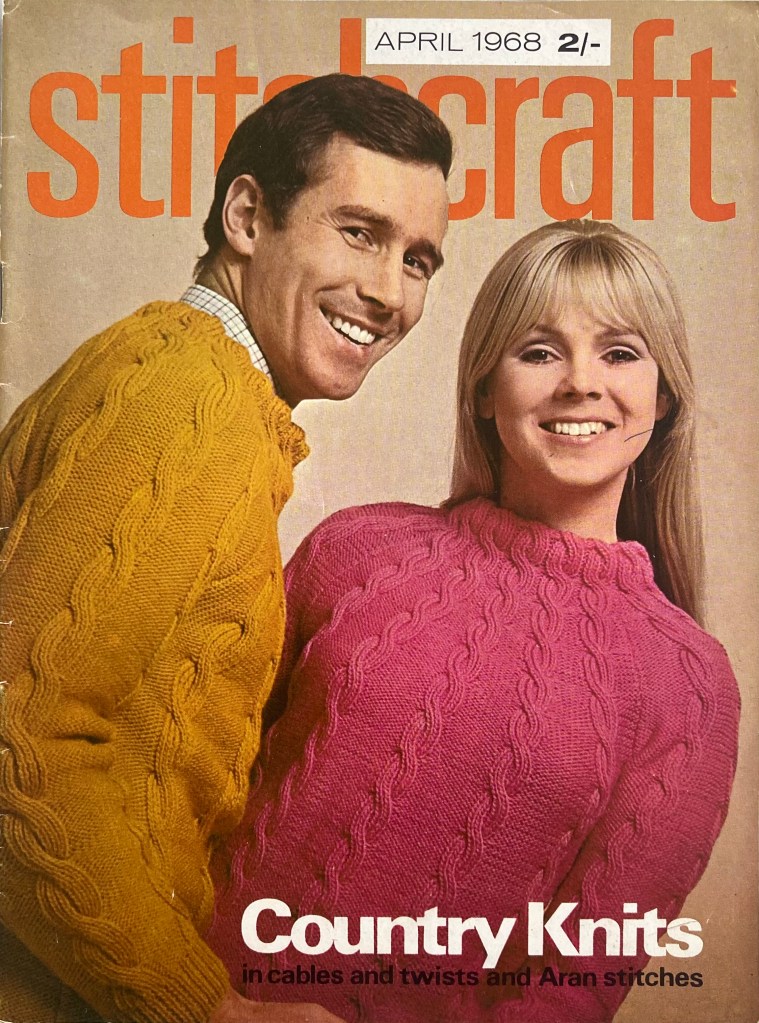
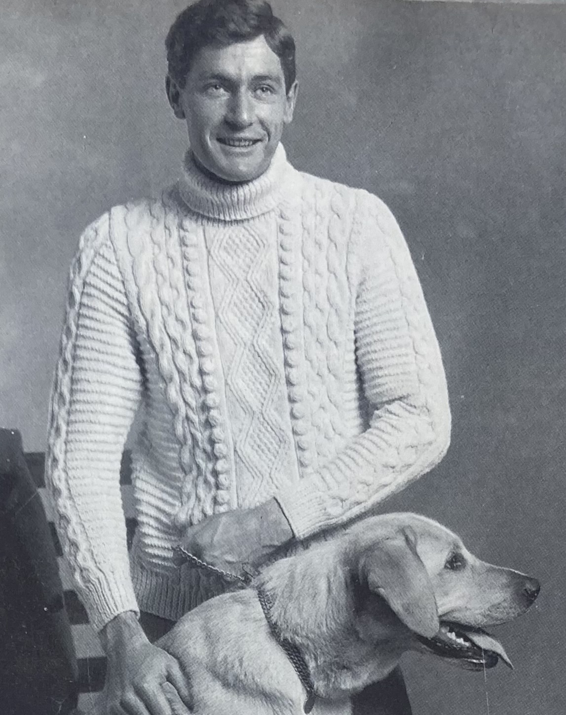
Cables, zigzags, and dogs, oh my! April 1968 is going to be a fun month at Stitchcraft.
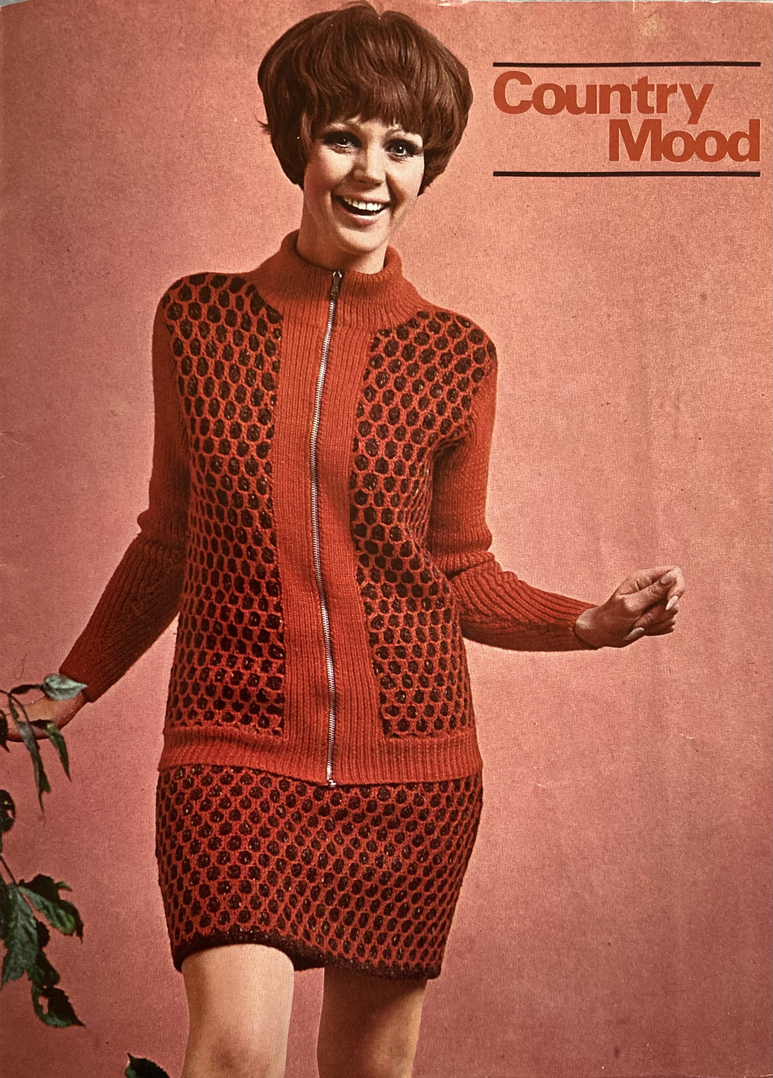
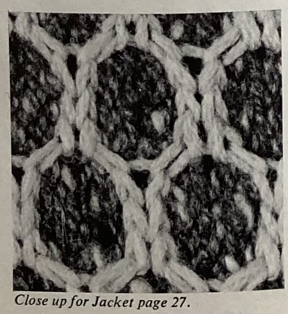
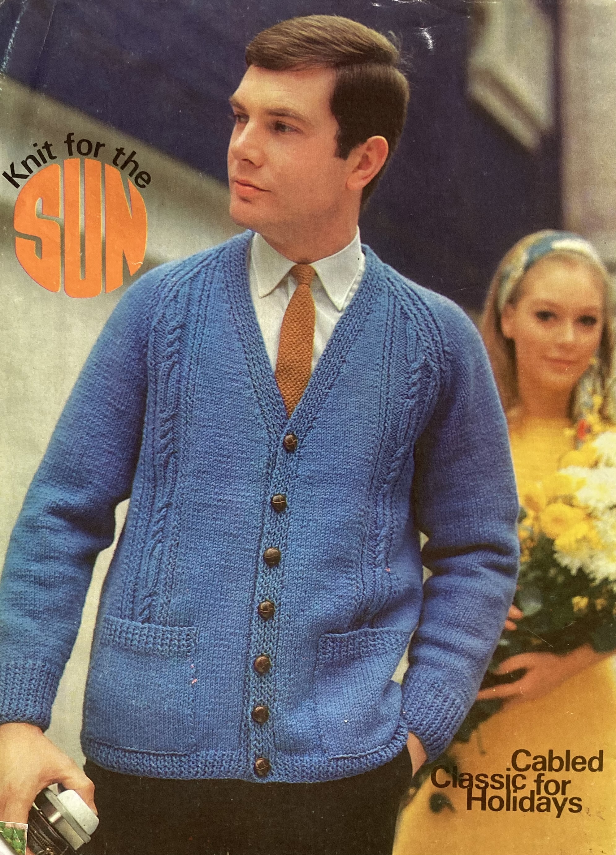
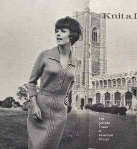
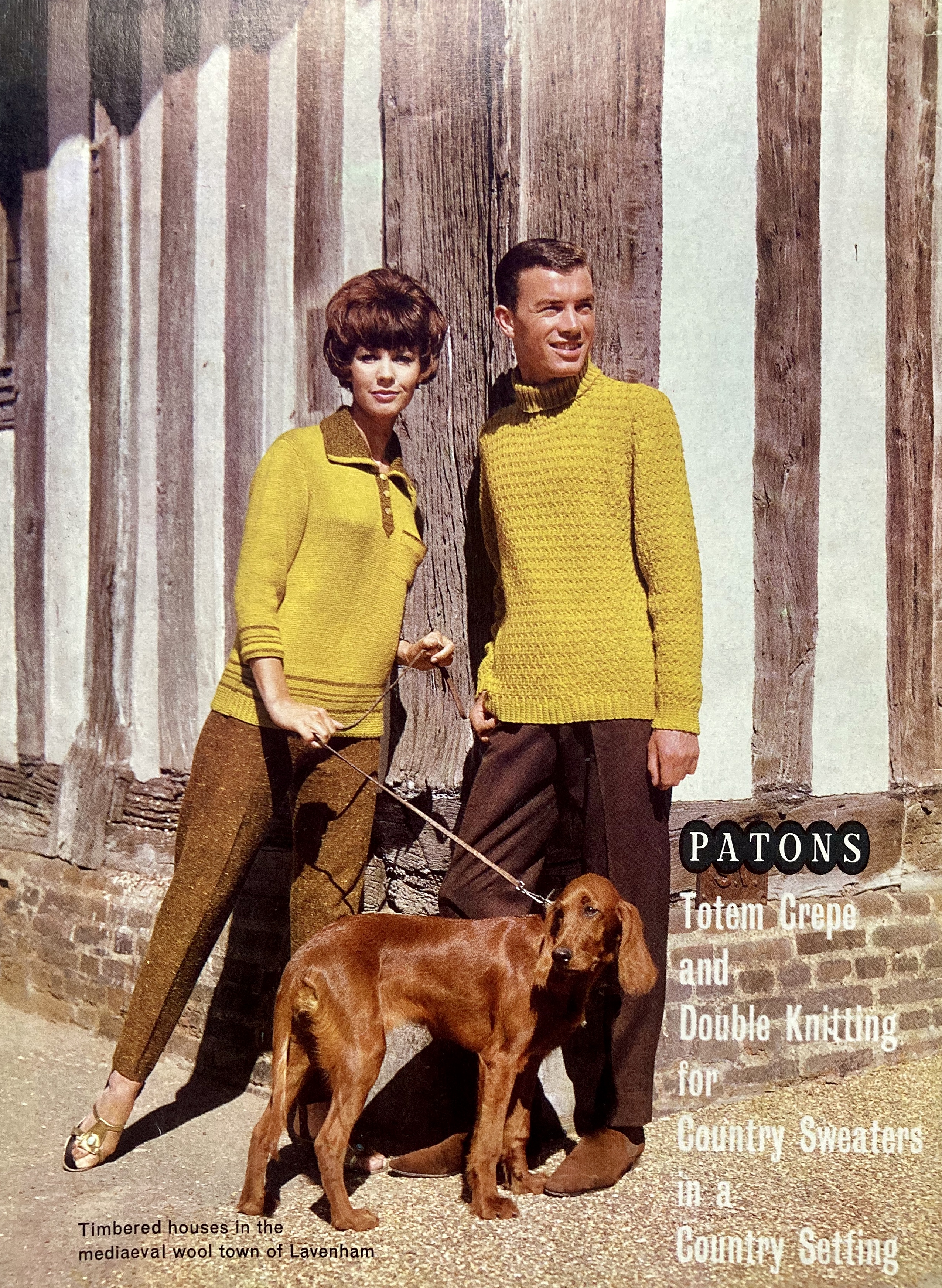
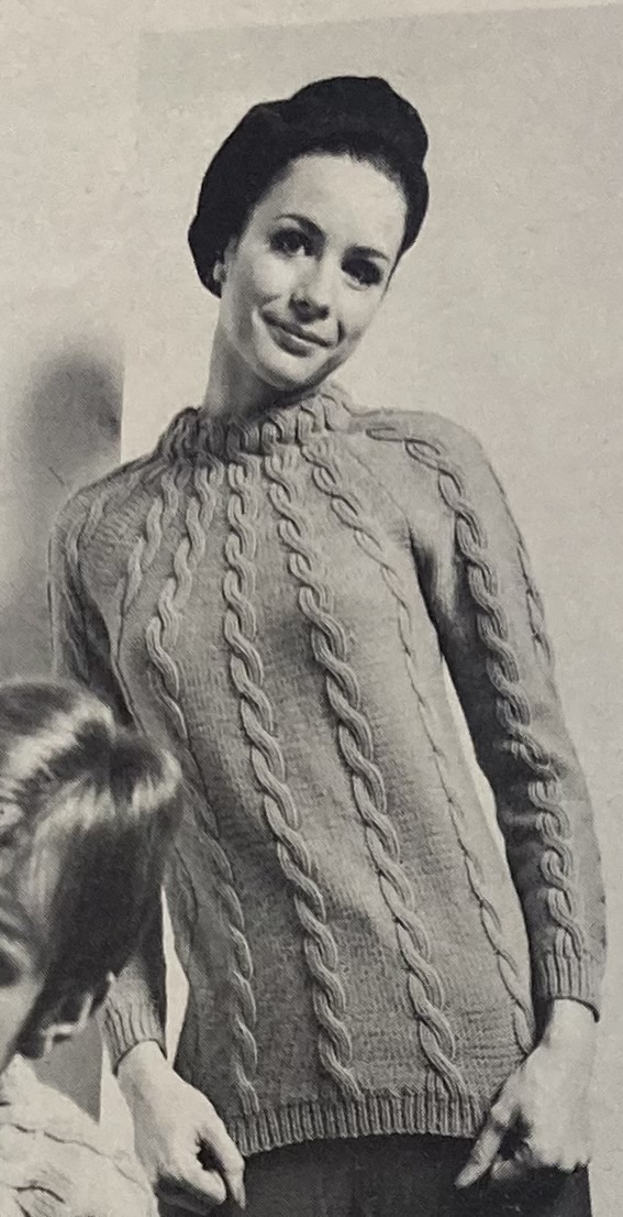
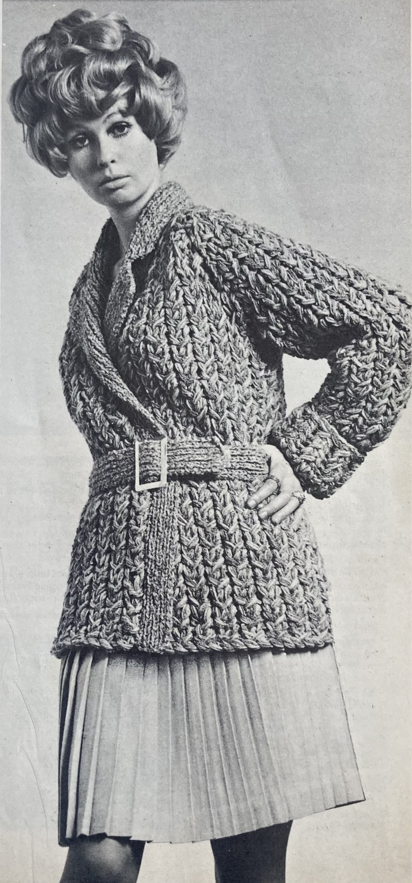
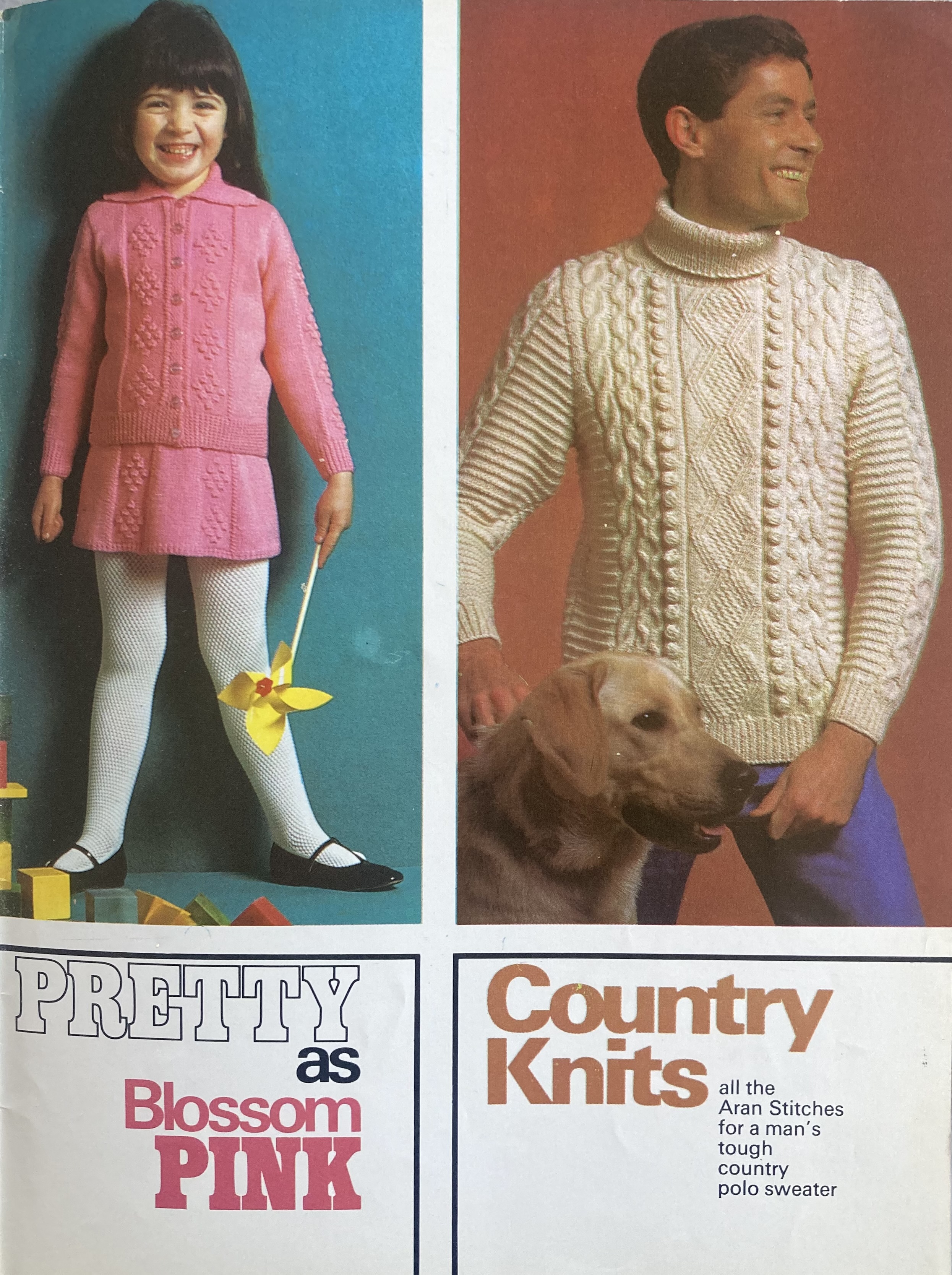
The “country knits” on the cover are in just two sizes, “for her” (34-36 inch bust) and “for him” (38-40 inch bust.) I imagine the style would look good on a larger woman as well. The raglan seams are sewn together after front, back and sleeves are knit separately. The cables continue onto the collar, which folds inward.There’s also a “travel coat” with mock-cable twists in “Super-Sonic” style (multiple strands of bulky wool knit together on maxi-size 3/4-inch needles) and a smooth and elegant cardigan with just a few cables on front and sleeves.
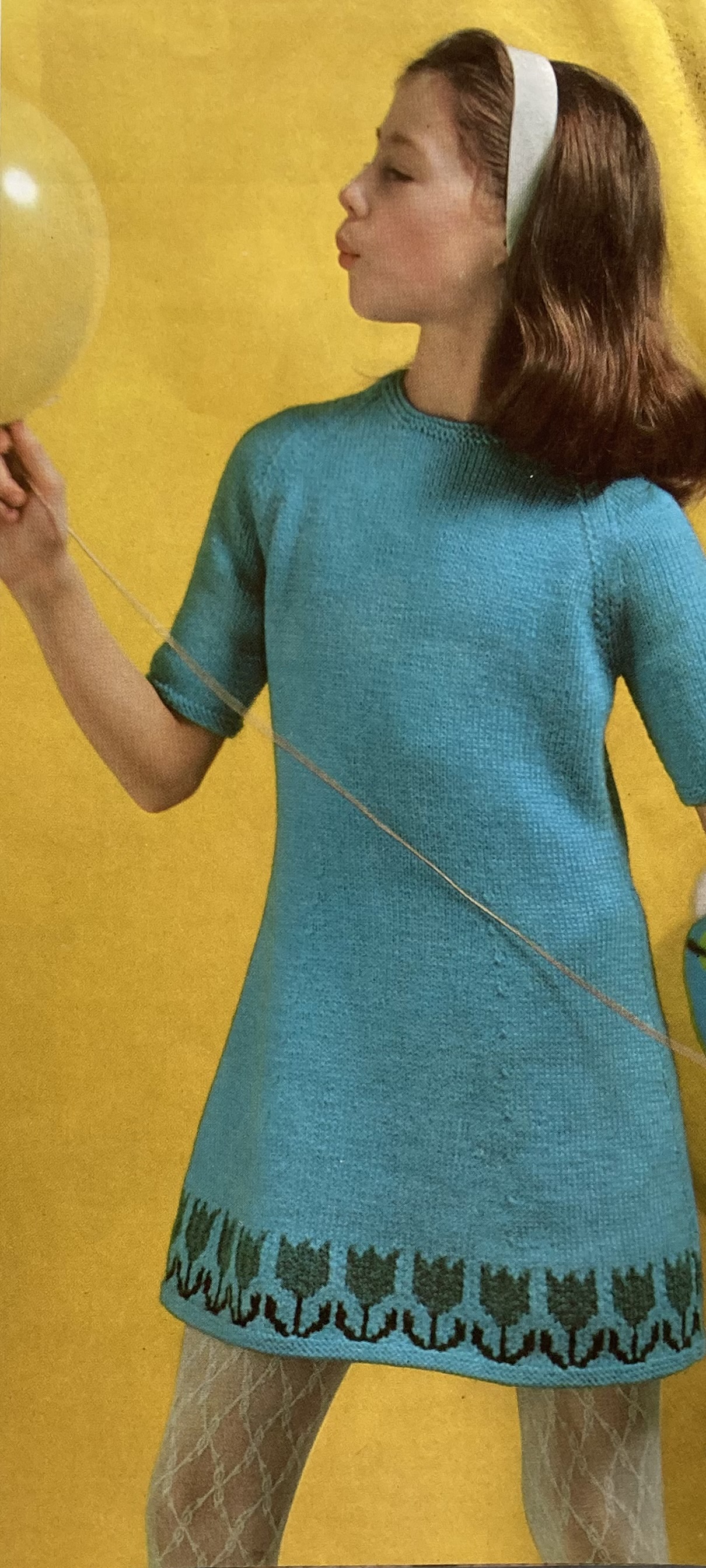
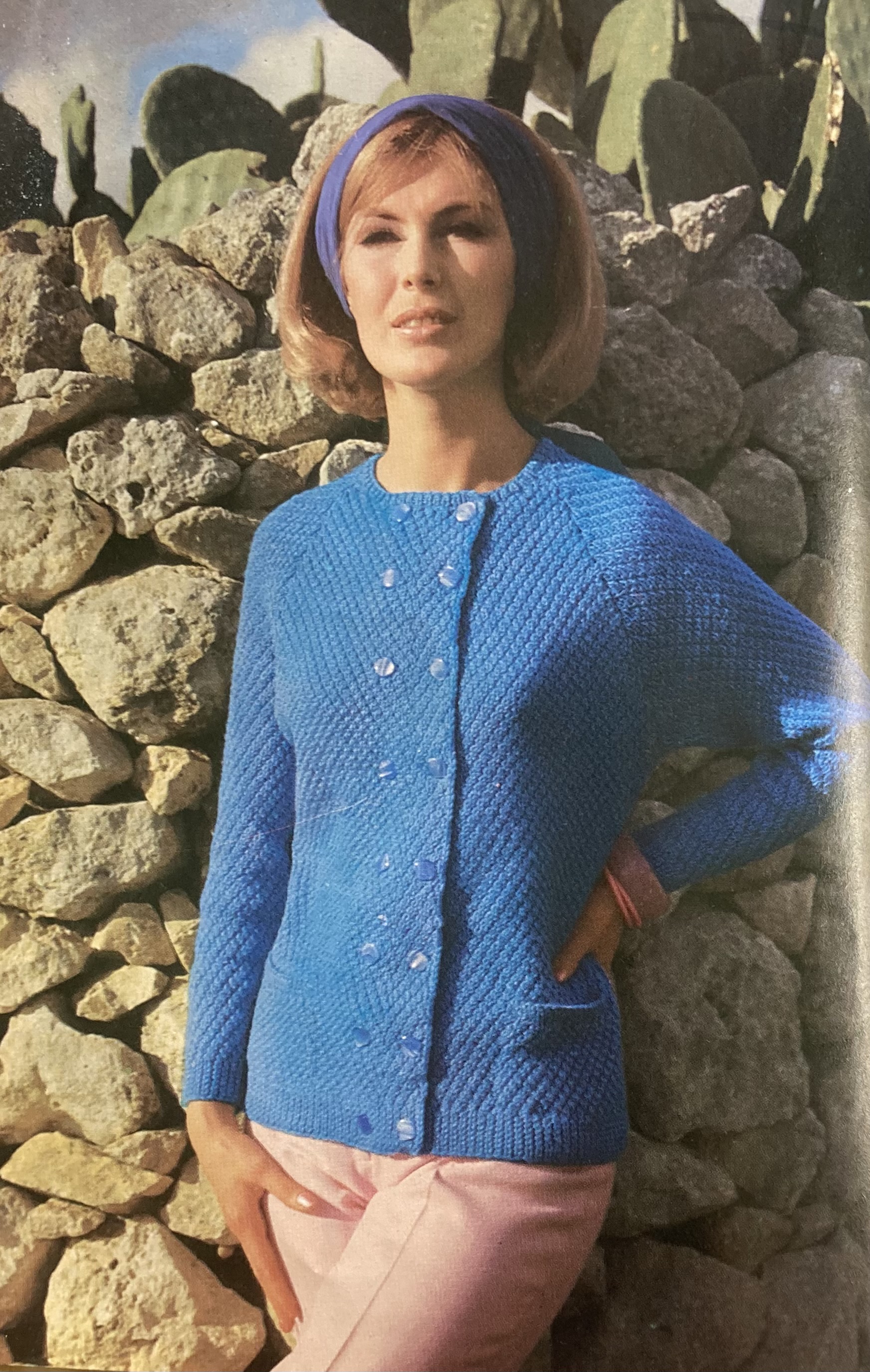
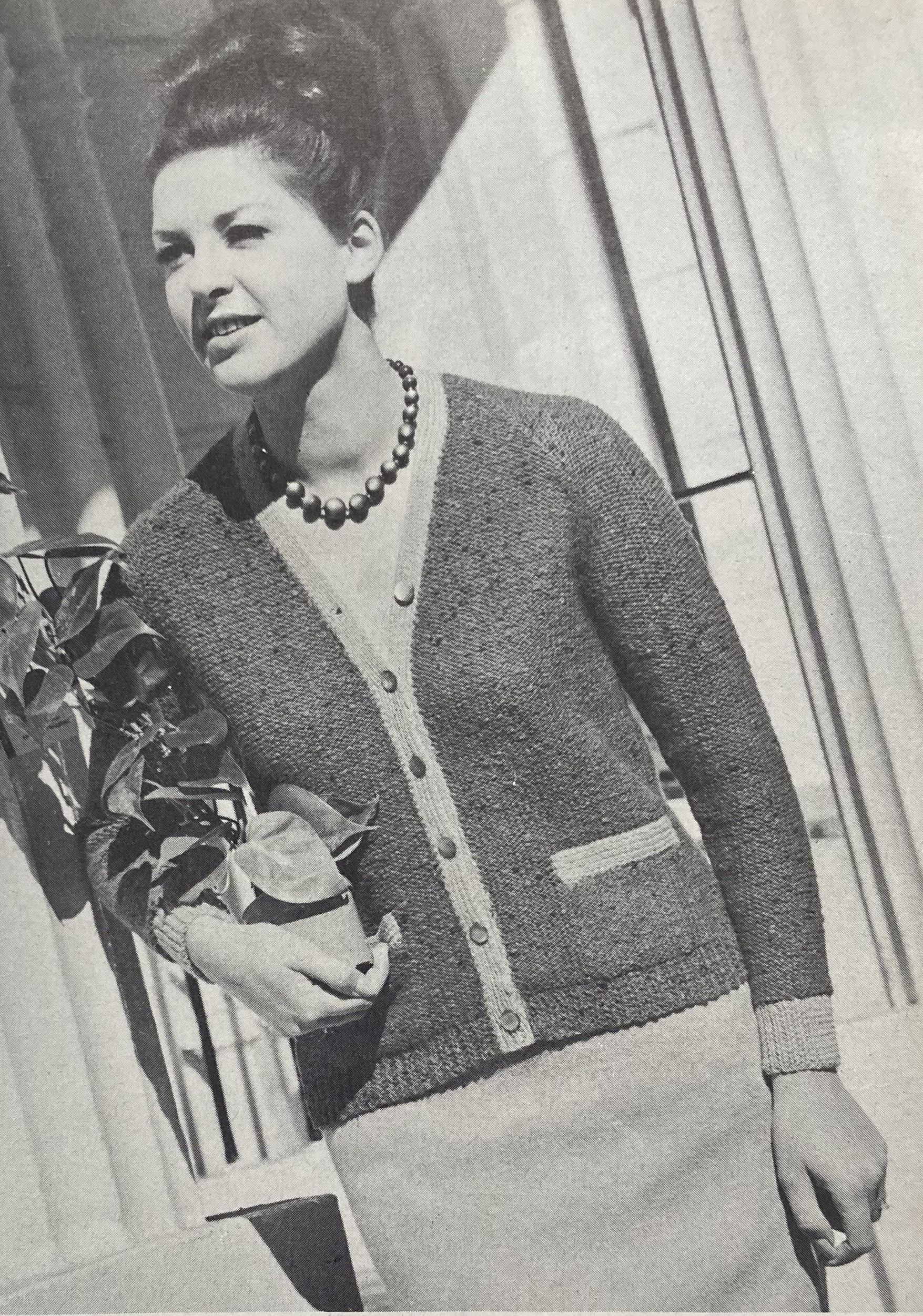
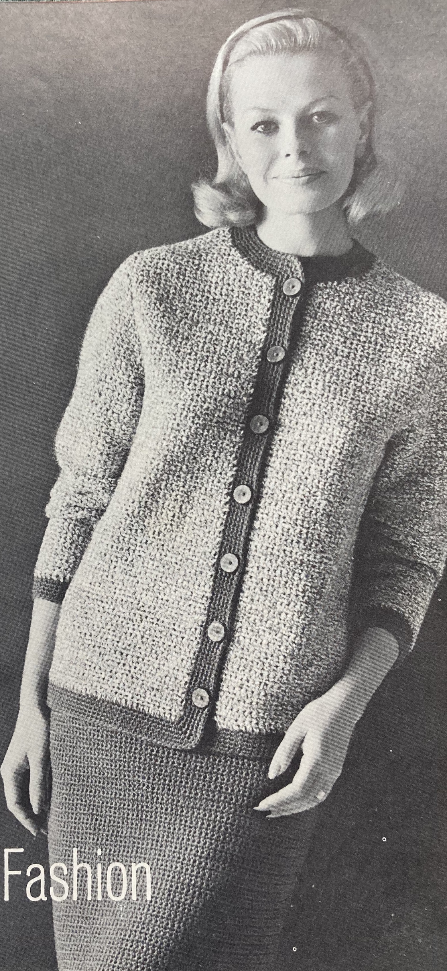
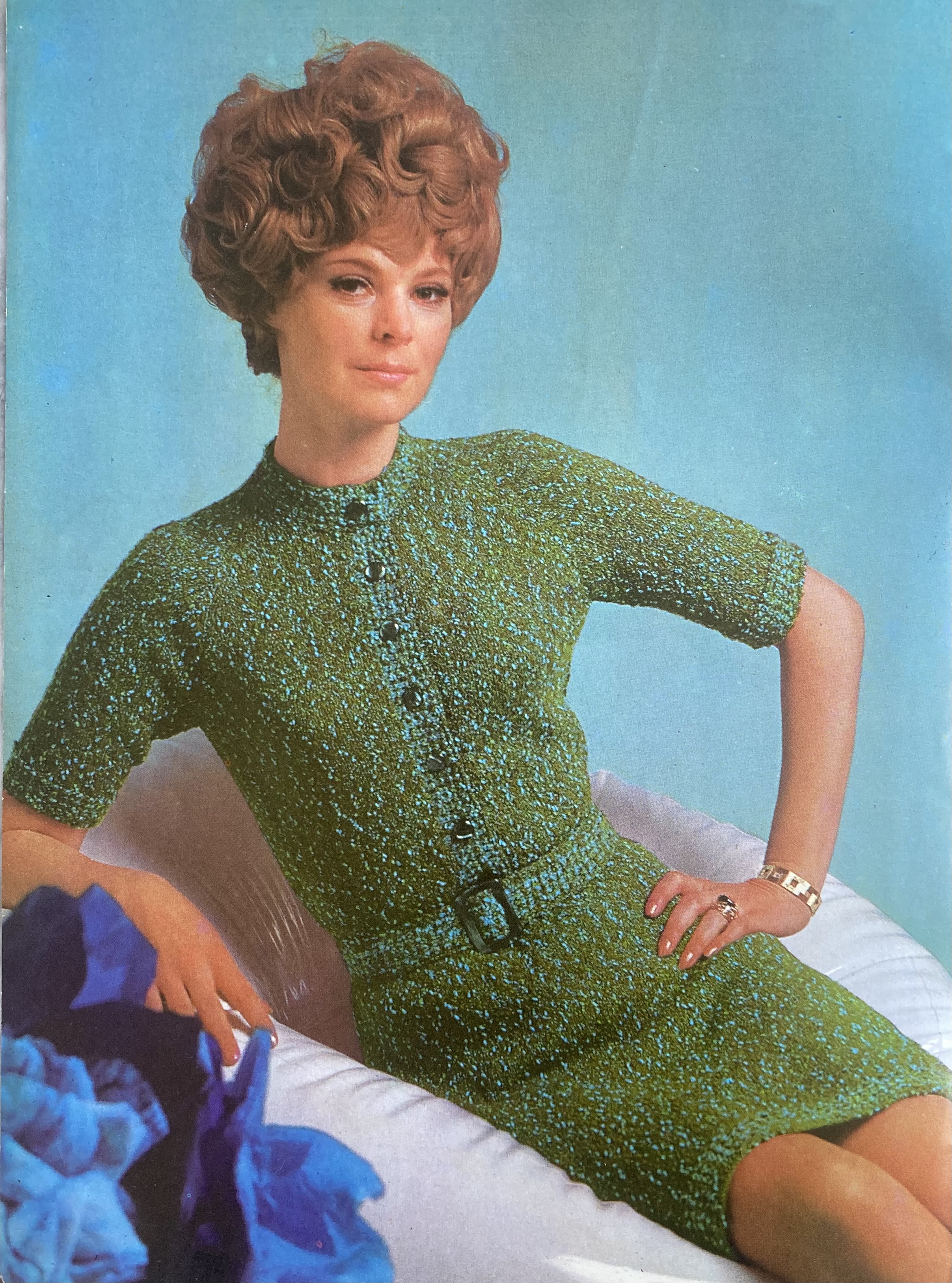
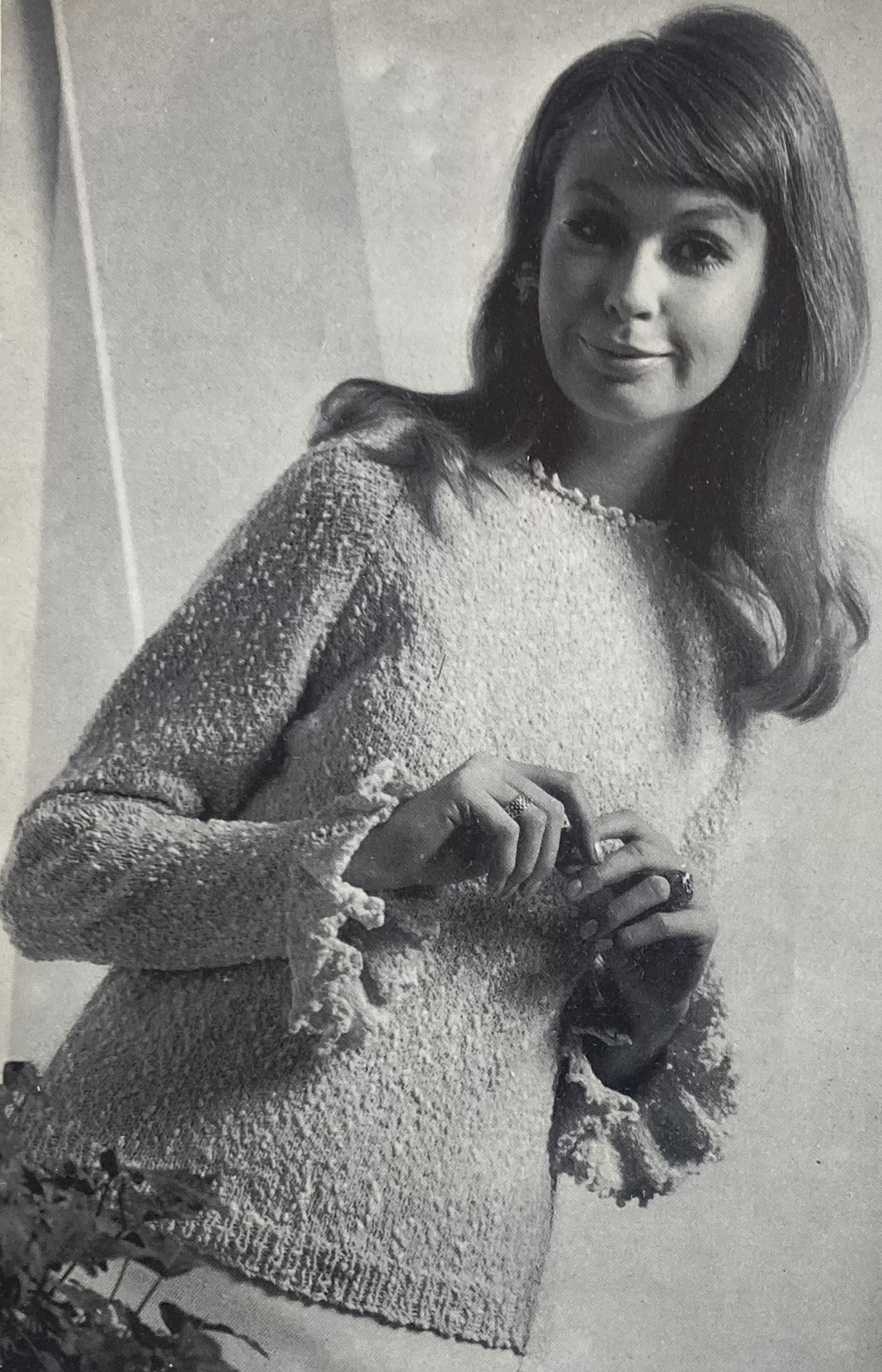
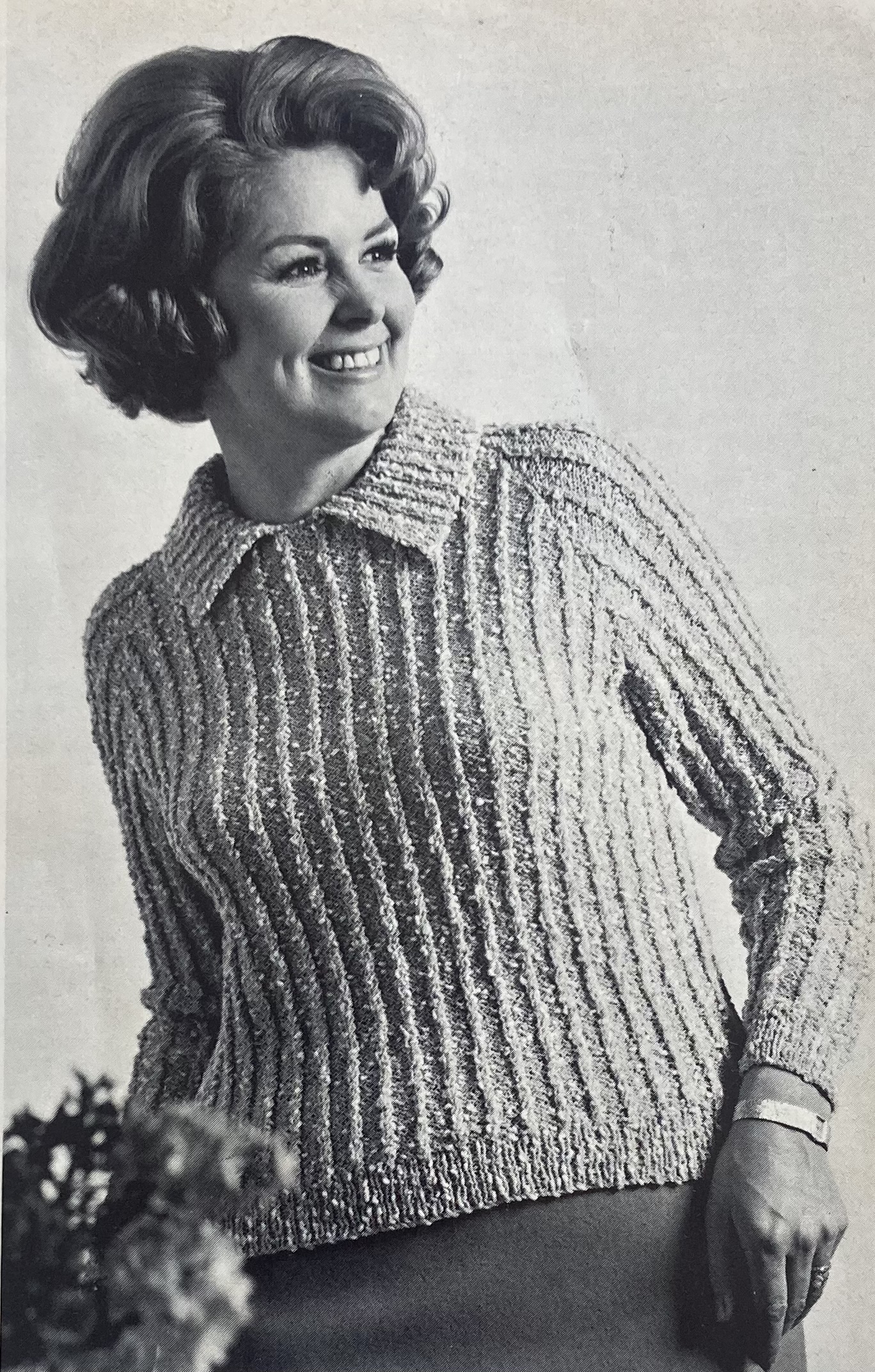
Texture without cables can be achieved using Patons nubbly “Four Seasons” yarn for a tweedy dress (love that wig again), a plain jumper with frilly edgings, or a ribbed “classic blouse in larger sizes”.
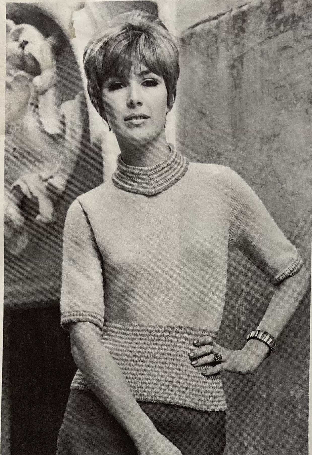
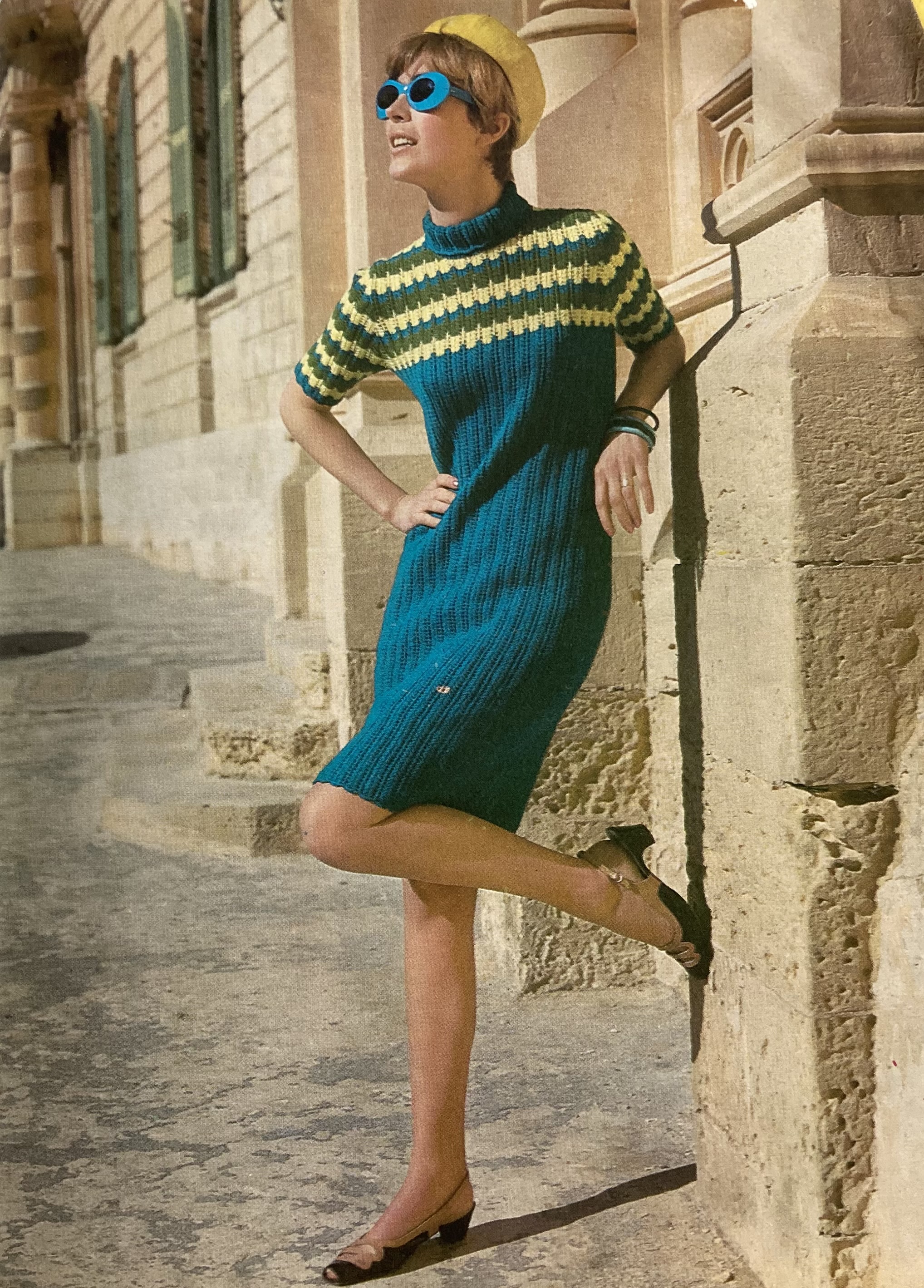
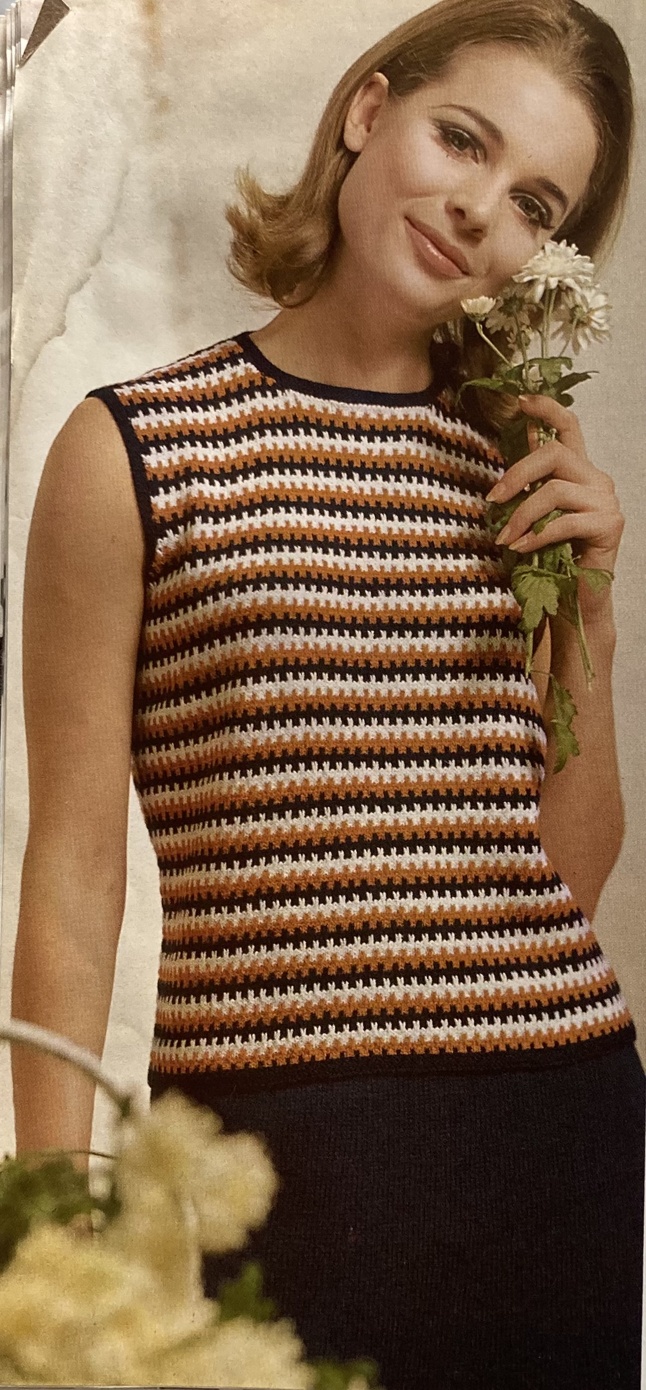
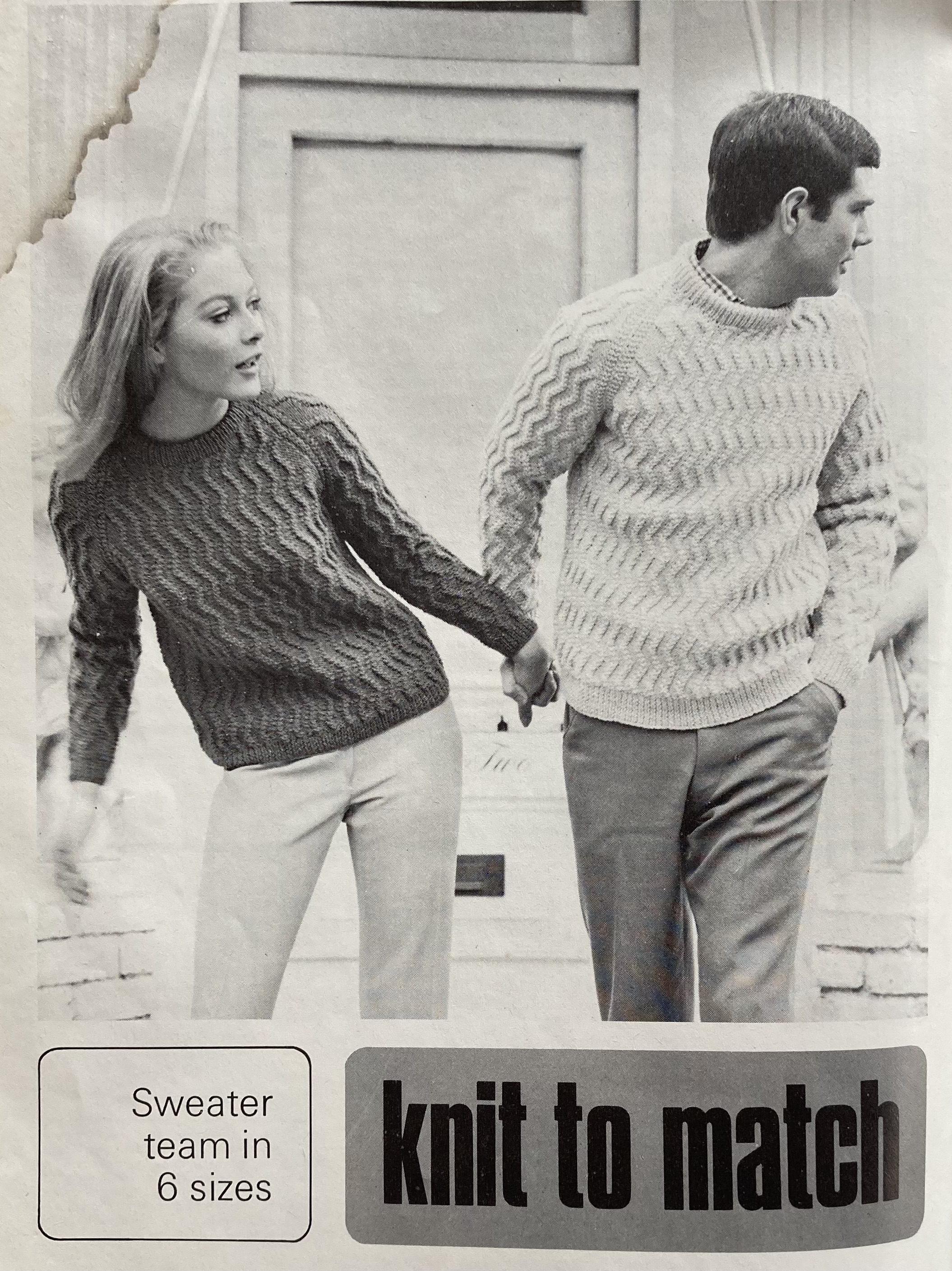
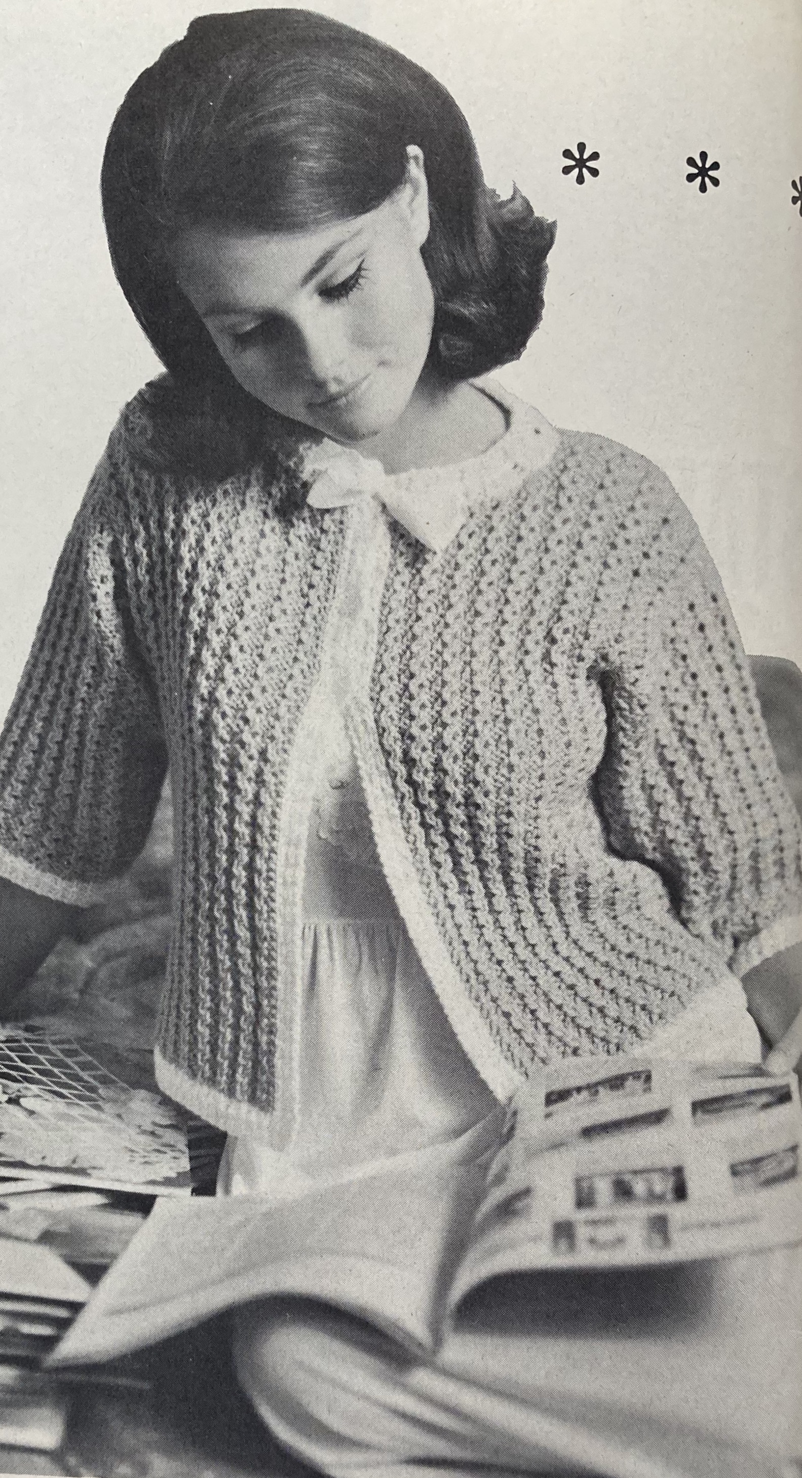
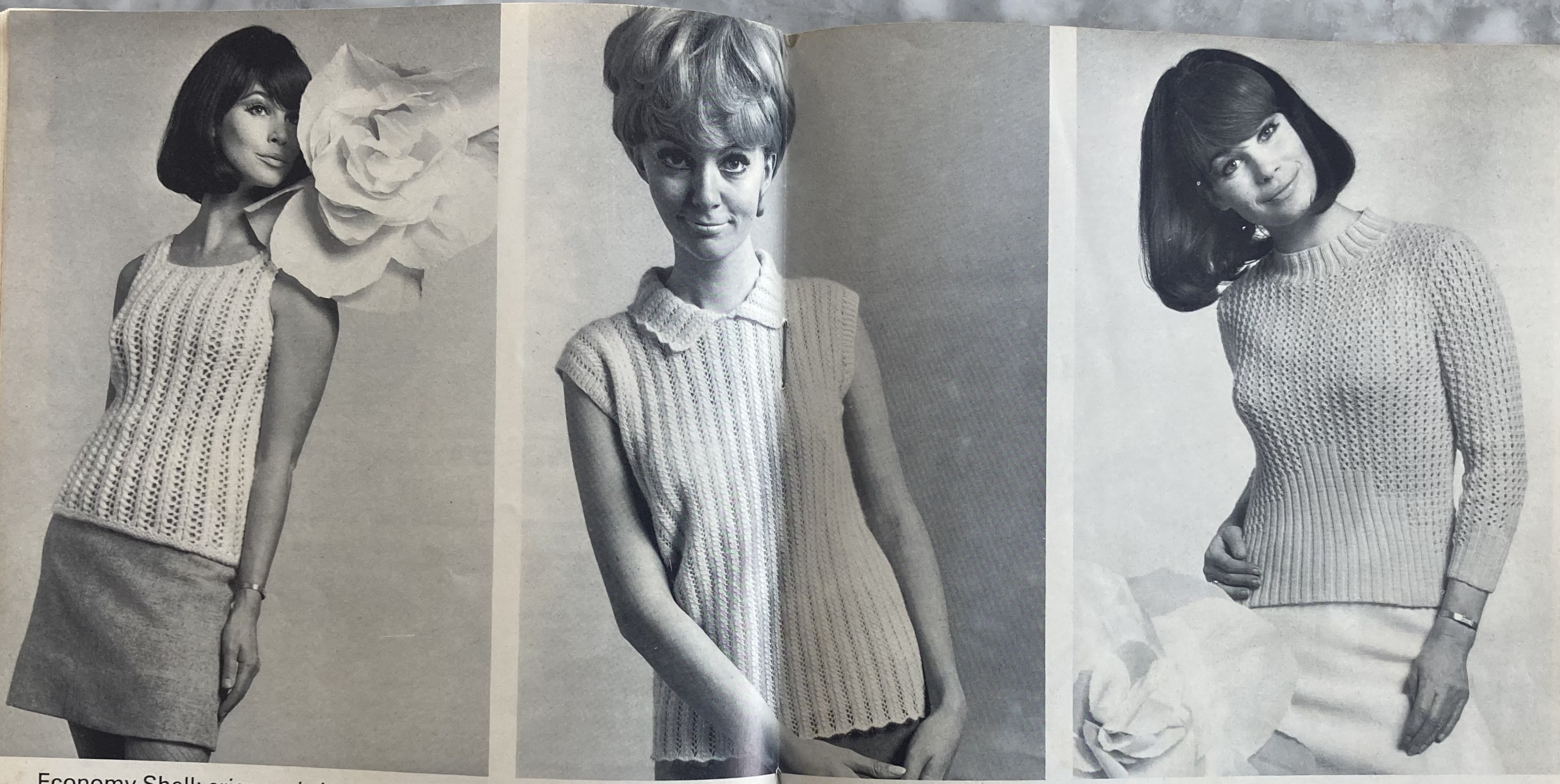
The three summer tops in the centrefold photo also use textured rib patterns for a cable-like effect. All three are in different weights: the sleeveless top on the left looks lightweight but is make in bulky “Big Ben” wool; the fluffy blouse in the middle is made in soft, fine angora-wool “Princess”, and the “practical wash-tub summer sweater” on the right is made in Bri-Nylon “Brilliante”.
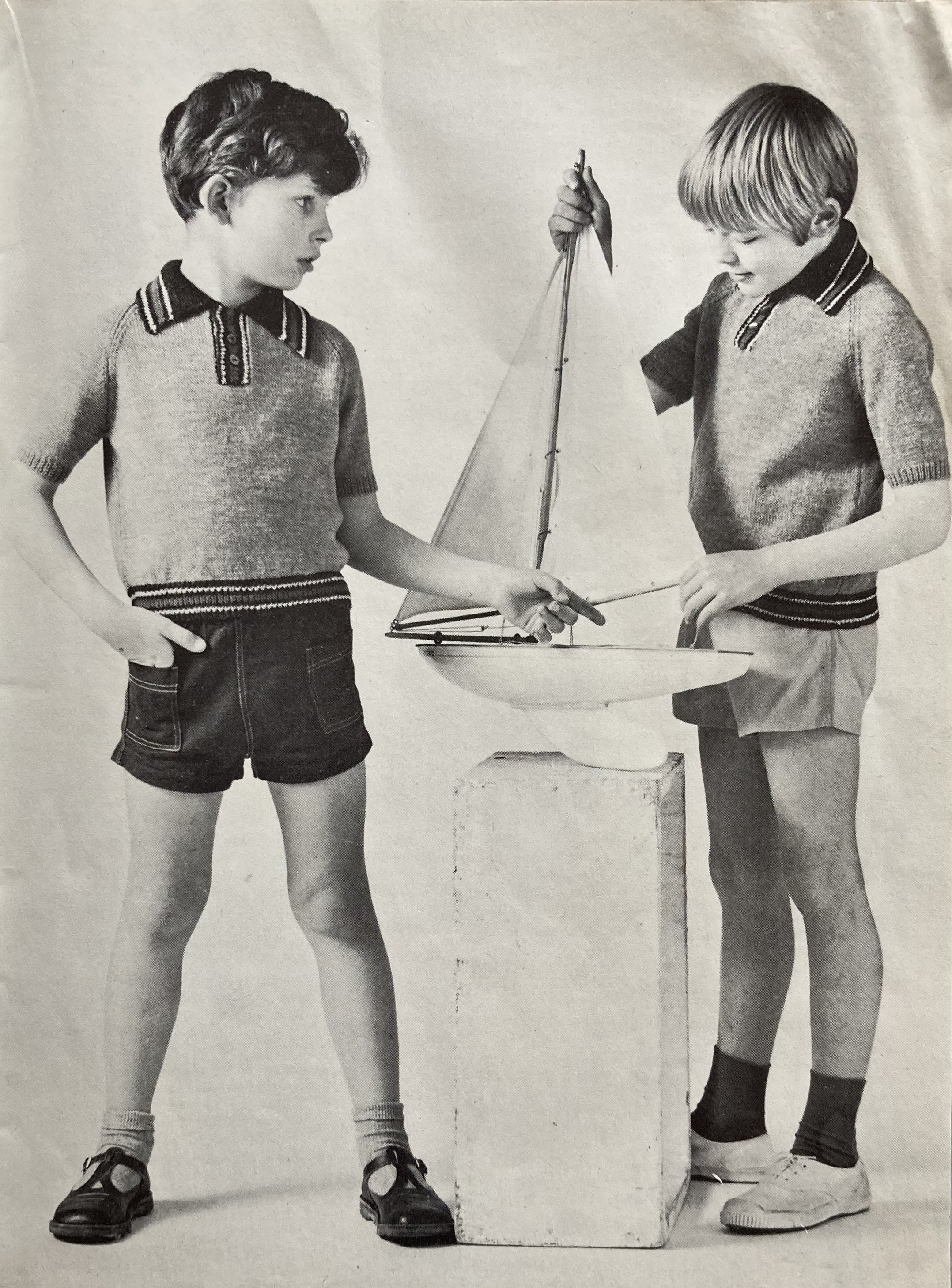
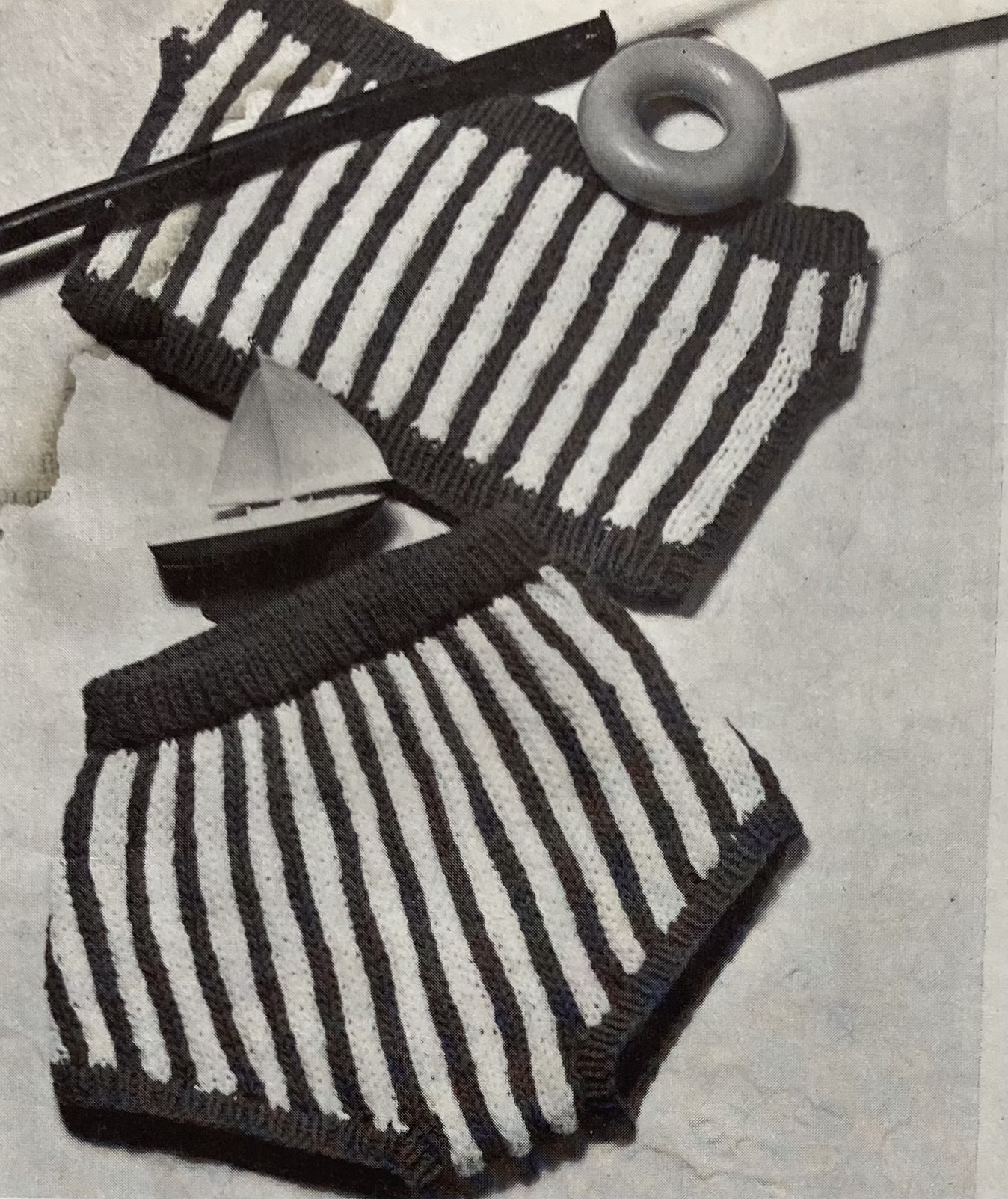
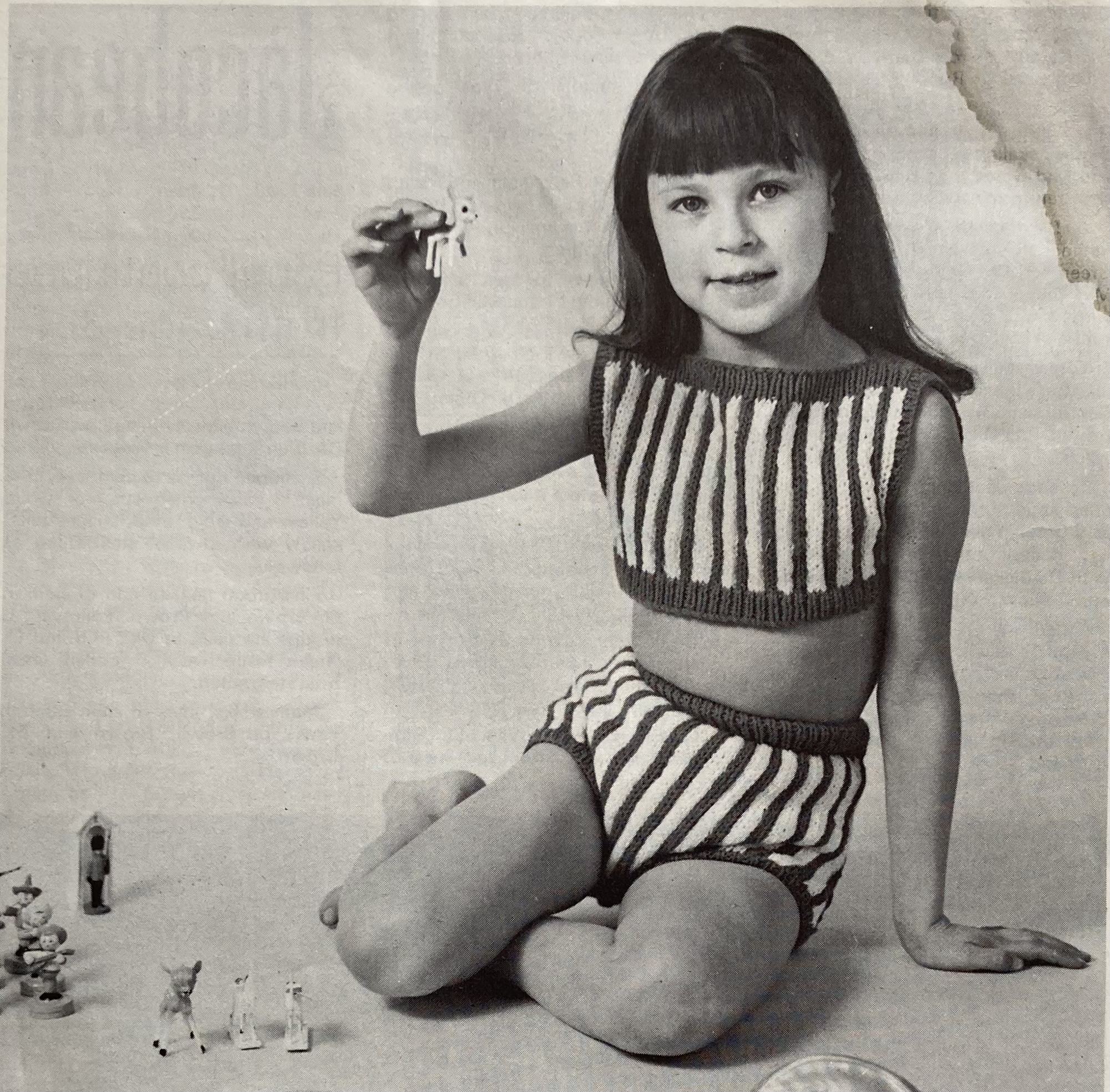
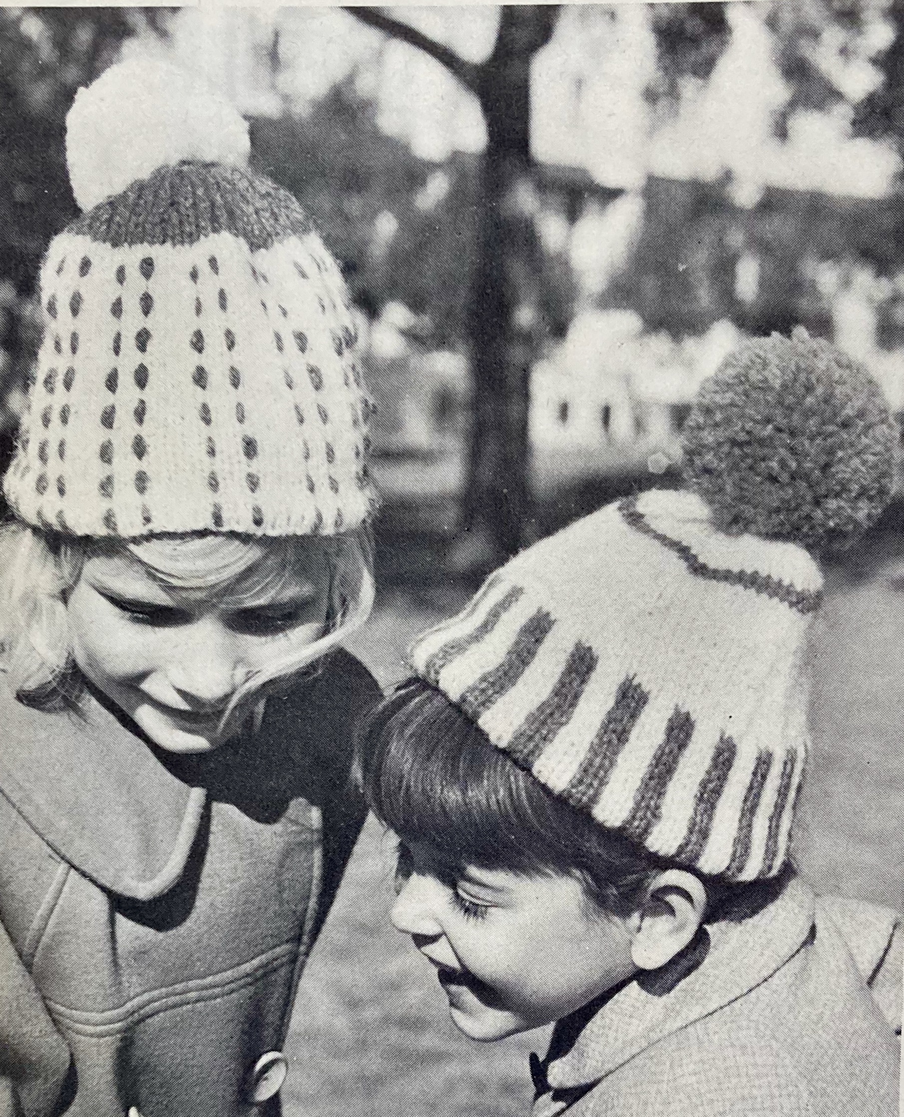
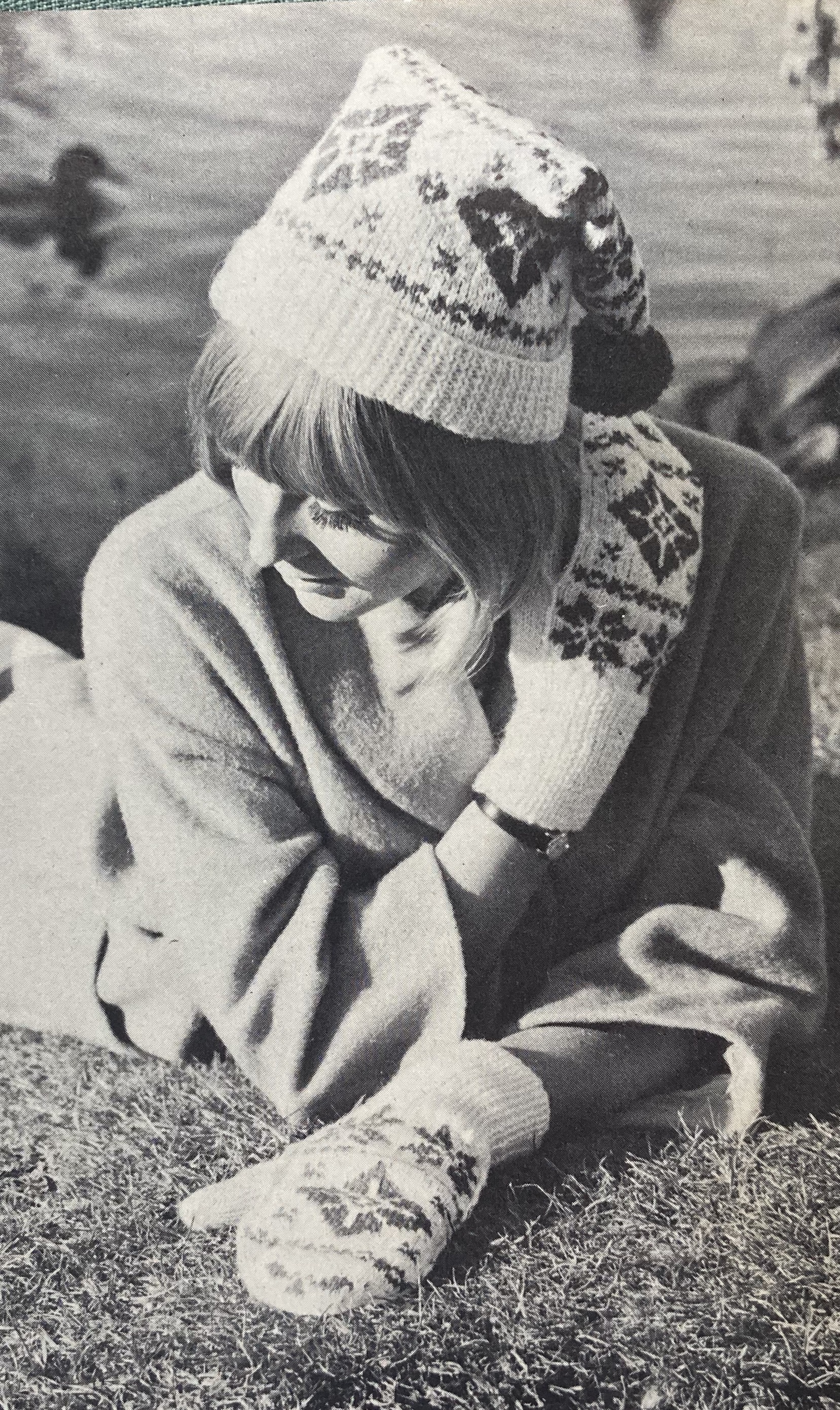
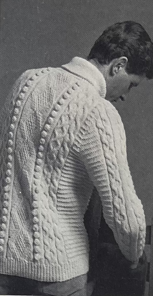
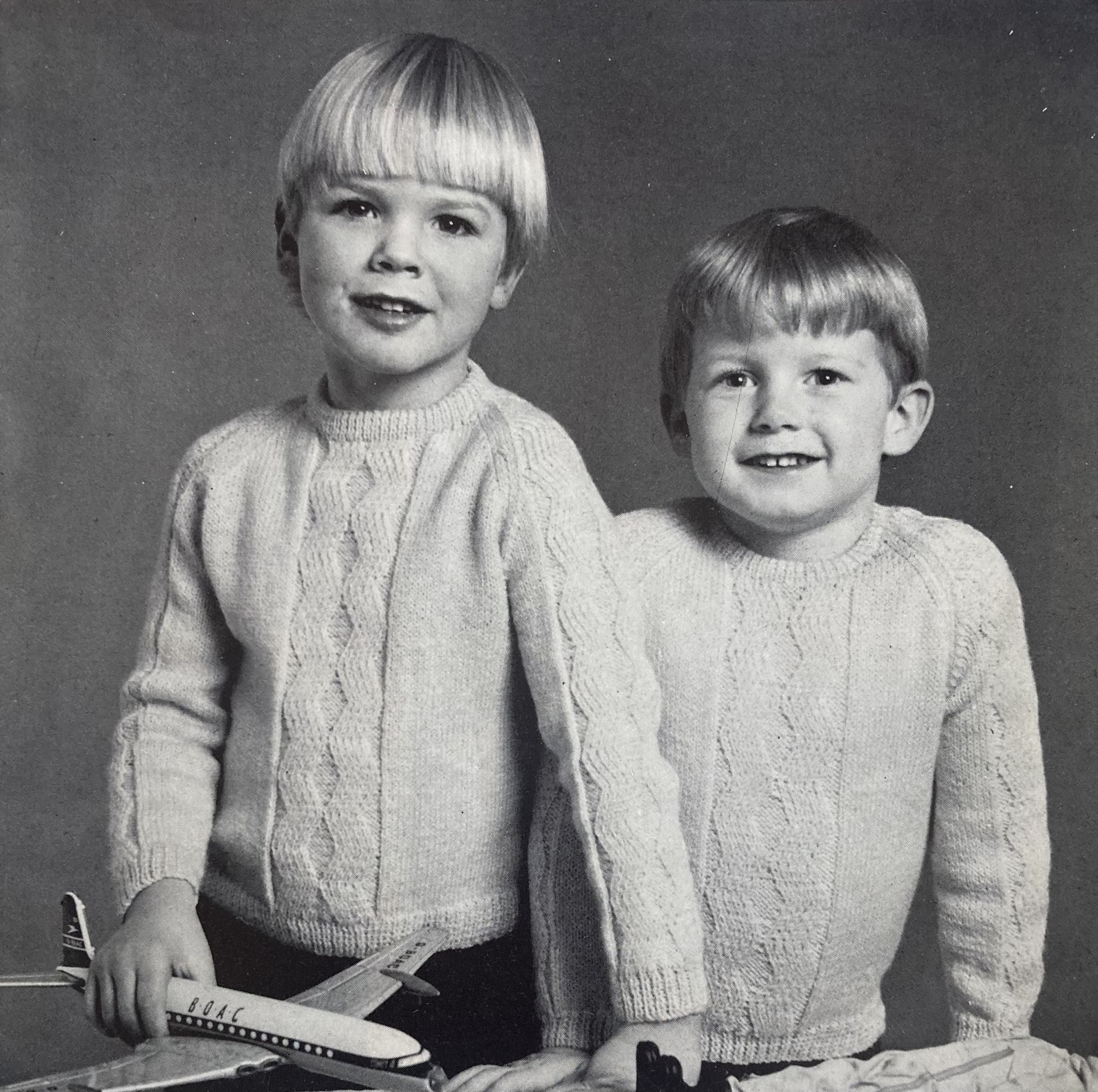
There are some nice cable and zigzag designs for men and children as well: Besides the cover pullover, there’s a traditional Aran-patterned sweater with cables and zigzags, a textured cardigan-and-skirt set for a little girl, and a boys’ jumper with a similar zigzag pattern to the men’s Aran sweater.
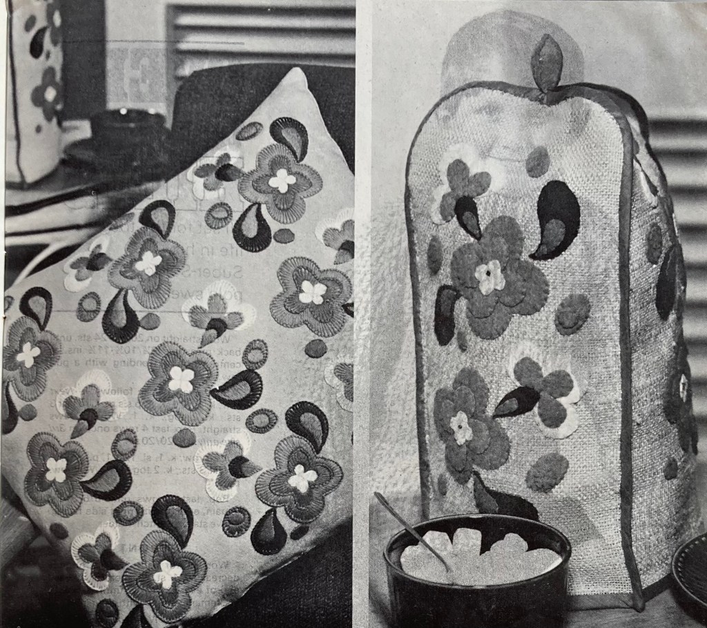
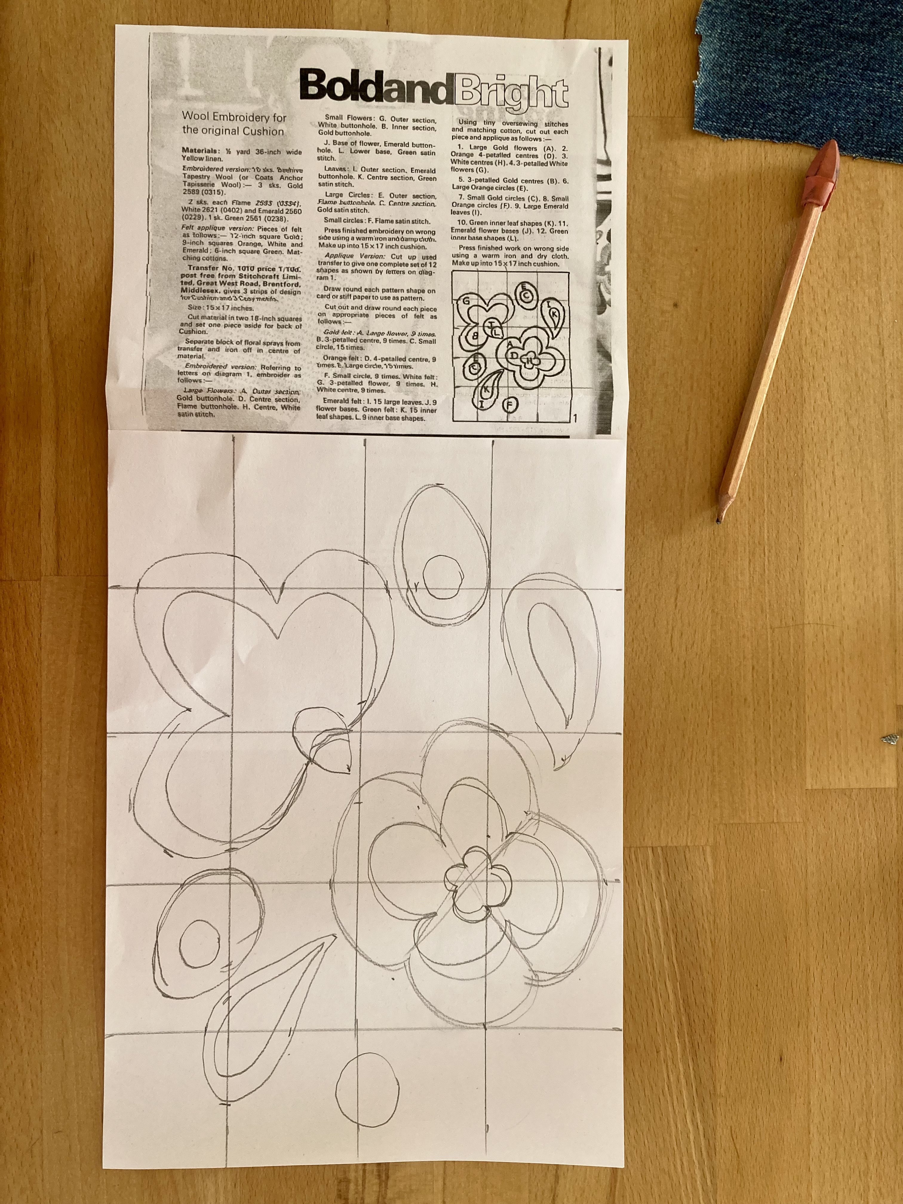
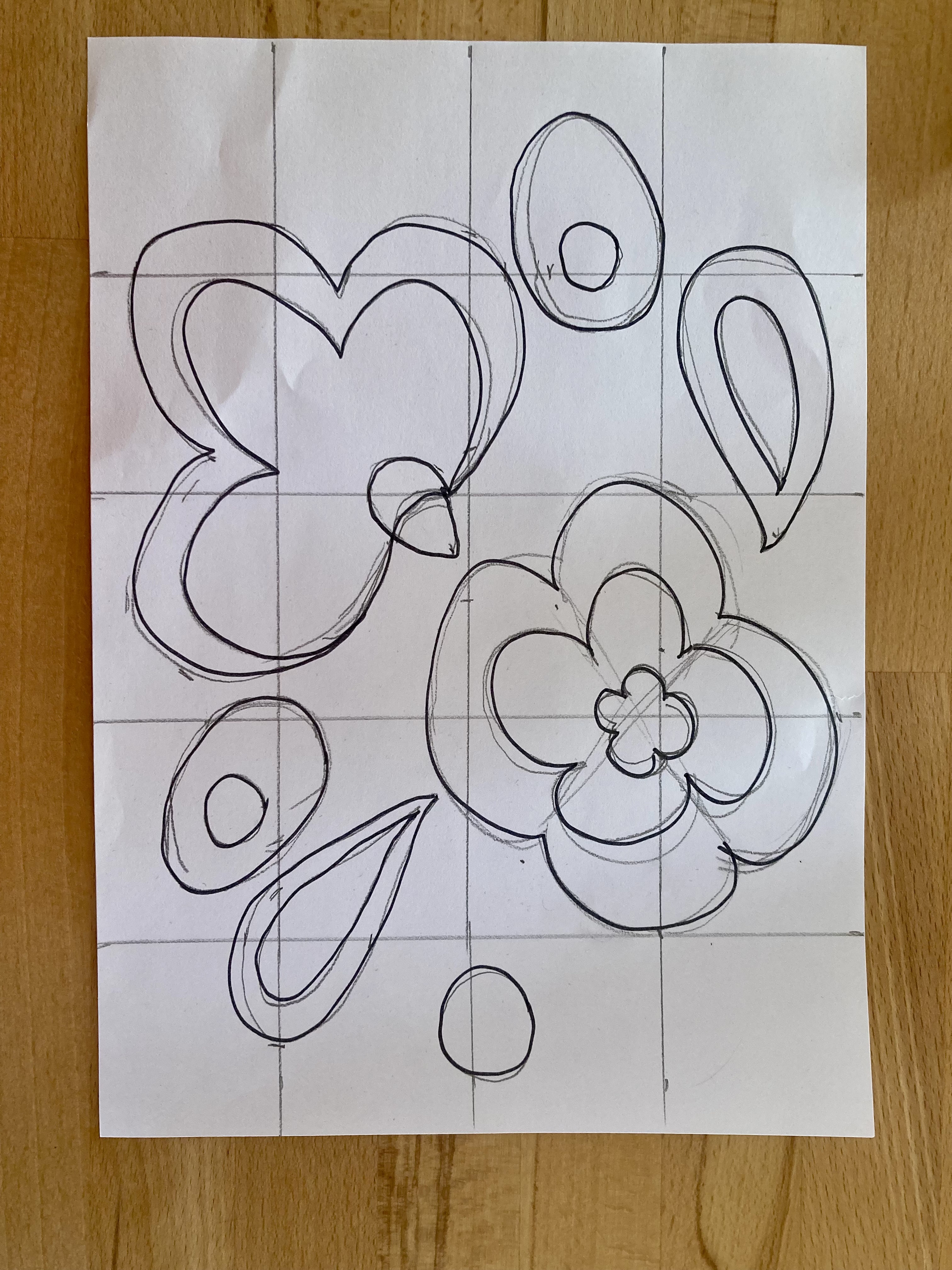
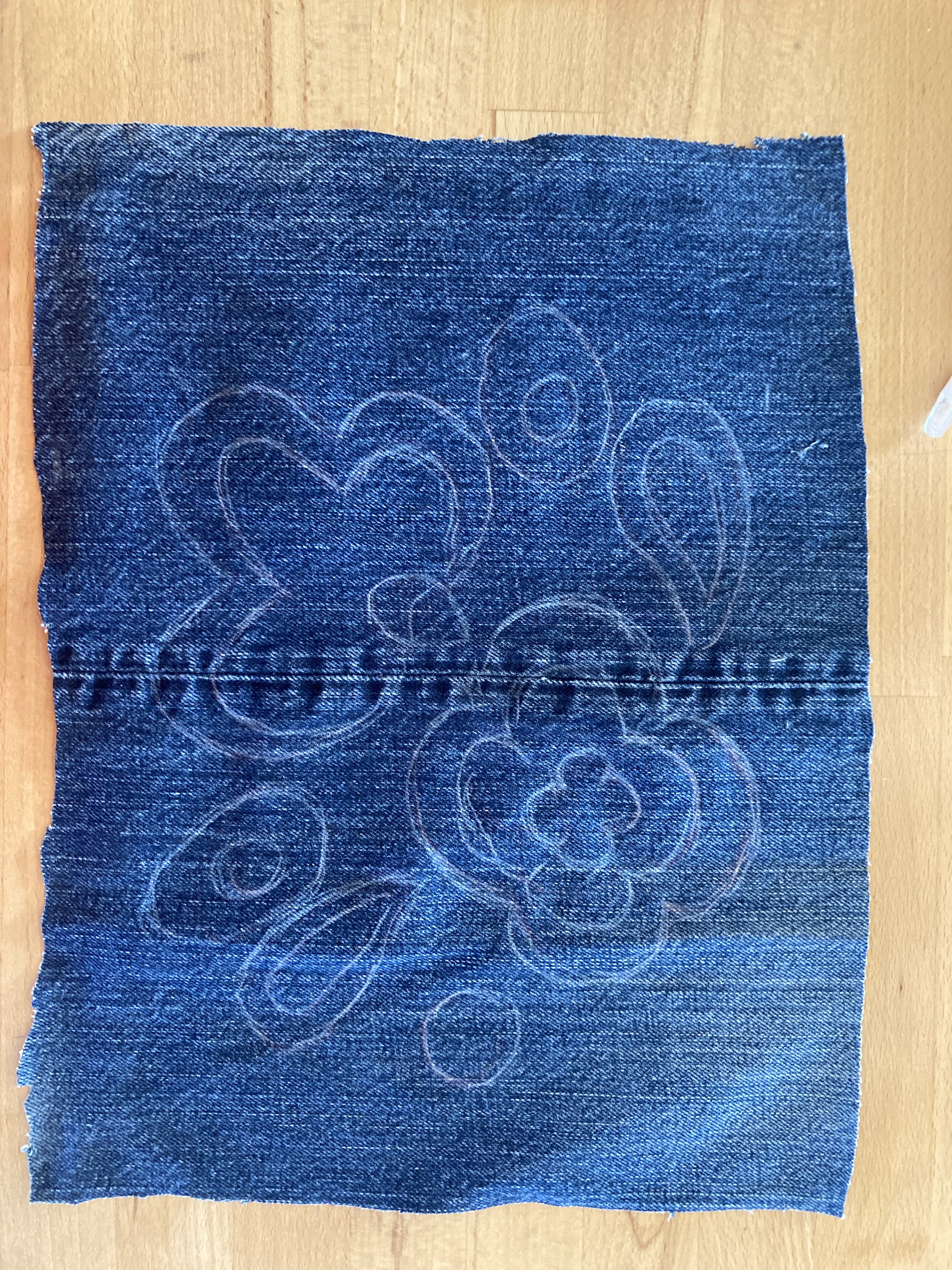
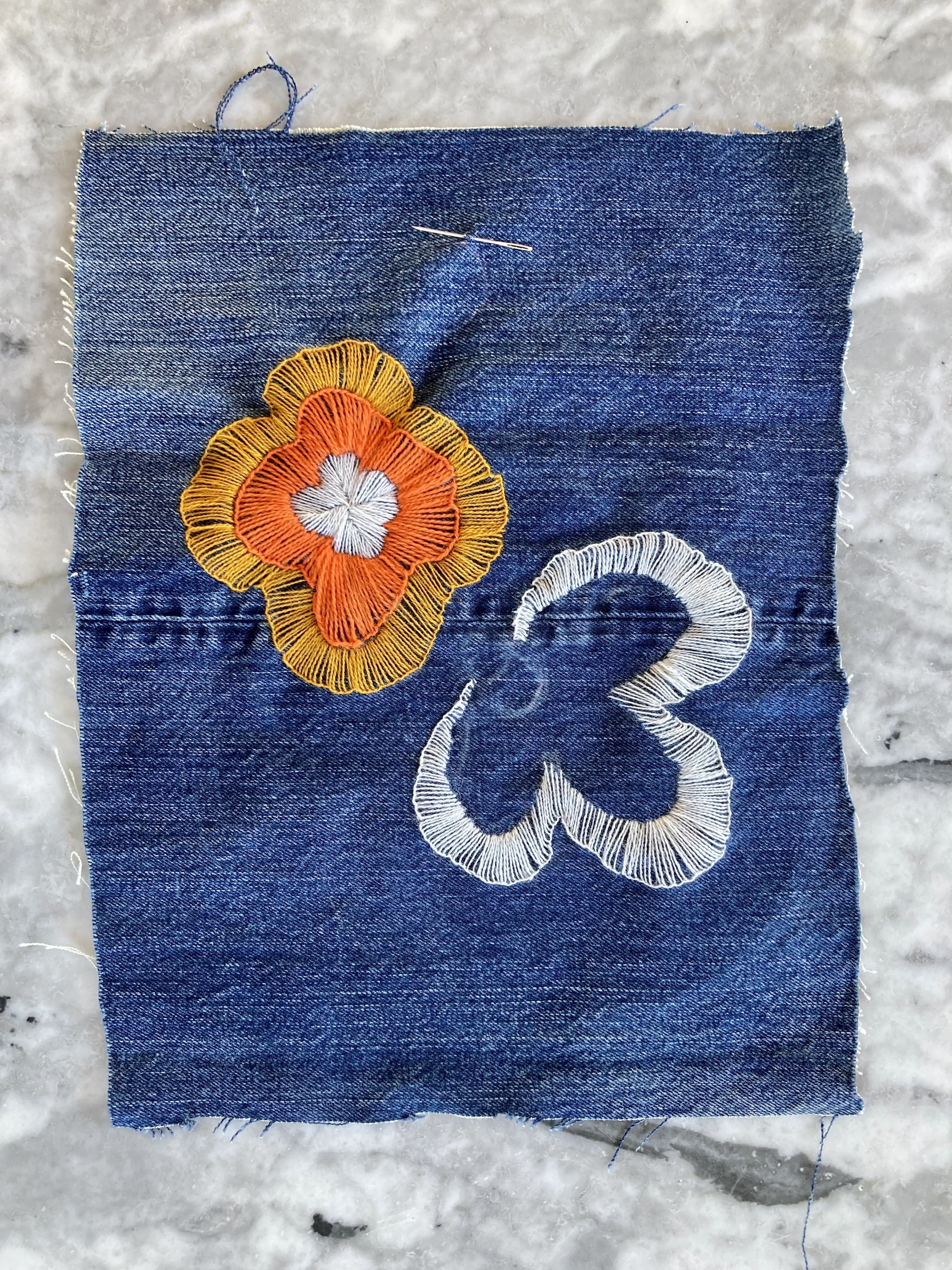
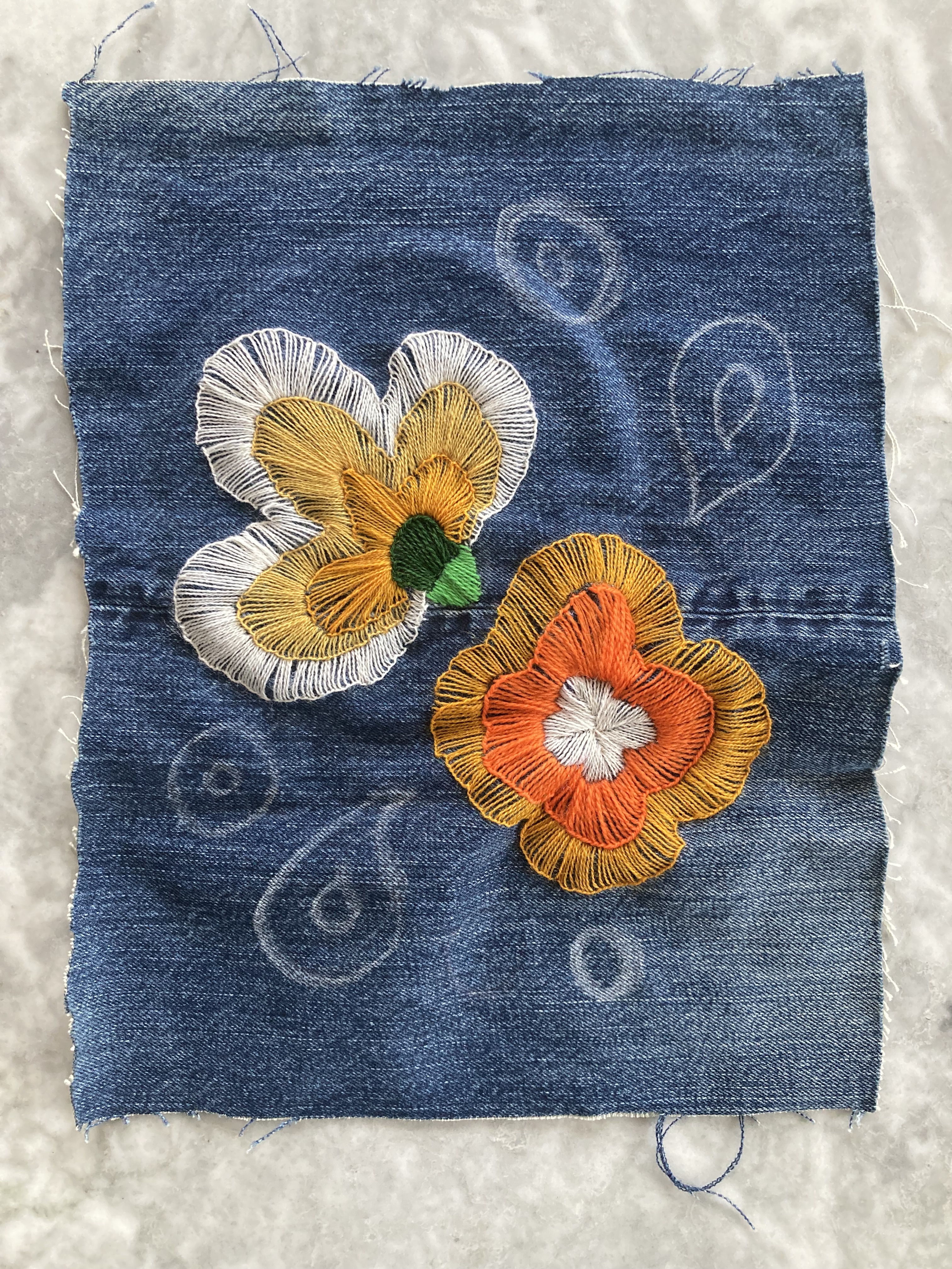
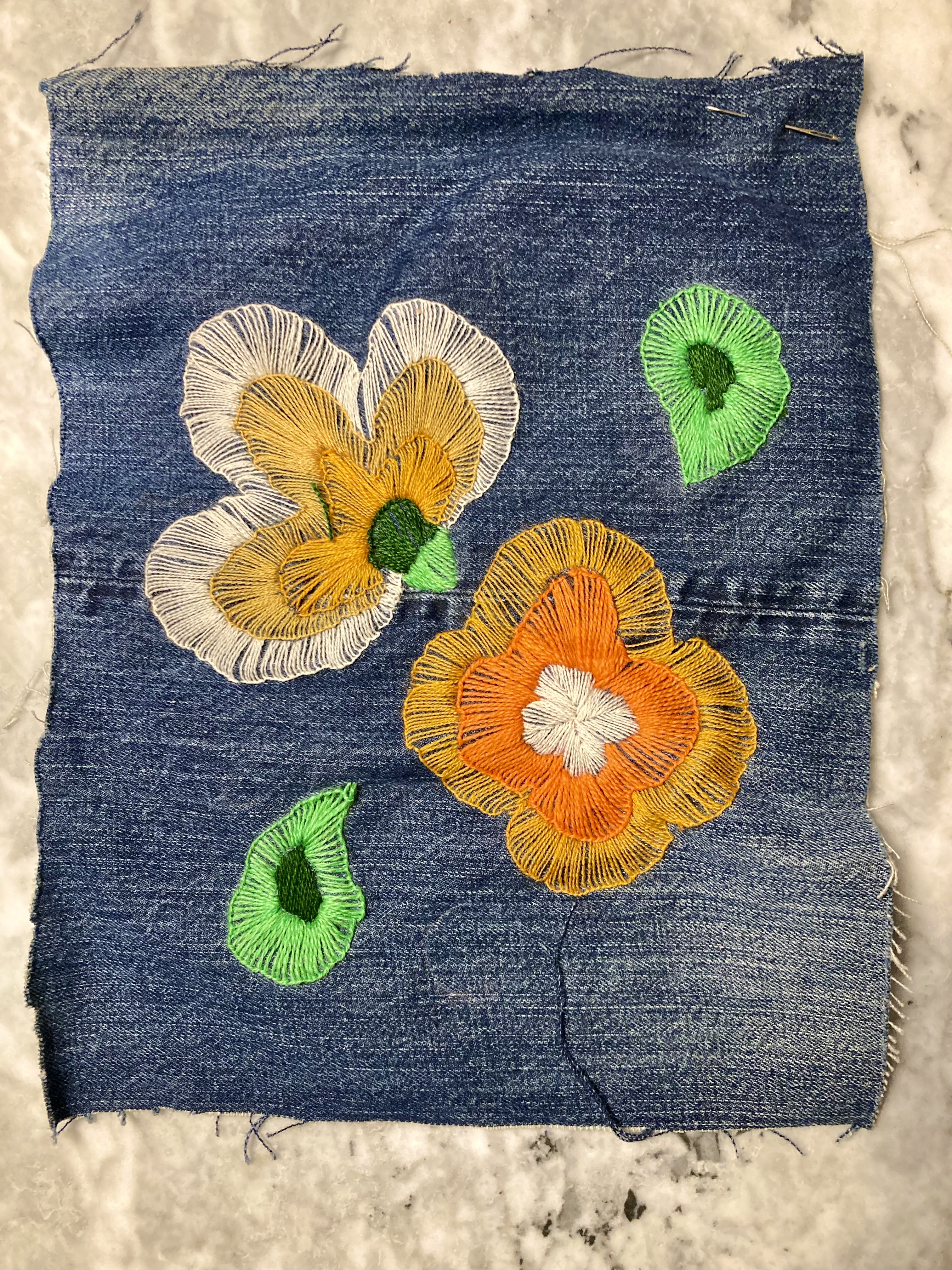
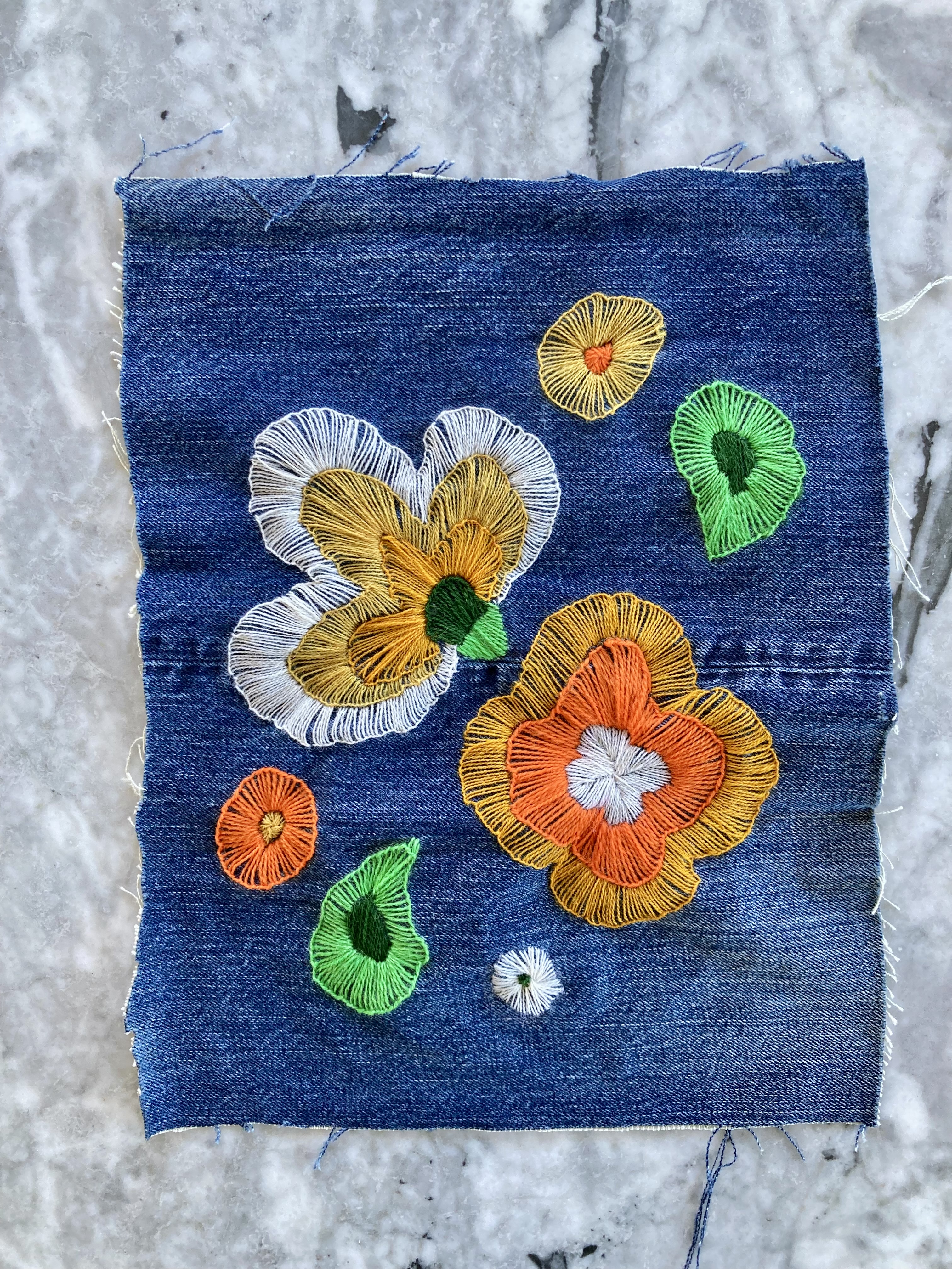
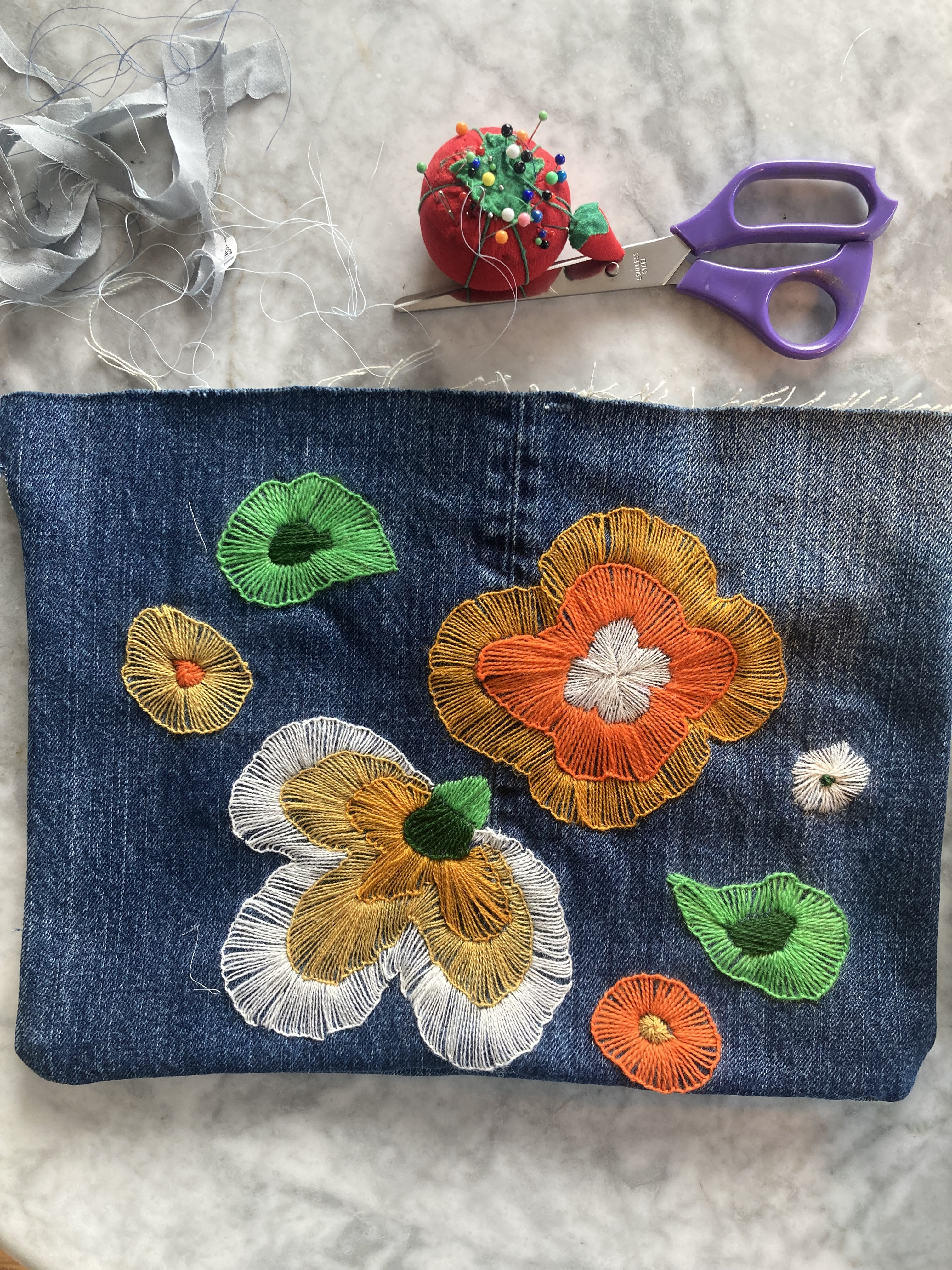
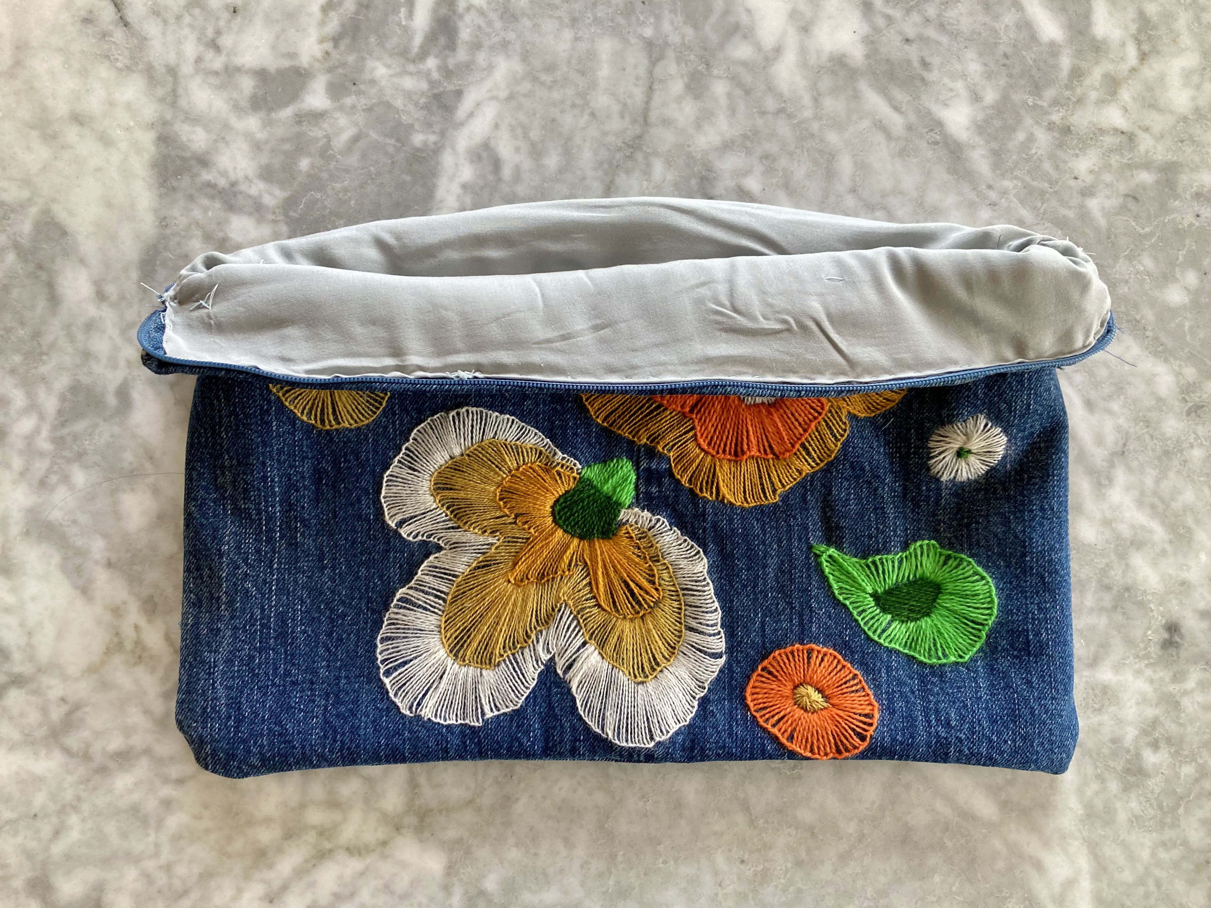
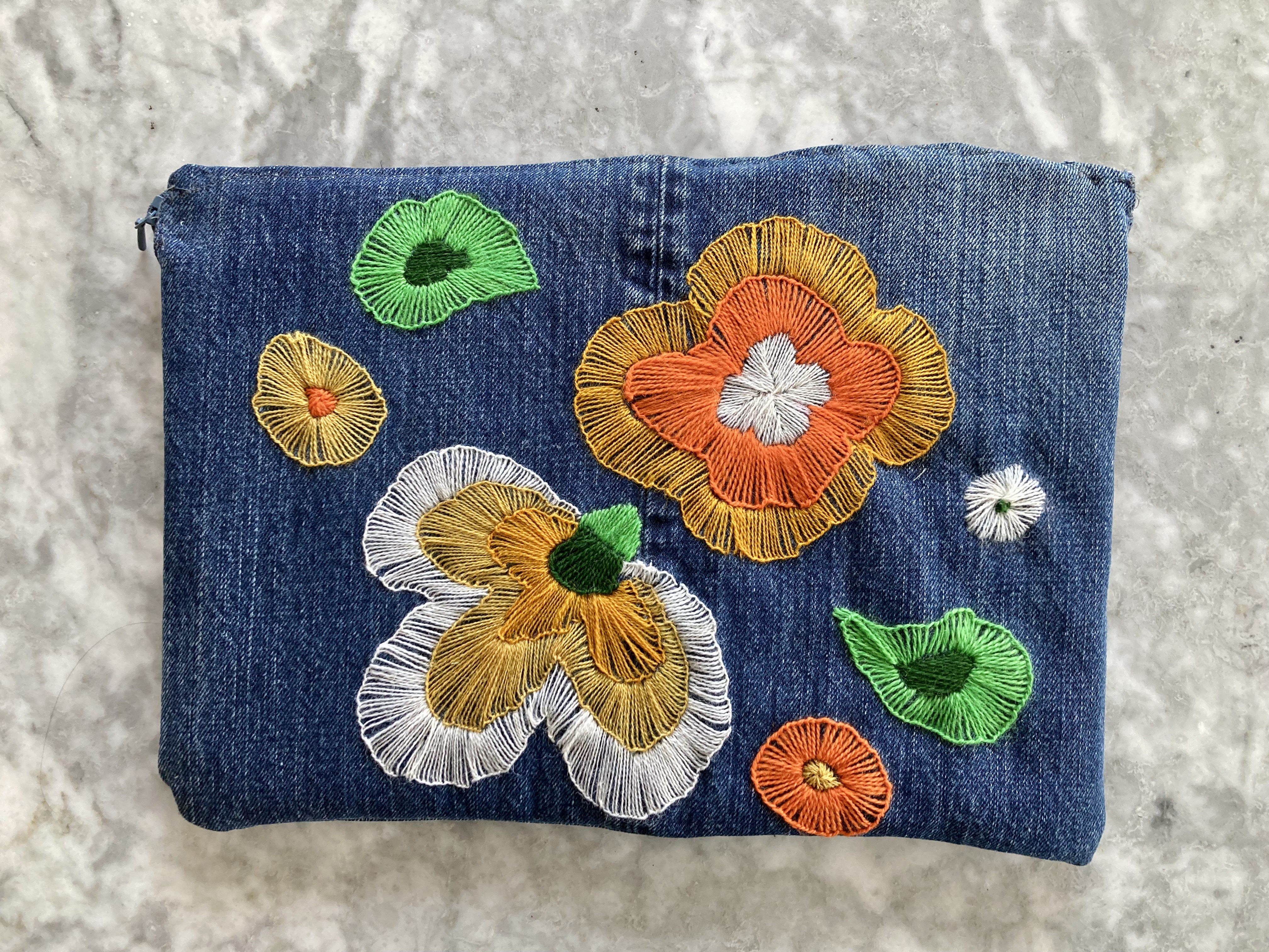
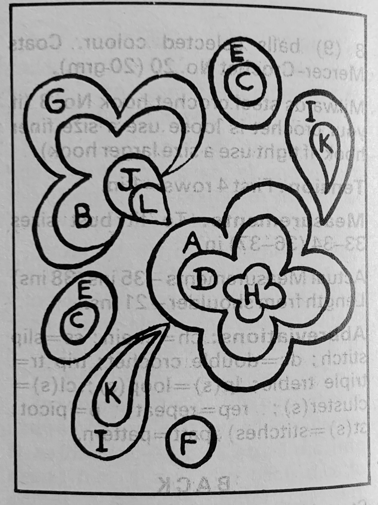
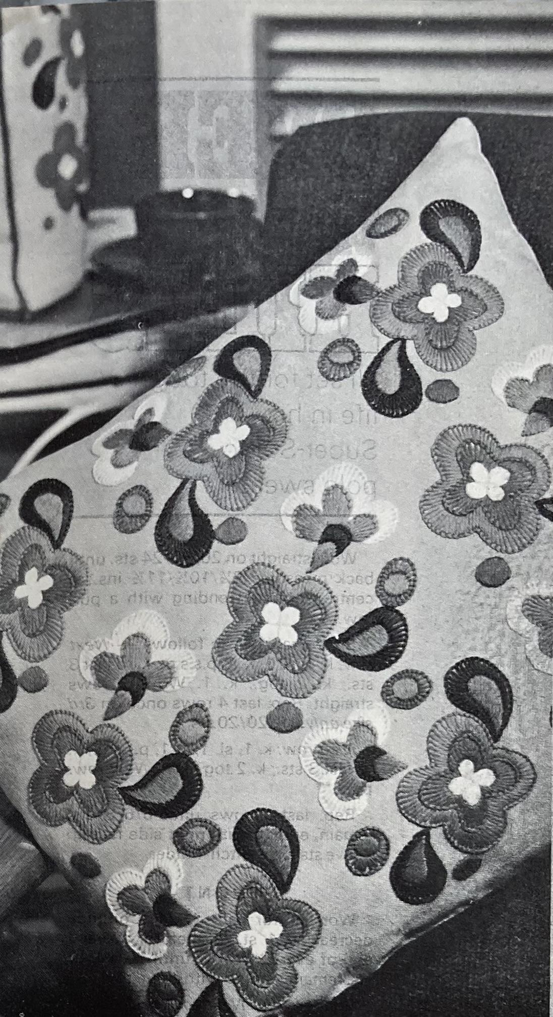
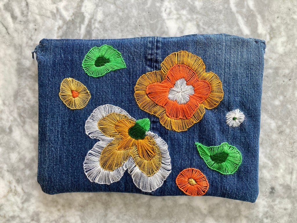
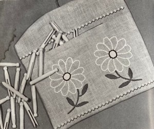
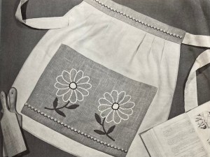
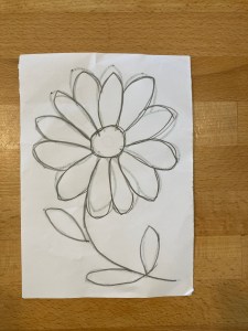
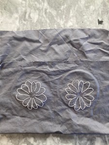
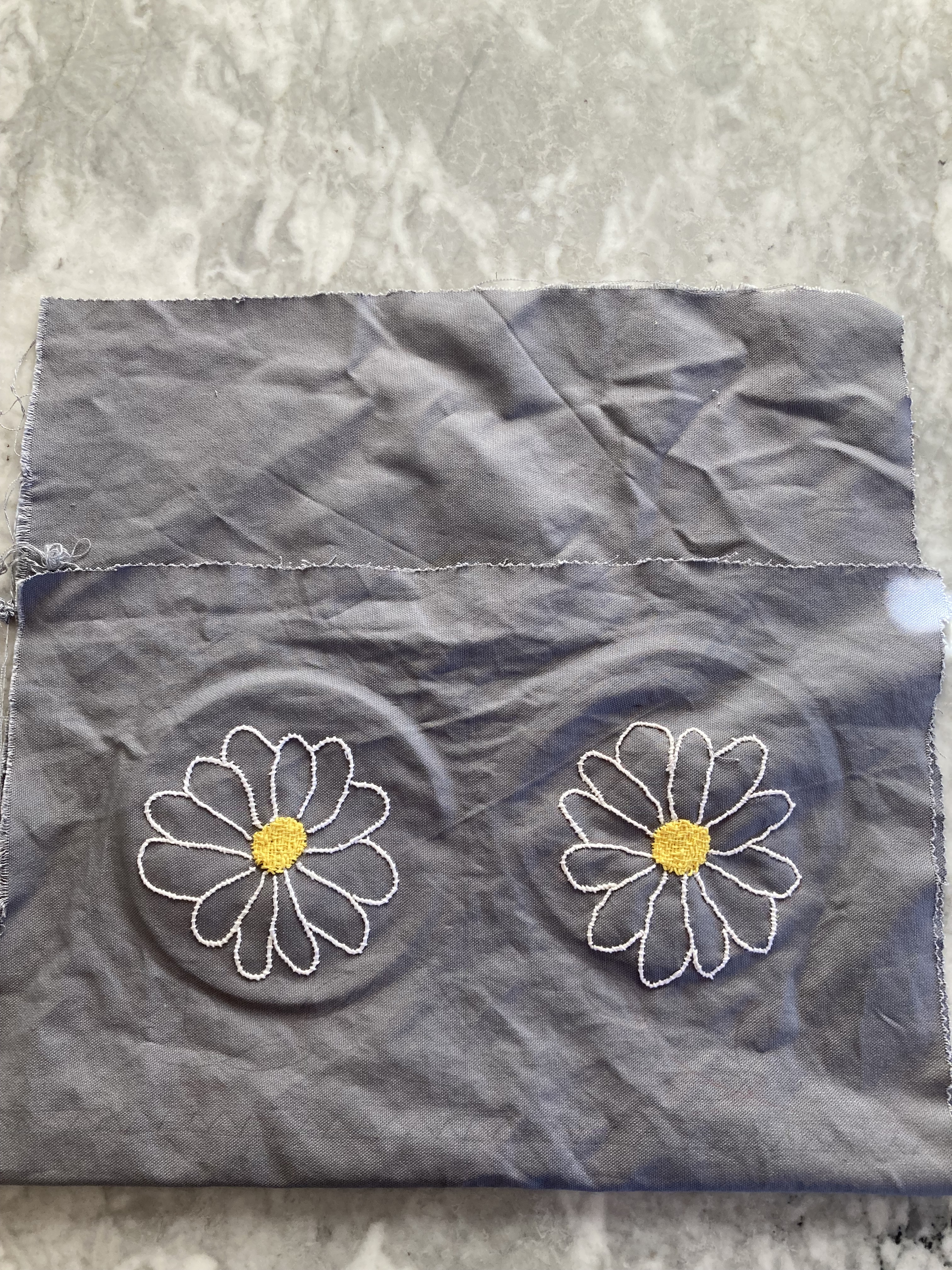
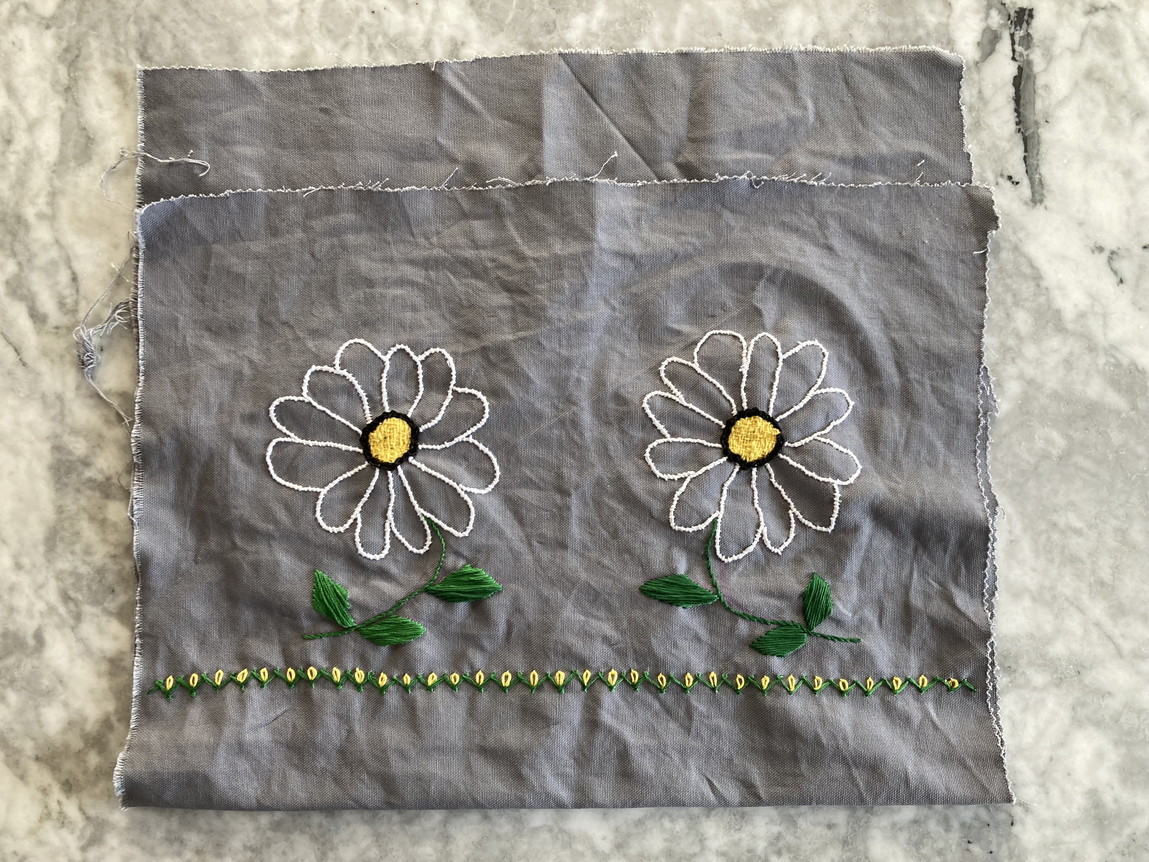
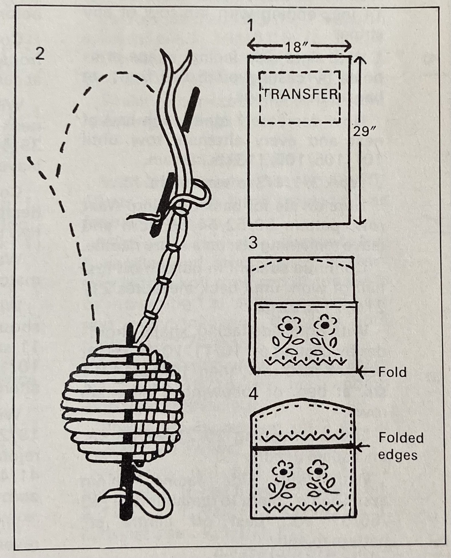
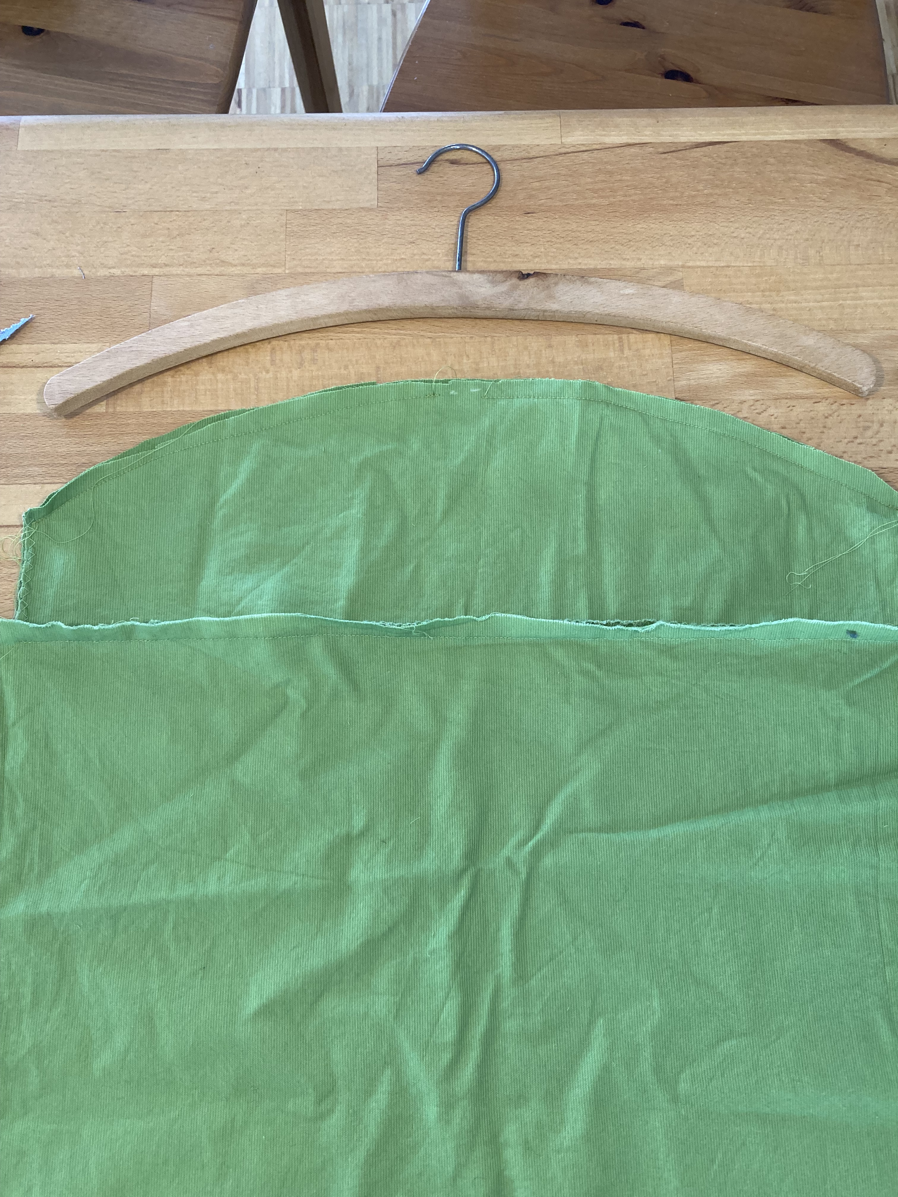
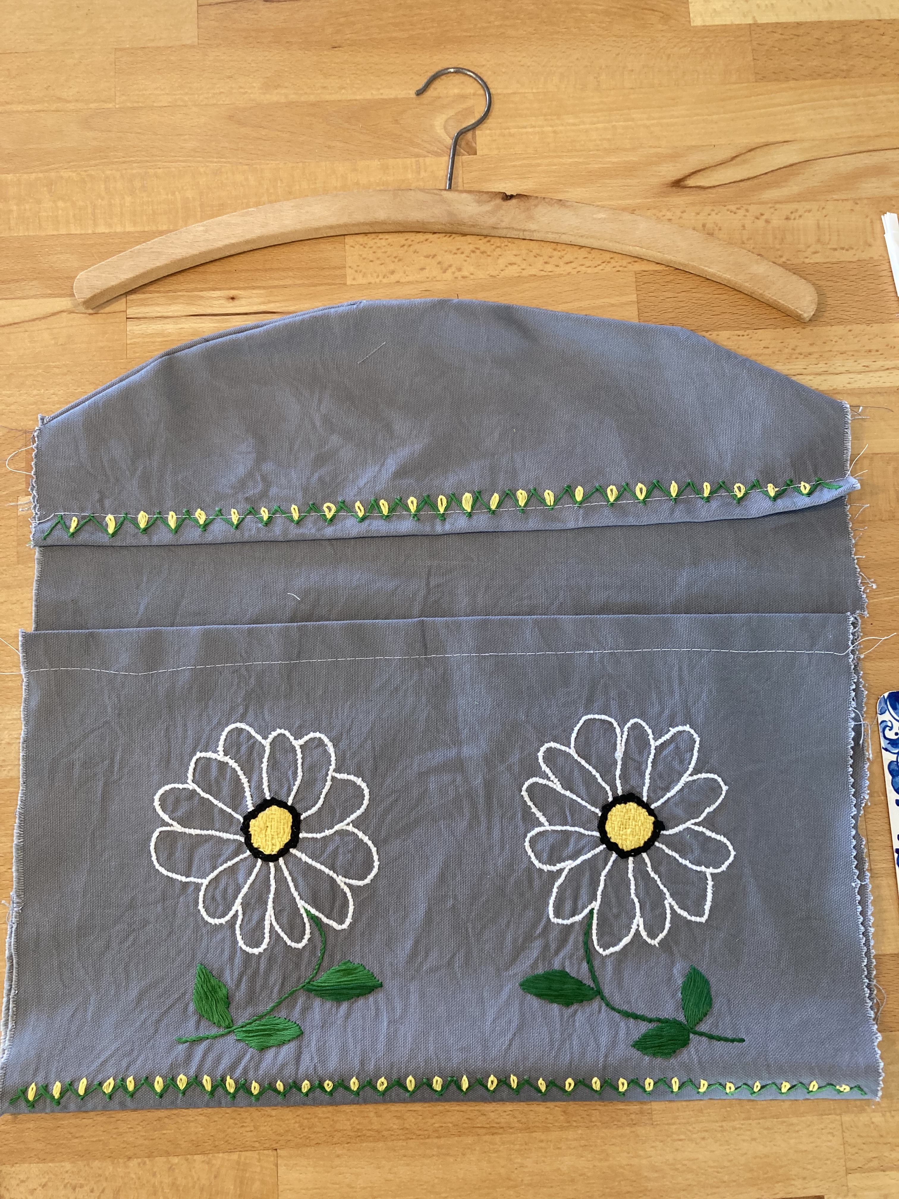
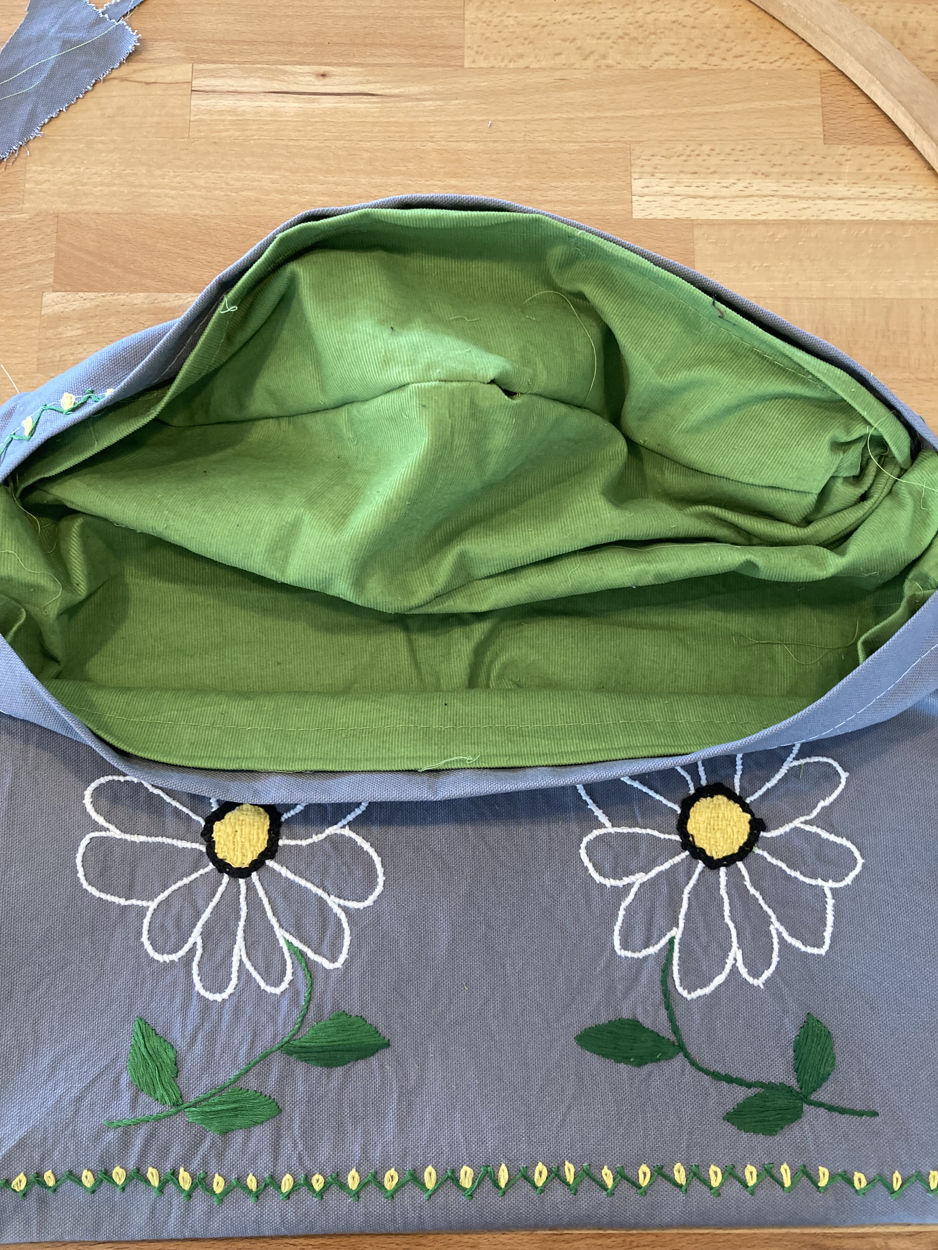
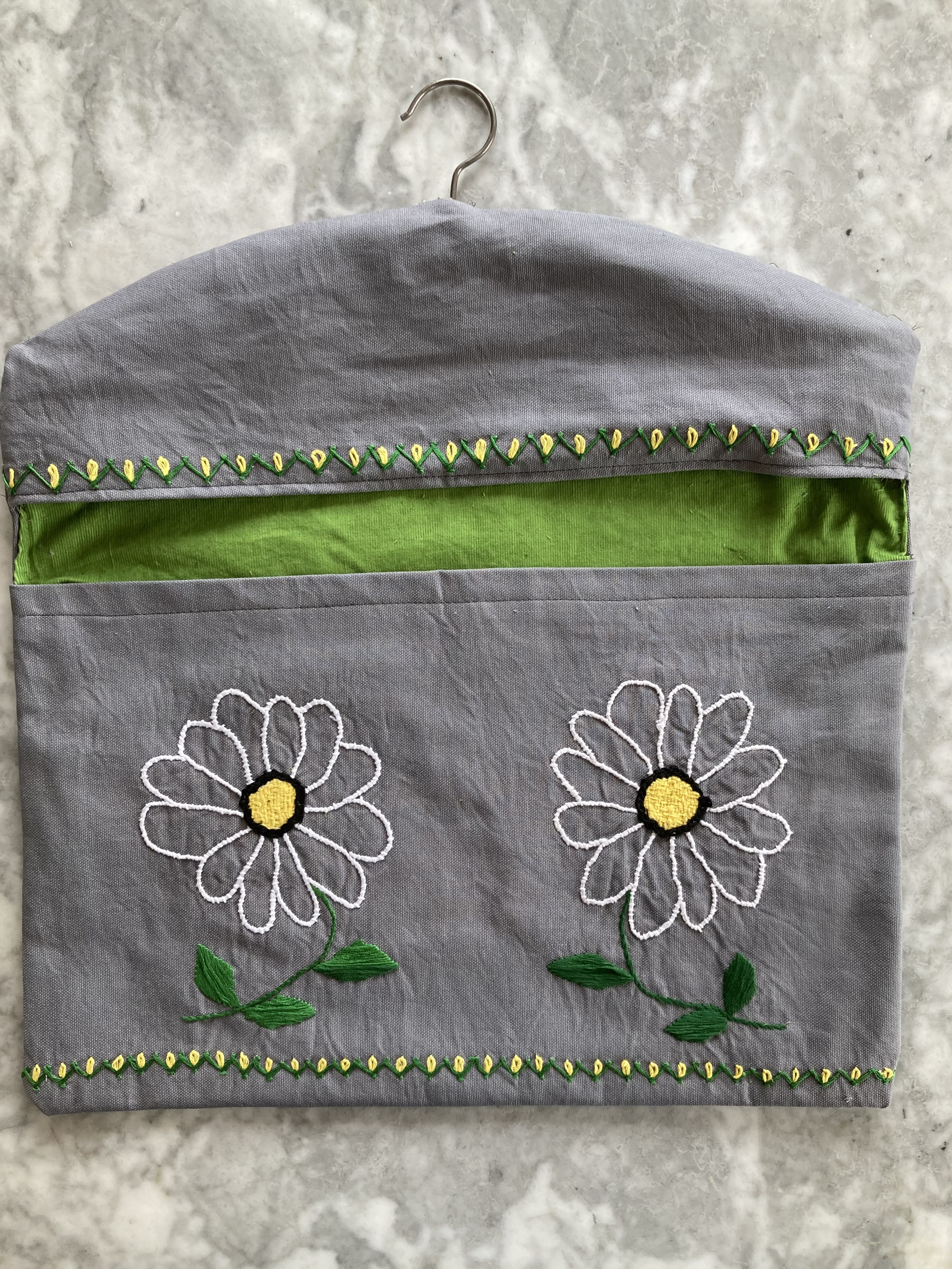
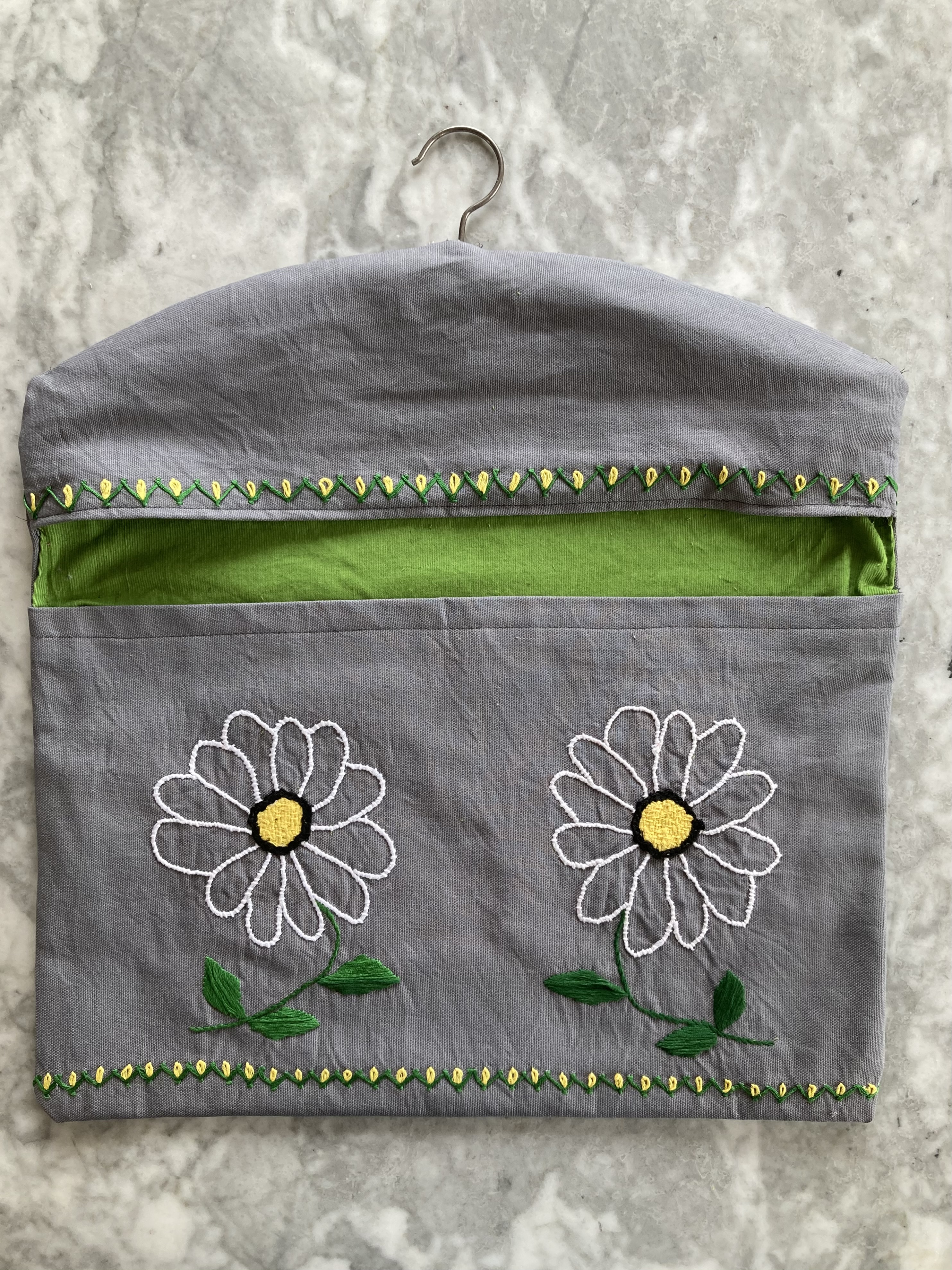
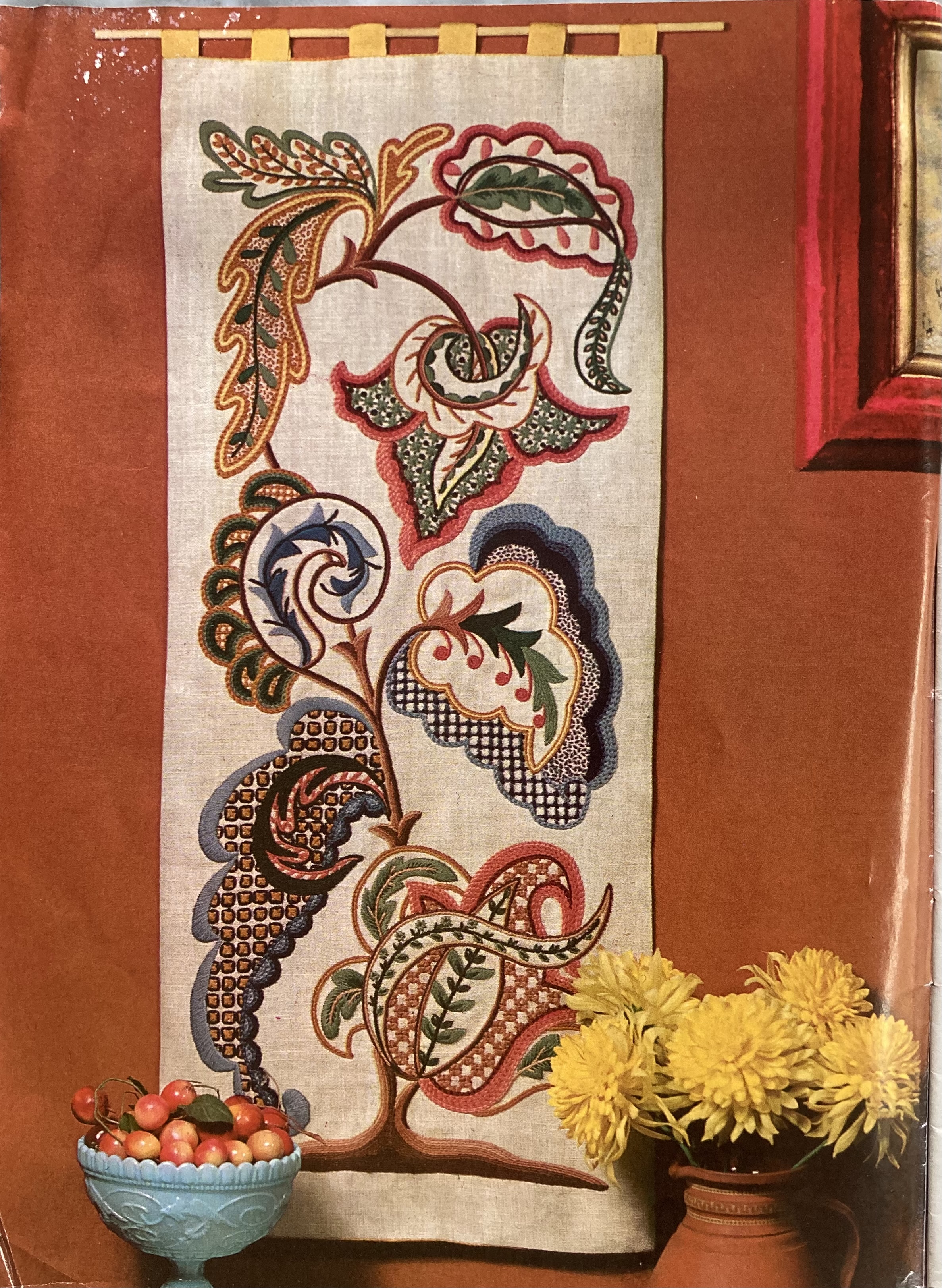
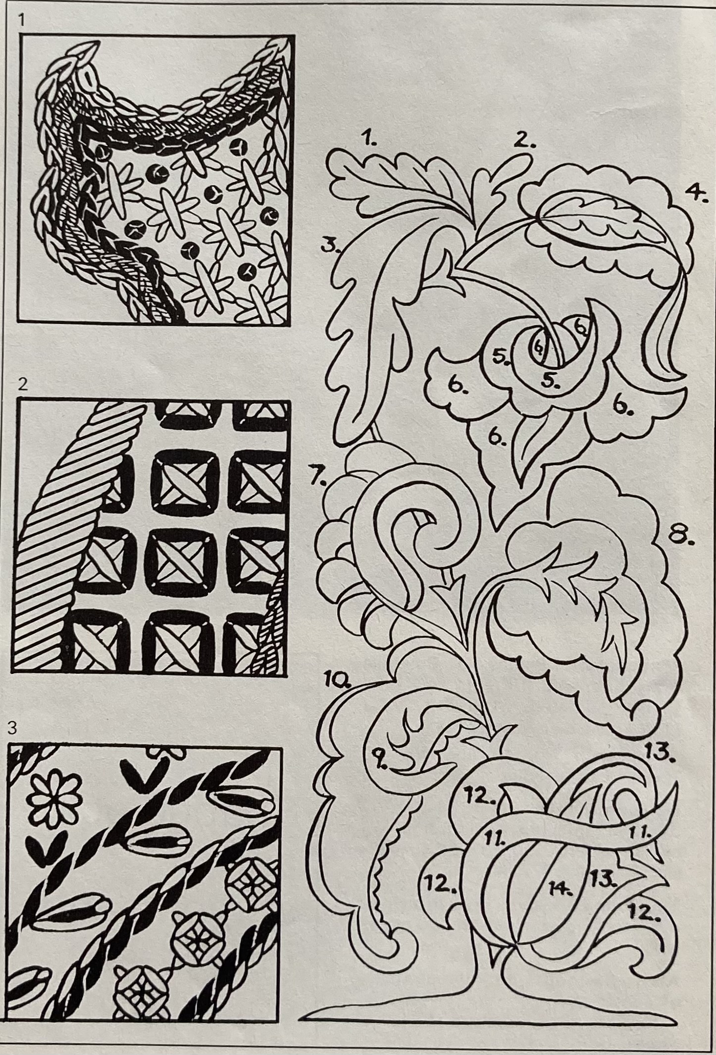
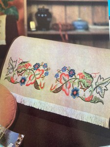
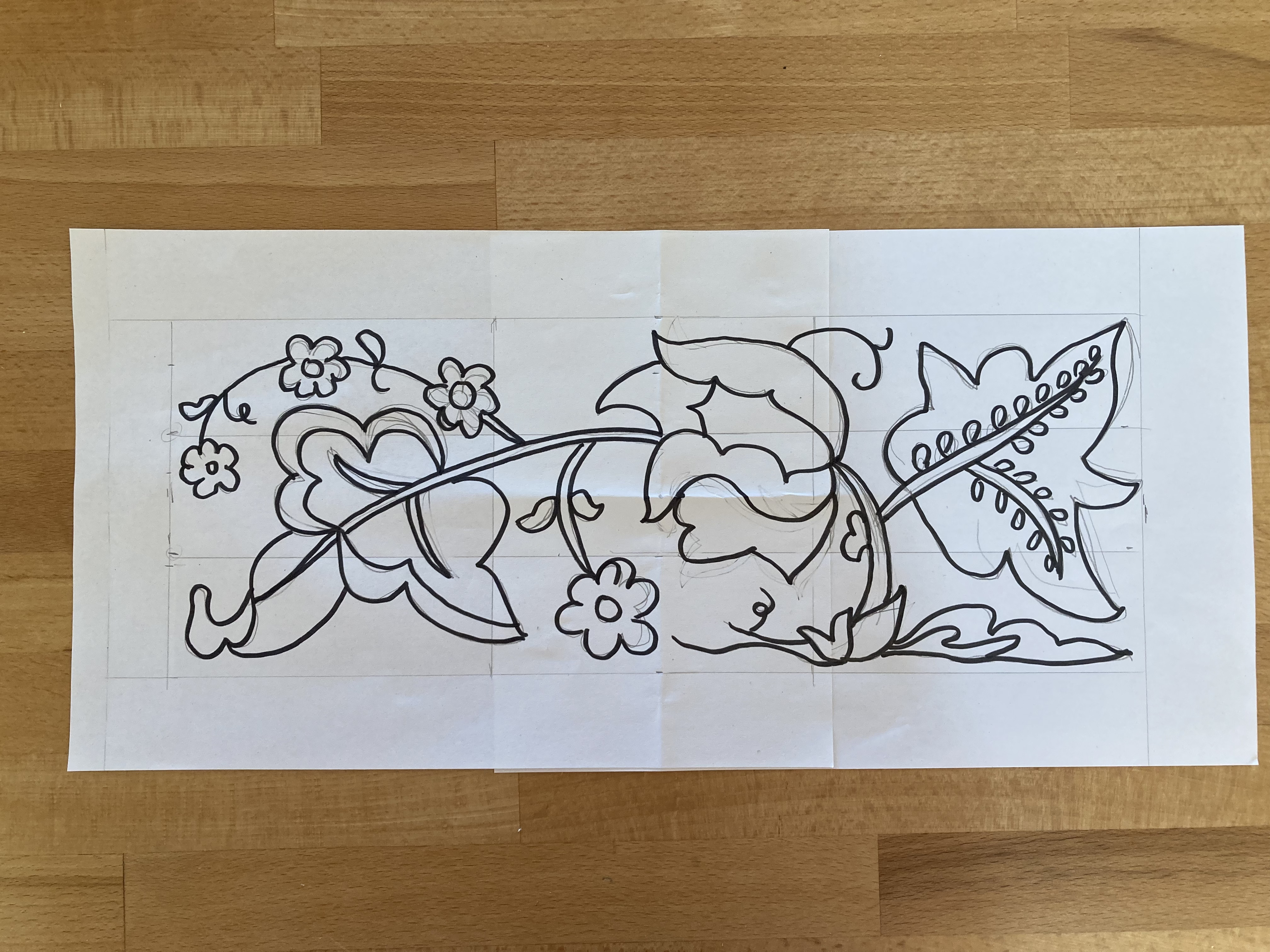
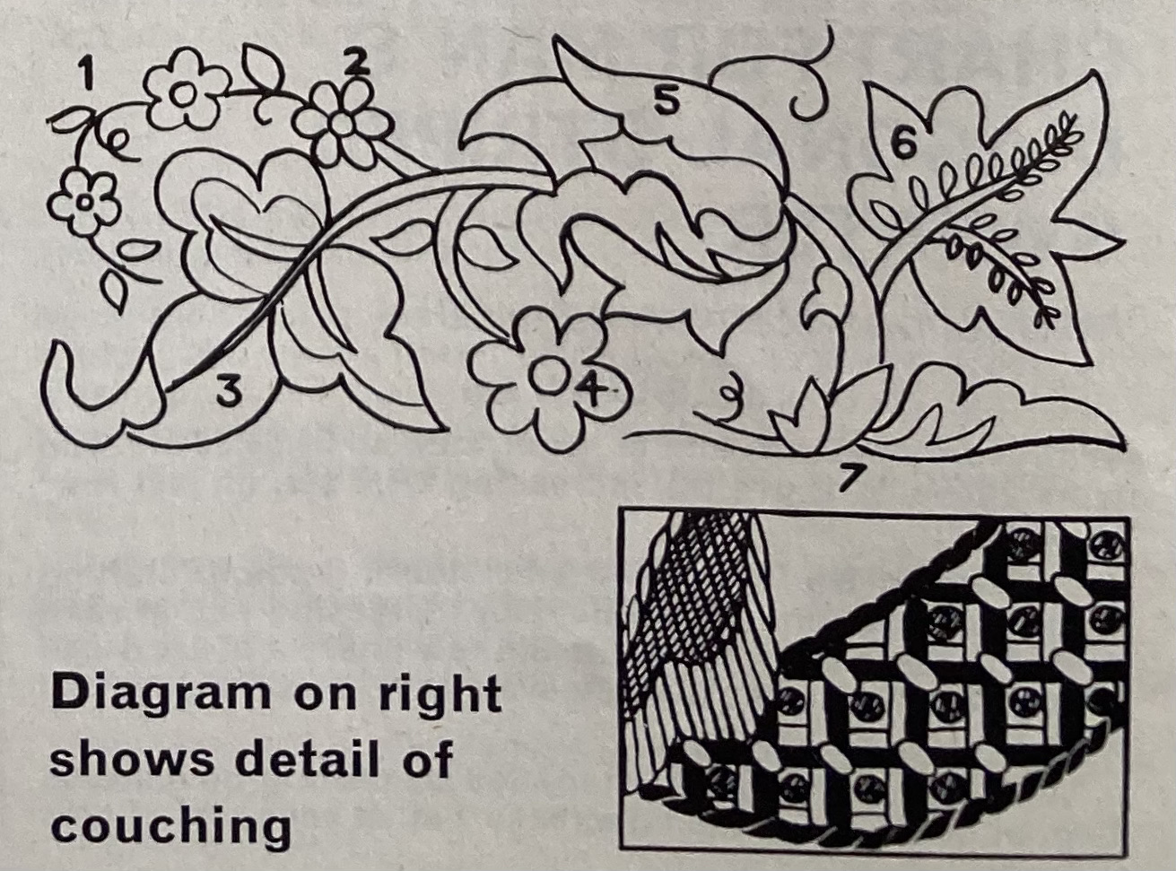
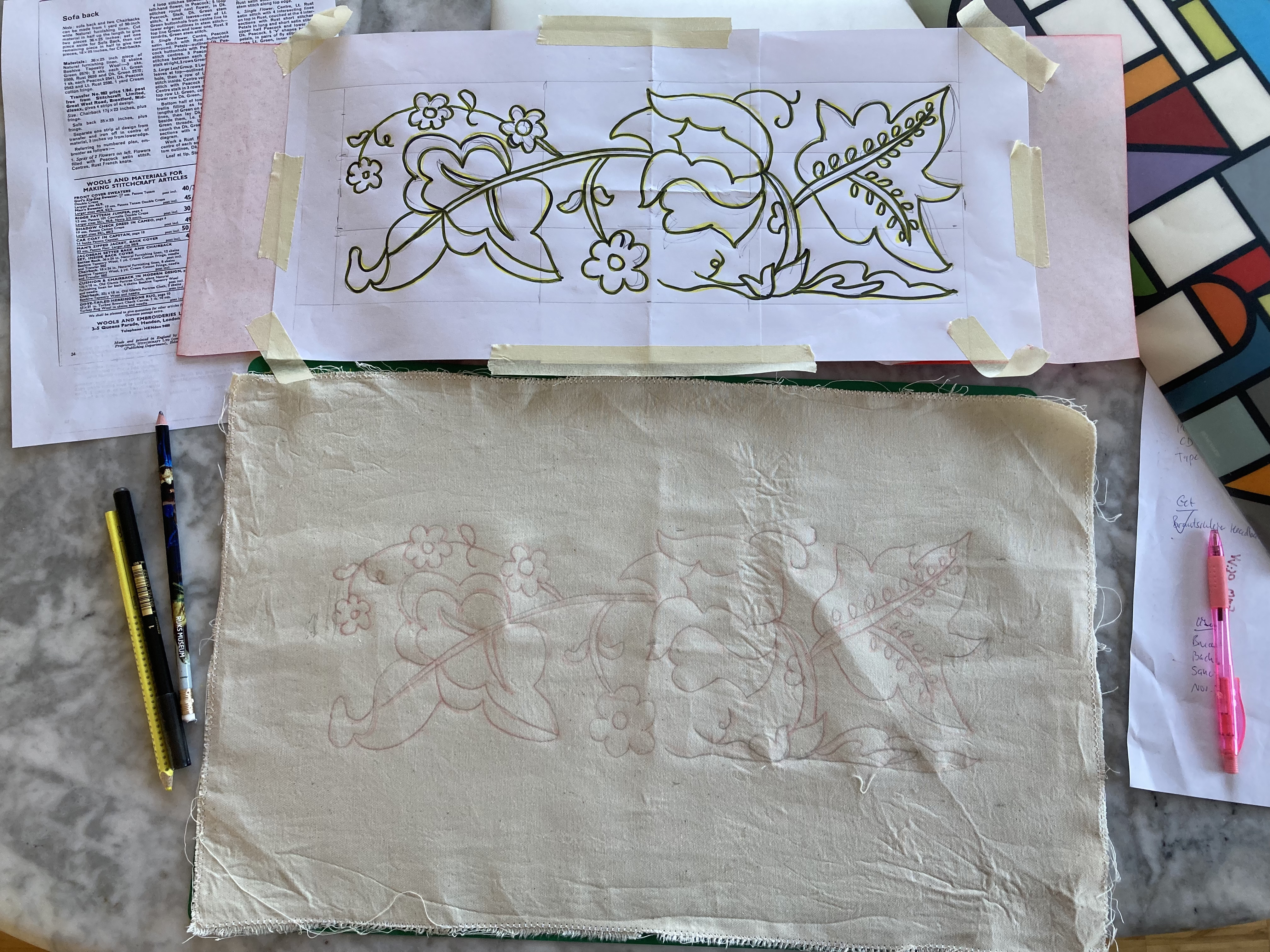
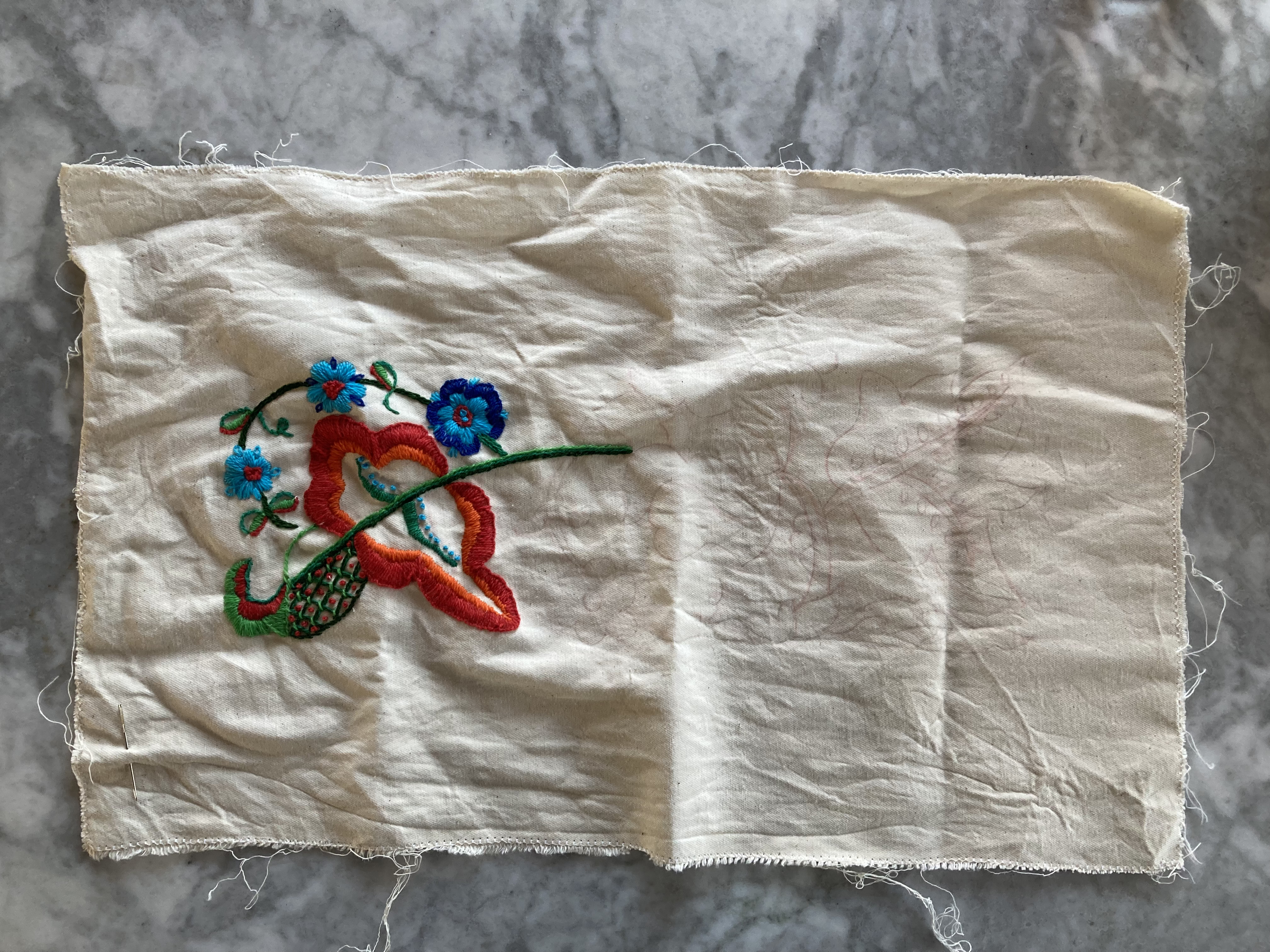
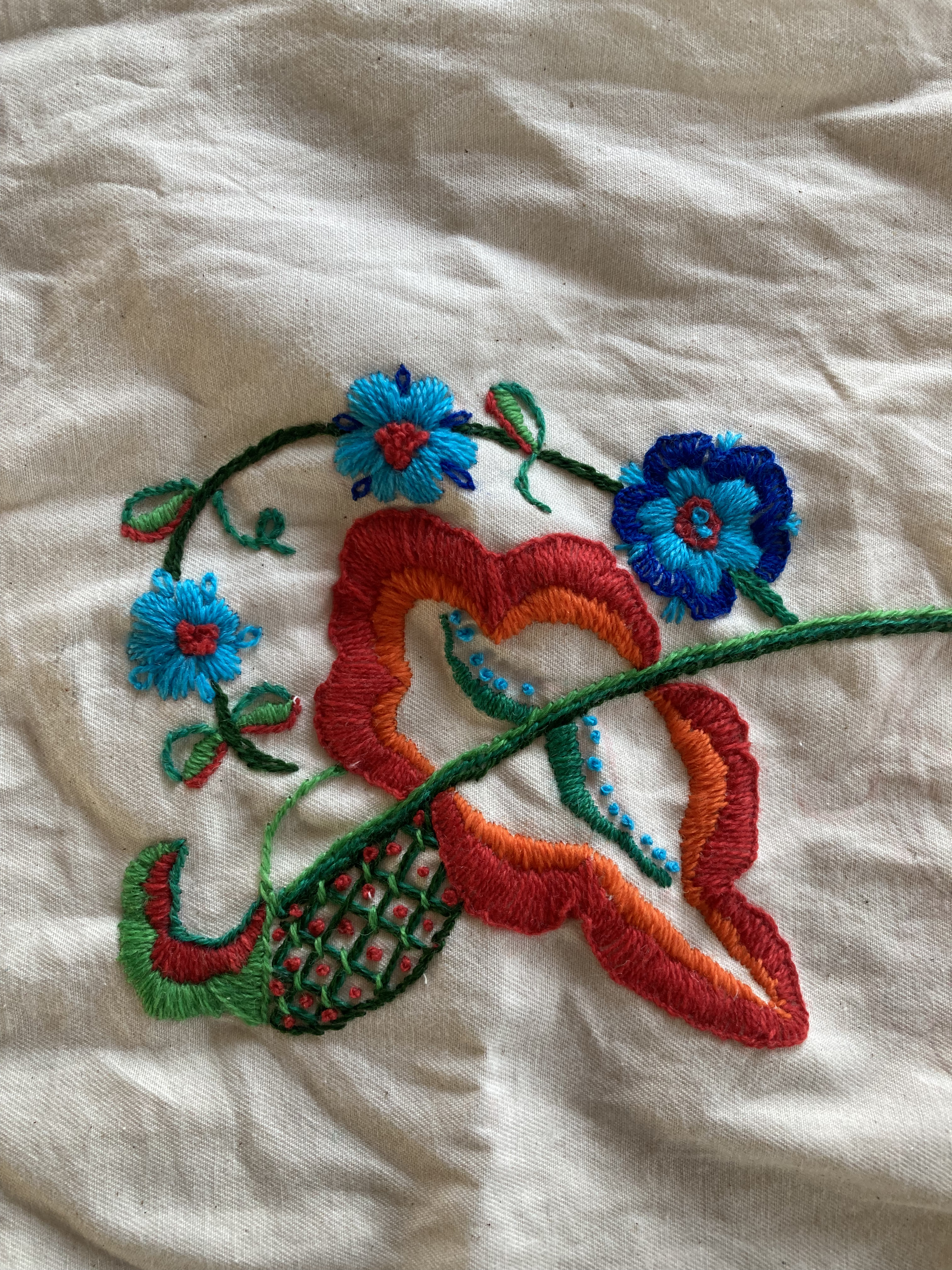
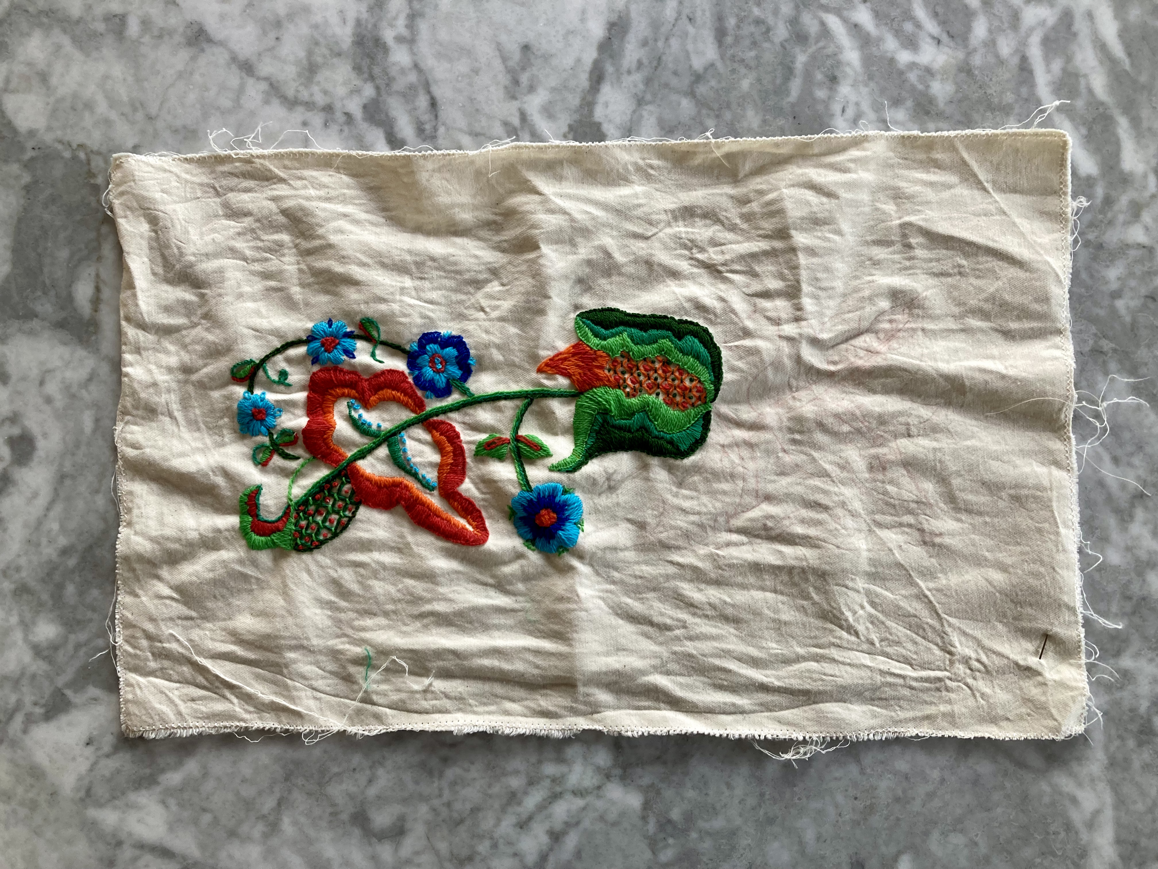
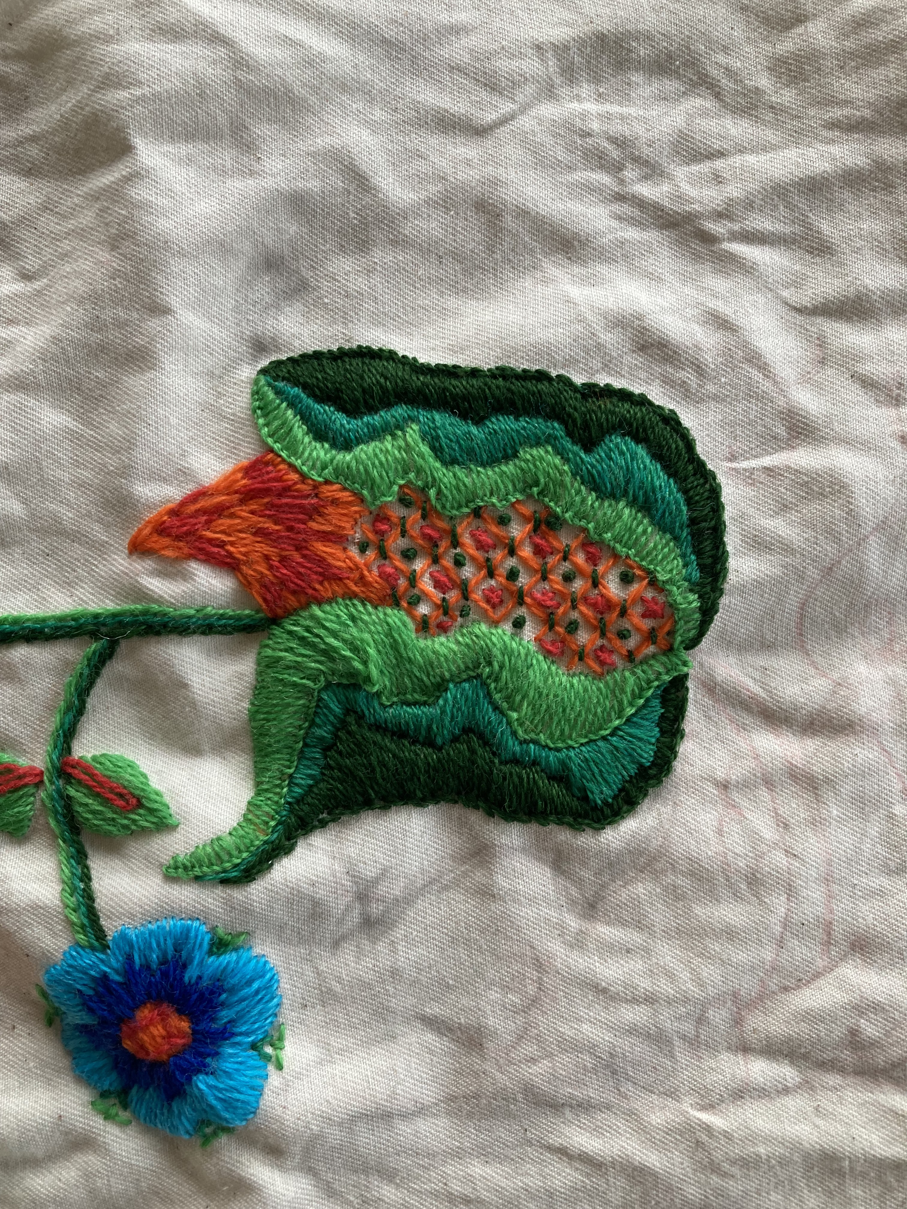
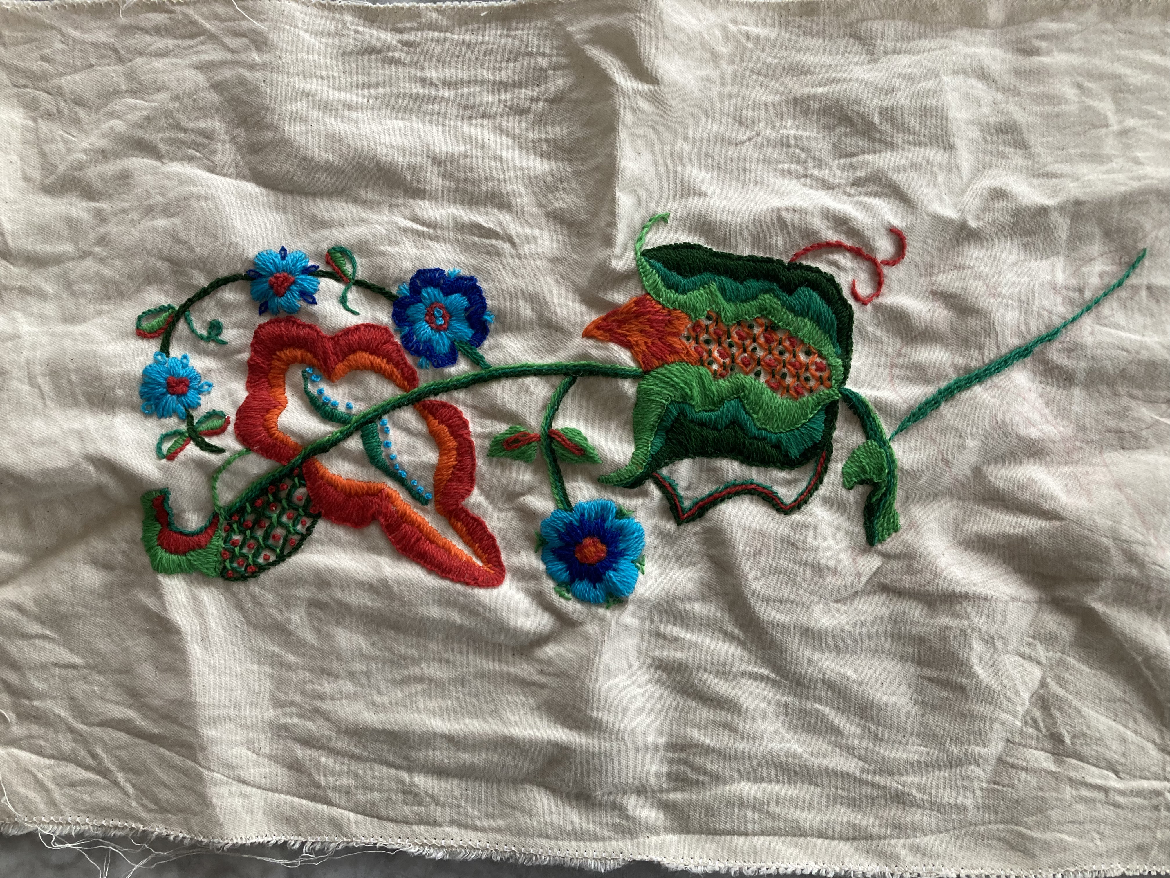
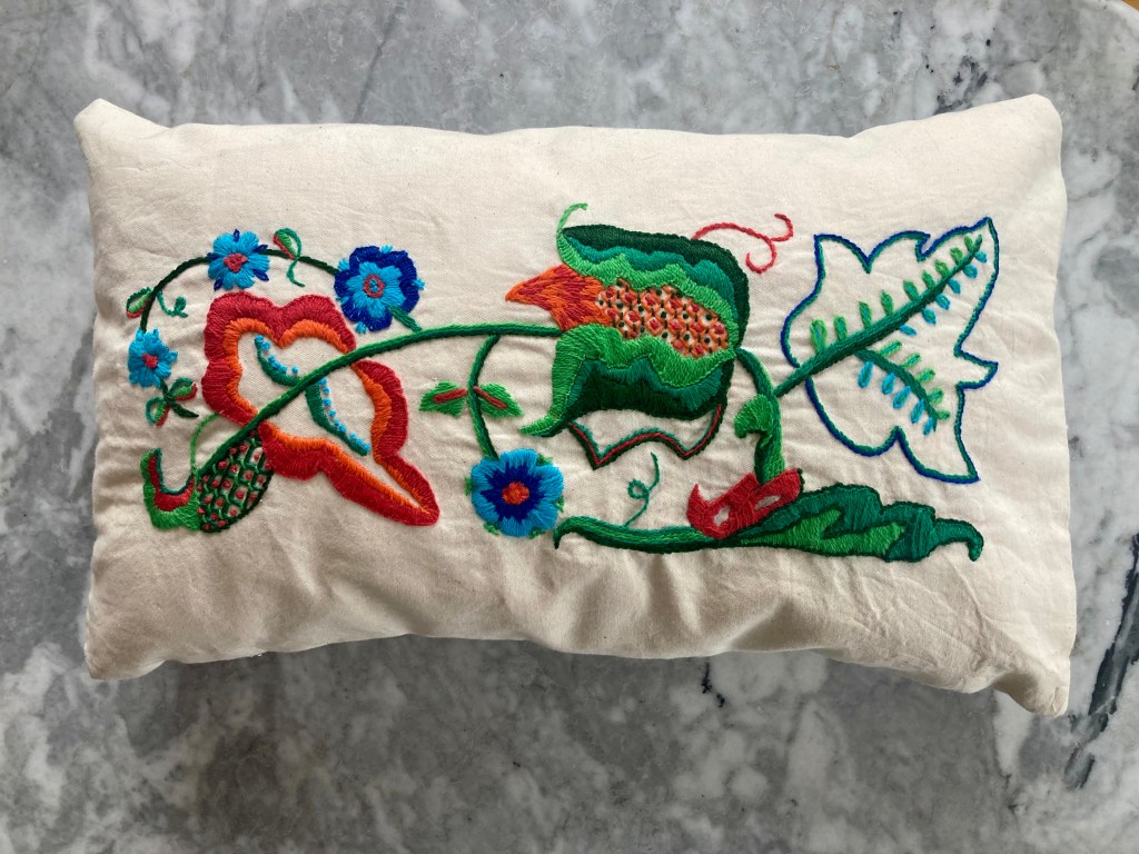
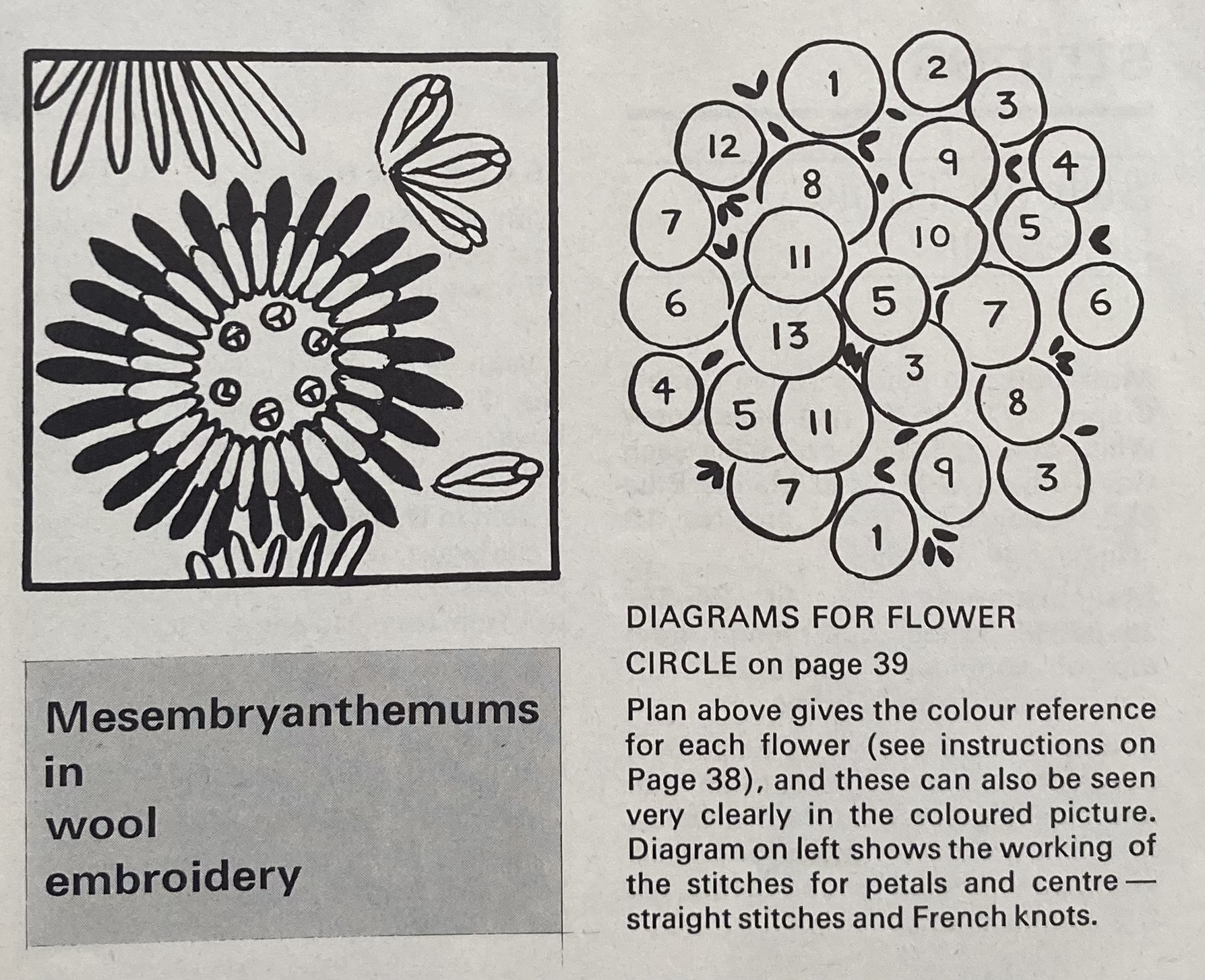
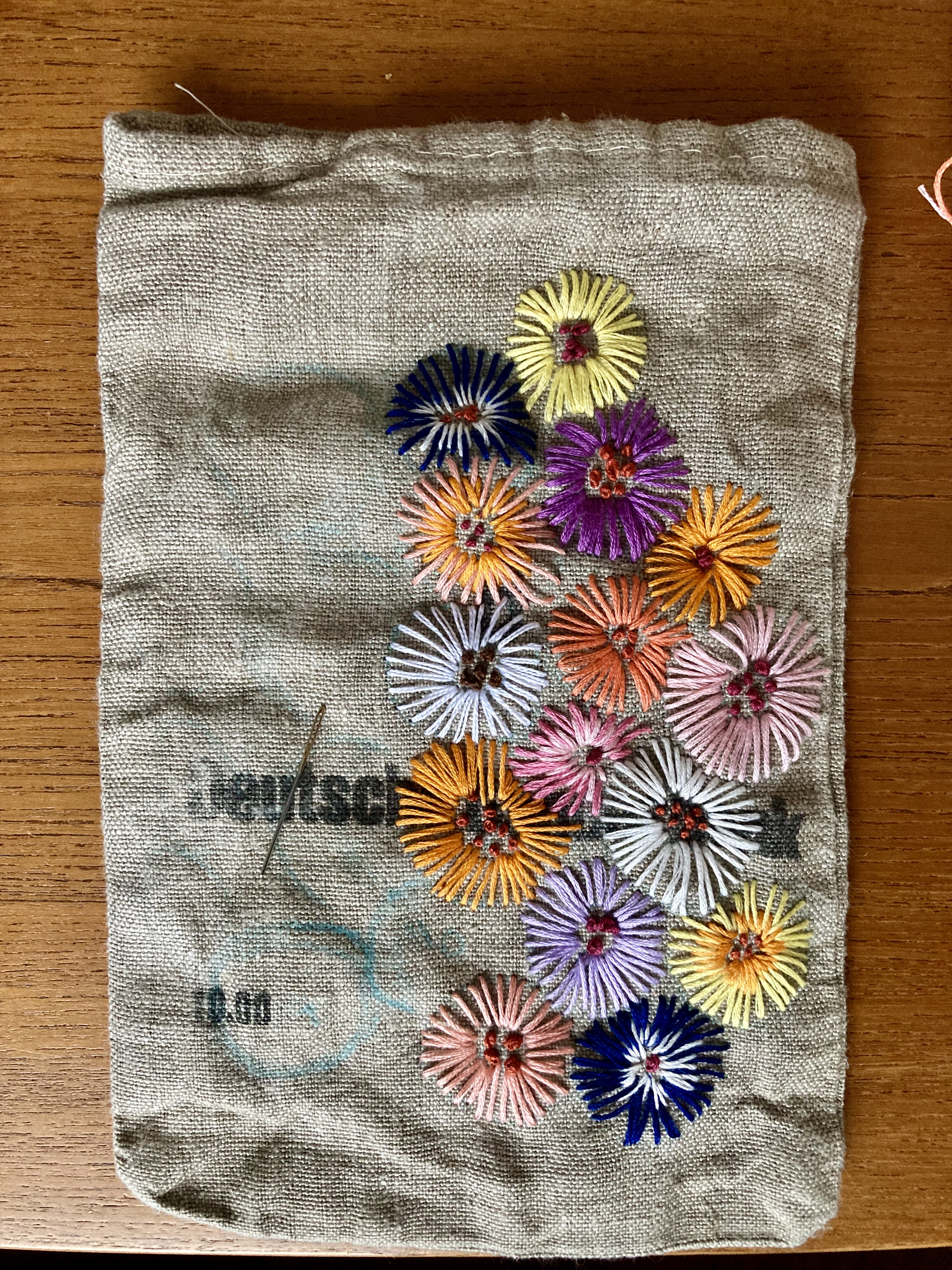
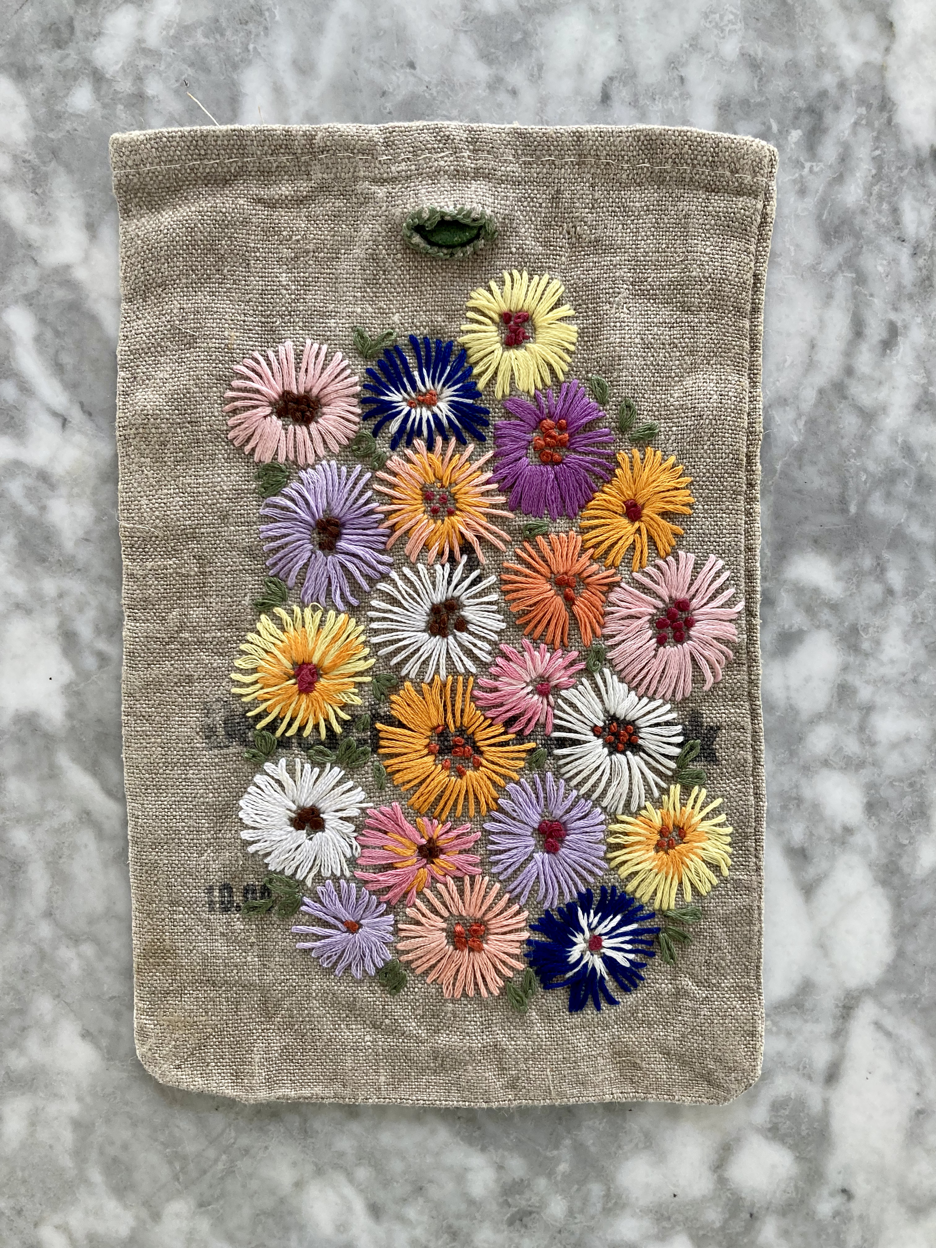
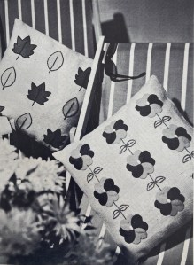
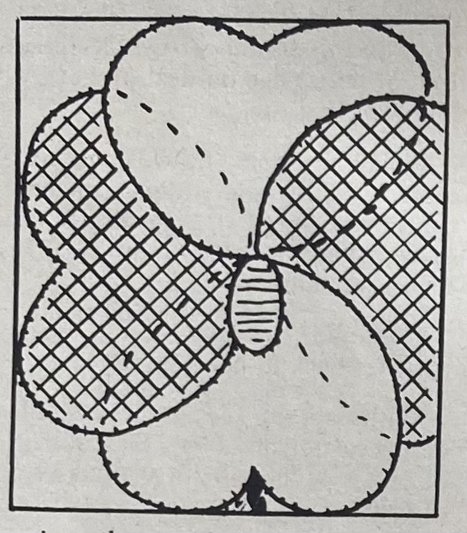
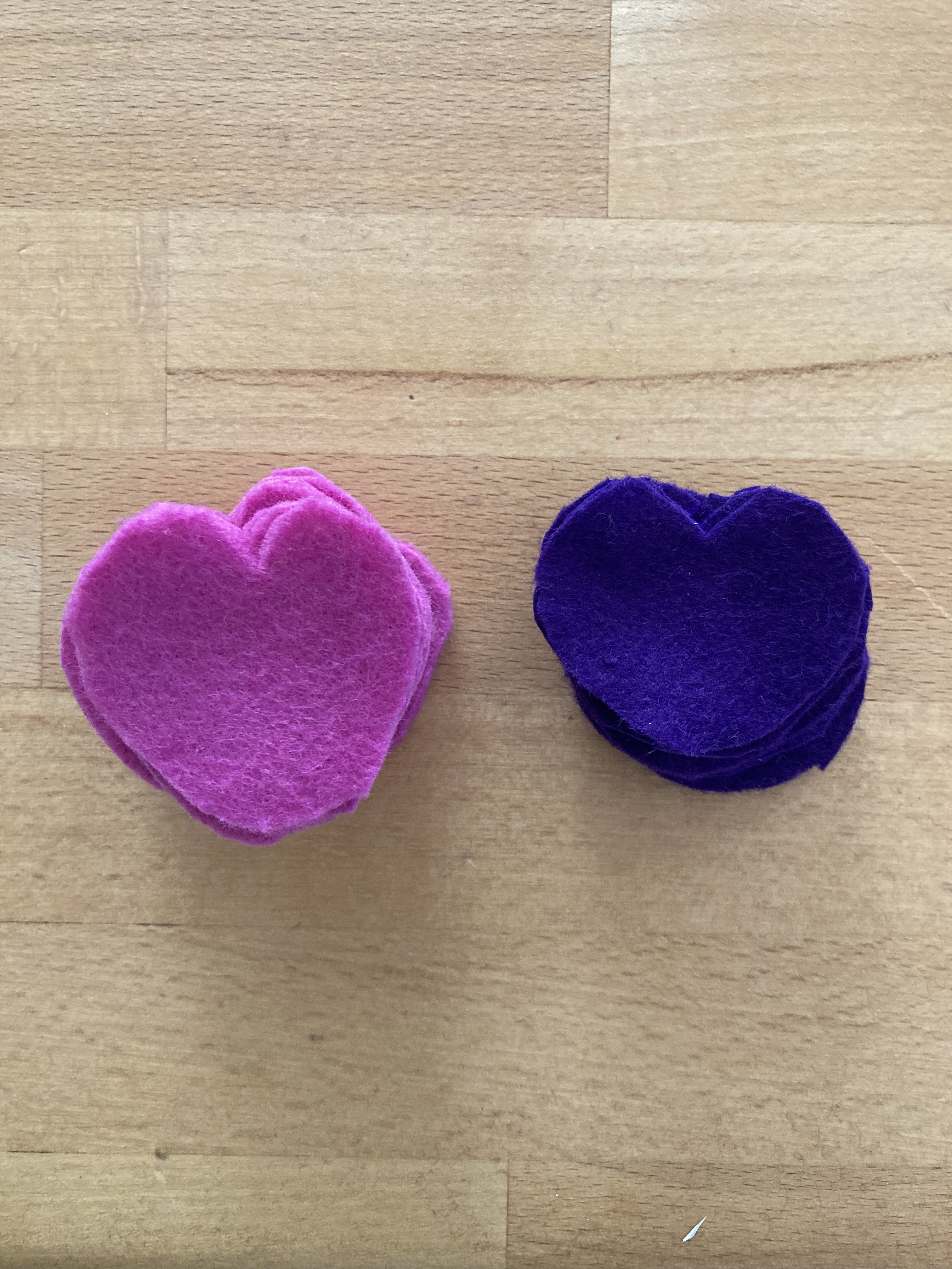
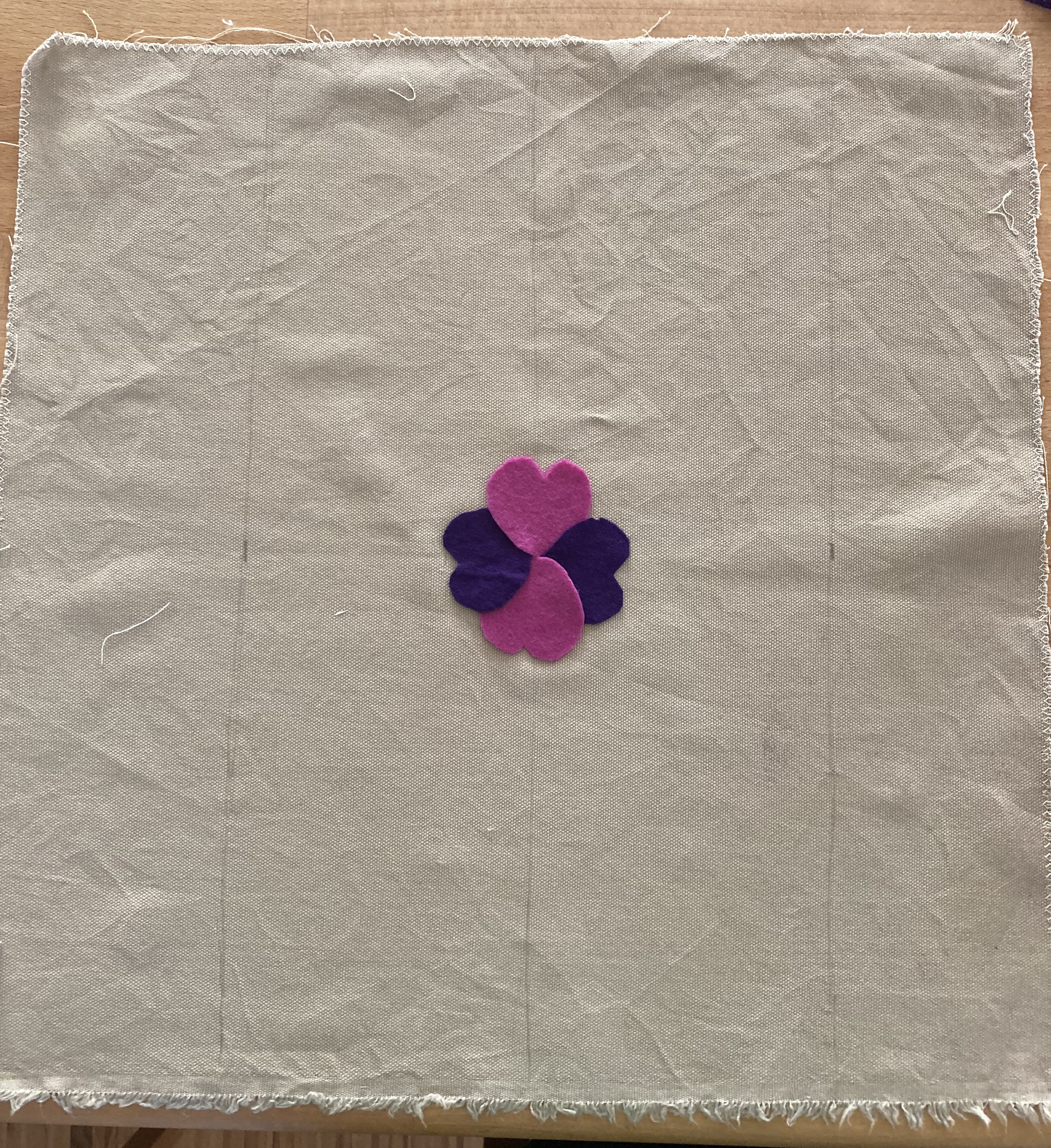
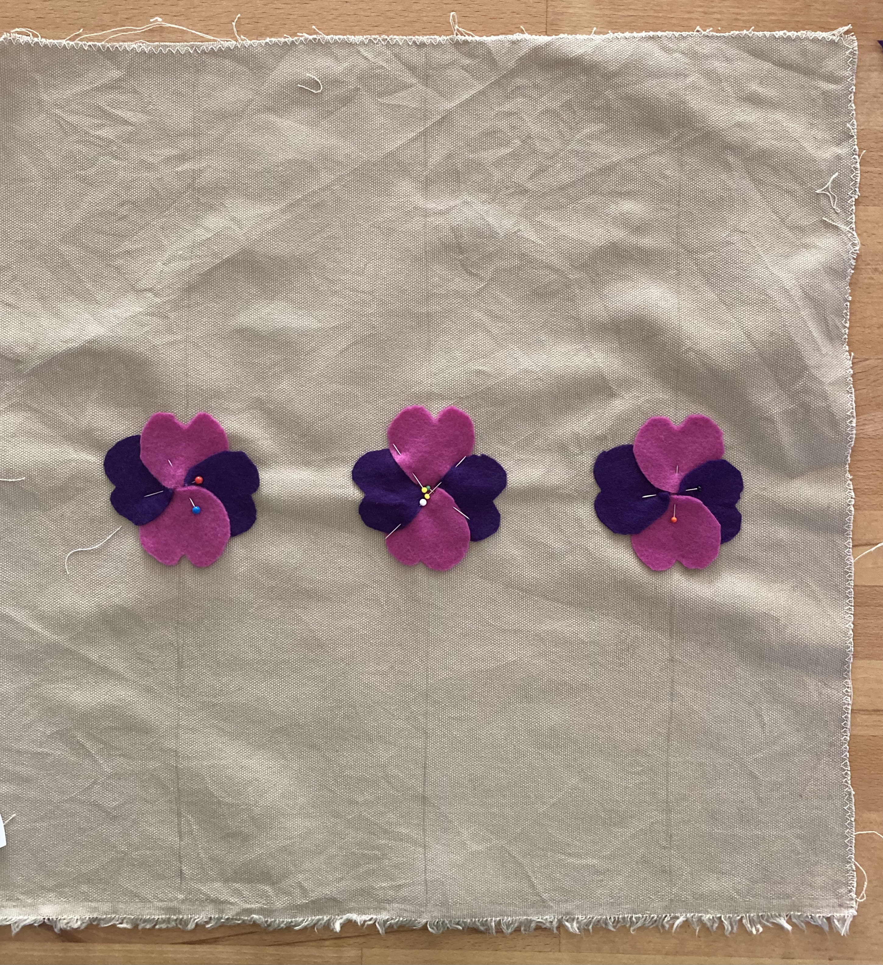
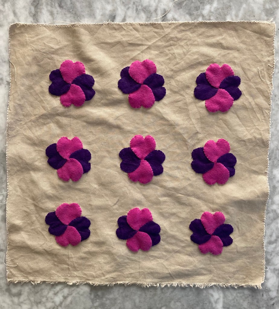
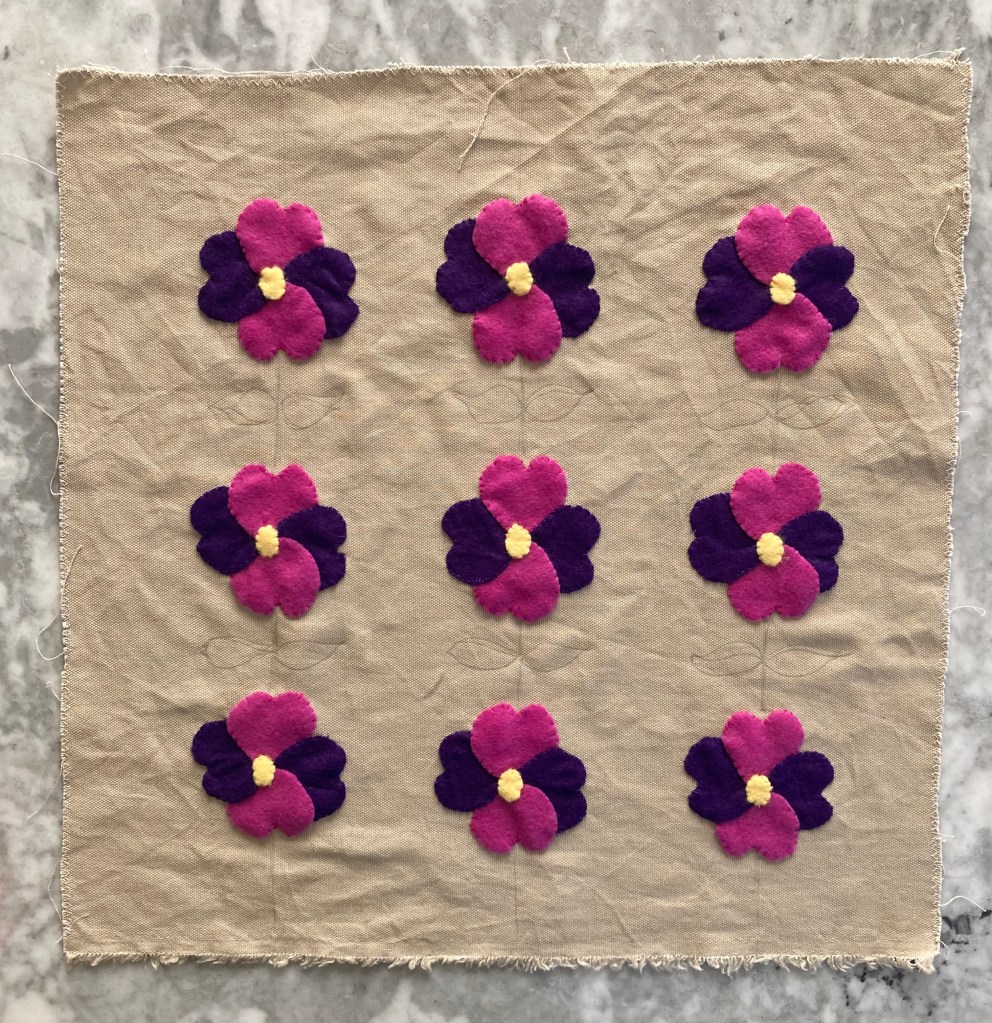
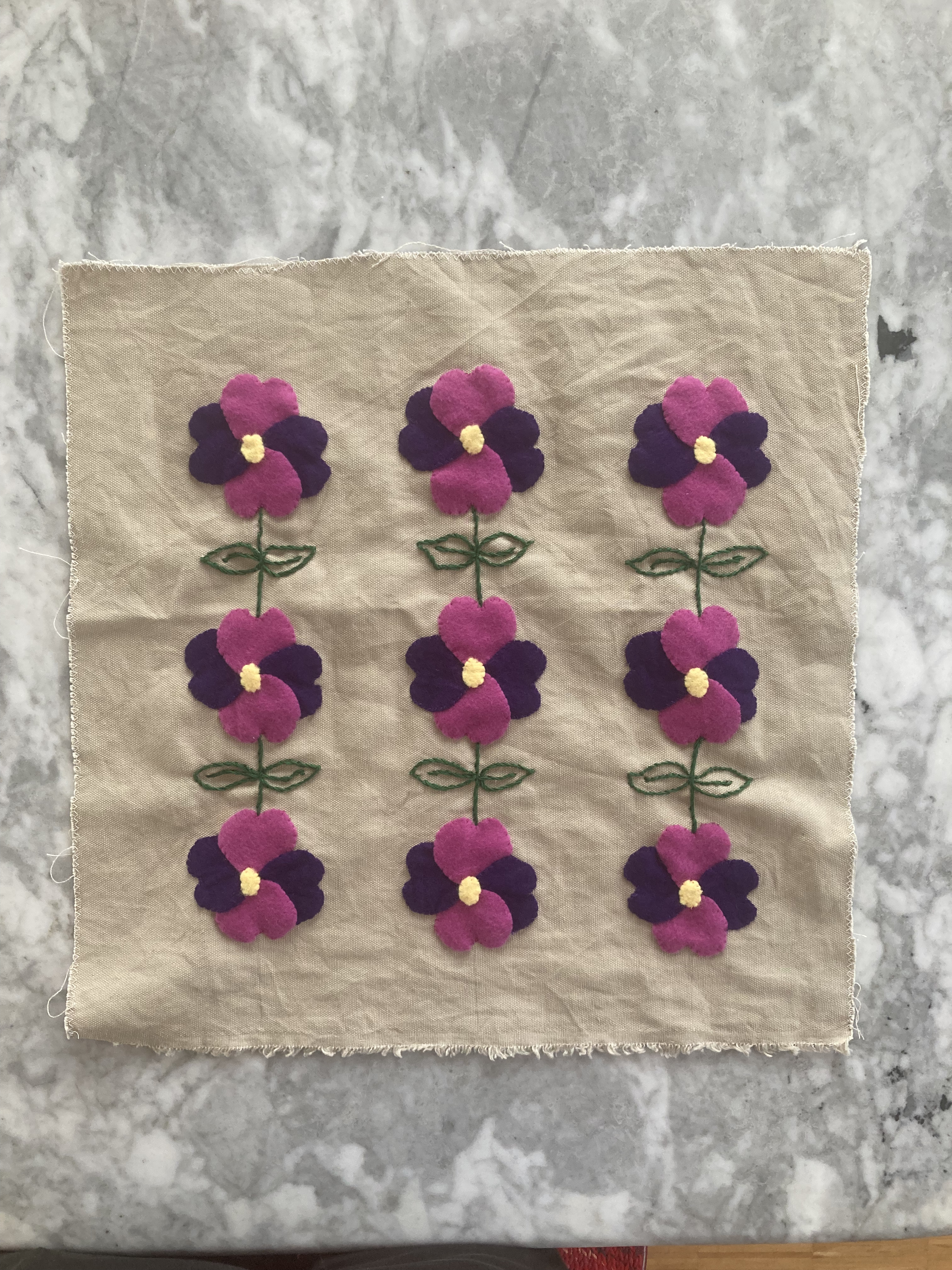
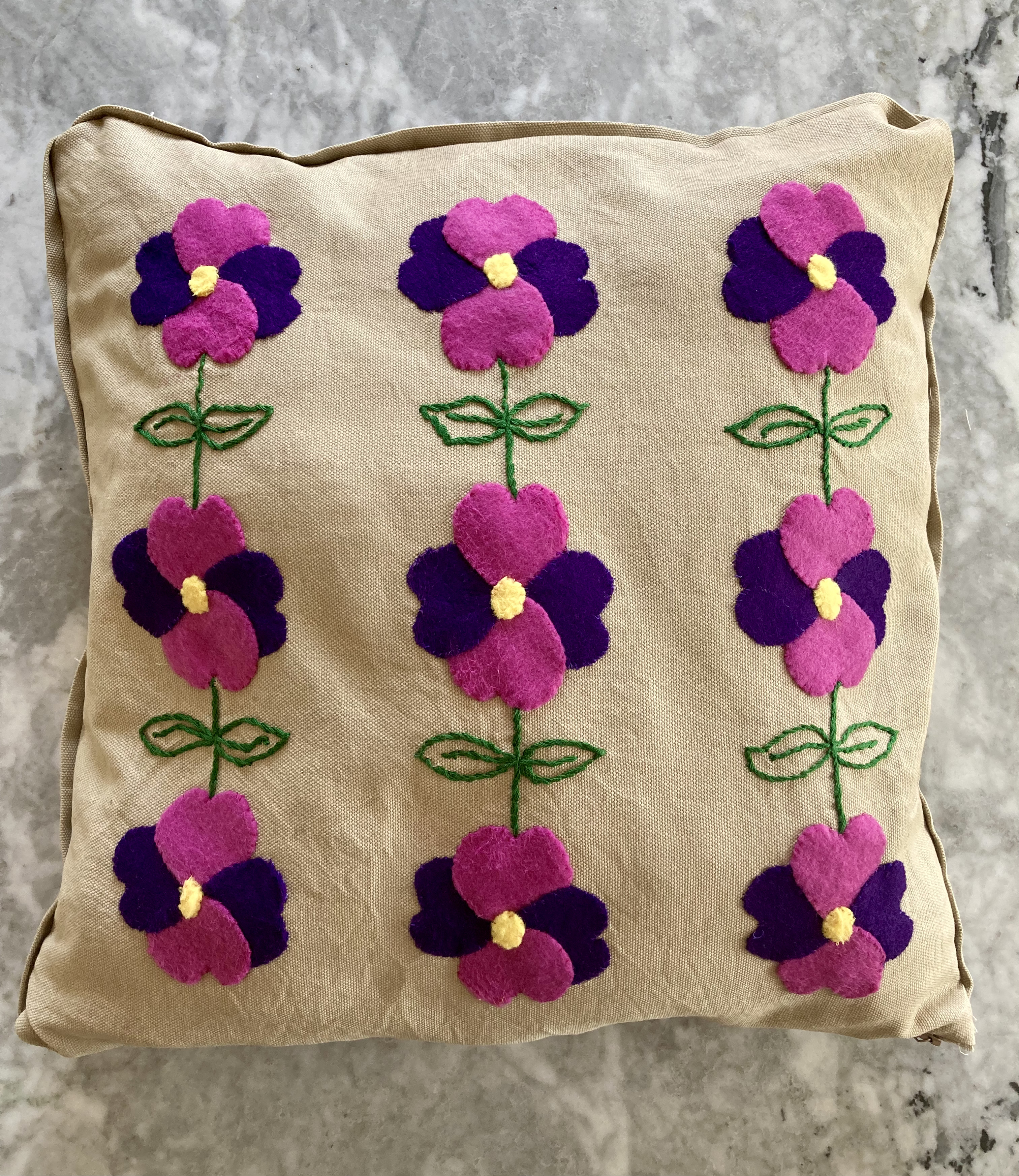
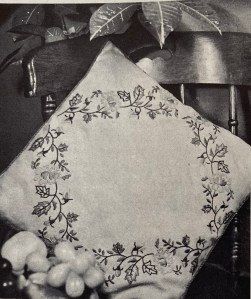
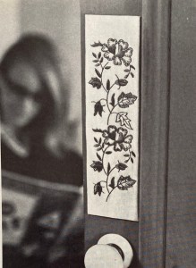
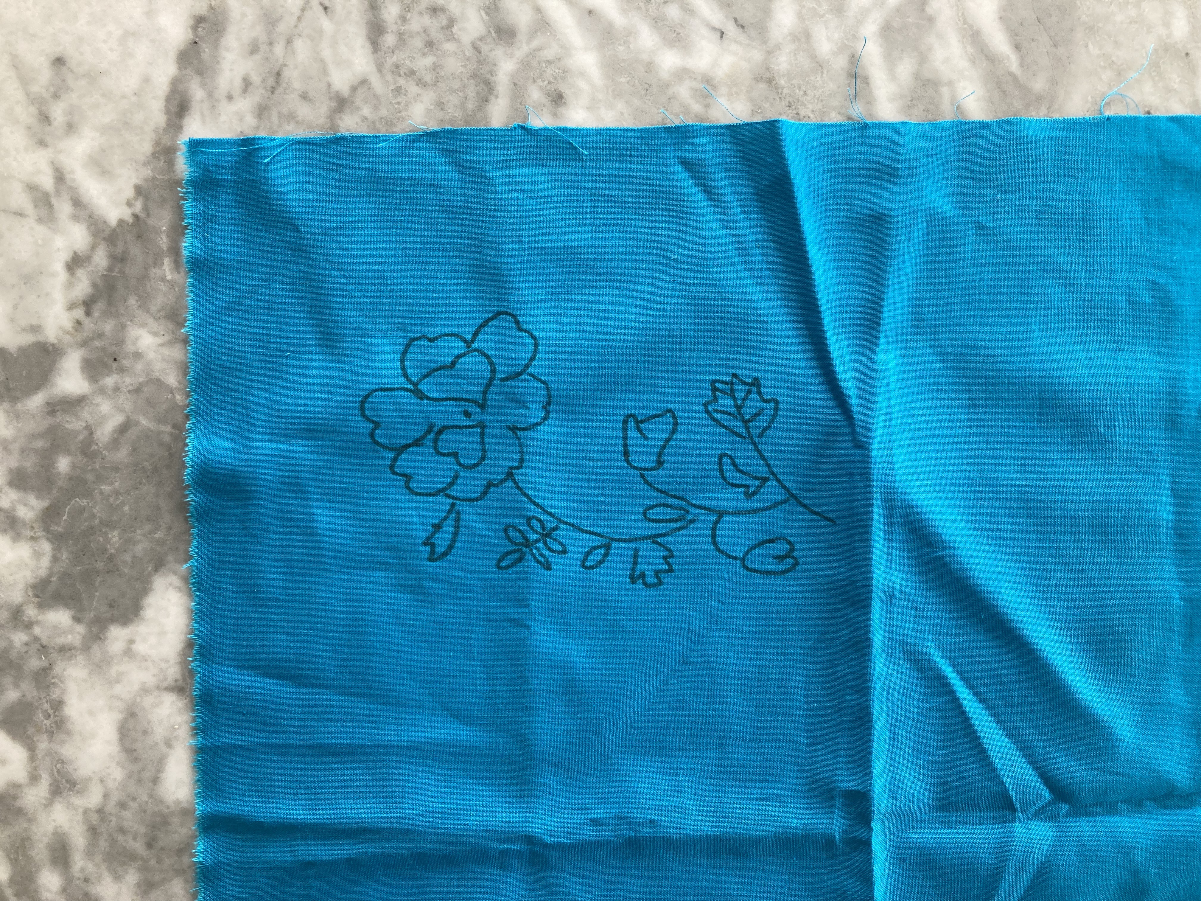
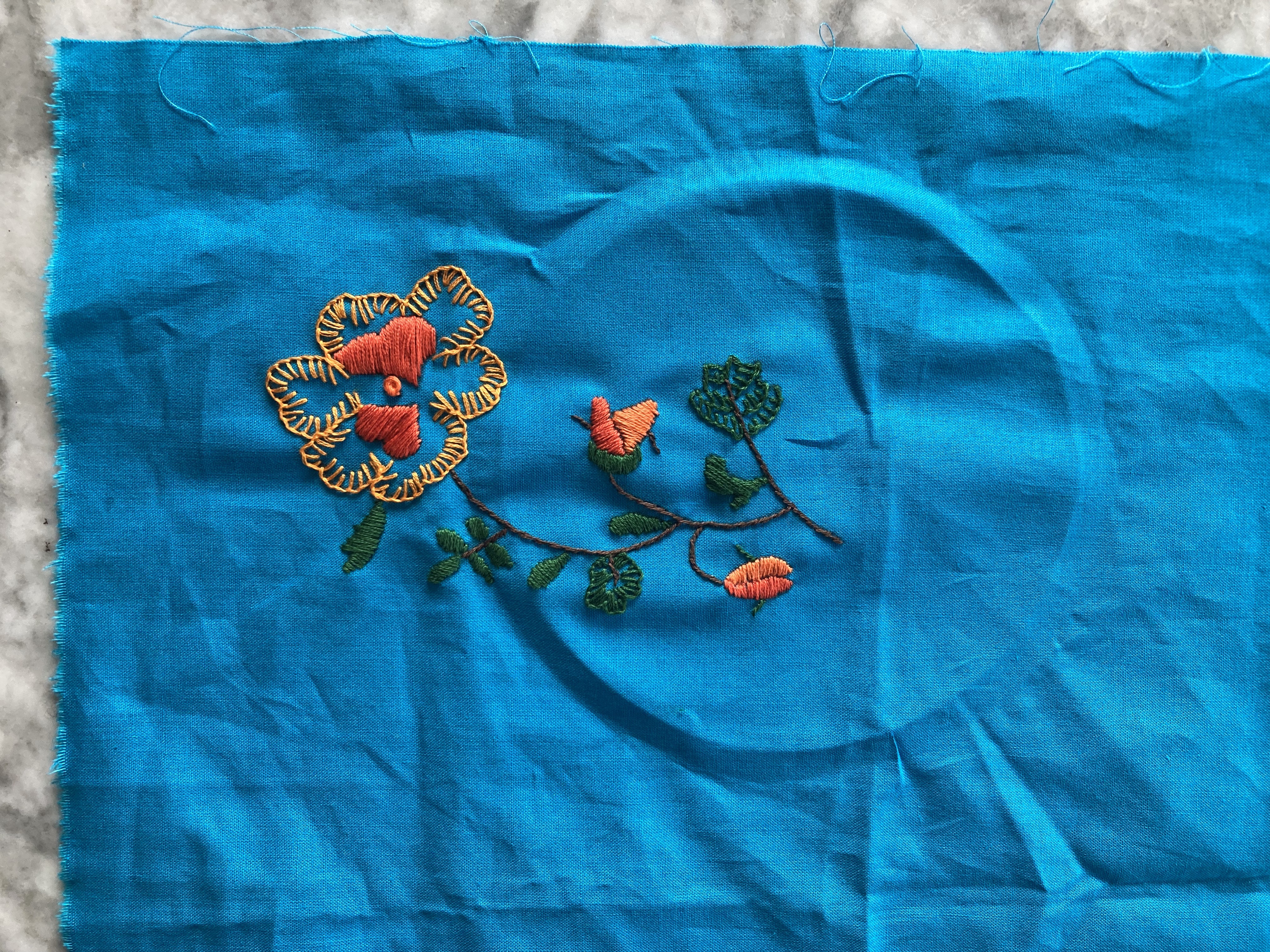
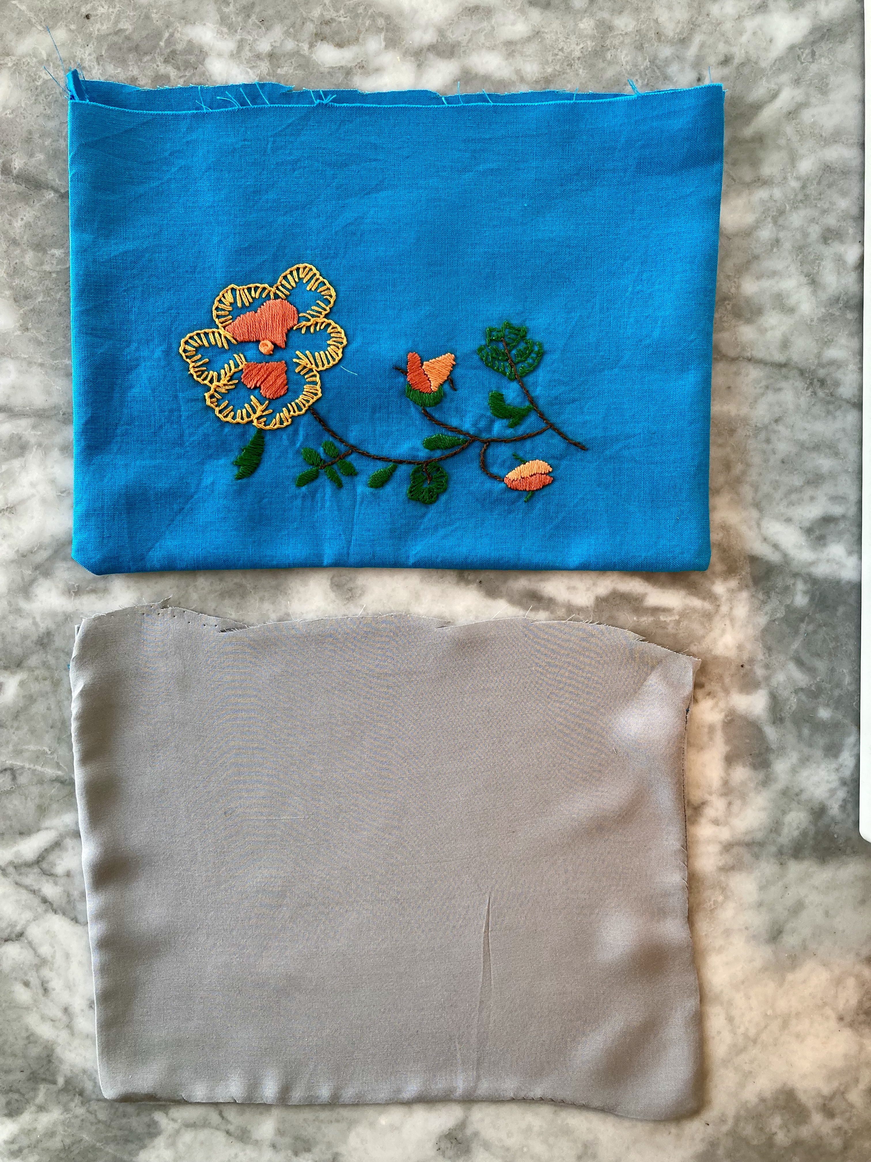
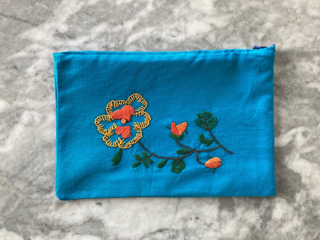
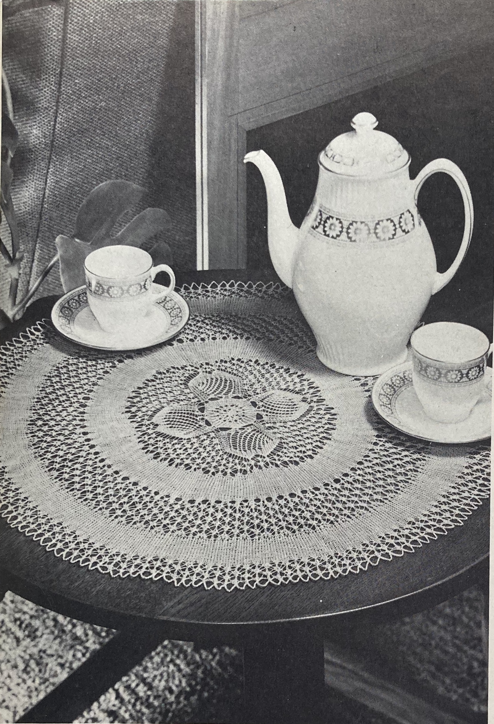
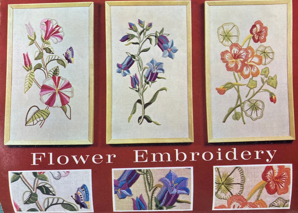
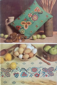
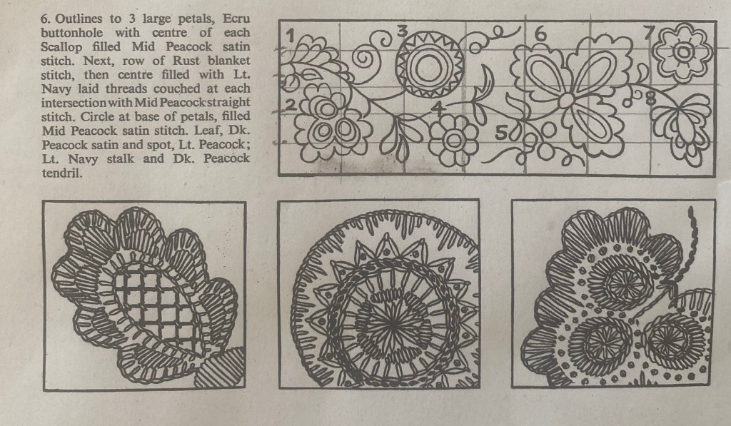
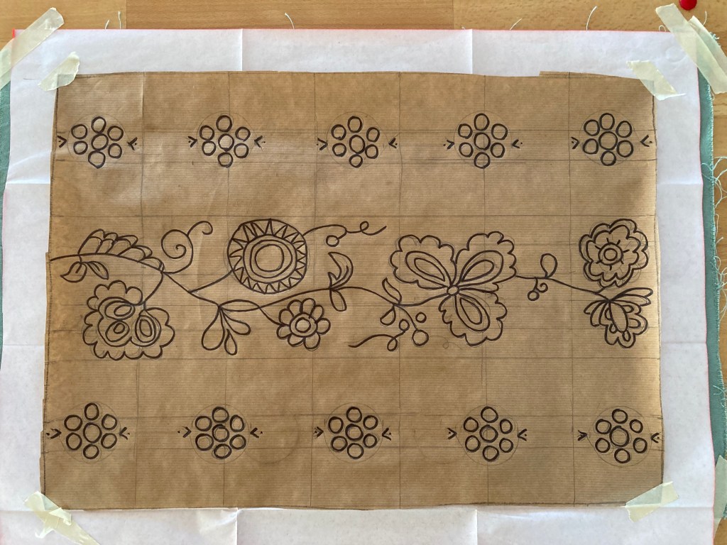
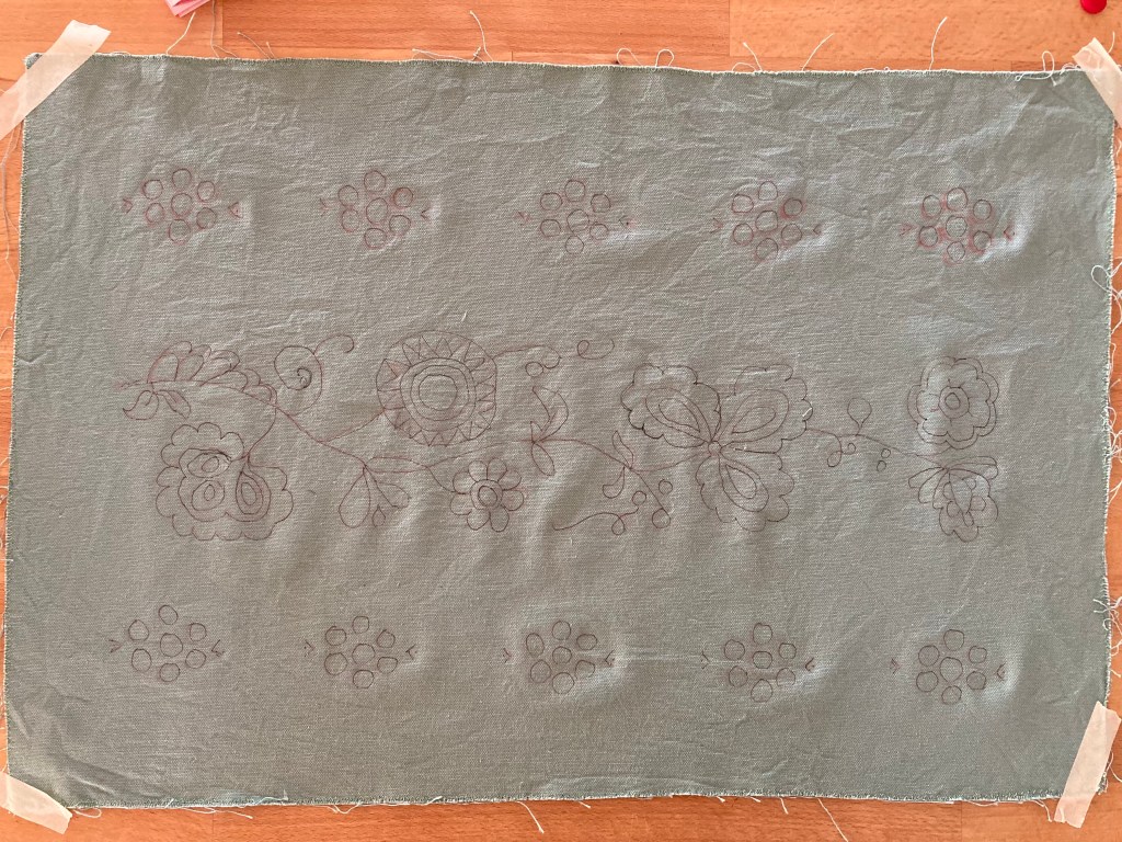
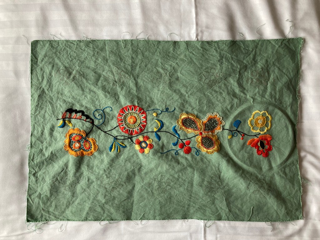
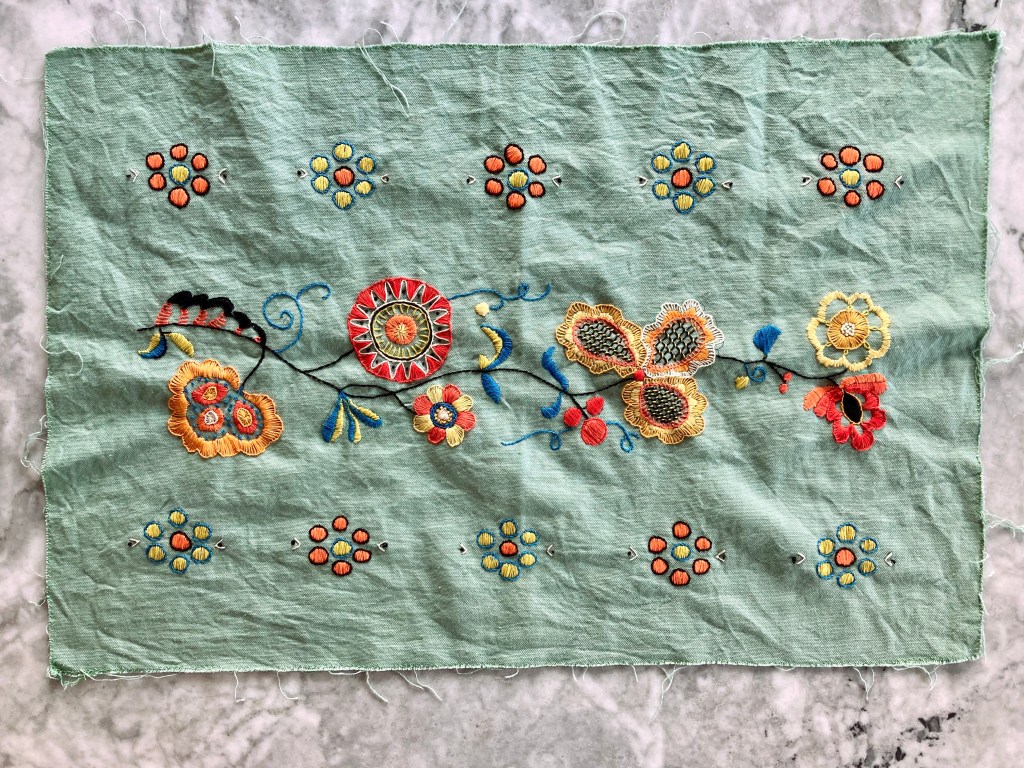
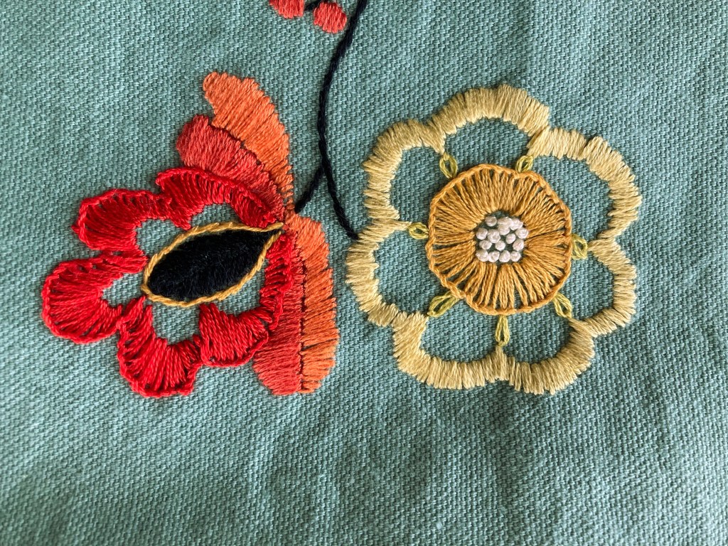
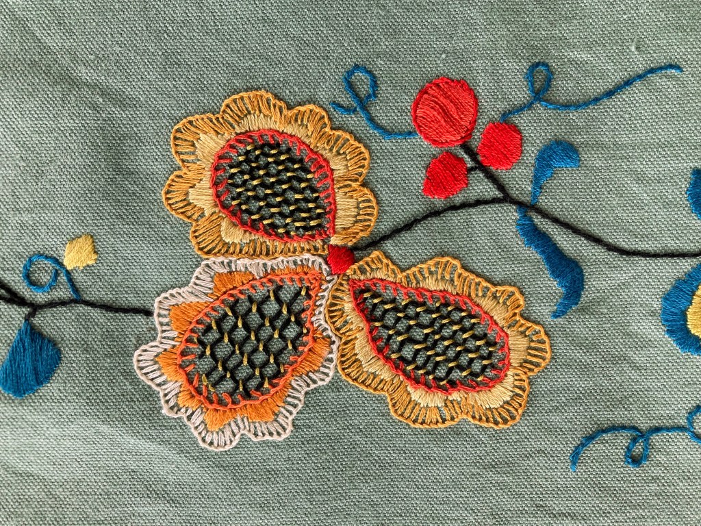
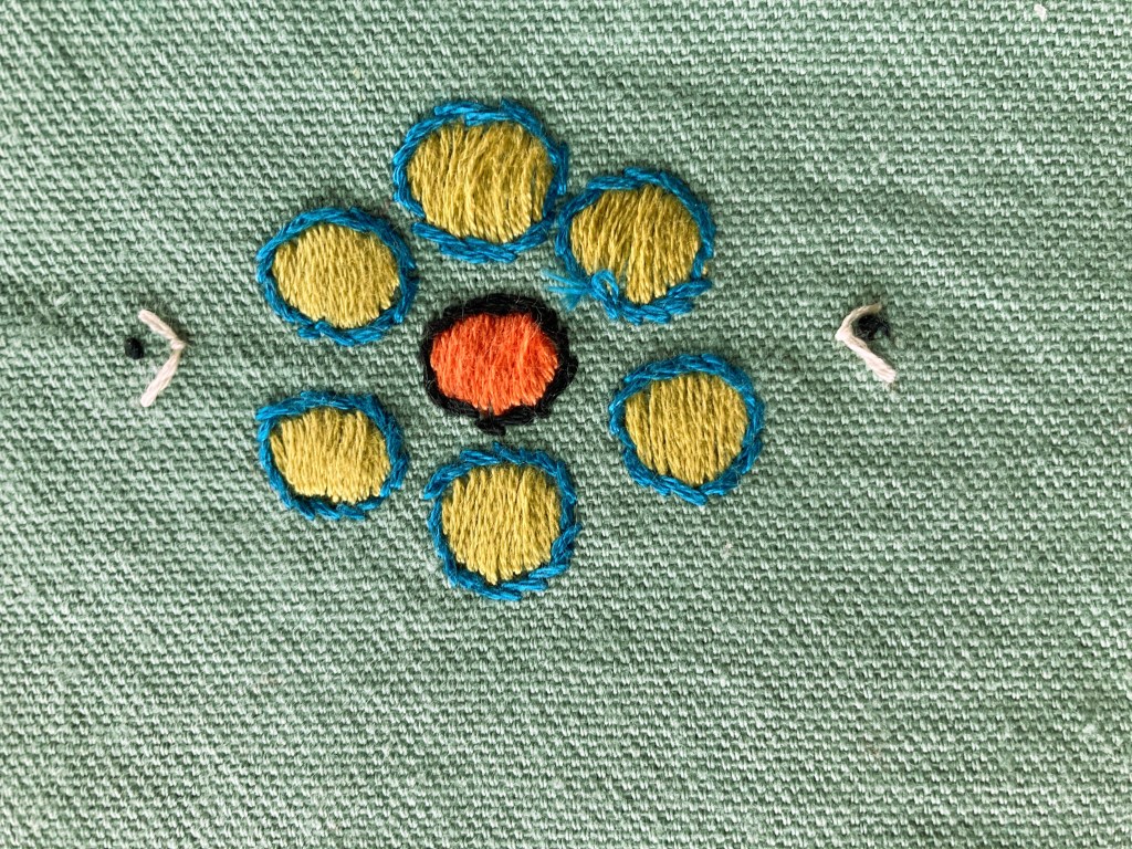
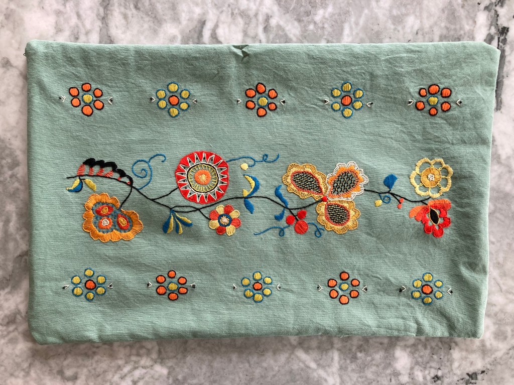
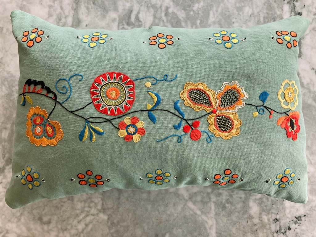
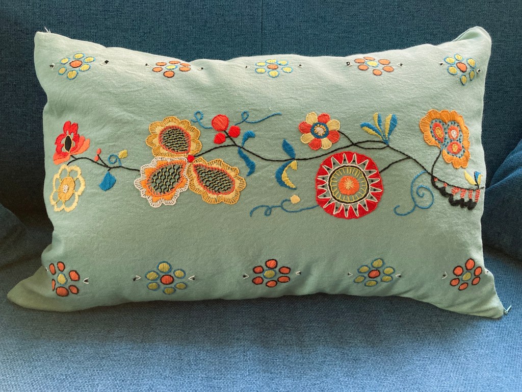
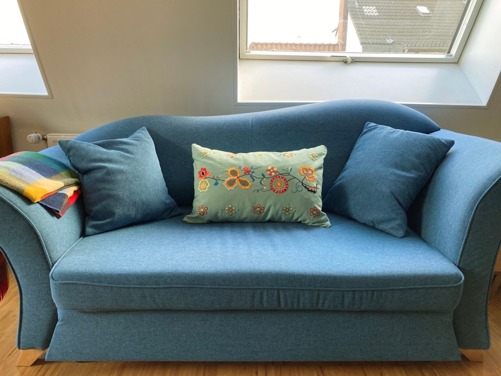
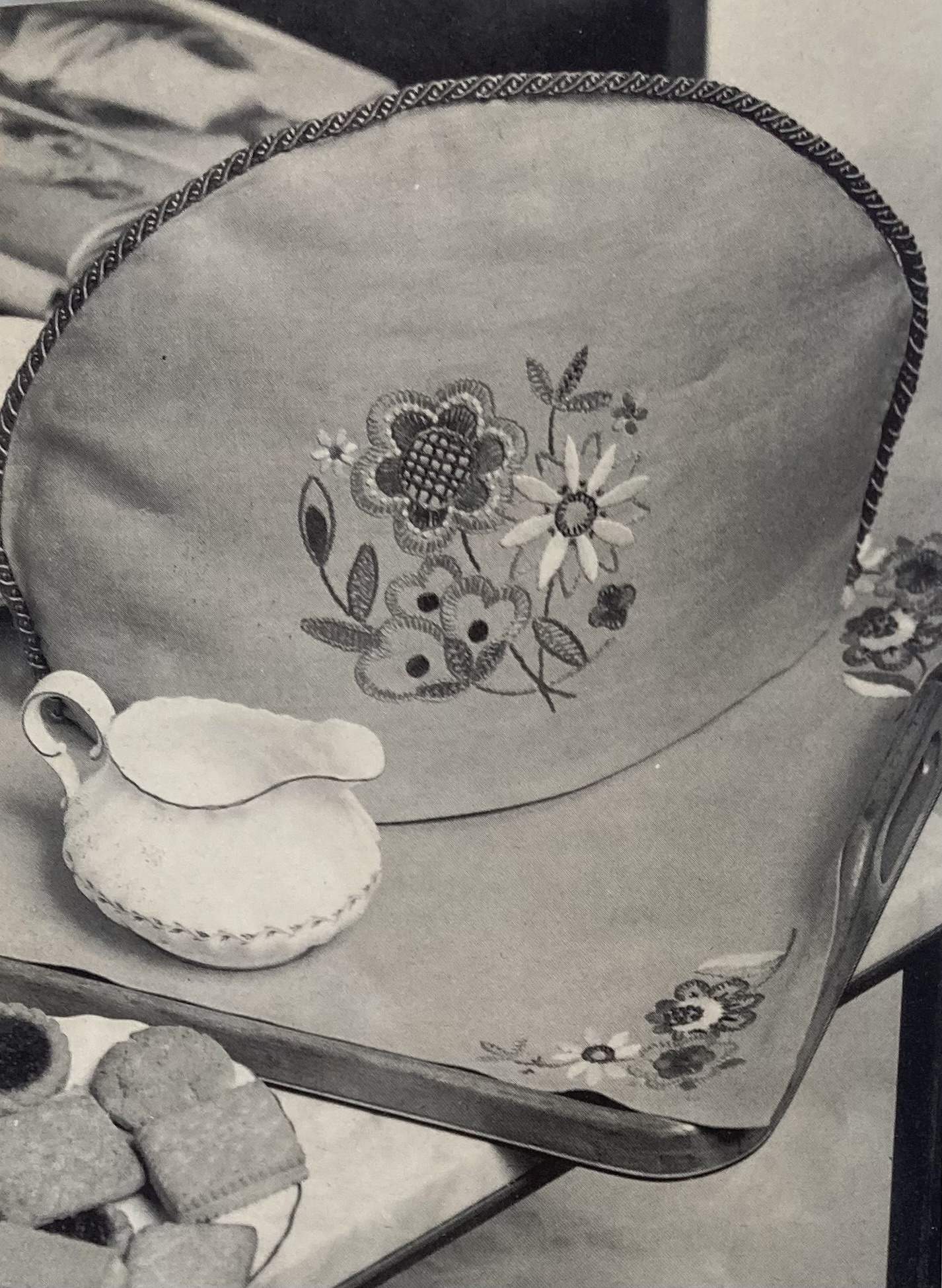
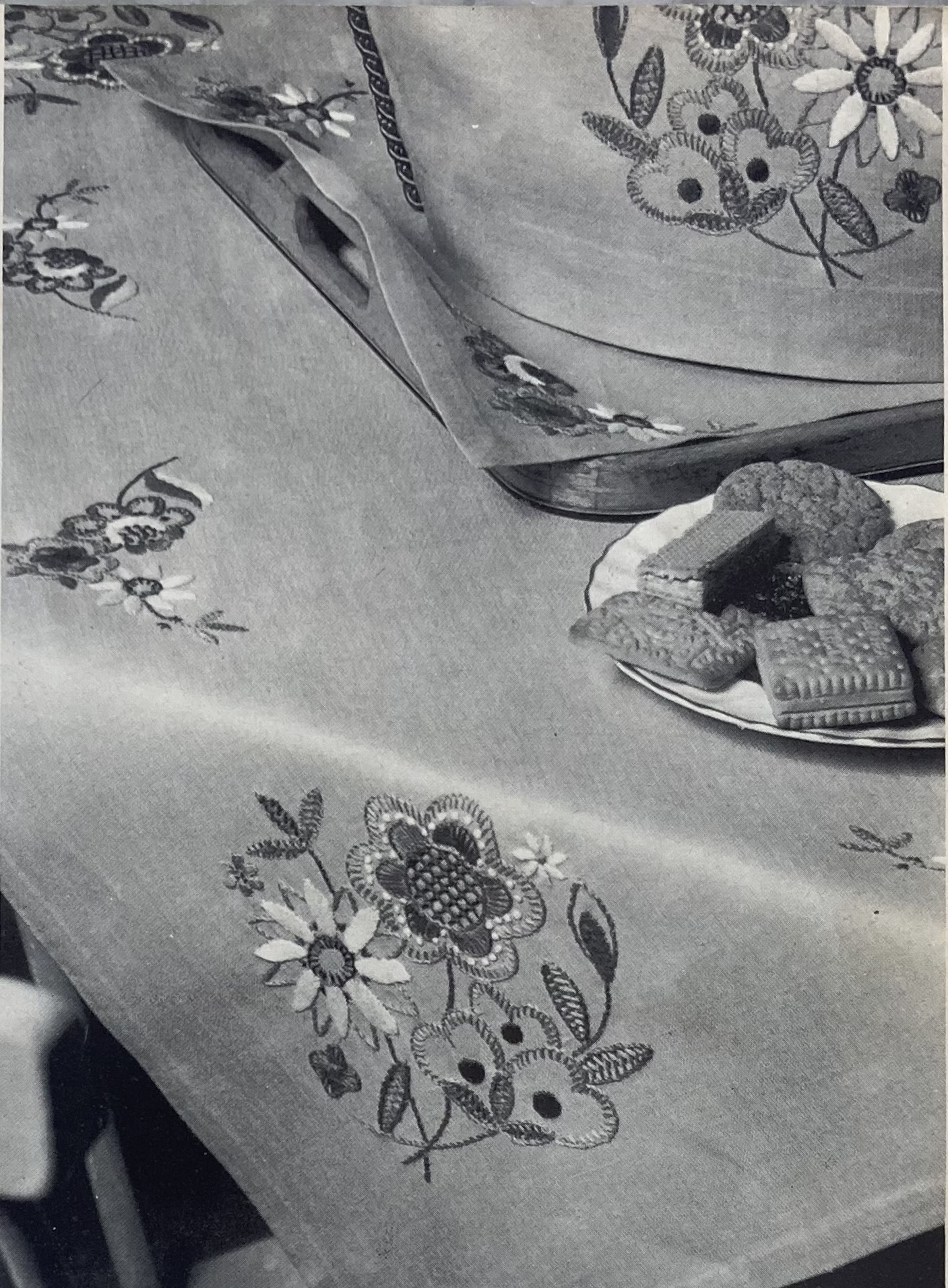
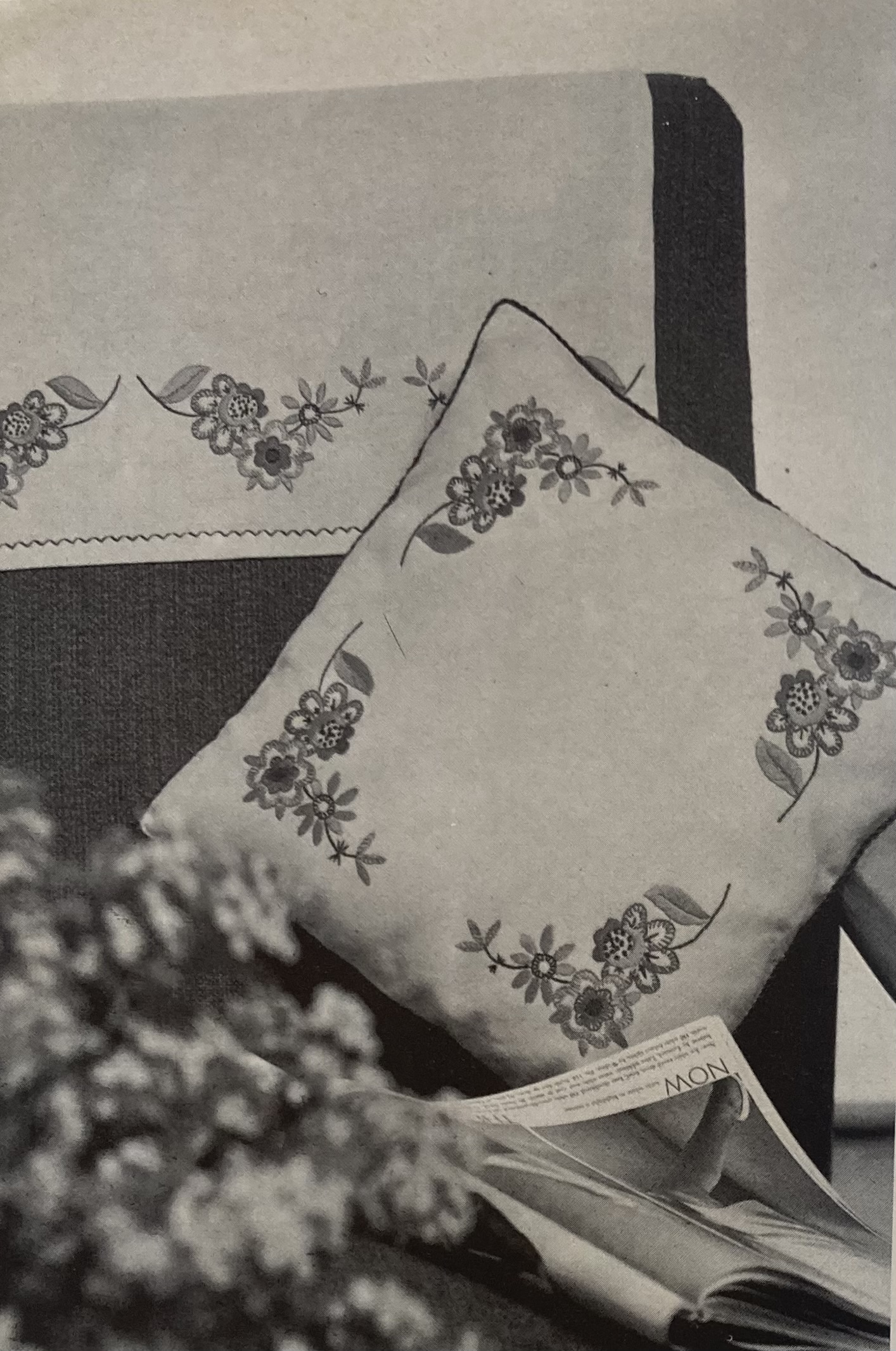
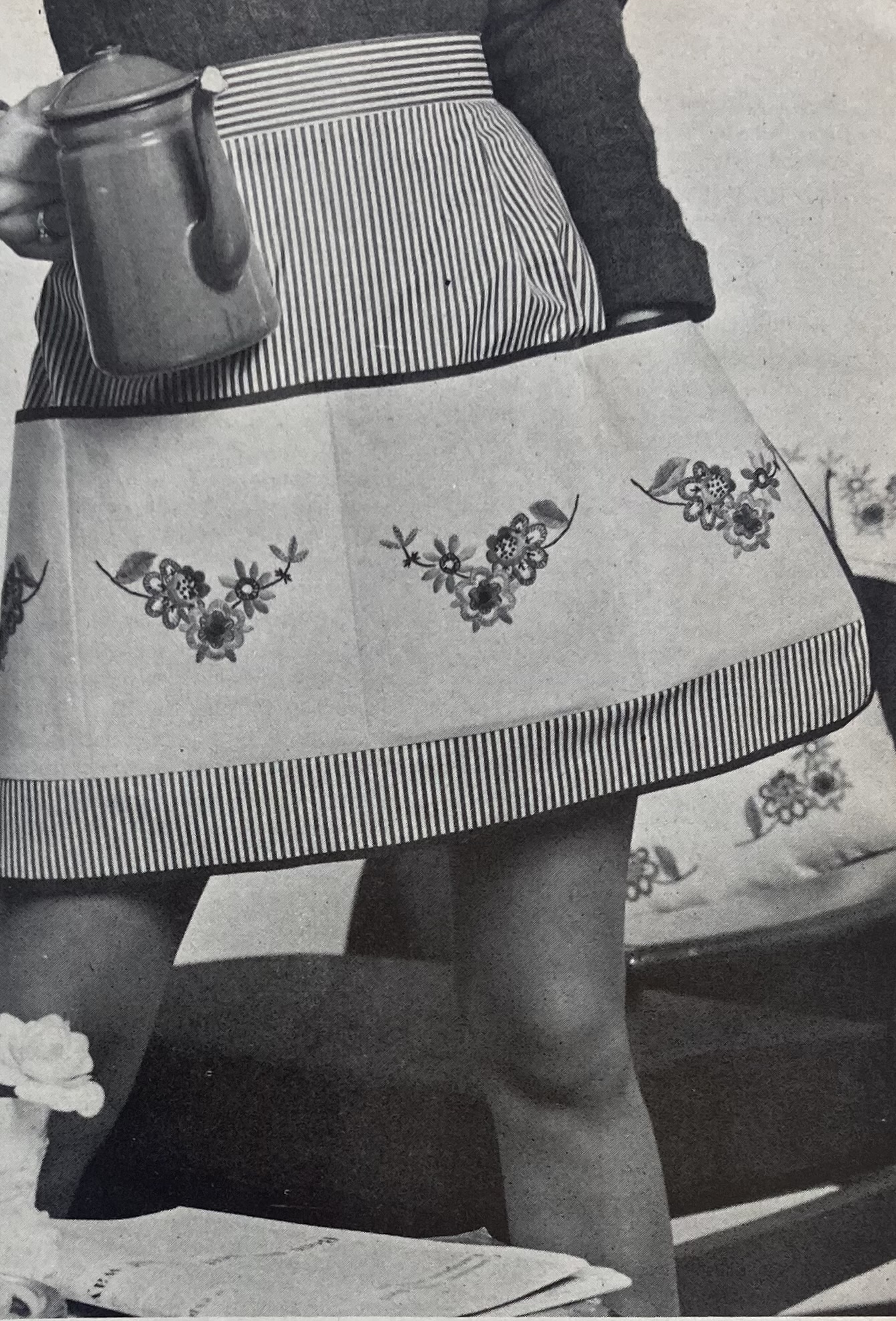
With so many great knitting projects, it’s no surprise that the homewares are mostly basic. There’s a pretty hedgerow-flower embroidery motif that can dress up a cosy, a tablecloth, a cushion, and/or an apron. The apron has a wide horizontal strip of embroidered fabric that’s divided by seams to make multiple pockets — very practical.
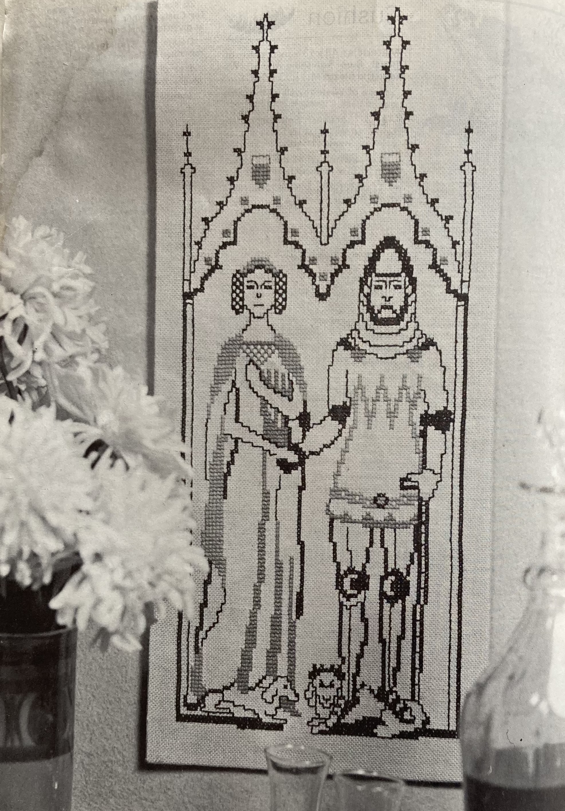
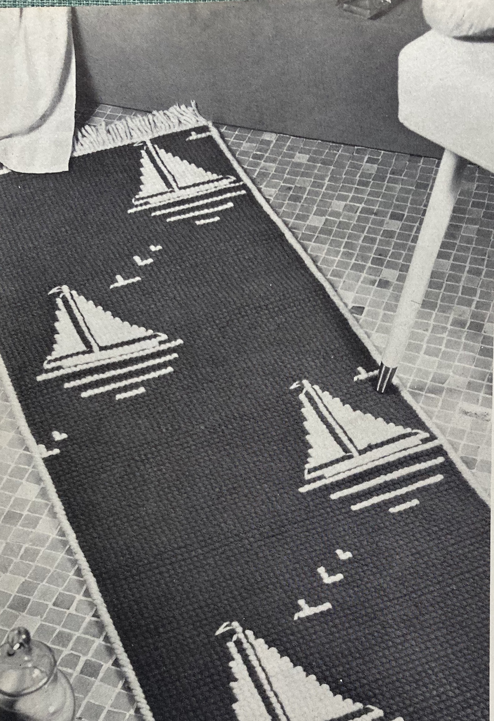
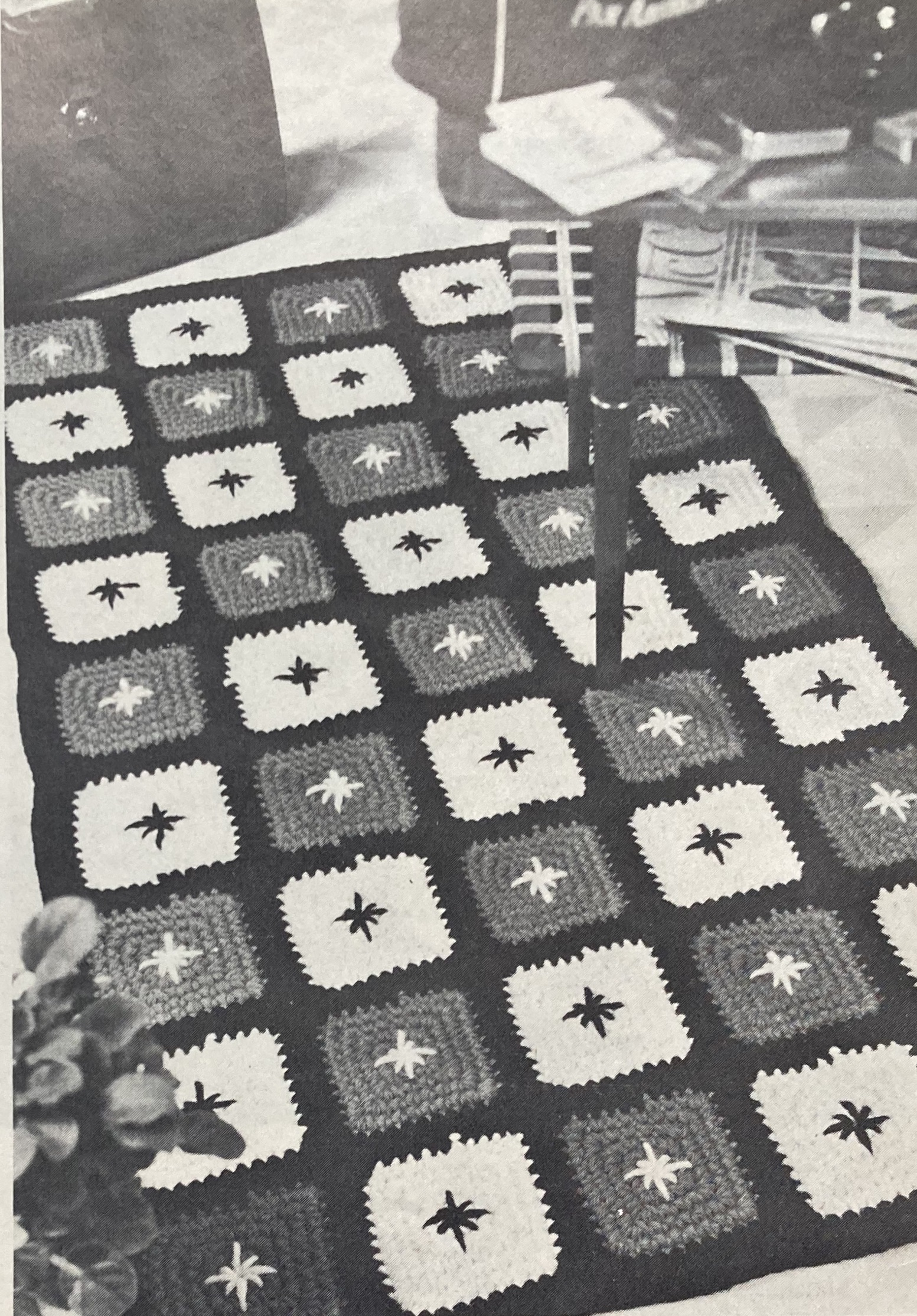
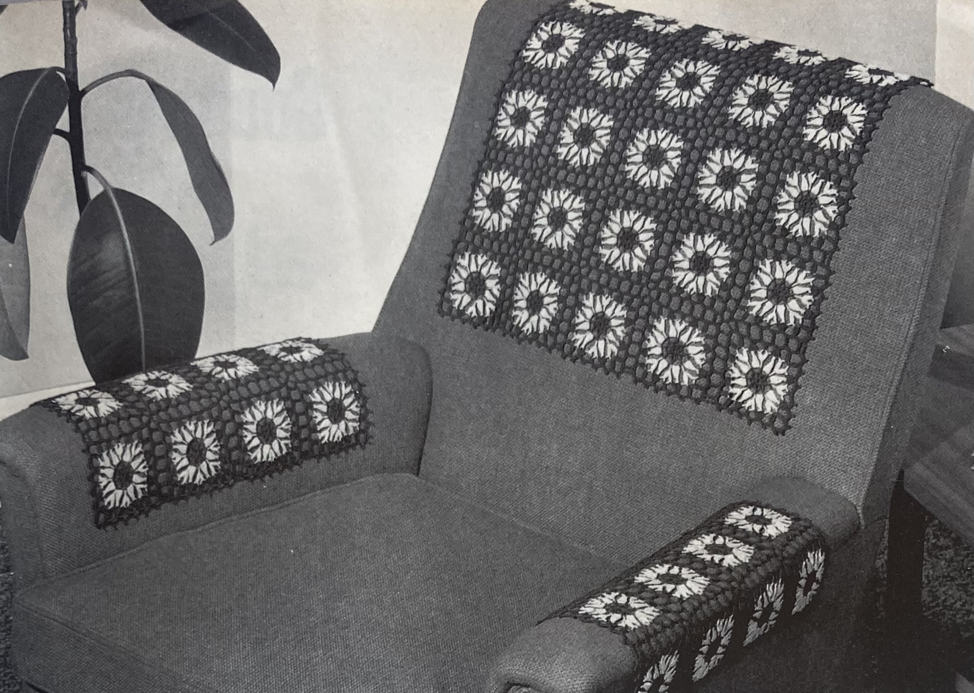
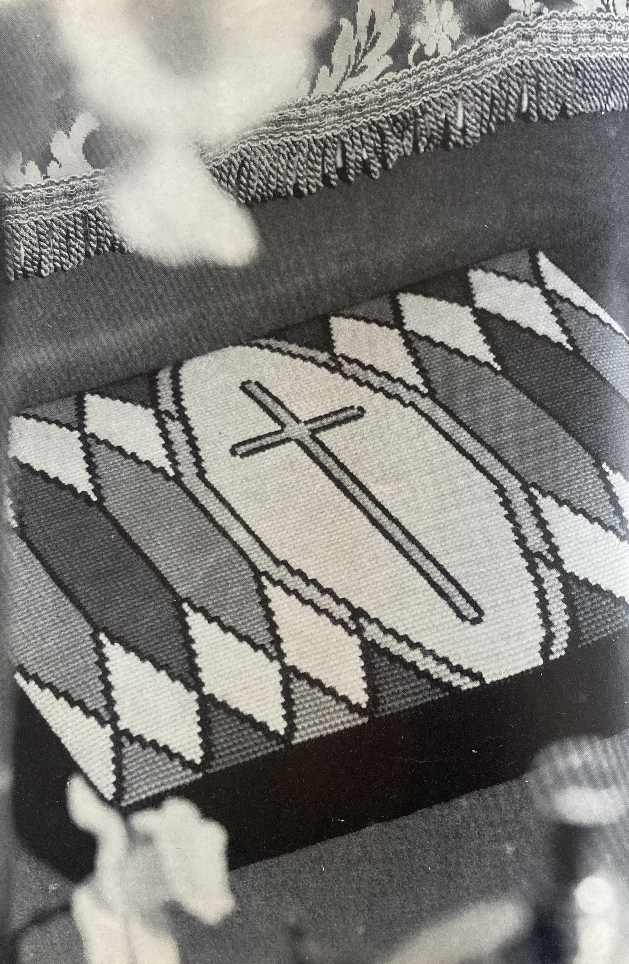
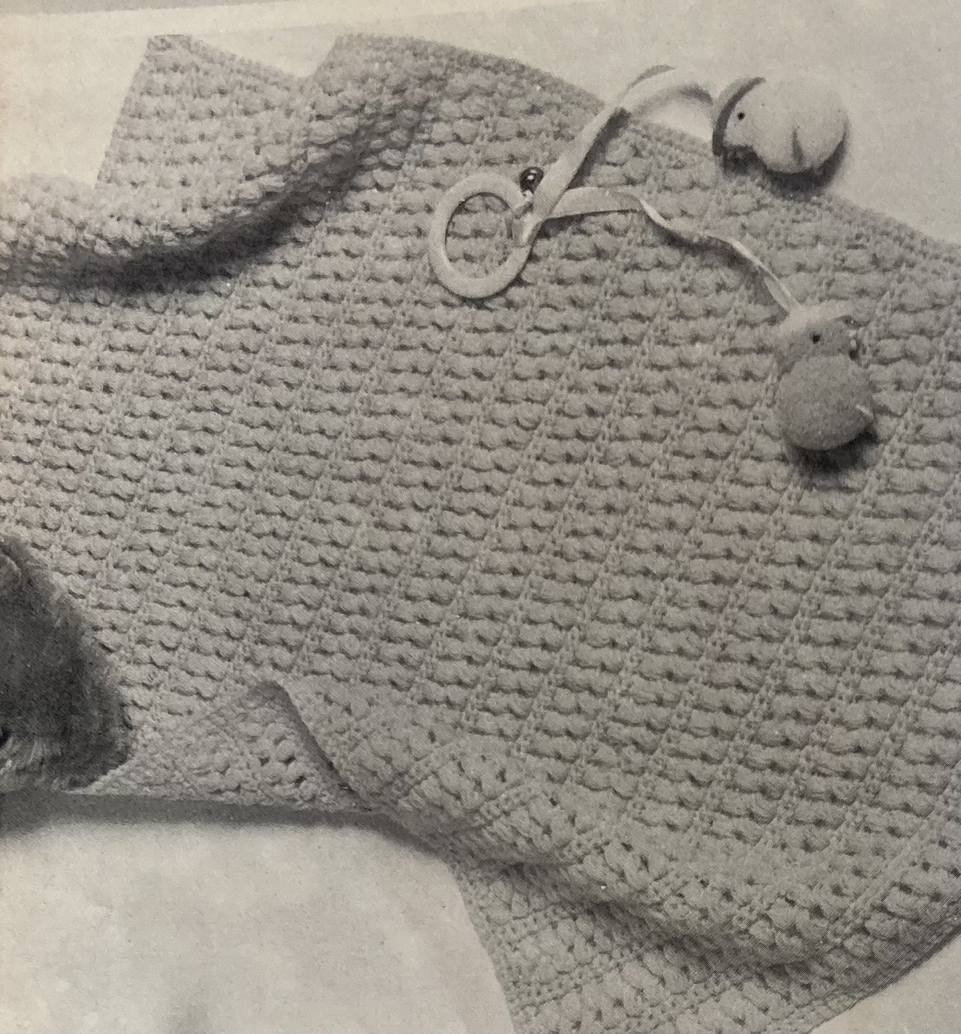
You can also crochet a quick baby blanket to use as a cover in the cot or pram, or a set of chair protectors with a flowery lace motif. Churchgoers can make a tapestry kneeler in “stained glass” effect for Easter, provided they work fast — Easter Sunday 1968 was on April 14th. The colours — two shades of blue, lemon yellow, red and gold — were probably quite pretty.
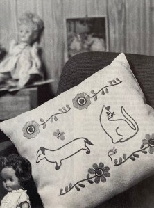
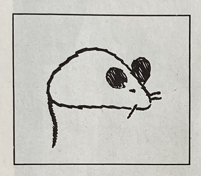
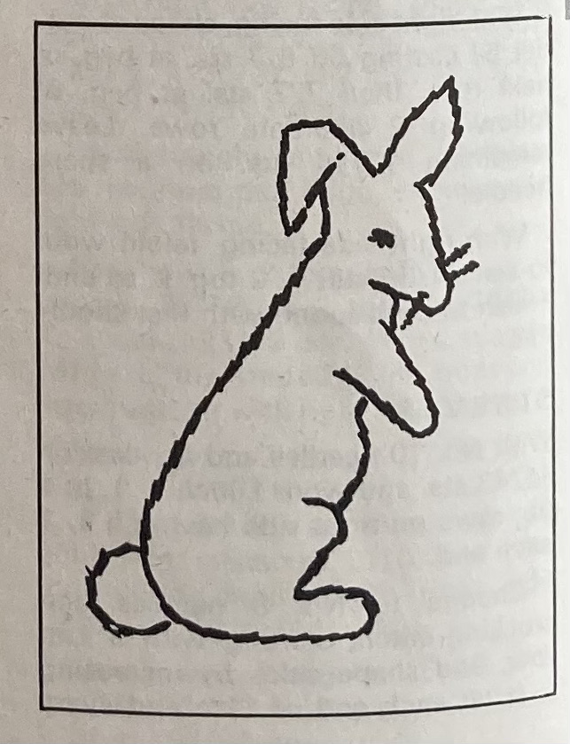
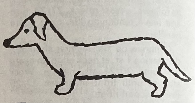
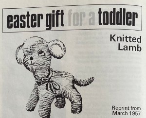
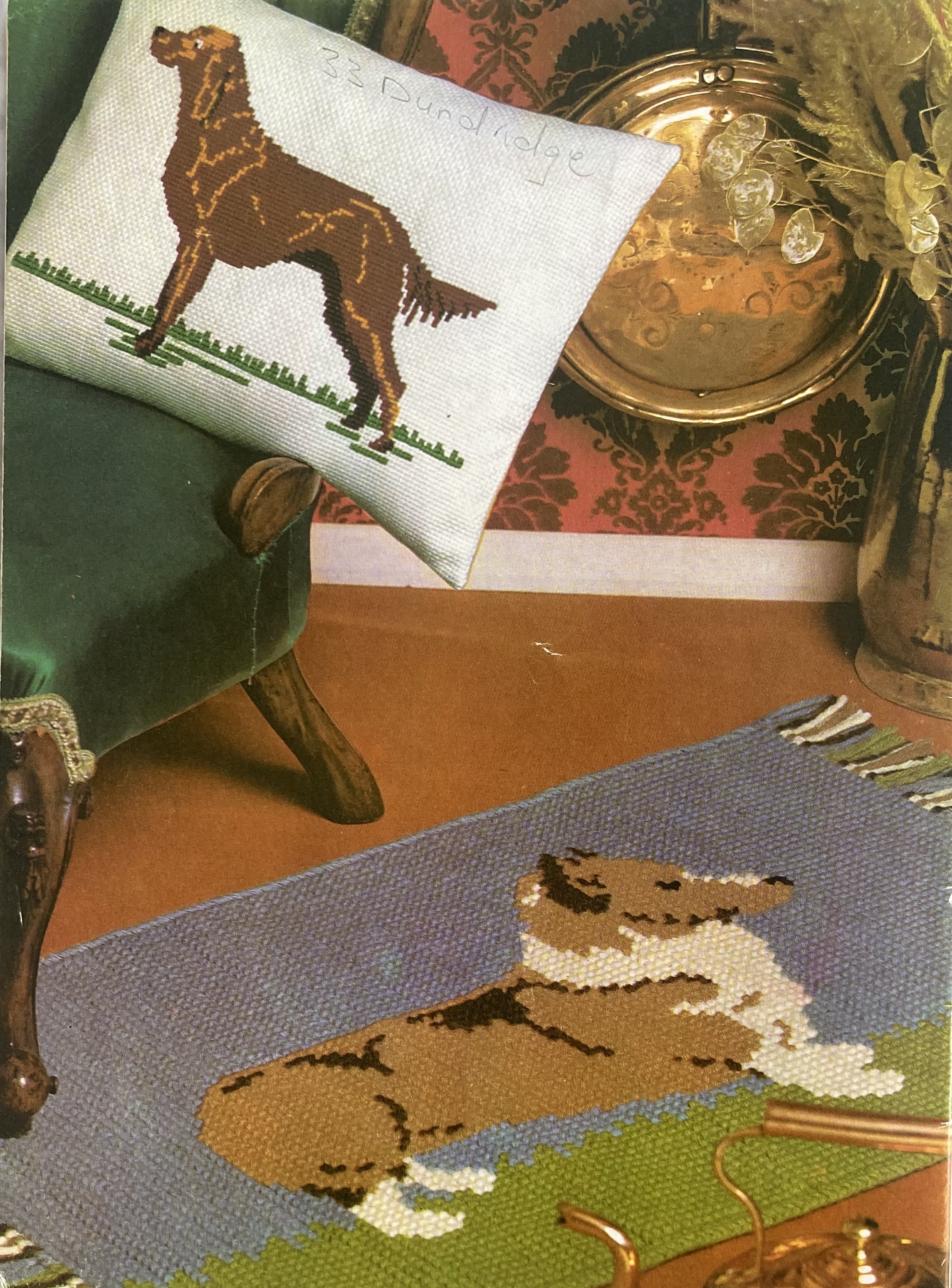
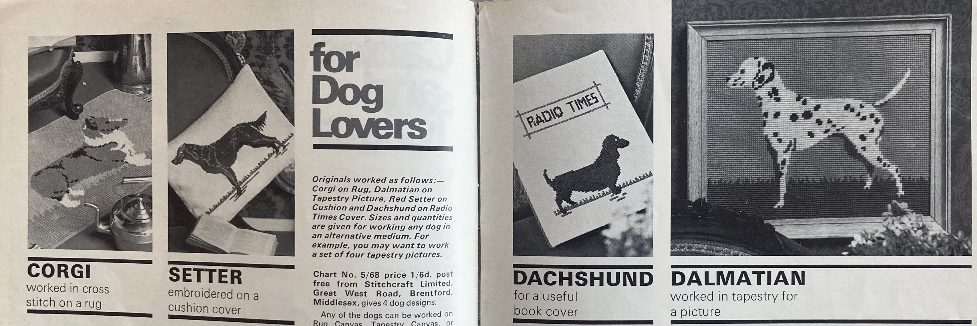
Plus, dogs! Besides the real live dog posing in the photos with the male model for that “country” effect, there are four projects for dog lovers: a cross-stitch rug with a corgi on it, a setter embroidered on a cushion cover, a cross-stitch dachshund for a book or “Radio Times” cover, or a tapestry dalmatian to hang on your wall. All of the pattern were included on one transfer, and all could be adapted to any medium (rug, tapestry or cross-stitch on Bincarette), so dog fans could go wild decorating their country homes.
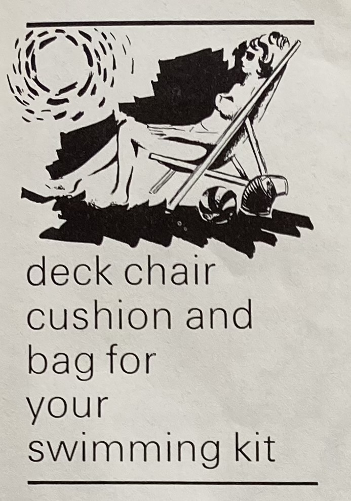
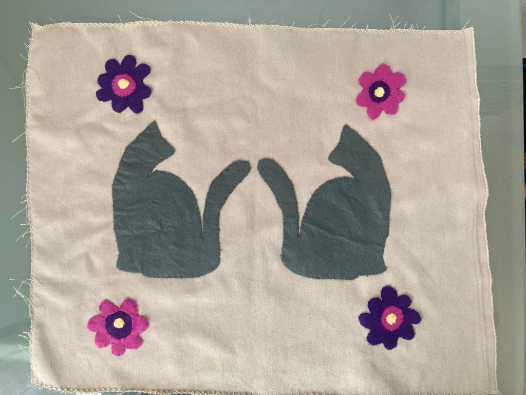
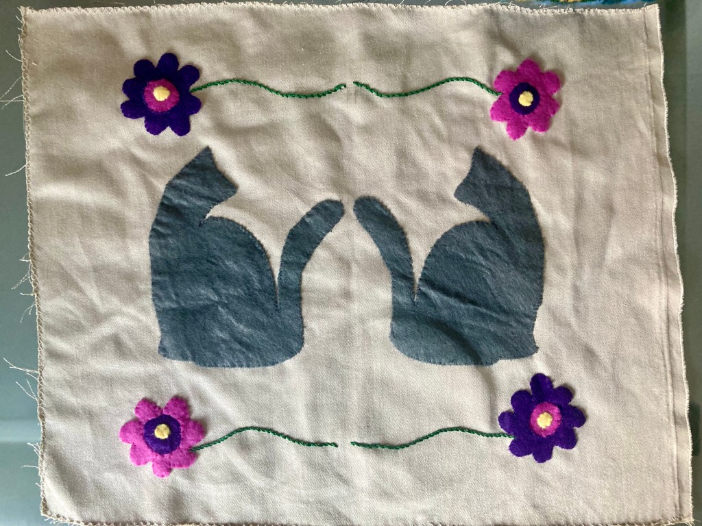
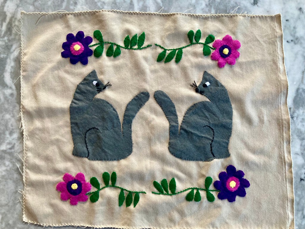
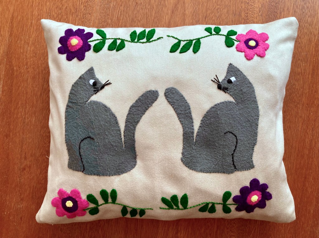
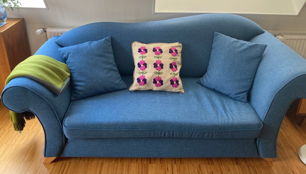
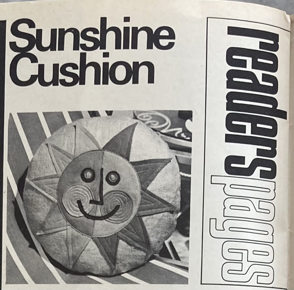
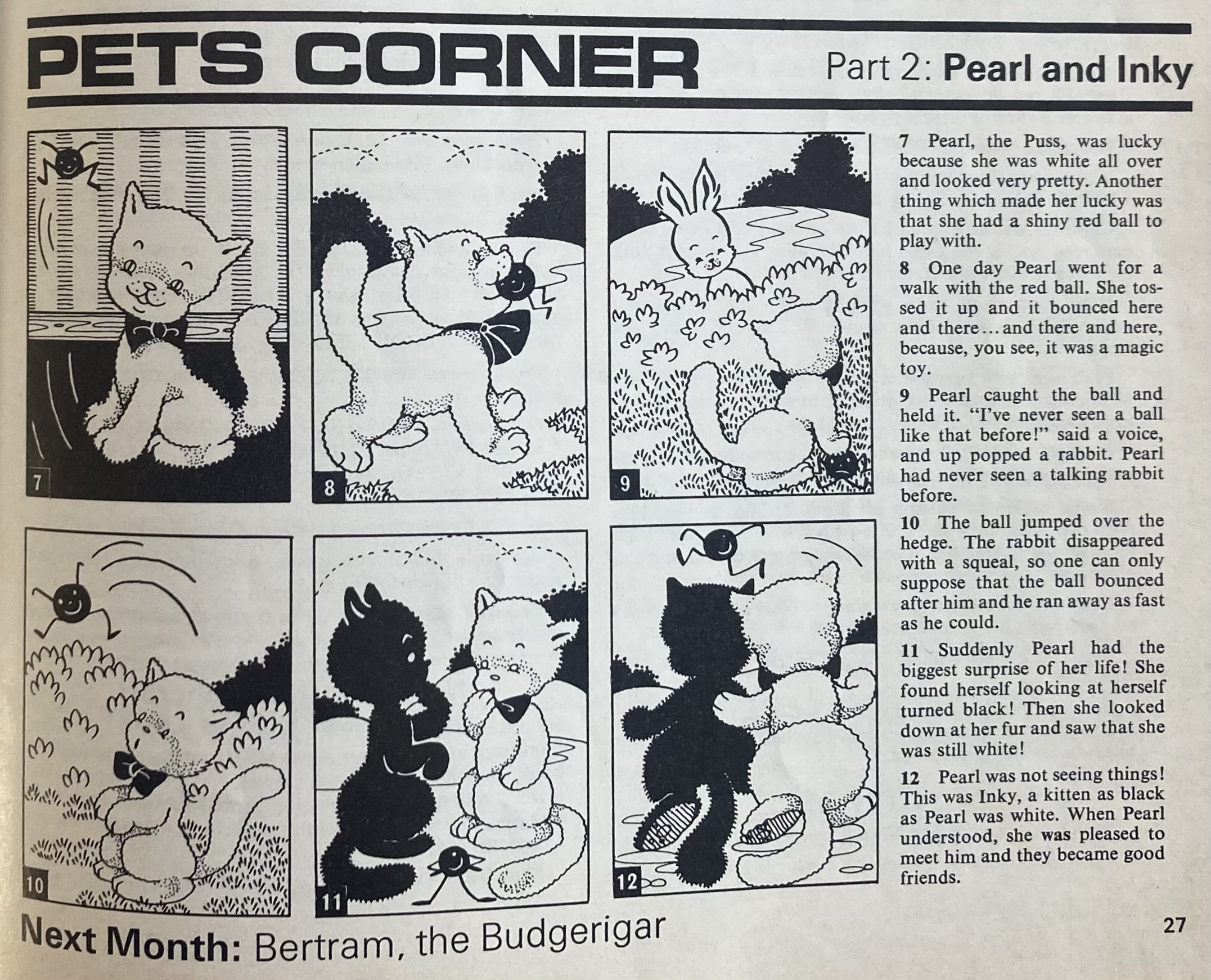
The Readers Pages feature a reprint of the “Sunshine Cushion” from June 1966, which I made in July 2024. It’s a great pattern and deserved to be reprinted! In the children’s comic, white cat Pearl and black cat Inky meet and become friends.
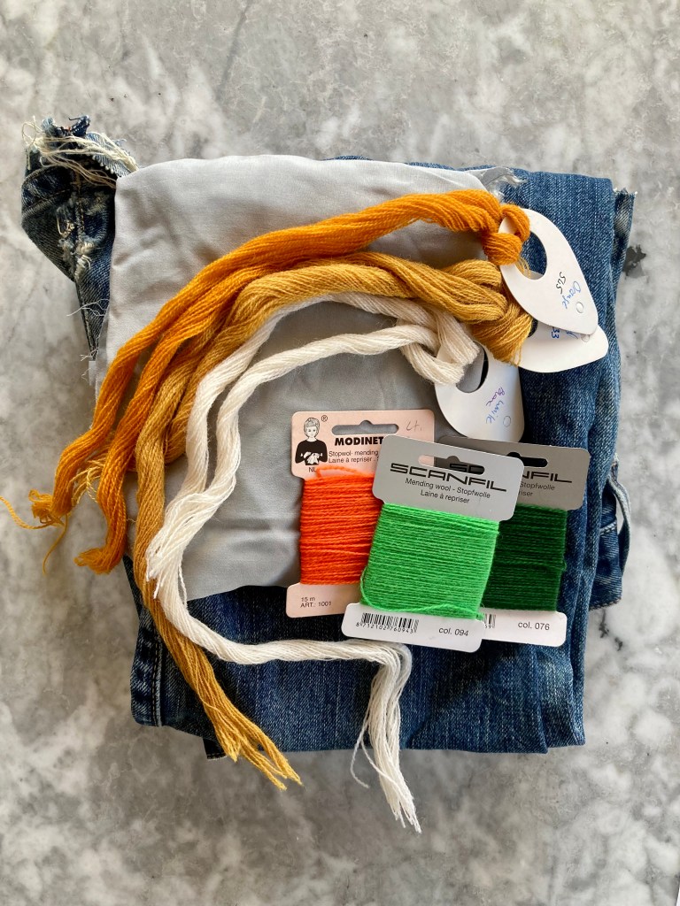
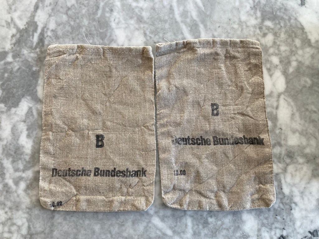
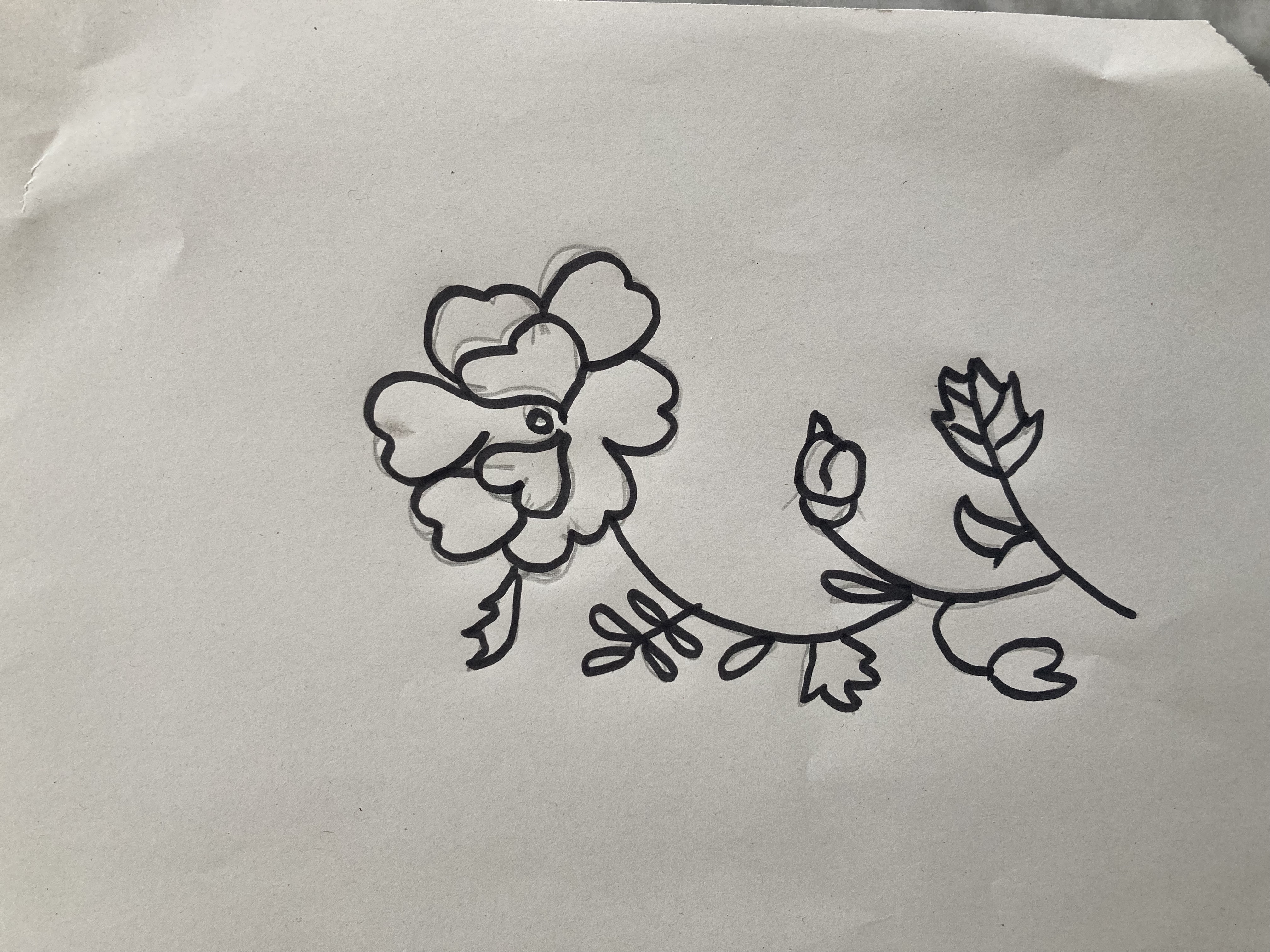
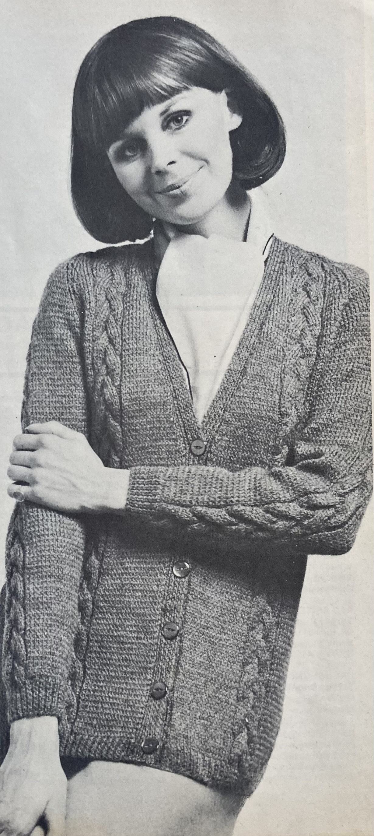
That’s all for this issue! I like the cover cables and the Princess top, but I’m working on other projects that I would like to finish, so I’ll probably embroider the hedgerow flowers onto a vegetable bag. Or maybe unravel a half-finished cardigan that I’m unhappy with and turn it into the long-line cable cardigan.