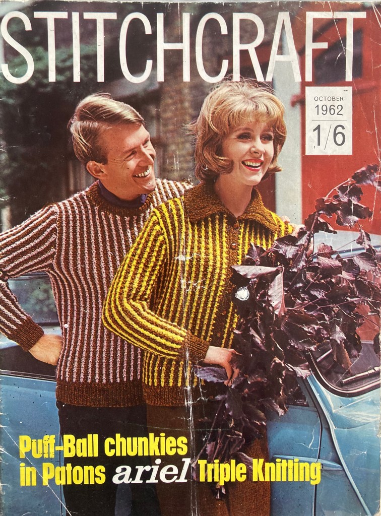
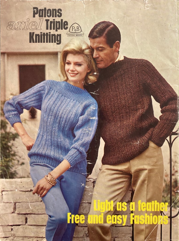
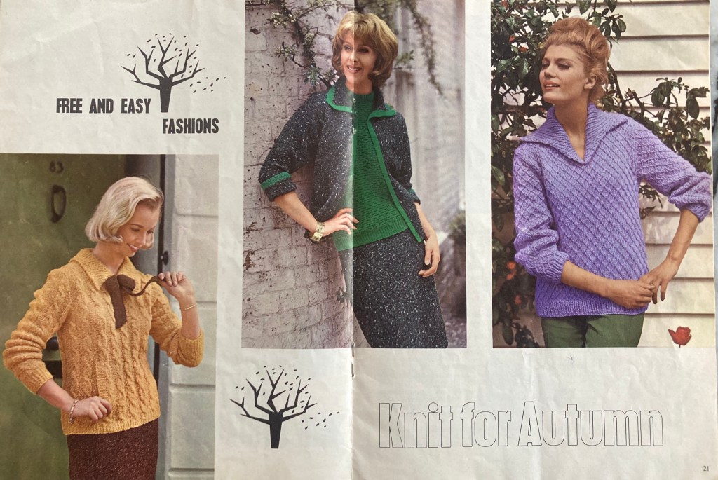
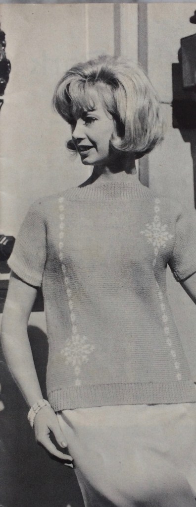
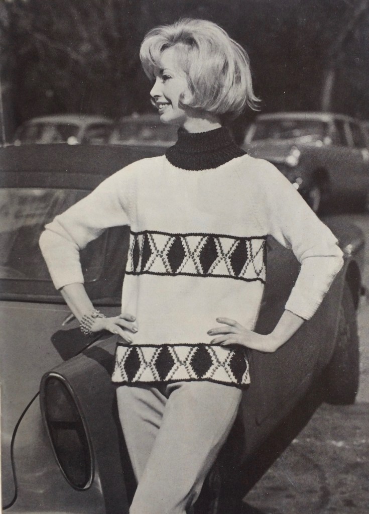
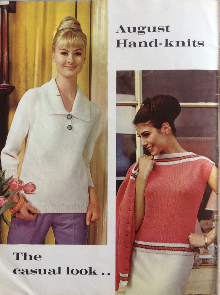
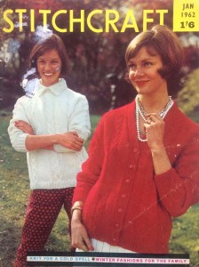
“There are several “special” things about this issue” writes Stitchcraft’s “editress” on the facing page, and I’m glad she put the word “special” in quotes, because this month’s issue is definitely a mixed bag. On the plus side, it has extra pages in colour and introduces a new yarn: Patons Ariel, designed to be “triple-knit” bulky and therefore quick to knit, but still lightweight. On the minus side… we’ll get to that later in the post.
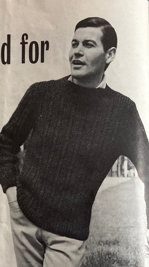
The new wool, Ariel, is listed on Ravelry as bulky weight (97 yards in a 2-ounce ball) and composed of 80% wool and 20% “other” (synthetic fibres). According to the person who wrote the Ravelry entry, it may or may not have been waterproof! It appears to be quite fluffy, thus the name and the “light as a feather” claim. It’s used for the two-colour, slip-stitch-patterned garments in the cover photo as well as the identical boatneck pullovers for men or women. The partner-look idea is still going strong.
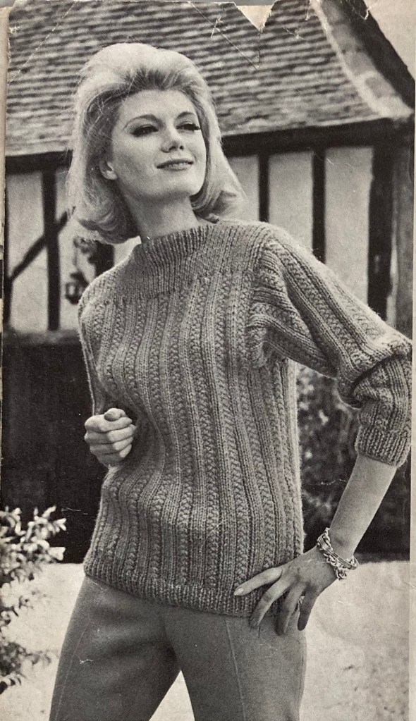
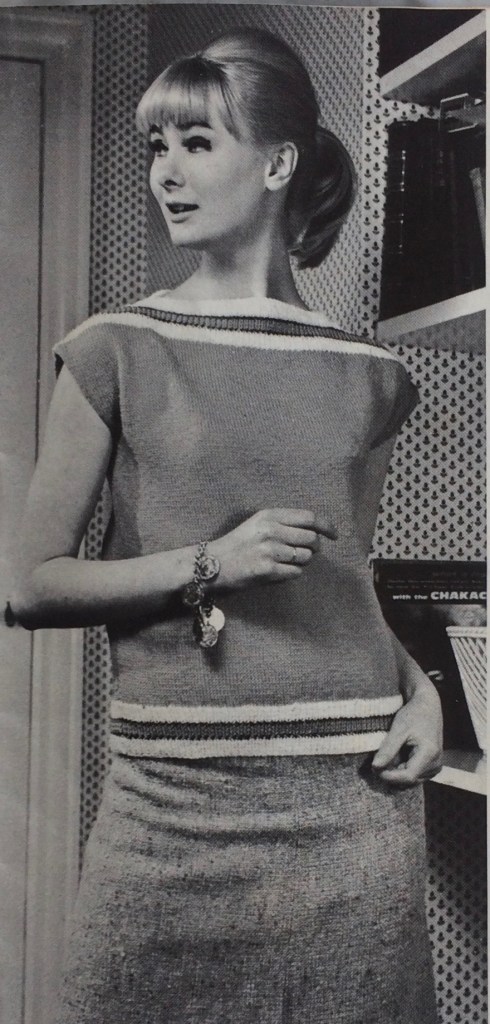
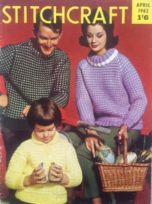
Tweed looks and suits are always popular in the fall, and this month’s issue gives us a loose-fitting suit with a short-sleeved jumper to wear underneath, all in double knitting weight. Nubbly Rimple yarn is also DK weight and still a fashionable choice for this sweater with a contrasting bow-tie. The purple pullover with the big collar (still in fashion after two years!) is made in bulky Big Ben wool. Greens, browns and yellows dominate the colour palette and go with the autumn theme.
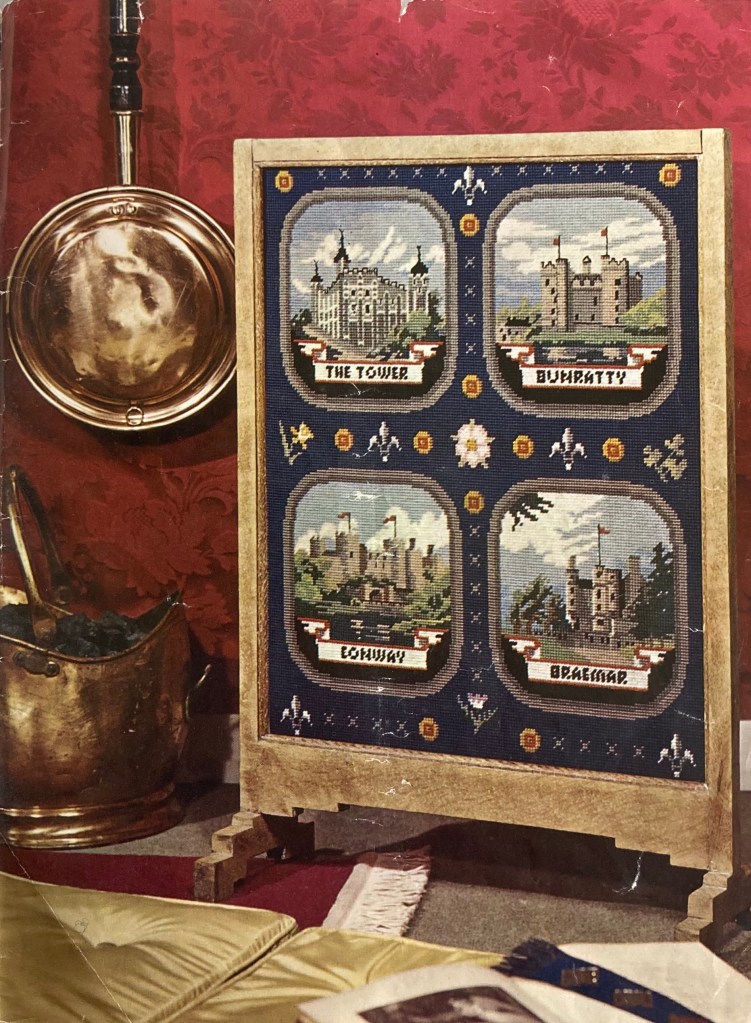
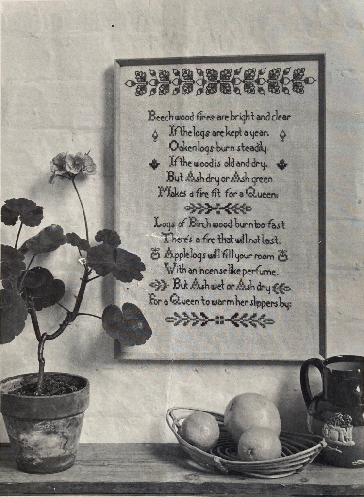
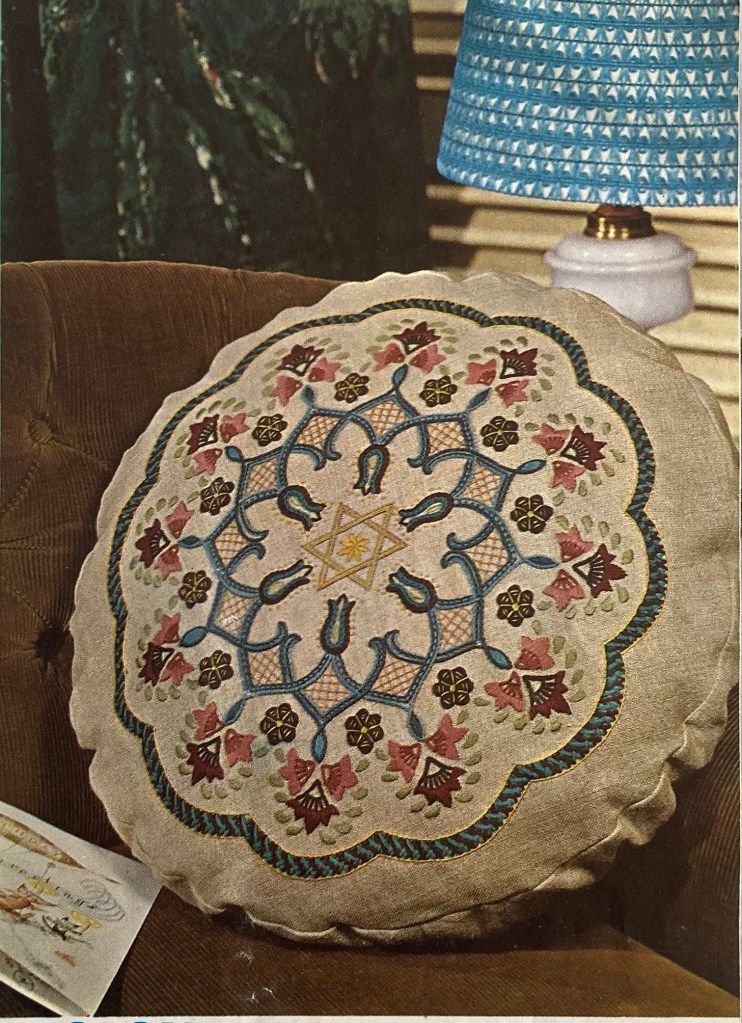
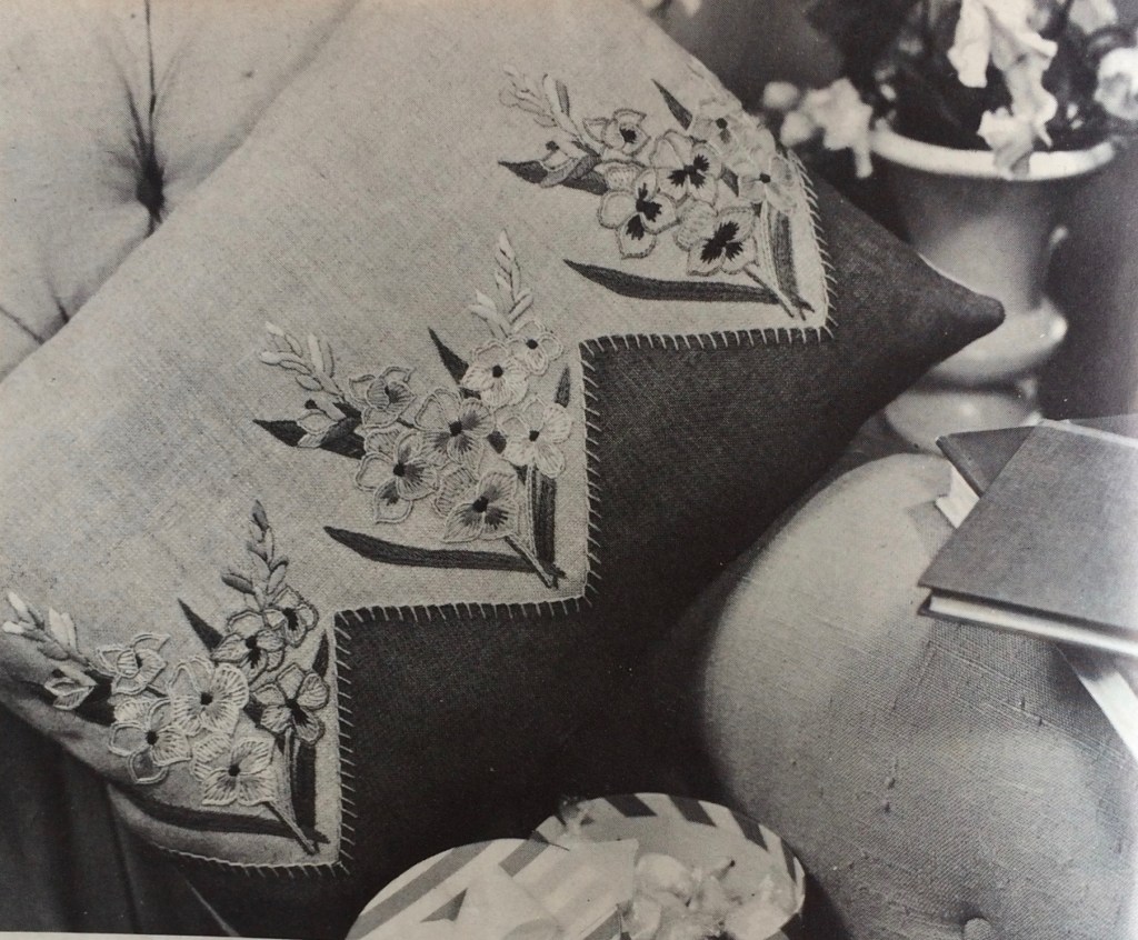
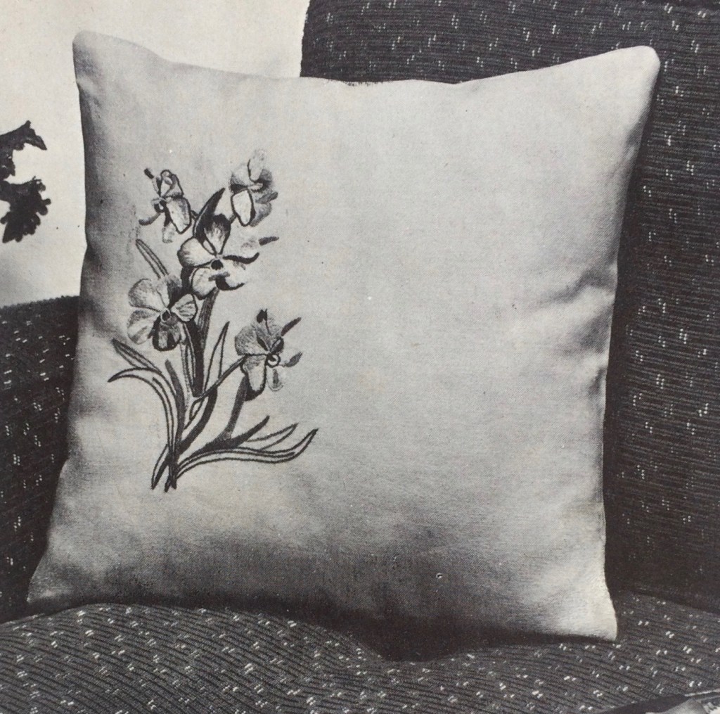
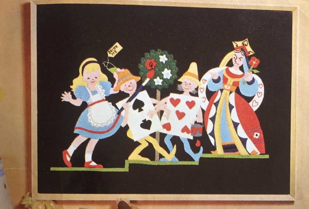
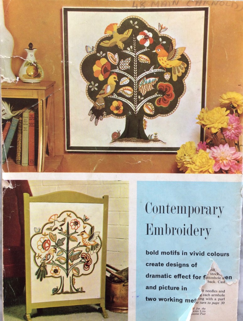
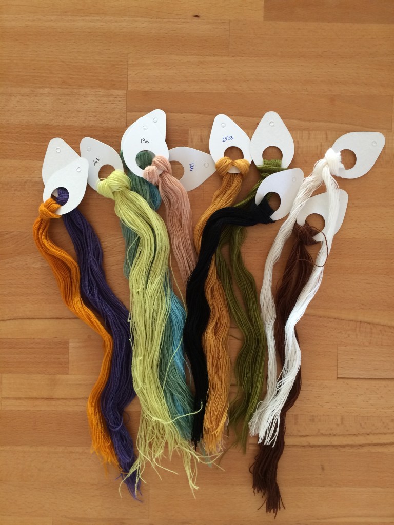
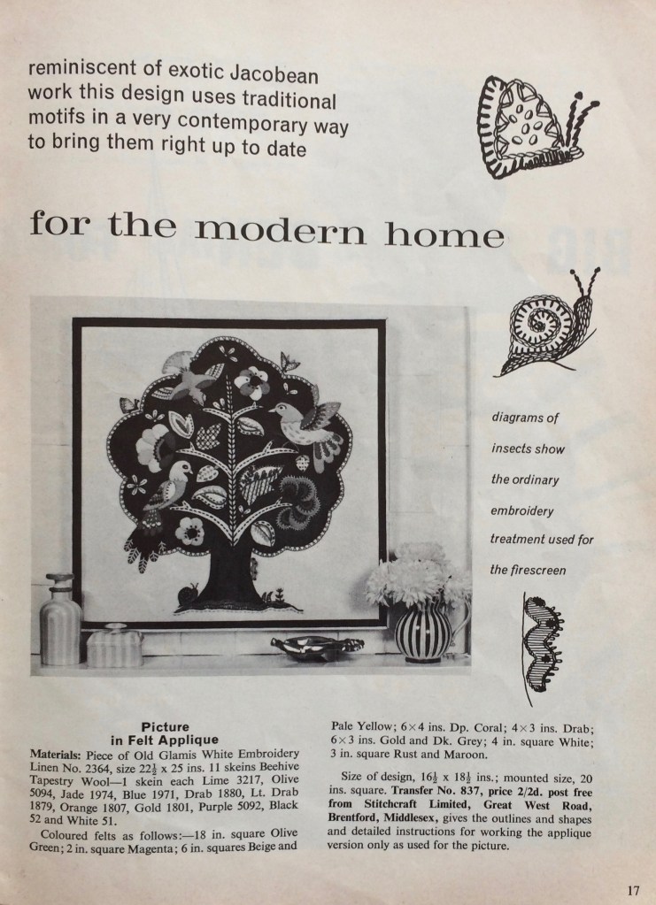
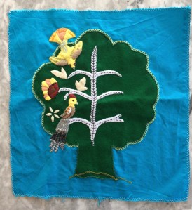
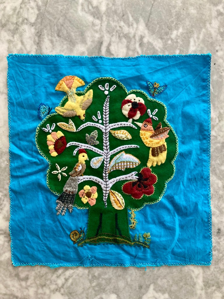
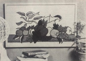
Embroidery and tapestry take a backseat to the autumn knits in this issue, with typical floral chair-back, apron, and traycloth designs. There’s a tapestry of four famous castles, a cross-stitch wall hanging with a poem about what type of wood to burn in a fireplace (I had never heard this rhyme, have any of you?) and a more complexly embroidered cushion of “Indian design”. I cannot vouch for its cultural authenticity, but the woven and latticed stitches are certainly striking and effective.
Speaking of cultural history, remember our little model Judy with her “trim Outfit” from 1960? (Of course you don’t, and I wouldn’t have recognised her either if her name weren’t in the caption.) Here she is, two years older, cutting a dash in her warm 3-piece play suit and all set to play with…
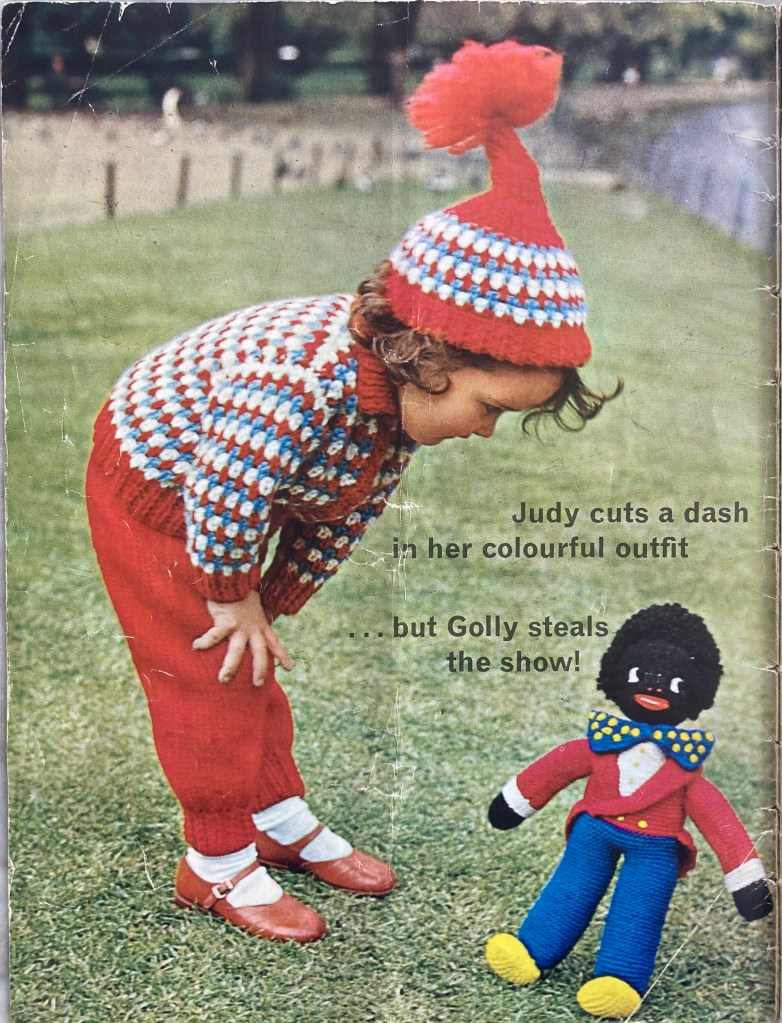
Ah, right. Her “Golly”, who “steals the show” and whom readers can also knit from a pattern in this issue. “He’s favourite”, writes our editress, and “everyone in the nursery loves Golly.” Who is he?
In 1895, the English-American cartoonist and illustrator Florence Kate Upton produced her first children’s book, titled The Adventures of Two Dutch Dolls and a Golliwogg. Over the next fourteen years, she and her mother Bertha collaborated on twelve more books starring the same characters. The books, and particularly the “Golliwog” character, enjoyed enormous popularity for at least sixty years afterwards and “Golly” dolls and toys as well as “golliwog” images on brand names and household products were practically ubiquitous in popular culture — particularly children’s culture — in the UK and elsewhere throughout the 1950s and 1960s.
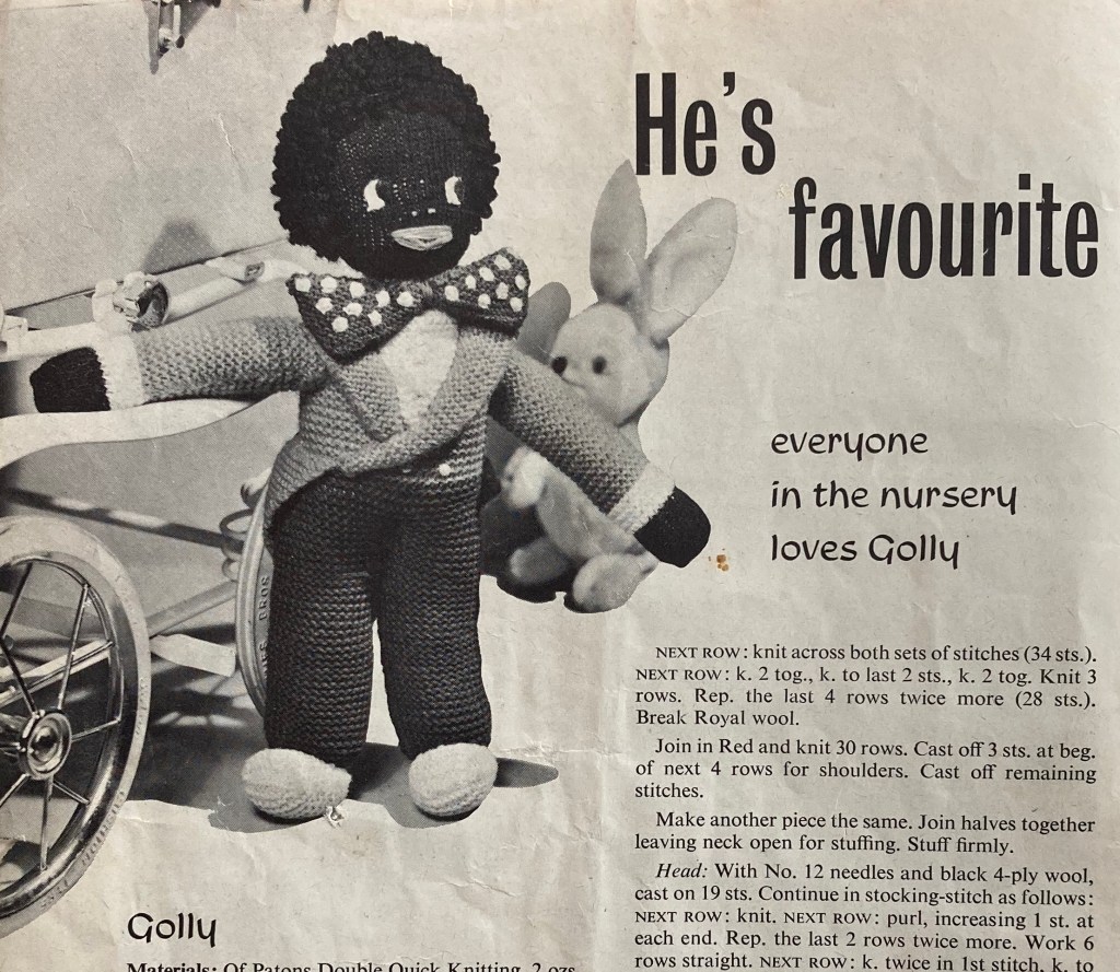
Though Upton intended the Golliwog(g) to be a positive character and the hero of the story, it can’t be denied that his representation is a racist caricature born of the blackface minstrel tradition in the United States. According to Upton herself, her inspiration for the character was a Black minstrel doll found in her house, and typical “Golly” representations show him with exaggerated, distorted features and wearing an outfit typical of minstrel performers in the early 20th century. Later literary and cultural depictions of “golliwogs” often portrayed them as animalistic, uncultured or criminal, thus reflecting and perpetuating negative racial stereotypes about Black people. Over time, the word “golliwog” and shortened forms of it became used and recognised as demeaning racial slurs.
Though many white Britons, Americans and Australians who grew up with golliwog dolls continue to claim that they are inoffensive (and capitalise on their popularity via Internet auctions and collectors’ organisations), it should be pretty obvious that they, and their related imagery, are problematic. For a more in-depth understanding of why, I encourage further reading, starting with this excellent article from the Jim Crow Museum of Racist Memorabilia at Ferris State University in Michigan (US).
It’s not the first or only time that Stitchcraft (like just about every other knitting/craft publication of its time) has featured patterns for toys or dolls that reflect stereotypes of particular ethnic groups or portray them as an “exotic Other”, even if those representations are supposed to be positive. Many patterns from the 1940s and 1950s are particularly offensive (take my word for it, I don’t want to show them here), as is the use, up until the late 1950s in some cases, of racial slurs as colour names for certain shades of wool (ditto). By the way, I have issues of Stitchcraft and many other vintage knitting magazines up to the mid-1970s and nowhere, in any of them, have I ever seen a model who was not white — the caricatures were also the only representation to be found. Let’s remember that, for all their fantastic fashions, the mid-century decades were definitely not the “good old days”.
On top of all that, there’s no pattern in this issue that I particularly want to make, so I’ll either embroider some anemones on a vegetable bag or finish up something from the WIP pile.


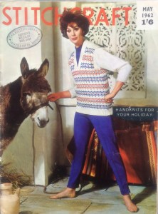 Handknits For Your Holiday! If you are planning on taking a holiday in 1962, that is. In that case, I would recommend going to the Algarve in southern Portugal, which, based on the pattern of the window shutters and blanket in the background, is where I am guessing this magnificent cover photo was taken. Sadly, my time machine is out of order and May 2020’s motto is (Lots Of ) Handknits For No Holidays This Year Or Probably Anytime Soon.


 “Easter Greetings” from Stitchcraft, April 1962! According to “editress” Patience Horne, “everyone is getting that “out-of-doors” feeling”. I and my fellow compatriots from 2020 have had a very much in-doors feeling for the last few weeks, as we watch Spring unfold from our quarantine windows.


 Springtime also means spring cleaning, and Easter means presents and


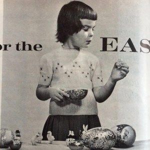 Greetings from the Covid-19 lockdown! March 1962’s project sports the headline “Ready for the Easter Parade” in the magazine, but there are definitely not going to be any Easter parades in March 2020. I hope all of you, dear readers, are staying healthy and staying home.

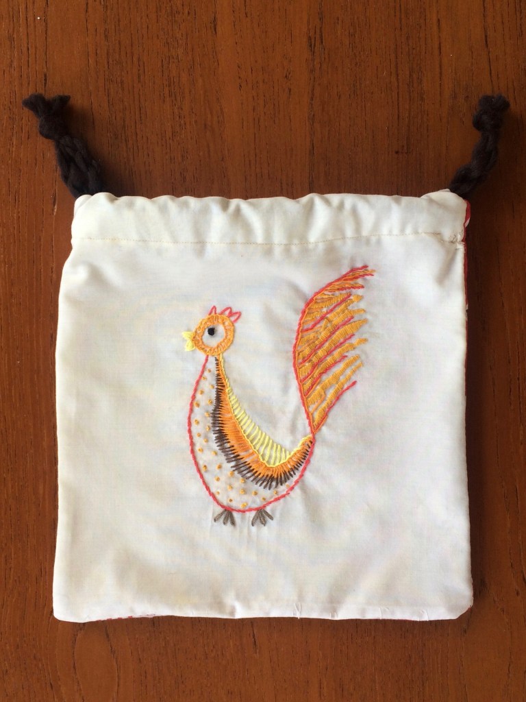
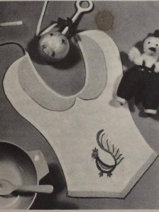 No, it’s not the menu choice for tonight’s dinner, don’t worry. My February 1962 was a little embroidered… animal , originally designed for a toddler’s “feeder” and which I adapted into a bag for vegetables/small projects/”stuff”. I say “animal” in this vague way because it is referred to as a “Squirrel” in the instructions, followed by more specific instructions on how to embroider the supposed squirrel’s beak and feathers. I can maybe, maybe forgive enough poetic license to call a squirrel’s mouth a “beak”, and the creature’s fluffy tail could be mistaken for a squirrel’s, but feathers… no. It also looks suspiciously like a chicken in the photo! So, not a squirrel, but a chicken and a proofreading error.


 Happy New Year, everyone! It’s 2020 in my real world and 1962 in my blog world. Where will Stitchcraft take us?


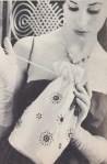 Technically, it was more of a “star-spangled burlap bag”, but that doesn’t have quite the same ring to it. Happy December, everyone! The 1961 festive holiday season, as envisioned by Stitchcraft magazine, involved at least a couple of glamorous parties and evenings out, for which this white satin drawstring clutch bag could be the perfect accessory.
 wink, and who knows if they had been treated with some kind of additional preservative chemical), I drew the motifs onto the bag with a wax embroidery-transfer pen, tracing around different sizes of button to get the circles, and embroidered them using leftover bits of pink and green embroidery cotton. I decided to forego the pearls and sequins and just made French knots instead. I also didn’t care too much about perfect symmetry or absolutely “clean” lines — I wanted it to look a little bit rough and homemade.


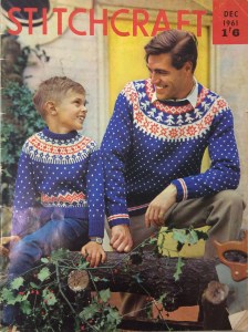 It’s that time of year again and December 1961’s issue has a lovely festive cover photo featuring matching father-son jumpers and a freshly-cut-down Christmas tree with holly branches. The jumpers are meant to be made in flat pieces with only the yoke worked in the round, but everything about them other than that is in the traditional Norwegian style, with a small snowflake pattern on the body and sleeves and a round yoke with tree and star patterns. I like that the jumpers’ pattern theme and colour choice are not so very specifically Christmas-y that they couldn’t be worn at any other time, or by people in our more diverse and modern times who don’t celebrate or don’t care much for Christmas and would just like a nice warm jumper with a wintery flair.


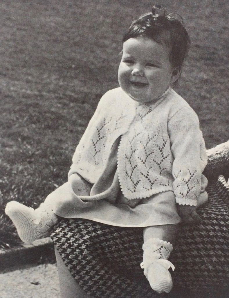
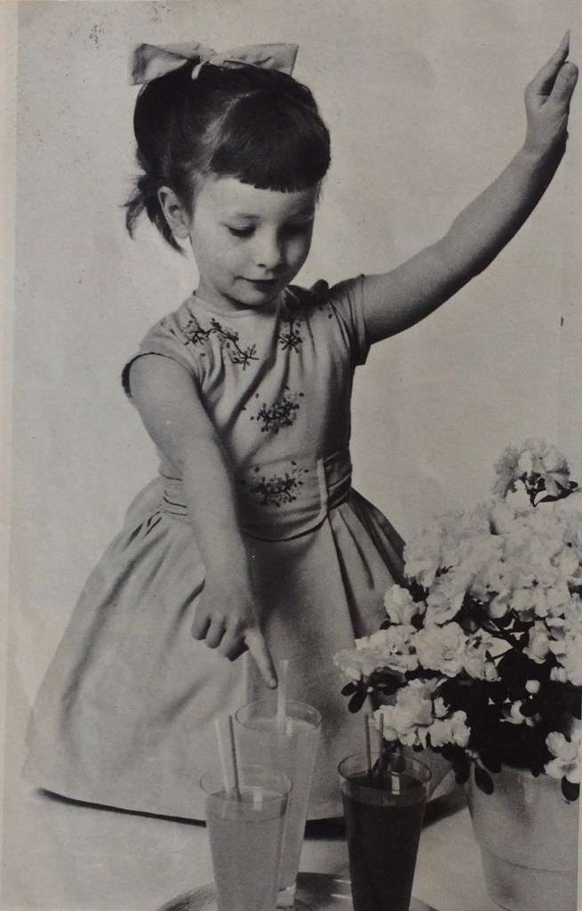
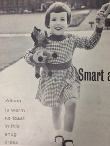 Children of all ages can look forward to practical, yet stylish winter garments — a knitted outdoor play-suit for toddlers in warm, bulky Big Ben, a smart fine-knit twin-set for girls of varying ages (sizes from 26-30 inch chest) and a wonderful knitted dress in a two-colour slip-stitch pattern that fits right into the tweed trend. The photo caption claims that Alison (the young model) is “warm as toast” but of course, her legs are going to be cold! She still seems pretty happy, though.
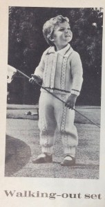


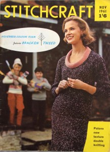 November is such a grey month, so it’s nice to see that Stitchcraft‘s November 1961 issue has the theme “Colour Flair”, featuring speckled yarns and a center page in colour. The issue showcases “Bracken Tweed”, Patons’ new double knitting wool. Bracken Tweed was one of the early multicolour yarns, mixing flecks of a lighter colour in with main strands of a darker colour to achieve a tweed effect. At its debut in 1961, it was 100% wool; with the change from ounces to grams in the late 1960s, the fiber content was changed to 60% wool and 40% acrylic.
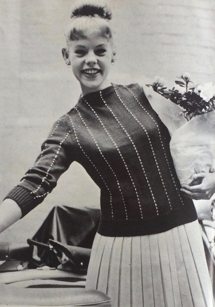
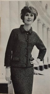 The Bracken two-piece dress on the cover is one of two ideas for “Separates with the BOUTIQUE LOOK”; the other is this wonderful suit, made with regular Patons Double Knitting and familiar nubbly Rimple. Note the deliberately too-short sleeves, designed to show off your gloves and bracelets! The slip-stitch pattern gives it a firm texture for more shape.


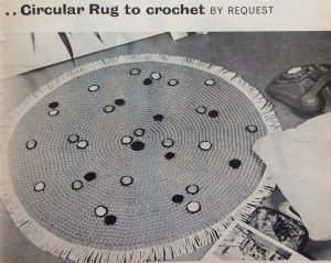 September’s project (finished only one day late) was this extremely 1960s crocheted green rug with black, white and orange embroidered spots (they “add a modern touch”) and fringe. Loved it!
 Felting wool, like rug wool, is bulky, mostly unprocessed, coarse and strong, so that was my first thought… but would it felt with use or washing? I decided to take the chance, since it’s easy to find, inexpensive and there happened to be some in the perfect colour at my local yarn shop. It’s the exact same shade of green as
  The crochet part was easy — just rounds of double crochet with regular increases — and went very quickly. You can see that the wool I ordered was from a different dye lot than the first skeins from the store, but I don’t mind. The embroidery was a bit tedious and the fringe posed a new problem: this type of old-fashioned cotton sew-on fringe is very much not in fashion and hard to find in stores these days. I hate buying things on the Internet, so I asked my friendly wool-shop owner from the store where I bought the wool what she thought, or if it could be ordered through the store. She suggested hand-knotting the fringe with cotton yarn in a similar colour to the rug. (the fringe in the original seems to be white or a lighter colour). I was eager to get the thing done and not wait for more elements to arrive, so I did it. I like the result! It’s stringier than the original, of course, but it makes the rug look like a sort of friendly amoeba. I like that.
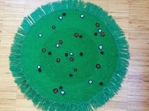 Wash-blocking it gently in cold water worked well and did not felt the wool. Also, it is going to live under my coffee table where it won’t get much foot traffic, so I’m not worried.
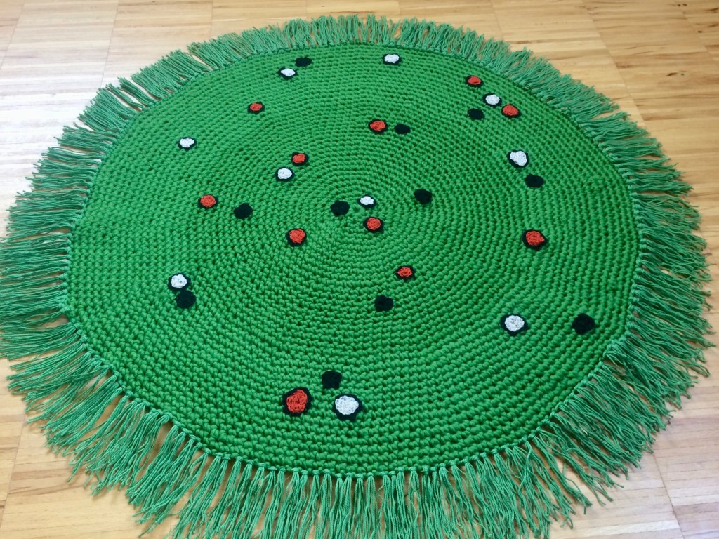
