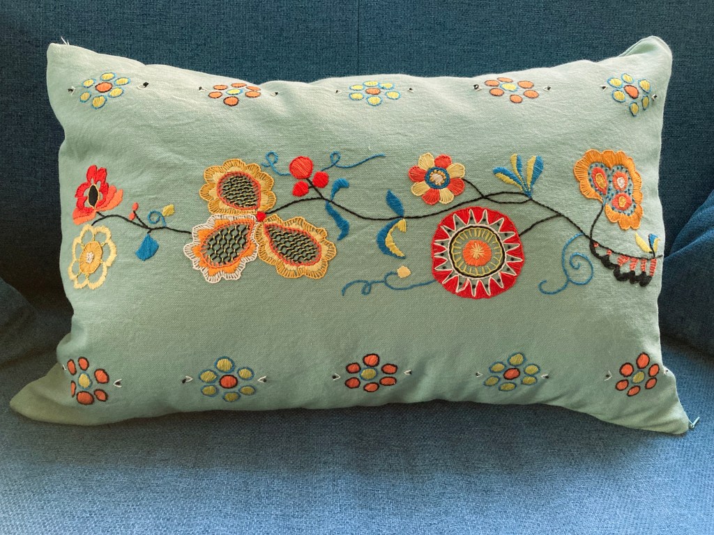
This month’s project — finished just on time! — was another embroidered cushion, larger and more ambitious than the previous ones I have made.
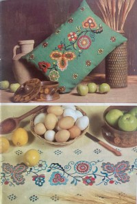
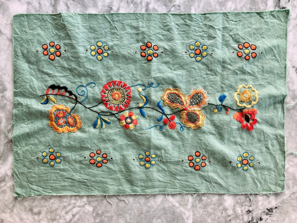
The cushion cover measures roughly 15×21 inches or almost 40×80 centimetres and features a highly stylised flower design in bold colours in the style of traditional Hungarian or Romanian designs. It is… interesting to note that Stitchcraft used very different appellations for traditional embroidery designs depending on the country or region they came from or which style they emulated. Typical Nordic designs were called “Scandinavian” or used the specific country name. Designs based on Indian, Persian, Chinese or Japanese works or styles usually used those country names. But anything related to a Southern or Eastern European tradition — Hungary, Romania, Czechoslovakia (one country at that time), Yugoslavia (country name at the time), Greece, etc. was a “peasant” design, with or without a specific country name. I’m sure it wasn’t meant in an insulting way (also pretty sure that most of Stitchcraft’s readers were descended from “peasants” if you go back far enough), but the word doesn’t quite sit right when you think about it in context; there is an unconscious bias at play, unfortunately typical for the time but worth noticing and pointing out when discussing vintage magazines now.
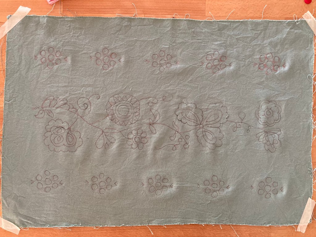
The design, in any case, is beautiful, and is given in two versions, for a cushion or a tablecloth border. As always, the biggest challenge is re-creating the transfer, which Stitchcraft readers at the time had to order separately. There is a colour photo, and helpfully, also a schematic diagram that is presumably exactly the same as the transfer, just smaller.
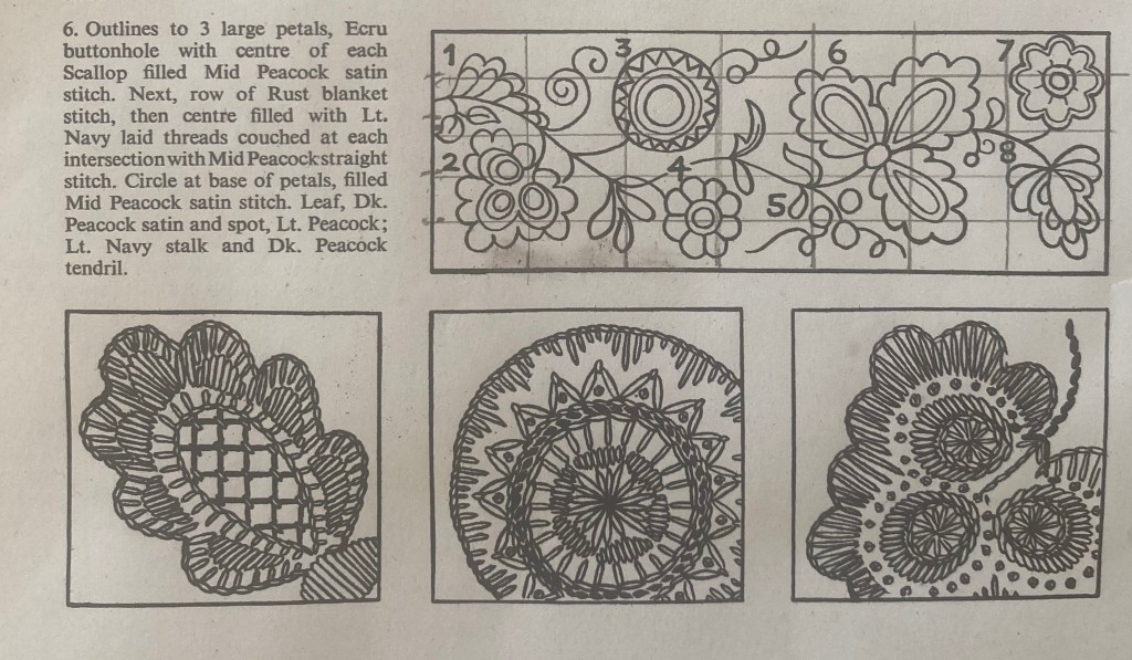
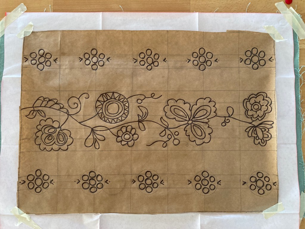
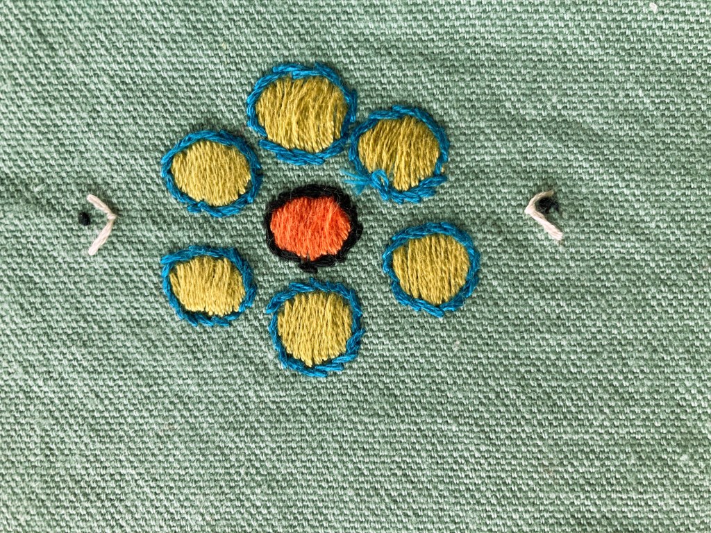
If the cushion were smaller, I might have been able to scan the diagram into the computer, adjust it to the correct size and print it out, then copy it onto the fabric with carbon transfer paper. Or even use the special embroidery printer paper that you can stick onto the fabric and wash off when the embroidery is done. But the design is much bigger than any paper my printer can print. I suppose I could have taken it to the print-and-copy shop, but I chose to enlarge the design the old-fashioned way, by drawing a grid over the diagram and the paper and copying it by hand. It’s a good exercise, and one I can certainly use more practice in. I transferred it with carbon paper and went over it with water-soluble pen. For the border flower circles, I marked the positions and just traced around a button.
My fabric was a fairly heavy furnishing linen in exactly the same colour as the original. The pattern is written for wool embroidery thread, which I would have had to order from the one little shop in Paris that sells it. It’s a wonderful shop, but I wanted to get the project started, so I just went with regular cotton crewel thread. The colours are Black, Peacock, Red, Rust, Dk Orange, Lt Orange, Gold, Yellow, Lime, and Cream. I used the photo and my own taste as a guide to all the shades of orange and yellow. My “Lime”, like the “Lime” in the photo, was more like a slightly greenish lemon, but it looked good (and probably accurately reflected the colour of any real limes available in England in 1964…) On working the embroidery, I noticed that the directions say “White” instead of “Cream”, but I was glad I had used the off-white — I think real white would have been too strong a contrast.
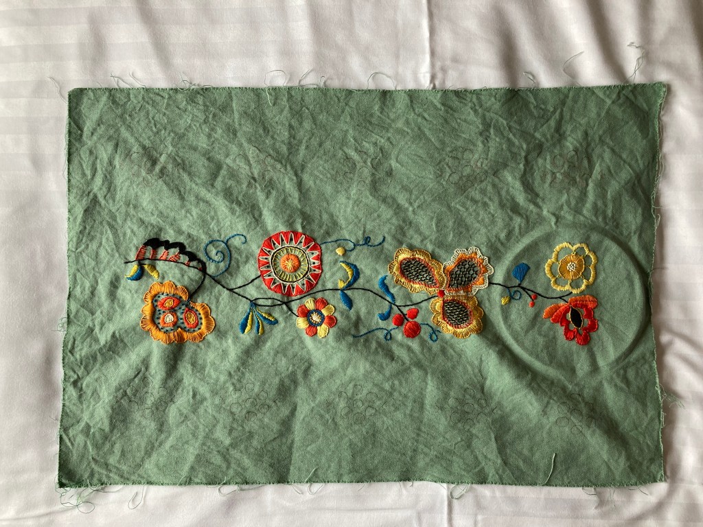
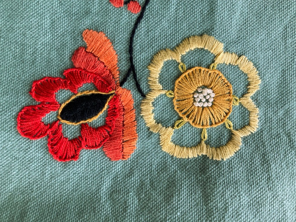
The stitches are all quite basic: stem, satin, buttonhole and blanket with some French knots and one use of Romanian stitch in the middle of the red and black flower. It was good practice for buttonhole stitch and French knots, which were my nemeses before, but have improved significantly due to this project.

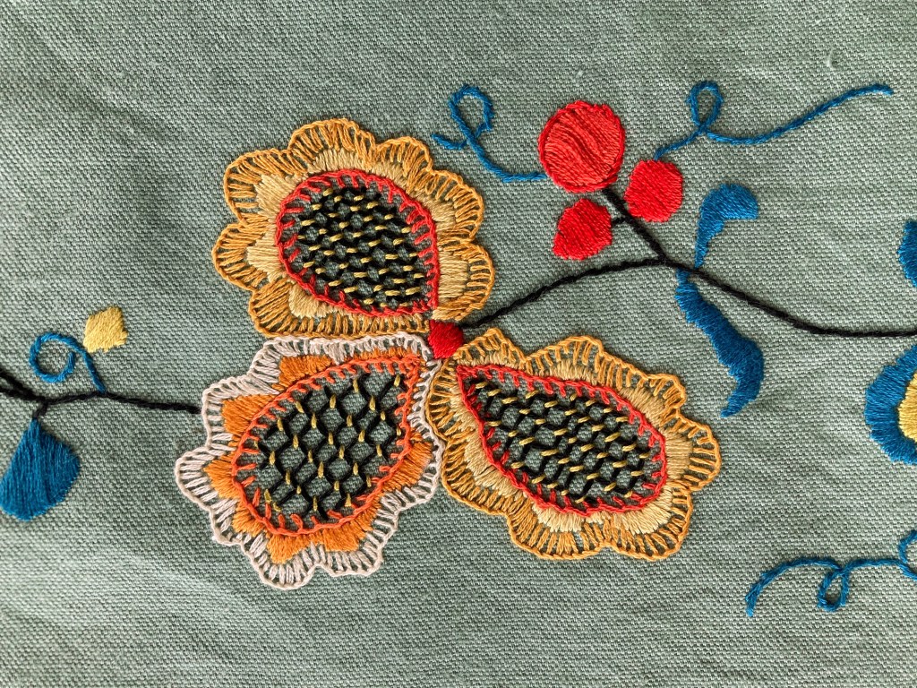
I realised while working it that the individual motifs weren’t quite big enough — in the original, they are much closer together, almost touching. There was no way I was going to re-do the entire transfer and start over, so I accepted it.
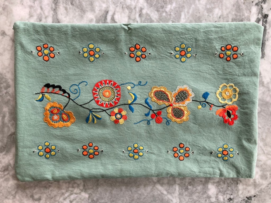
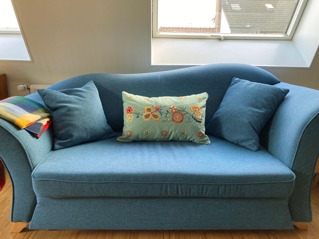
The work went surprisingly quickly, considering how large the cushion is. I made it up into a cover with the same fabric as a backing and a zipper close. A standard 40×80 cm bed pillow fits in it well. Though my embroidery skills are still a work in progress, I am very happy with the final result.
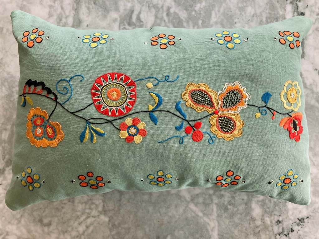
When I started this project, I had no plans for it after finishing — I have more cushions than couch/chair space, so I assumed I would give it away as a present or sell it. Happily, a colleague noticed me working on it during a break and loved it, saying it was the perfect colour for her sofa and the walls in the living room, and she offered to buy it! So it will have a good home and I earned a bit of money for the craft budget. Perfect.

The pillow looks great – your embroidery skills do it justice, and your color choices were the right ones, imo. Nice win-win for you and your colleague, too.
Interesting about the period nomenclature for “traditional” designs. Who’s a “peasant”, and who is not? 😉
LikeLiked by 1 person