 October 1961 gives us “Colour for autumn” with “special fashion features” and a great center spread with colour photos. “I always think October is a nice friendly month,” writes “editress” Patience Horne on the facing page, and I have to agree.
Bulky Big Ben wool and different kinds of textured rib stitches play a prominent role in this month’s issue, starting with the partner-look pullover and cardigan on the front cover. Both are made in the same drop-stitch rib pattern — basically 2×2 ribbing, but you drop a stitch down 3 rows every 4th row and pick it up again in the next row to make a long vertical rib. Children get twisted-rib raglan pullovers to keep their upper bodies nice and warm while their legs freeze in tiny shorts and mini-skirts, typical for the era.
Nubbly Rimple wool may be easing out of fashion, as there’s only one pattern for it in this issue: a simple, yet elegant dress with “the new horseshoe neckline.” Other women’s garments include a cabled cardigan with colour accents and matching cap, a long-line pullover with a wide collar (still in fashion) and saddle-stitching detail, and a cardigan jacket in a wonderfully ornate Florentine stitch that involves a lot of slipping, dropping and pulling stitches up and around in two colours. The finished effect is a lot like a trellis, accentuated here by posing the model in a green skirt and holding on to a plant. Autumn colours of gold, orange, and beige prevail.


There are some additions to the “Stitchcraft Layette” for the smallest member of the family, but we’ve moved on from the bramble-stitch pattern in the last few issues to a mix of cables and flower motifs. Both cardigan and blanket are pretty and useful, but I don’t like the huge dolman sleeves on the cardigan — I can see a baby getting their arm stuck inside it. The bottle cover with a fuzzy knitted kitten on it is great, though! If it were made somewhat smaller or larger, I could imagine it as a phone or tablet cover.


In the homewares and accessories department, we’ve got the usual teapot cosies (how many can one household have??), a knitted donkey named “Ned”, and a pair of “mitts for a scooter fan” — with separate thumb and first finger. There are tapestry patterns for a piano stool and a chair seat, and did you honestly think we were finished with the Zodiac theme, just because all the months had had their patterns already? Of course not! Now you can order the complete chart and embroider them all one more time on a tablecloth.


The back cover illustration shows two hand-made rugs using different techniques: flat crossed stitches for a woven effect, or stitching combined with pile knotting (latch hook), which was apparently the latest thing in Sweden at the time.

The highlight of the home art section, for me, is this sequinned, glittered appliqué wall hanging of some of Great Britain’s famous kings and queens. I don’t think I would hang it in my own home, but what a wild idea and the appliqué and embroidery work is certainly stunning. Look the detail on Queen Elizabeth (I)’s face! And they definitely found a wall with the perfect wallpaper to hang the sample piece on.


The “Readers Pages” have the usual ads, kiddy comic (Sally in Sampler Land), a preview of the next issue, and some easy counted-stitch ideas for borders on towels, pillowcases, etc. I love this ad for the latest Coats crochet booklet — it has flower-arranging lessons in addition to the crochet patterns.

That’s all for now! My October project will be the baby cardigan (with modified sleeves) and maybe some kind of phone-cover version of the kitten bottle cover.
 “Knitting with an Autumn Theme” is the motto of this month’s Stitchcraft from September, 1961. Knowing that September is the month where many knitters take up their needles again after not wanting to handle wool in the hot summer, I would have expected a “bumper issue” with extra ideas, new fashions from Paris, more colour photographs and so on. Not the case! It has more or less the same mix of “chunky”, bulky garments and easy homewares that we saw in the summer issues.
 probably will never be my style). The kid’s coat looks cosy and fun to wear, and the “gay sweaters for him and her” in a Norwegian-style pattern are warm, practical and unisex. I imagine the boatneck collar on an unshaped front must scratch horribly across the neck, though.


 “August is an issue that needs special thought and planning” writes Stitchcraft‘s “editress”, Patience Horne, in the introduction to the August issue, pointing out that it is “rather an “in-between” month for needleworkers” — often too hot to want to wear or make heavy sweaters and too late in the year for fine-knits. At the same time, reminding people that “Autumn is around the corner” can be “a little depressing” to people enjoying their late-summer holiday.


 My favourite, though, is this sewing project: a head cushion that lets you recline charmingly in bed with your hair and makeup perfectly done, your satin nightie on, a book on your lap and your telephone on your ear. It’s glamorous leisure and lifestyle advertising personified, and though they say it’s an “idea for your bazaar”, I would bet the Stitchcraft readers who made this in 1961 did not make it to sell.
 Apropos lifestyle advertising, the early 1960s Stitchcrafts show a rise in full-page ads for Patons and Baldwins wools. That’s obviously not surprising considering the magazine was published for the Patons wool company, but the full-page ads that “tell a story” are a new trend: the late 1950s and 1960s issues up to now had little celebrity testimonials. This one caters to grandmothers and the message is clear: Knitting is not only a rewarding pastime on its own, but earns you the love and affection of the grandchildren for whom you knit. (But only if the kid likes it, and that’s only guaranteed if you use P&B wools, of course.) The 1950s and 1960s saw a huge shift in advertising methods towards a psychologically-based system, which is a huge topic that I won’t start with here, but suffice to say there will be more of these ads, and that they are representative of changing advertising styles.
 The motto of the July 1961 issue is “Sew through the Summer” and indeed, there are a lot more sewing projects than one would normally find in Stitchcraft, summer being a time when many people do not want to hold wool in their hands or think about colder weather to come. There’s more emphasis on homewares and small, fun projects to make and use on holiday. The farm photos were taken in Hertfordshire and the boating photos in “the heart of London’s Little Venice”. Doesn’t that sound like fun? Let’s dive in!
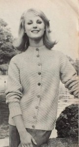
 a really pretty basketweave blouse with that V-neck-plus-collar design that we saw so much of in 1960 and the last years of the 1950s, not to mention just last month on the cover of the


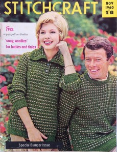
 I love this cover. The yellow stripes on the hats, the yellow trim on the sweaters and the yellow sans-serif lettering all harmonise perfectly with the off-white garments in the center focus. Even the models’ hair colour looks like it was chosen to match the wooden wall. And we can see that typical 1960s hairdo coming into fashion, with more volume on the top and curled ends.
 elephant! The dress is totally cute and definitely on my project list for this month, for my friend’s kid who just turned three. Those are seahorses, in case that wasn’t clear (the ones on the front panel of the dress and matching sunsuit look weird to me — I think I’ll fill in the bodies to make the shape more clear.) The sunsuit and dress are made in wool-nylon blend
  (Speaking of tiny children in goofy poses, am I the only one who finds this advertisement for next month’s Stitchcraft strangely funny? What is it about this baby that comes off looking so weird? Too much hair? The quasi-adult-looking face? The indescribable expression?)


 And then there’s this incredible birds-in-a-tree number, to be worked either in wool on linen for a firescreen or in felt appliqué with wool embroidery on linen for a picture. I’m normally not so crazy about 1950s and 1960s neo-Jacobean designs, but I love this one and definitely want to make the felt appliqué version as a cushion (with a more greeny green for the tree and not quite so much brown-orange-yellow in the appliqué work.) I imagine it might be tough without a transfer, but they gave us two very clear photographs including one in full colour, so what could go wrong?
 Last but not least, there’s a lovely, elegant two-piece suit in nubbly Rimple double knitting wool, featured in the most magnificent photo I have ever seen in any magazine, ever. If I remember correctly, I saw it in one of those Internet lists of “best/worst/weirdest knitting pattern photos” long before I started collecting vintage patterns. It’s definitely at the top of my list and if you haven’t seen it yet, you saw it here first!
 Time for the Summer Forecast! “Editress” Patience Horne writes that it is “a lovely sunny day in March” as they go to press for the May issue. It’s freezing cold and pouring rain where I am on May 2nd, so my summer forecast feelings have been literally dampened.


 April showers bring May flowers, or so they say. I’ll just say that, after the last couple of weeks of March, that umbrella on the cover of this month’s issue looks really familiar. As does the model on the right — she was featured (with a more flattering haircut) in many issues throughout the 1950s.
 to spend your holiday in April or May on the British isles or the North Sea coast, you will definitely want to wear one of the warm, bulky wool garments from this issue. “Jenny”‘s thick, double-knit Norwegian-style jumper and hat, described as “dazzling designs to cut a dash on the beach this summer”, tells you everything you need to know about that.


 Are you ready to “Rendez-vous with Spring”? I sure am! This month’s issue has a lovely extra “centerfold” spread in colour, showing off Spring 1961’s latest fashions.


 The ads are for the usual knitting machines and sewing fabrics… except for this one, for “Cooper’s moth proofer” spray, presumably made of


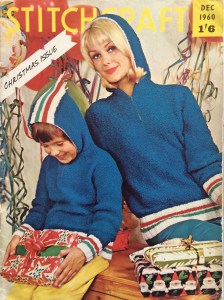 This year (1960 or 2018, take your pick) draws to a close with Stitchcraft’s “Christmas Issue”, which, as you may expect, is full of holiday-themed novelties to decorate and give.
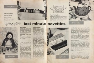


 Adult women, having hopefully embraced the “new length” (long) and “new sleeve style” (3/4 or 7/8) from last issue, can get ready for Paris’ “new necklines” — a high turn-down-and-rib combination or a buttoned-up turtle (polo) neck. No turn-down collars this time — are they on the way out? There’s a new yarn to go with them, Cameo Crepe, which is smooth and less “hairy” than other wools, for good stitch definition.


 Brrrr! November 1960’s Special Bumper Issue” brings us “Colour for the Cold Days” and an extra 16-page pull-out booklet of baby woollies. Sadly, so sadly, the booklet from my copy of this issue has been pulled out long ago and is missing.


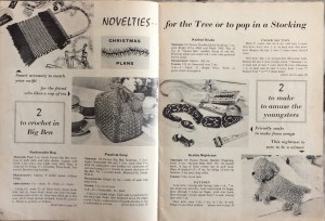 Homewares are still in a weird phase. The working woman or baby-boom mum (and those were overlapping categories, then as now) of 1960 didn’t have the time or patience to make too many elaborate Jacobean embroidery pieces or huge, detailed tapestries, especially not right before the great rush to get Christmas presents under the tree, so the focus is on quick, easy-to-make novelties for gifts. The aesthetic sense does seem to get lost a bit, though, if you ask me.


 (I notice that Word Press does not recognise the word “chairback”. They have been out of fashion for too many years, I guess, having fallen victim to cheaper furniture, more frequent hair-washings and less
 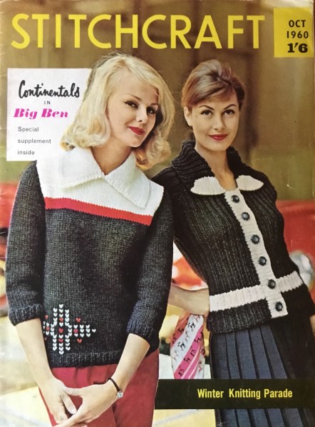 October and November are really the best months for knitting. The weather has gotten cold enough that you really want to wear and make warm, woolly things, and there’s the nice “surprise” of packing the winter clothes out of storage, and so remembering what nice hand-knitted pieces you made in other years. At least, that’s my experience.


