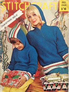
 It’s that time of year again and December 1961’s issue has a lovely festive cover photo featuring matching father-son jumpers and a freshly-cut-down Christmas tree with holly branches. The jumpers are meant to be made in flat pieces with only the yoke worked in the round, but everything about them other than that is in the traditional Norwegian style, with a small snowflake pattern on the body and sleeves and a round yoke with tree and star patterns. I like that the jumpers’ pattern theme and colour choice are not so very specifically Christmas-y that they couldn’t be worn at any other time, or by people in our more diverse and modern times who don’t celebrate or don’t care much for Christmas and would just like a nice warm jumper with a wintery flair.
1961 Stitchcraft, of course, celebrates Christmas in a big way. Most of the projects are either glamorous party-wear for the ladies or gifts of all sizes and sorts for family and friends, while the fashionable housewife can do her Christmas shopping in a flecked-tweed cardigan suit similar to the ones in the November 1961 issue, or keep warm on casual days with bulkier sweaters. Tweed and contrasting polo-neck collars are in fashion all around.


For those fancy parties and evenings out, there’s a cocktail jumper in popcorn stitch, an angora stole, and an embroidered and sequinned evening bag. The jumper is knitted with wool and Lurex yarn held together, giving it a bit of sparkle. The stole is absolutely timeless and modern as well as easy to make (a rectangle in simple lace pattern with garter-stitch borders) and probably quite warm and cosy to wear over your strapless evening gown at the theatre. The bag is fancy, yet inexpensive to make, with a very 1960s “modern” look. Even after the party and the night out are over, you can still look glamorous in a knitted pink bedcape.


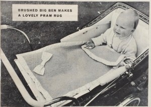
 Children of all ages can look forward to practical, yet stylish winter garments — a knitted outdoor play-suit for toddlers in warm, bulky Big Ben, a smart fine-knit twin-set for girls of varying ages (sizes from 26-30 inch chest) and a wonderful knitted dress in a two-colour slip-stitch pattern that fits right into the tweed trend. The photo caption claims that Alison (the young model) is “warm as toast” but of course, her legs are going to be cold! She still seems pretty happy, though.
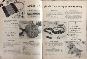
For me, the best, and sometimes goofiest, projects of every December Stitchcraft issue are the homewares and “novelty gifts”. This year, some are quite normal, like the snowflake-pattern table mats “for a supper party” pictured above, a cutwork tablecloth, or the tapestry stool cover in a diagonal Florentine pattern. Some are specifically winter- or Christmas-themed, such as the knitted cushion and a framed tapestry picture of angels. Two are very classic and beautiful and have nothing to do with “the season” — a typical Jacobean chairback and a very pretty tray cloth embroidered with anemones. They are all quite nice, if not particularly special.


And then there are the novelty gift ideas, or, as they are titled here, “gay mascots.”
The knitted teddy bear is nice enough, but looks quite stern with its unsmiling mouth and sharp, downward-pointing eyebrows. The snowman egg cosy… well, if you really feel the need to use an egg cosy, fine, it looks cheerful enough. Ivy-leaf pincushion, OK. The bear cub, though, looks like it’s about to attack! Something about its half-smile and the glint in its eye makes it look malicious. And the Father Christmas egg cosy… it’s hard for me to express exactly what’s wrong with it, but if I woke up on Christmas morning and found him on my breakfast place, I would expect to be getting coal in my stocking. Give me a gay mascot any day, but maybe not exactly these ones?!?

I guess it shows just how difficult it is to embroider faces.
Our “Readers’ Pages” have the usual ads for fabric remnants and sewing machines as well as an extra pattern for a little knitted and embroidered scarf, some traditional Swedish pattern motifs and review of the exhibition of Swedish embroidery recently held at the Embroiderers’ Guild, and a comic in which Little Bobby gets a skiing lesson from a friendly snowman.
Merry Christmas to all of you who celebrate it and happy winter days to all! My December project will be to finish some of the many WIPs lying around (including the November blazer, I swear it is almost done) and use the evening-bag embroidery motifs on something fun and small like dinner napkins or a vegetable bag.
 November is such a grey month, so it’s nice to see that Stitchcraft‘s November 1961 issue has the theme “Colour Flair”, featuring speckled yarns and a center page in colour. The issue showcases “Bracken Tweed”, Patons’ new double knitting wool. Bracken Tweed was one of the early multicolour yarns, mixing flecks of a lighter colour in with main strands of a darker colour to achieve a tweed effect. At its debut in 1961, it was 100% wool; with the change from ounces to grams in the late 1960s, the fiber content was changed to 60% wool and 40% acrylic.
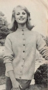
 The Bracken two-piece dress on the cover is one of two ideas for “Separates with the BOUTIQUE LOOK”; the other is this wonderful suit, made with regular Patons Double Knitting and familiar nubbly Rimple. Note the deliberately too-short sleeves, designed to show off your gloves and bracelets! The slip-stitch pattern gives it a firm texture for more shape.


 September’s project (finished only one day late) was this extremely 1960s crocheted green rug with black, white and orange embroidered spots (they “add a modern touch”) and fringe. Loved it!
 Felting wool, like rug wool, is bulky, mostly unprocessed, coarse and strong, so that was my first thought… but would it felt with use or washing? I decided to take the chance, since it’s easy to find, inexpensive and there happened to be some in the perfect colour at my local yarn shop. It’s the exact same shade of green as
  The crochet part was easy — just rounds of double crochet with regular increases — and went very quickly. You can see that the wool I ordered was from a different dye lot than the first skeins from the store, but I don’t mind. The embroidery was a bit tedious and the fringe posed a new problem: this type of old-fashioned cotton sew-on fringe is very much not in fashion and hard to find in stores these days. I hate buying things on the Internet, so I asked my friendly wool-shop owner from the store where I bought the wool what she thought, or if it could be ordered through the store. She suggested hand-knotting the fringe with cotton yarn in a similar colour to the rug. (the fringe in the original seems to be white or a lighter colour). I was eager to get the thing done and not wait for more elements to arrive, so I did it. I like the result! It’s stringier than the original, of course, but it makes the rug look like a sort of friendly amoeba. I like that.
 Wash-blocking it gently in cold water worked well and did not felt the wool. Also, it is going to live under my coffee table where it won’t get much foot traffic, so I’m not worried.
 “Knitting with an Autumn Theme” is the motto of this month’s Stitchcraft from September, 1961. Knowing that September is the month where many knitters take up their needles again after not wanting to handle wool in the hot summer, I would have expected a “bumper issue” with extra ideas, new fashions from Paris, more colour photographs and so on. Not the case! It has more or less the same mix of “chunky”, bulky garments and easy homewares that we saw in the summer issues.
 probably will never be my style). The kid’s coat looks cosy and fun to wear, and the “gay sweaters for him and her” in a Norwegian-style pattern are warm, practical and unisex. I imagine the boatneck collar on an unshaped front must scratch horribly across the neck, though.


 Stitchcraft‘s August 1961 “Late Summer” issue had multiple cute, easy embroidery and tapestry projects. Mine was this little set of rose sprays. To show the versatility of the designs, the magazine usually had directions for and photos of the designs made on different items: a cushion and/or tray cloth, for example. Overall, there was a huge range of homewares that could potentially be embroidered: an apron, a place mat, a chair-back, a wall hanging, a “nightie case”, a project bag, a finger plate, a fire screen, even a room divider or a waste-paper basket cover. This issue added a new idea to the mix: the rose-spray design on a lampshade, complete with a pattern to cut out, sew and fringe the lampshade cover itself.
 Of course, they don’t have to be embroidered, but why not? Cotton embroidery floss is machine-washable even at high temperatures and I have plenty of scraps and bits of plain linen or cotton materials that can be put to good purpose. The bag I made for this August project was made from a piece of linen from shoes, yes, shoes that a friend bought (the shoes came wrapped in this piece of fabric in the shoe box instead of in paper.) I had enough embroidery floss on hand, so this was an almost 100% up-cycled / didn’t have to buy anything new project. (I say almost because I bought the cord for the drawstrings — then realised I could have made monks’ cord or i-cord from leftover cotton yarn. Next time…)
 The design is of
 “August is an issue that needs special thought and planning” writes Stitchcraft‘s “editress”, Patience Horne, in the introduction to the August issue, pointing out that it is “rather an “in-between” month for needleworkers” — often too hot to want to wear or make heavy sweaters and too late in the year for fine-knits. At the same time, reminding people that “Autumn is around the corner” can be “a little depressing” to people enjoying their late-summer holiday.


 My favourite, though, is this sewing project: a head cushion that lets you recline charmingly in bed with your hair and makeup perfectly done, your satin nightie on, a book on your lap and your telephone on your ear. It’s glamorous leisure and lifestyle advertising personified, and though they say it’s an “idea for your bazaar”, I would bet the Stitchcraft readers who made this in 1961 did not make it to sell.
 Apropos lifestyle advertising, the early 1960s Stitchcrafts show a rise in full-page ads for Patons and Baldwins wools. That’s obviously not surprising considering the magazine was published for the Patons wool company, but the full-page ads that “tell a story” are a new trend: the late 1950s and 1960s issues up to now had little celebrity testimonials. This one caters to grandmothers and the message is clear: Knitting is not only a rewarding pastime on its own, but earns you the love and affection of the grandchildren for whom you knit. (But only if the kid likes it, and that’s only guaranteed if you use P&B wools, of course.) The 1950s and 1960s saw a huge shift in advertising methods towards a psychologically-based system, which is a huge topic that I won’t start with here, but suffice to say there will be more of these ads, and that they are representative of changing advertising styles.
 The motto of the July 1961 issue is “Sew through the Summer” and indeed, there are a lot more sewing projects than one would normally find in Stitchcraft, summer being a time when many people do not want to hold wool in their hands or think about colder weather to come. There’s more emphasis on homewares and small, fun projects to make and use on holiday. The farm photos were taken in Hertfordshire and the boating photos in “the heart of London’s Little Venice”. Doesn’t that sound like fun? Let’s dive in!
 a really pretty basketweave blouse with that V-neck-plus-collar design that we saw so much of in 1960 and the last years of the 1950s, not to mention just last month on the cover of the


 I love this cover. The yellow stripes on the hats, the yellow trim on the sweaters and the yellow sans-serif lettering all harmonise perfectly with the off-white garments in the center focus. Even the models’ hair colour looks like it was chosen to match the wooden wall. And we can see that typical 1960s hairdo coming into fashion, with more volume on the top and curled ends.
 elephant! The dress is totally cute and definitely on my project list for this month, for my friend’s kid who just turned three. Those are seahorses, in case that wasn’t clear (the ones on the front panel of the dress and matching sunsuit look weird to me — I think I’ll fill in the bodies to make the shape more clear.) The sunsuit and dress are made in wool-nylon blend
  (Speaking of tiny children in goofy poses, am I the only one who finds this advertisement for next month’s Stitchcraft strangely funny? What is it about this baby that comes off looking so weird? Too much hair? The quasi-adult-looking face? The indescribable expression?)


 And then there’s this incredible birds-in-a-tree number, to be worked either in wool on linen for a firescreen or in felt appliqué with wool embroidery on linen for a picture. I’m normally not so crazy about 1950s and 1960s neo-Jacobean designs, but I love this one and definitely want to make the felt appliqué version as a cushion (with a more greeny green for the tree and not quite so much brown-orange-yellow in the appliqué work.) I imagine it might be tough without a transfer, but they gave us two very clear photographs including one in full colour, so what could go wrong?
 Last but not least, there’s a lovely, elegant two-piece suit in nubbly Rimple double knitting wool, featured in the most magnificent photo I have ever seen in any magazine, ever. If I remember correctly, I saw it in one of those Internet lists of “best/worst/weirdest knitting pattern photos” long before I started collecting vintage patterns. It’s definitely at the top of my list and if you haven’t seen it yet, you saw it here first!
 Time for the Summer Forecast! “Editress” Patience Horne writes that it is “a lovely sunny day in March” as they go to press for the May issue. It’s freezing cold and pouring rain where I am on May 2nd, so my summer forecast feelings have been literally dampened.


 April showers bring May flowers, or so they say. I’ll just say that, after the last couple of weeks of March, that umbrella on the cover of this month’s issue looks really familiar. As does the model on the right — she was featured (with a more flattering haircut) in many issues throughout the 1950s.
 to spend your holiday in April or May on the British isles or the North Sea coast, you will definitely want to wear one of the warm, bulky wool garments from this issue. “Jenny”‘s thick, double-knit Norwegian-style jumper and hat, described as “dazzling designs to cut a dash on the beach this summer”, tells you everything you need to know about that.


 My Stitchcraft project this month was a simple embroidered spray of flowers, originally intended as a decoration for a cushion or traycloth. Having enough cushions and not using traycloths, I updated the design for an iPad cover similar to


 Are you ready to “Rendez-vous with Spring”? I sure am! This month’s issue has a lovely extra “centerfold” spread in colour, showing off Spring 1961’s latest fashions.


 The ads are for the usual knitting machines and sewing fabrics… except for this one, for “Cooper’s moth proofer” spray, presumably made of


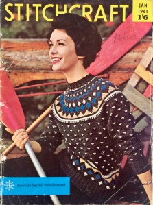 Happy New Year 2019! Or 1961, if you prefer. January 1961’s issue “starts with a swing” with “lots of colour” and “tip-top designs” like the gorgeous Greenlandic-style sweater on the cover.


 This year (1960 or 2018, take your pick) draws to a close with Stitchcraft’s “Christmas Issue”, which, as you may expect, is full of holiday-themed novelties to decorate and give.


 Adult women, having hopefully embraced the “new length” (long) and “new sleeve style” (3/4 or 7/8) from last issue, can get ready for Paris’ “new necklines” — a high turn-down-and-rib combination or a buttoned-up turtle (polo) neck. No turn-down collars this time — are they on the way out? There’s a new yarn to go with them, Cameo Crepe, which is smooth and less “hairy” than other wools, for good stitch definition.


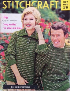 Brrrr! November 1960’s Special Bumper Issue” brings us “Colour for the Cold Days” and an extra 16-page pull-out booklet of baby woollies. Sadly, so sadly, the booklet from my copy of this issue has been pulled out long ago and is missing.


 Homewares are still in a weird phase. The working woman or baby-boom mum (and those were overlapping categories, then as now) of 1960 didn’t have the time or patience to make too many elaborate Jacobean embroidery pieces or huge, detailed tapestries, especially not right before the great rush to get Christmas presents under the tree, so the focus is on quick, easy-to-make novelties for gifts. The aesthetic sense does seem to get lost a bit, though, if you ask me.


 (I notice that Word Press does not recognise the word “chairback”. They have been out of fashion for too many years, I guess, having fallen victim to cheaper furniture, more frequent hair-washings and less