“The LAST of the SUN” is the headline of the introductory page of Stitchcraft’s August 1967 issue, and there is no blurb about the latest fashions or designs: just the subtitle “fashion for late holidays and the first smoky days.” (That the first cooler days of the year were called “smoky” is presumably meant quite literally, seeing that a good portion of family homes in the UK were still heated with coal fires in 1967.) The late-summer fashions in this issue are warmer, but still sunny and colourful, with layered and mid-weight garments that can be worn indoors or out.
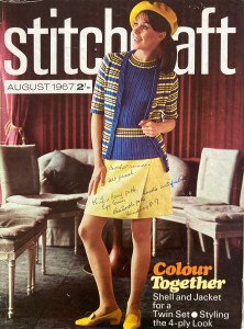
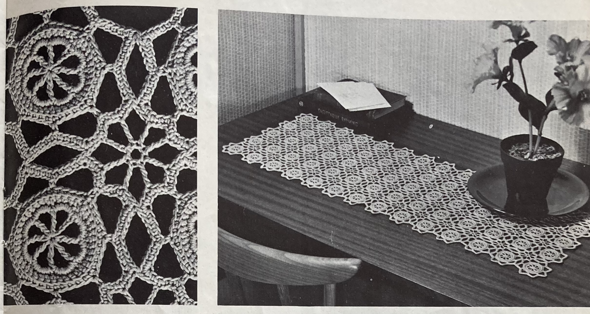
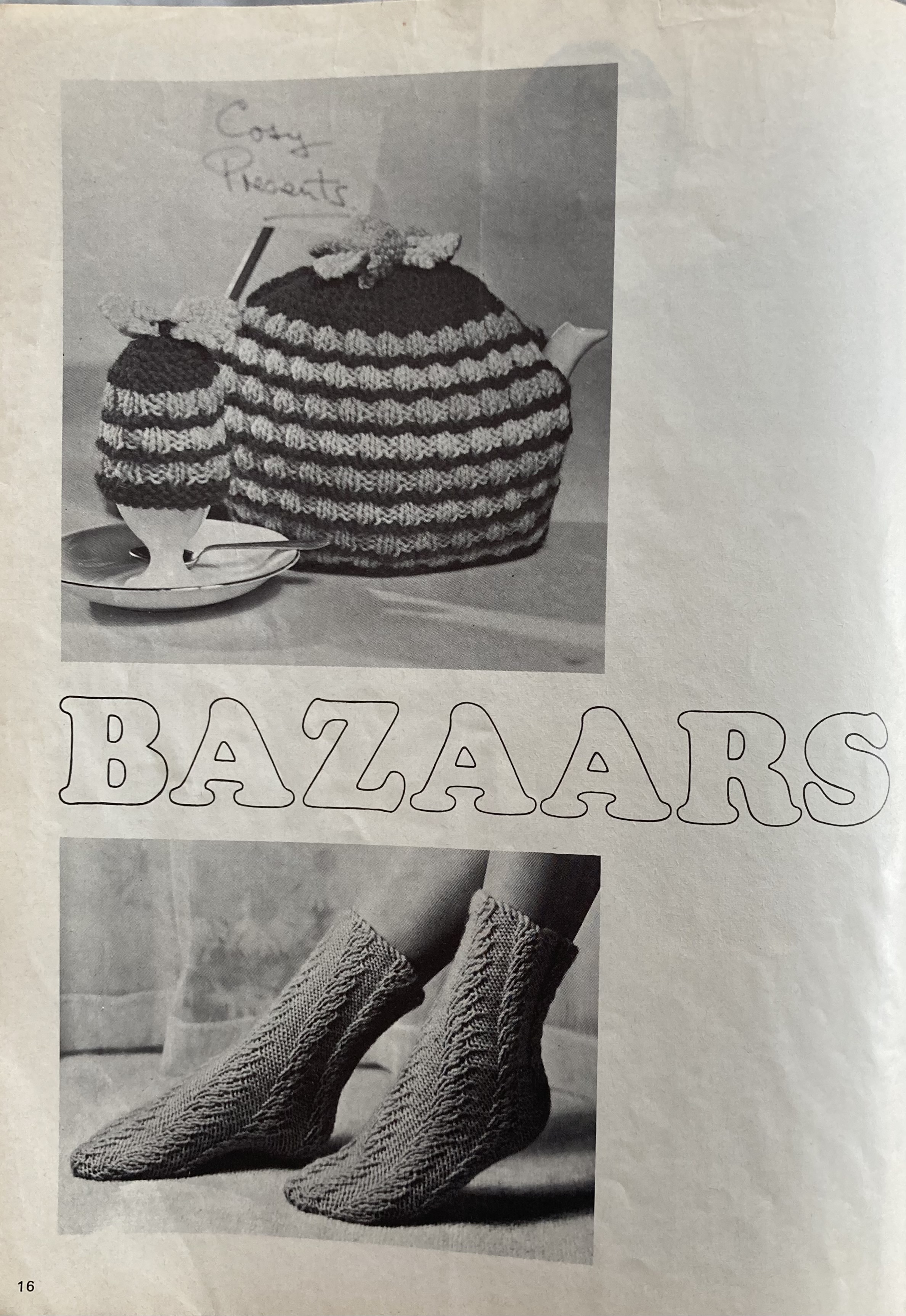
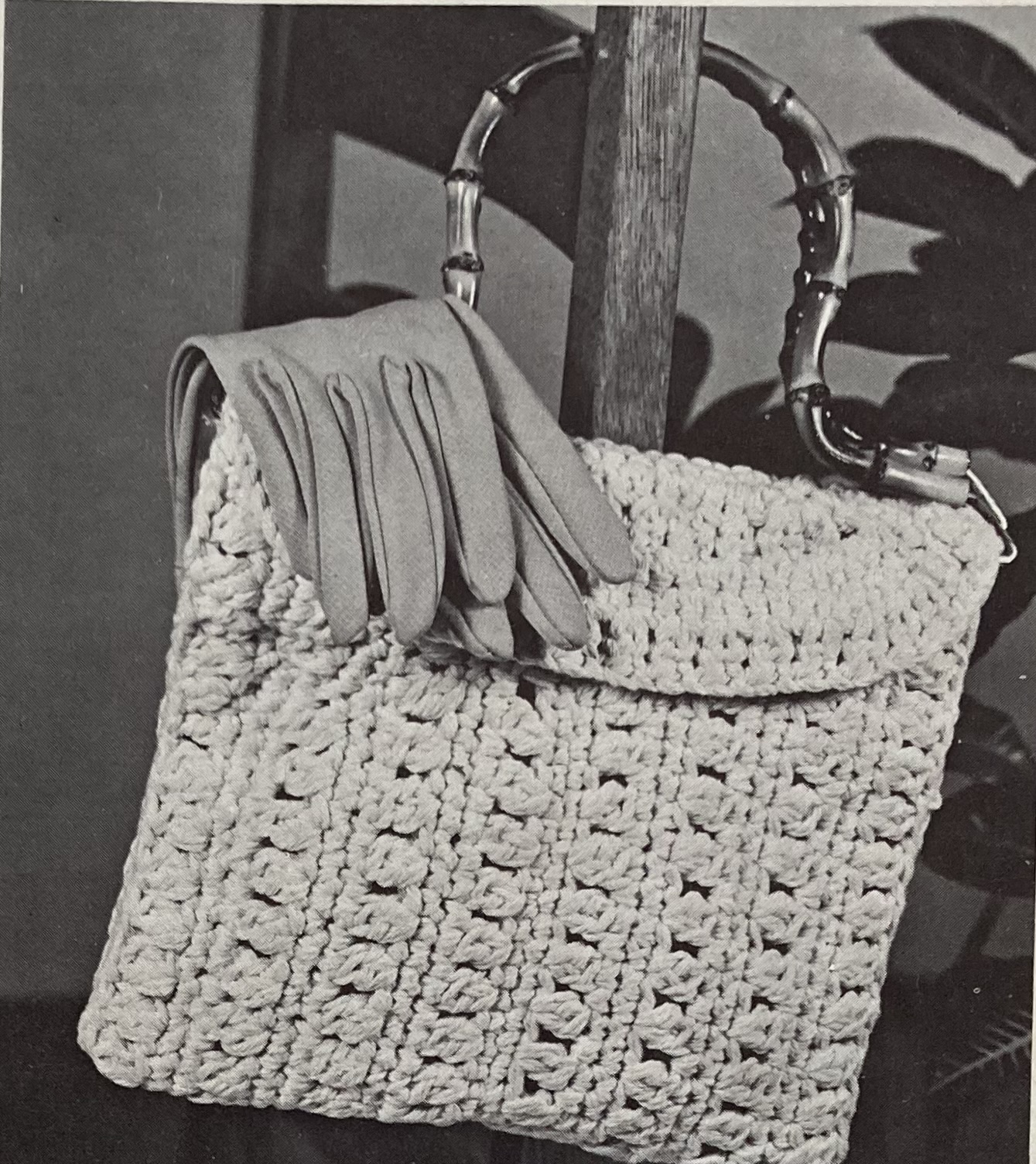
Case in point: the cover design, a twin-set of sleeveless “shell” and lightweight cardigan with elbow sleeves in cheerful, sunny yellow and blue. Note how short skirts have gotten! I think this might be the first Stitchcraft cover photo that features a true miniskirt. My copy of this issue was clearly used — according to the handwritten notes on the cover, the previous owner was interested in the crochet runner, the felt panel, the knitted tea cosy, egg cosies, and bed socks on page 16, and the handbag on page 17.
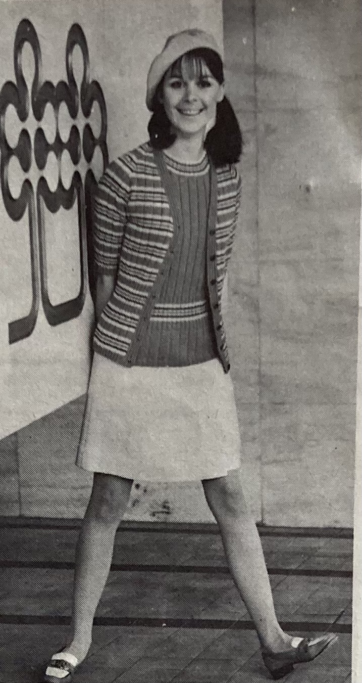
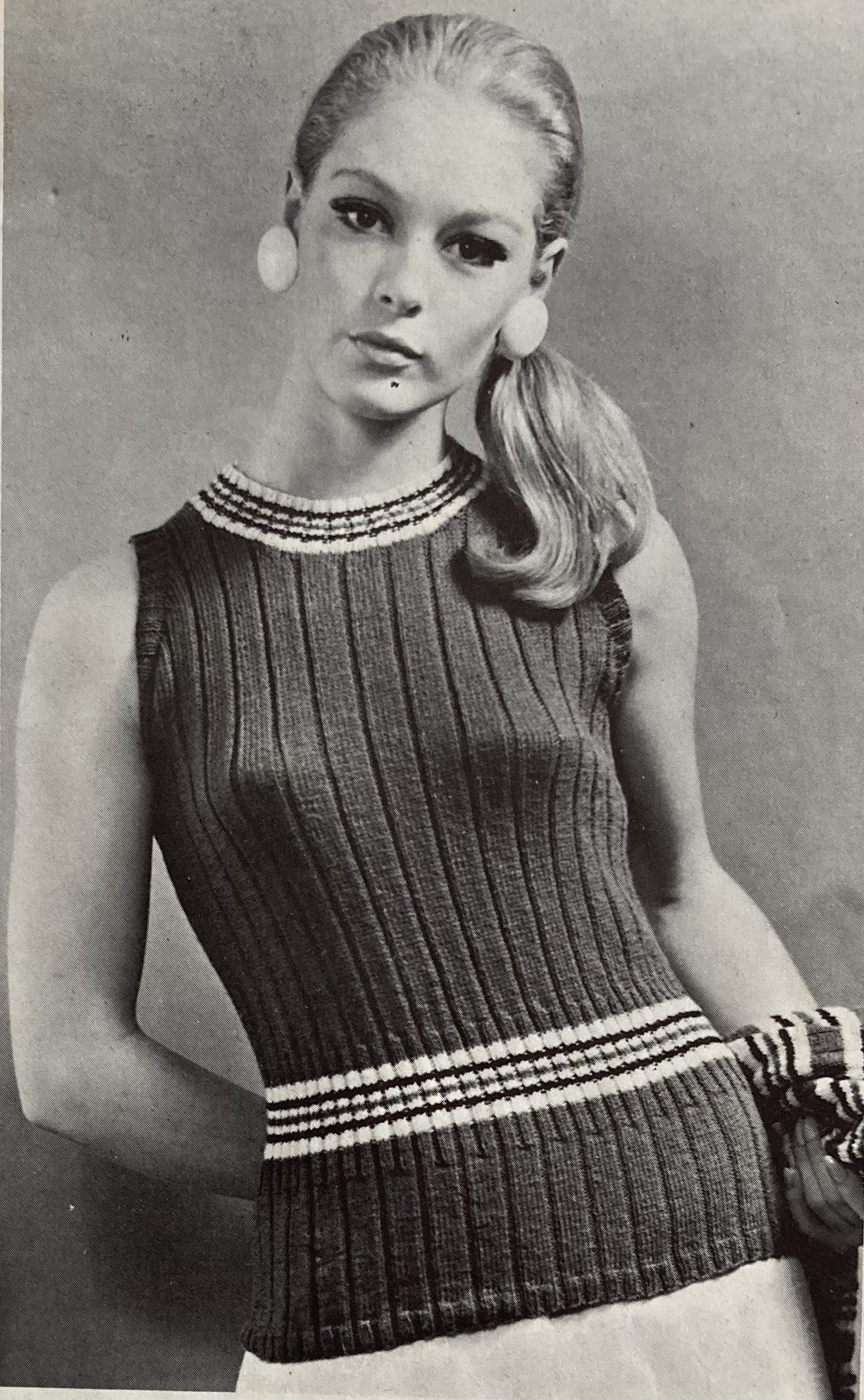
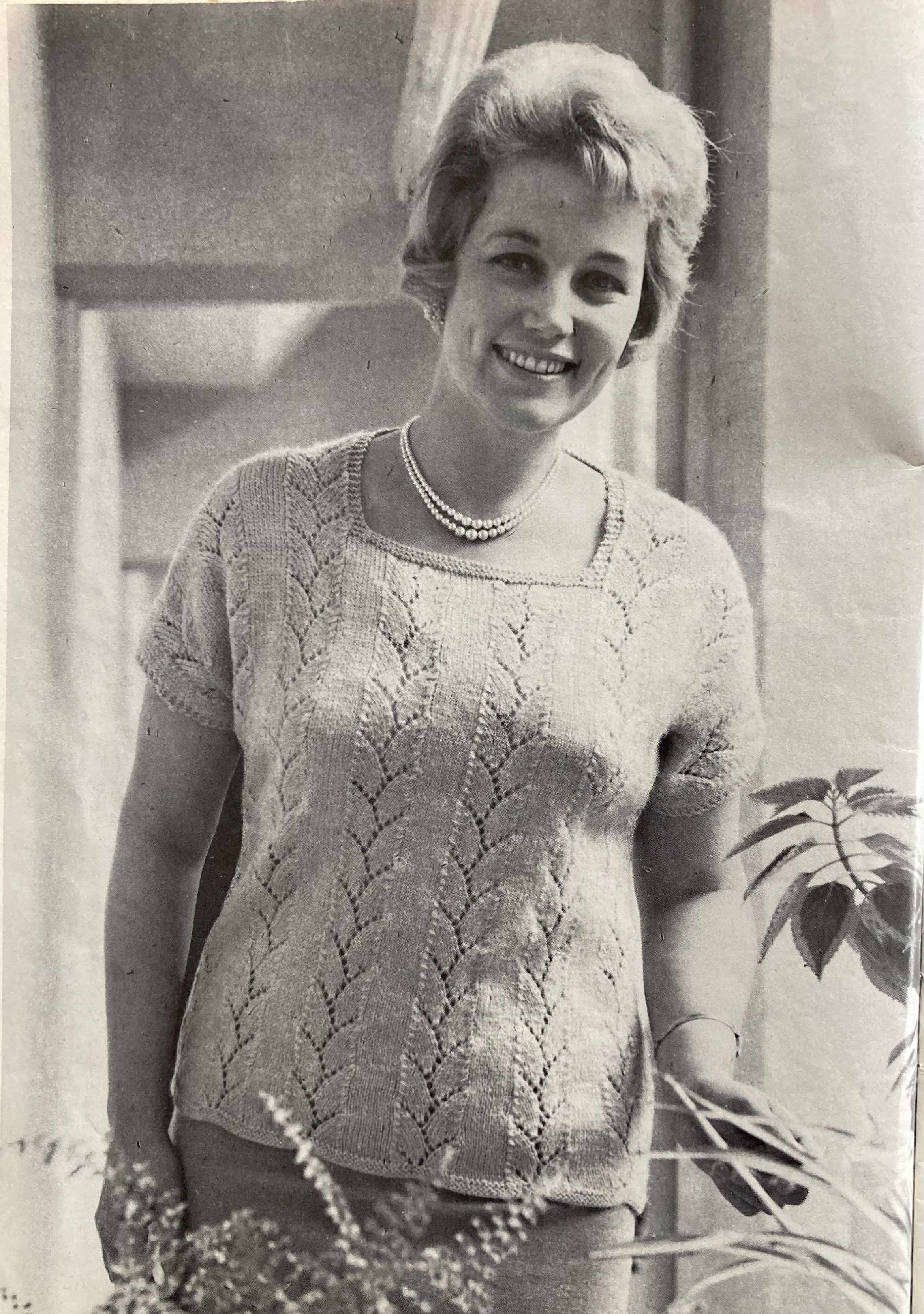
The other women’s fashions include a lacy top in larger sizes (to fit 42/44/46 inch bust), a two-colour shirtdress in a slip-stitch pattern, two short-sleeved knitted jumpers, and a heavier saddle-shoulder cardigan to work as a jacket on those cooler days. With the exception of the larger-sizes jumper in pastel “Camelia” pink, bold colours prevail: yellow, pink, red, or blue tones. (The saddle-shoulder cardigan is navy blue with white.) There are more colour photos in this issue than in previous issues.

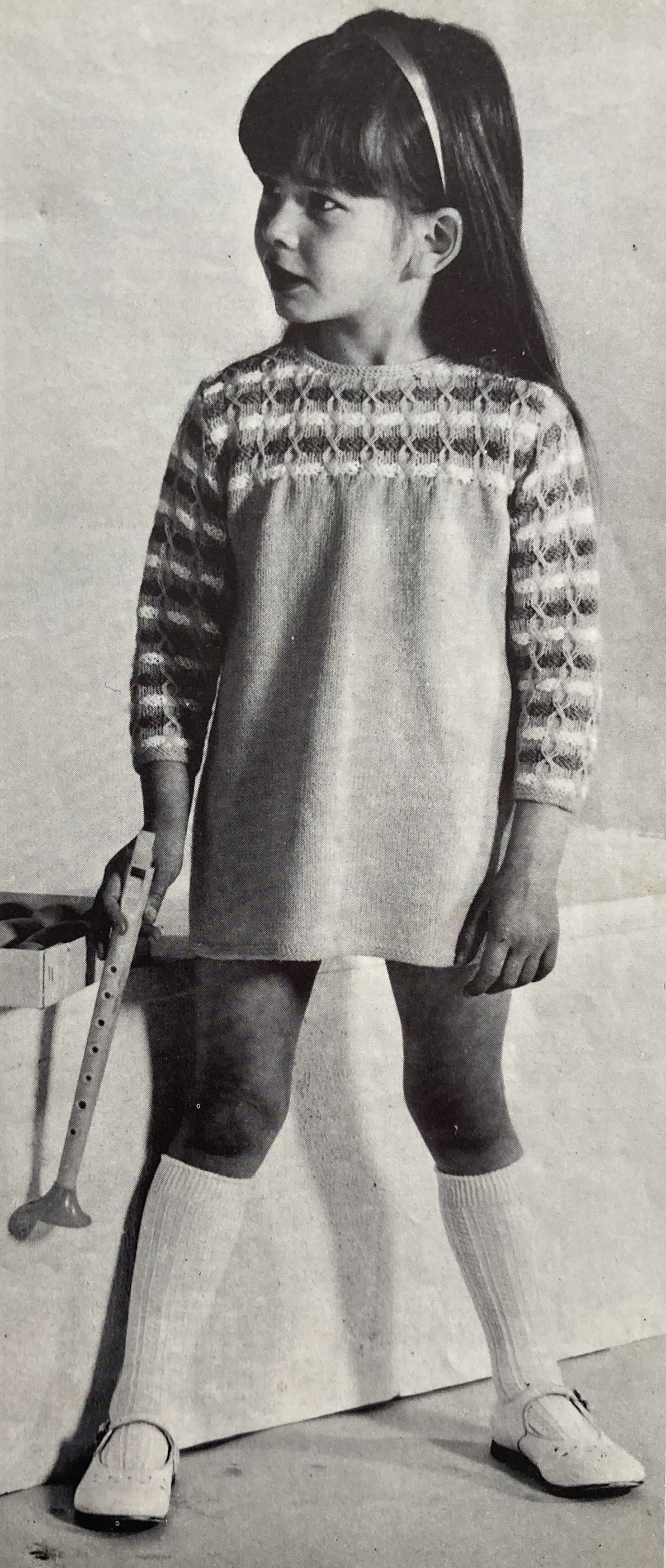
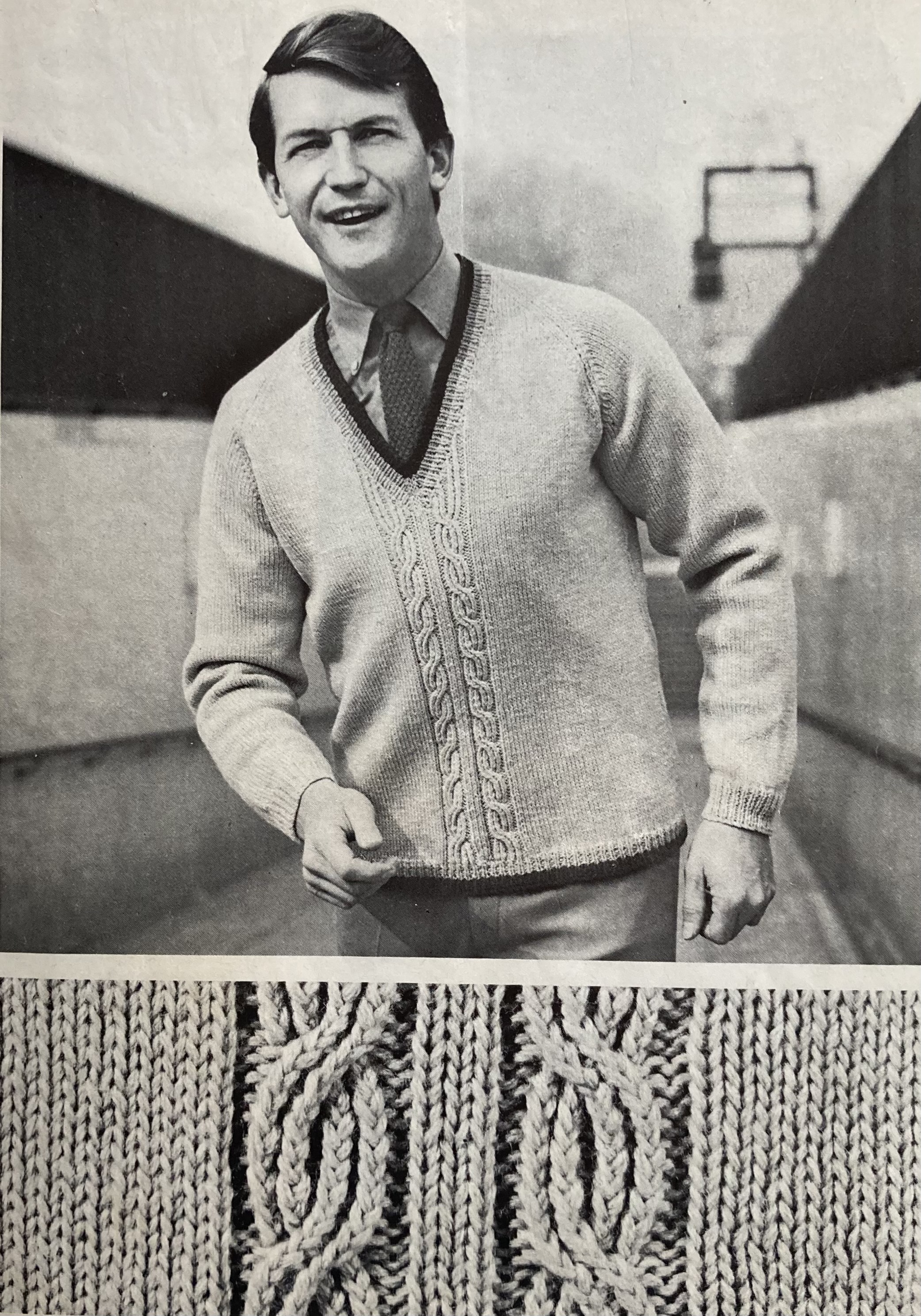
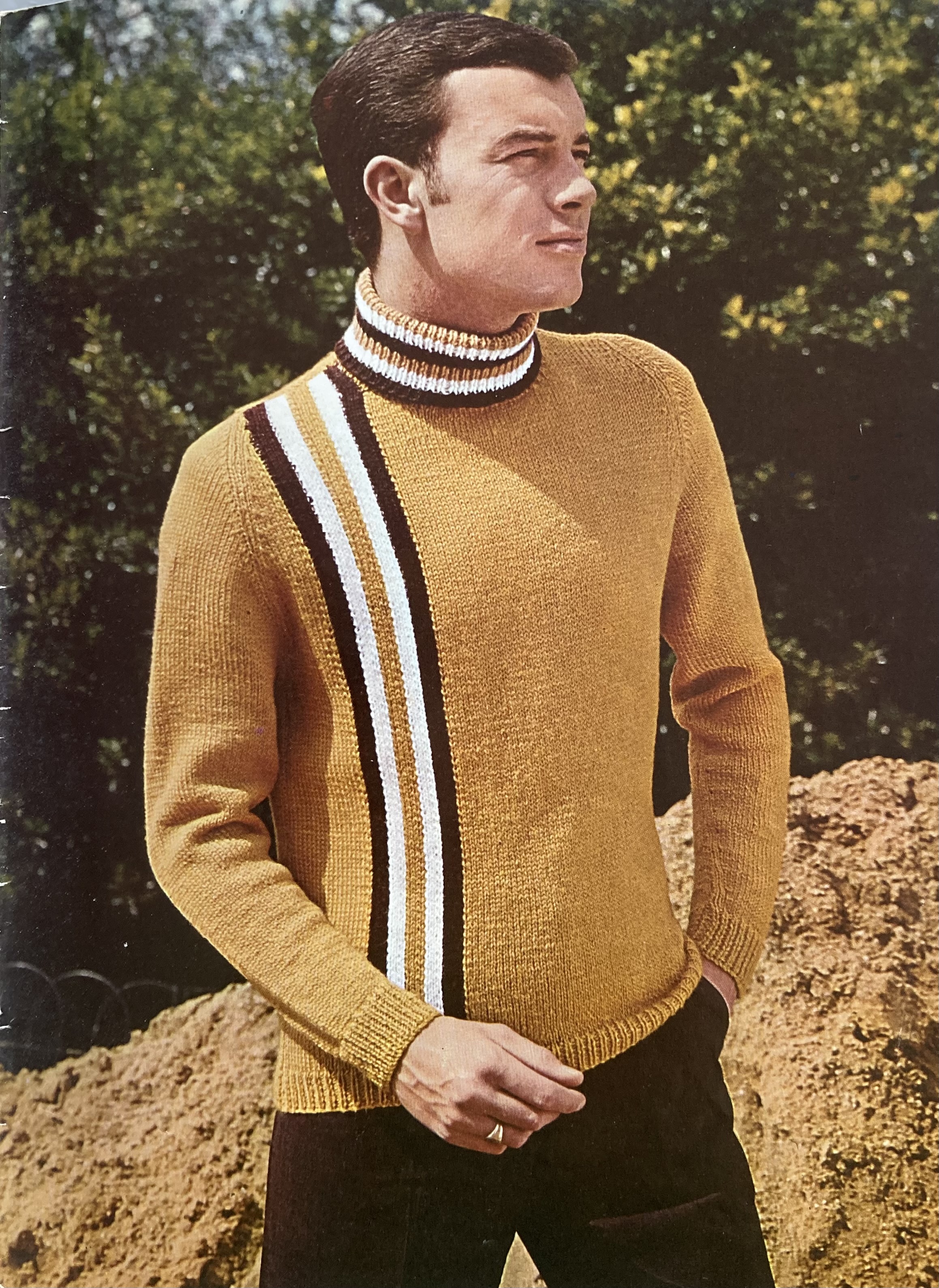
A micro-trend for contrasting yokes that encompass the sleeves and the upper bust area can be seen in both the “Fuzzy-Wuzzy” (that is the name of the wool, an angora blend) jumper for adult women and the little girl’s way-too-short-to-actually-play-in tunic dress featuring a smocked effect made by dropping an extra-long stitch and then picking it up a few rows later and a few stitches over. It is designed to be made in the very 1960s colours of “Spark Gold” with “French Mustard” and white. Men are unusually well served in this month’s issue with both an “Autumn Stroller” V-neck pullover with cable panel and a “rugged for the outdoor life” racing-stripe pullover “designed for slim chaps”. Here as well, late-60s brown and gold tones are on trend.
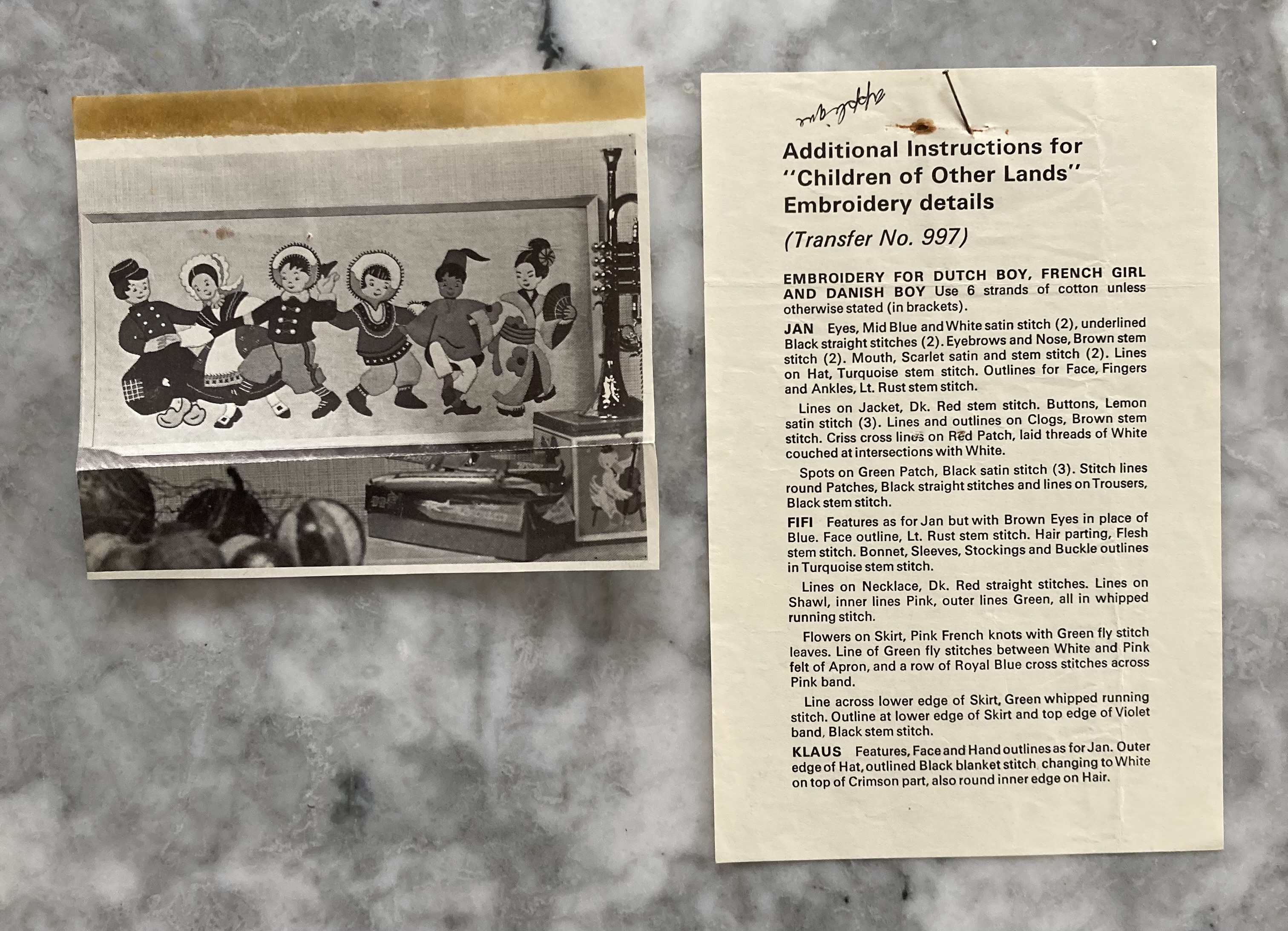
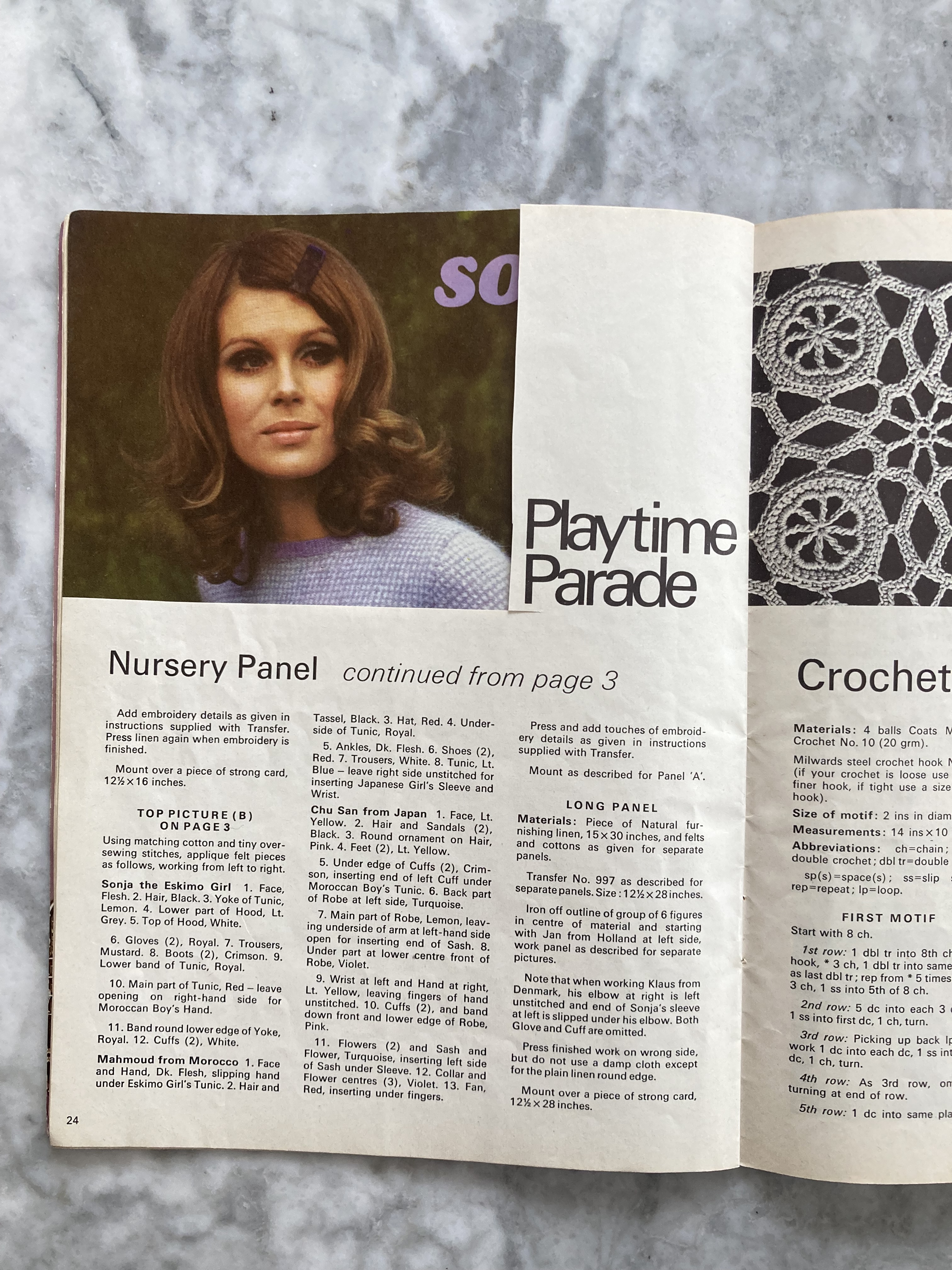
Housewares are either quite complex or easy enough to dash off quickly for a church bazaar or quick gift. On the more complicated and difficult side, there’s a large wall panel made in felt appliqué, designed after the “Children of Other Lands” serial comic that winds up in this month’s issue. Like the comics, the wall panel is sweet and well-meant (and well-designed from a technical standpoint) and the fictional children are not portrayed negatively in any way, but of course their depictions and their comic stories draw very, very heavily on outdated stereotypes. The previous owner of my copy of this issue seemd to be a fan and presumably made the wall panel: she cut out the extra photo of the finished panel from another page in the magazine and pinned a small page with additional instructions into the first page of the pattern. I’m guessing the additional instructions came with the embroidery transfer, which readers had to send away for by post.

There’s an ambitious stitched rug in a very modern pattern, and a crocheted table runner (also on the list that the previous owner wanted to make) that looks quite intricate to me.
The cutwork chair set and breakfast tray set with Celtic-inspired design elements seem to be of average difficulty. Finally, there are quick and easy cosies and a crocheted handbag that promise to be “easy knitters” and “top sellers” at your next church or charity bazaar.

That’s all for this issue! I have to admit that there is nothing in it that particularly inspires me, so I will use this month to hopefully finish up the spectacular chevron-striped dress from April 1967 and the “Fair Isle Country Cardigan” from January 1967. I should be prepared for any kind of late-summer weather then.
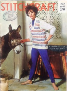 Handknits For Your Holiday! If you are planning on taking a holiday in 1962, that is. In that case, I would recommend going to the Algarve in southern Portugal, which, based on the pattern of the window shutters and blanket in the background, is where I am guessing this magnificent cover photo was taken. Sadly, my time machine is out of order and May 2020’s motto is (Lots Of ) Handknits For No Holidays This Year Or Probably Anytime Soon.


