EDIT December 31st, 2021: FINISHED!
July 1962’s issue didn’t have anything in it that particularly interested me, so I took the time to go back to the June 1961 issue, which had so many nice projects in it that it was hard for me to decide which to make. (I ended up making this lacy top and later, this child’s tunic-dress.)
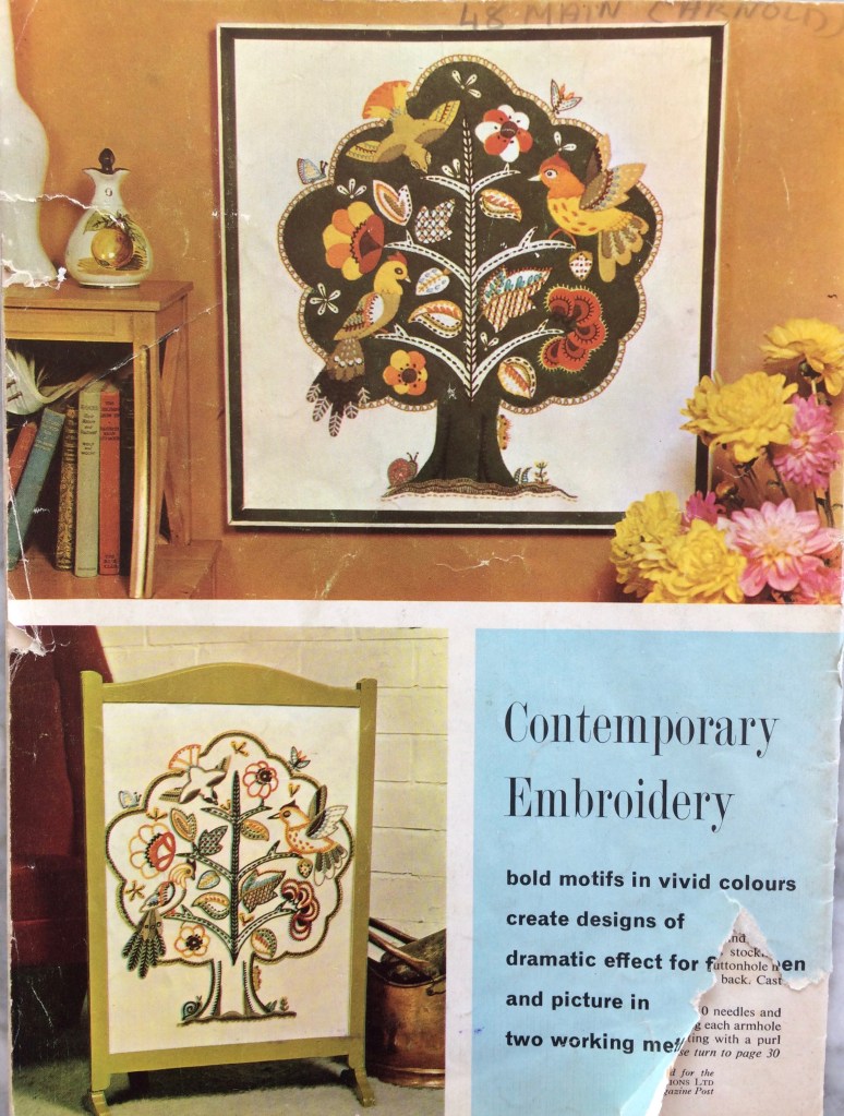
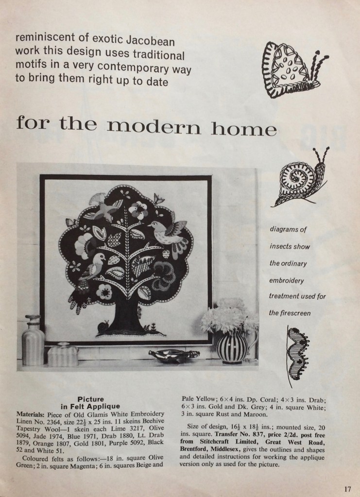
I loved the extremely complicated, heavily embroidered, faux-neo-Jacobean felt appliqué “birds in a tree” extravaganza featured in colour on the back cover, but it was too daunting. For one thing, of course I didn’t have the transfer or pattern for the appliqué pieces, since I would have had to have sent away for them via postal order in 1962. For another, there weren’t even any instructions in the magazine — the design was offered as either an embroidery or an appliqué project (see photo), and the instructions in the magazine only covered the embroidered version in any detail. The appliqué version just gave a list of materials, size of finished design, and the address where one could order the pattern and instructions. And when it comes right down to it, my appliqué and especially, embroidery skills are really not very well developed.
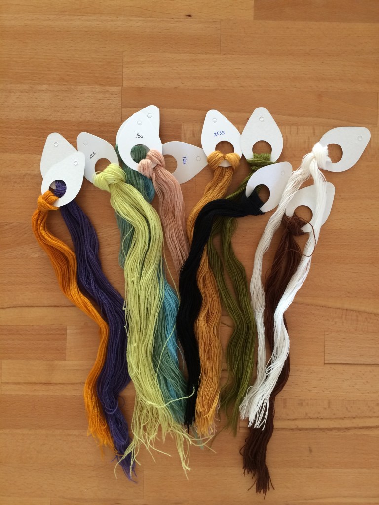
Oh yes, and while felt is easy enough to buy, the materials included tapestry wool for the embroidery, which is impossible to find in stores anywhere near me and even difficult to order online in the right weight (very fine)! Luckily, last year I happened to be in the one city I know that houses the one shop I know that actually specialises in tapestry and sells the right kind of wool, so I was able to get that, at least.
I decided to make it as a cushion, not a wall hanging. The background tree was easy enough. Technically, the white branches and leaves should have been made by cutting holes in the green tree felt and letting the (white/beige) background fabric show through, but since I chose a blue background fabric, I appliquéd them as well. It was predictably difficult to make and cut out my own patterns for the little bits of felt for the birds and leaves, and after making the first two birds, I realised it was easier to just cut the pieces freehand. Since there were no instructions to follow, I went from the photo and the instructions for the embroidered version, which obviously didn’t give much useful information.
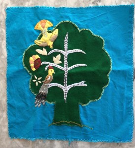
Such a detailed project took forever, of course. It needed many tools and materials, so I could only work on it at home at a table, and not during the winter months, as I needed natural light for the fine work.
I made two of the birds on the left first, wasn’t really happy with them, and realised why after making the first flower on the left. I liked the way the flower turned out — it’s much simpler! The birds seemed overdone in comparison. I thought about changing the design and realised at some point that, of course, the who idea of this neo-Jacobean, embroidered and appliquéd extravaganza is that it is supposed to be over the top.
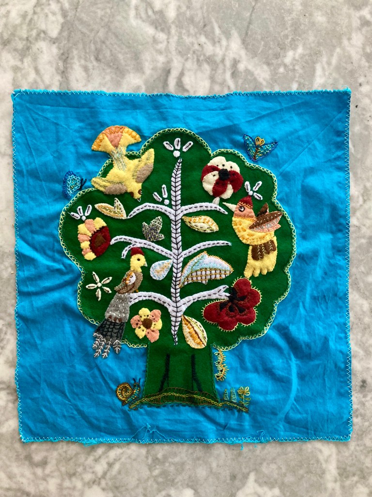
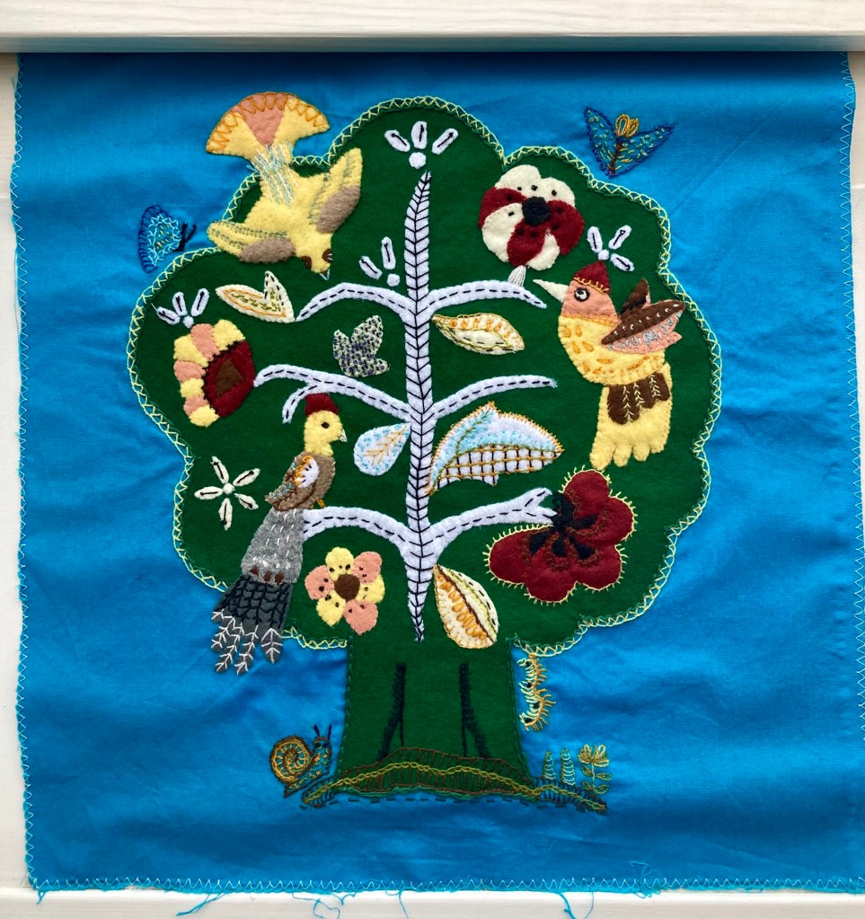
And so, slowly and painstakingly, it got done, one piece at a time. (It also spent a lot of time in the cupboard in between bursts of activity.) The embroidery directions in the magazine were often quite different from the appliqué version, so I did a lot of guesswork and adaptation based on the (rather small) colour photo on the back cover, from which the colours had changed and faded in the 50 years since its printing.
I was determined to get it done before the end of 2021, and I did (on December 31st.) It was a huge milestone for me in my appliqué / embroidery learning process, and I am really, really happy with the way it turned out.

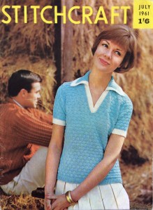 The motto of the July 1961 issue is “Sew through the Summer” and indeed, there are a lot more sewing projects than one would normally find in Stitchcraft, summer being a time when many people do not want to hold wool in their hands or think about colder weather to come. There’s more emphasis on homewares and small, fun projects to make and use on holiday. The farm photos were taken in Hertfordshire and the boating photos in “the heart of London’s Little Venice”. Doesn’t that sound like fun? Let’s dive in!
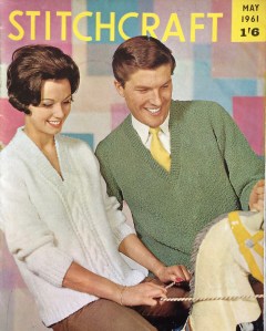
 a really pretty basketweave blouse with that V-neck-plus-collar design that we saw so much of in 1960 and the last years of the 1950s, not to mention just last month on the cover of the


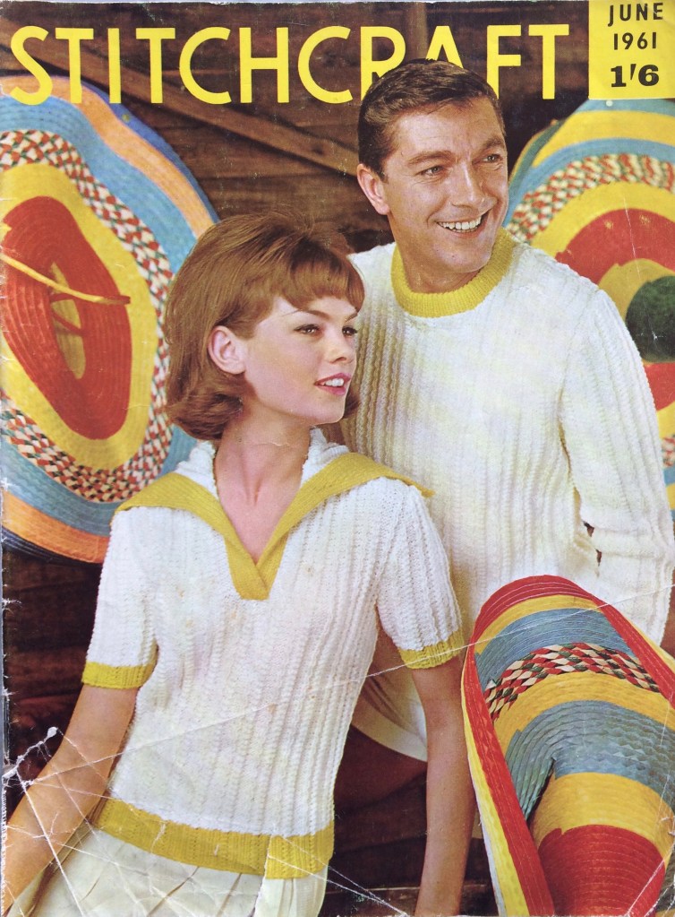
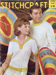 I love this cover. The yellow stripes on the hats, the yellow trim on the sweaters and the yellow sans-serif lettering all harmonise perfectly with the off-white garments in the center focus. Even the models’ hair colour looks like it was chosen to match the wooden wall. And we can see that typical 1960s hairdo coming into fashion, with more volume on the top and curled ends.
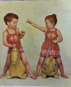 elephant! The dress is totally cute and definitely on my project list for this month, for my friend’s kid who just turned three. Those are seahorses, in case that wasn’t clear (the ones on the front panel of the dress and matching sunsuit look weird to me — I think I’ll fill in the bodies to make the shape more clear.) The sunsuit and dress are made in wool-nylon blend
  (Speaking of tiny children in goofy poses, am I the only one who finds this advertisement for next month’s Stitchcraft strangely funny? What is it about this baby that comes off looking so weird? Too much hair? The quasi-adult-looking face? The indescribable expression?)


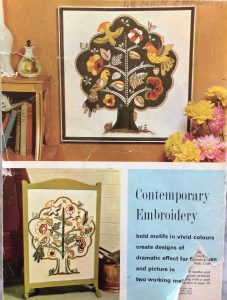 And then there’s this incredible birds-in-a-tree number, to be worked either in wool on linen for a firescreen or in felt appliqué with wool embroidery on linen for a picture. I’m normally not so crazy about 1950s and 1960s neo-Jacobean designs, but I love this one and definitely want to make the felt appliqué version as a cushion (with a more greeny green for the tree and not quite so much brown-orange-yellow in the appliqué work.) I imagine it might be tough without a transfer, but they gave us two very clear photographs including one in full colour, so what could go wrong?
 Last but not least, there’s a lovely, elegant two-piece suit in nubbly Rimple double knitting wool, featured in the most magnificent photo I have ever seen in any magazine, ever. If I remember correctly, I saw it in one of those Internet lists of “best/worst/weirdest knitting pattern photos” long before I started collecting vintage patterns. It’s definitely at the top of my list and if you haven’t seen it yet, you saw it here first!
 Time for the Summer Forecast! “Editress” Patience Horne writes that it is “a lovely sunny day in March” as they go to press for the May issue. It’s freezing cold and pouring rain where I am on May 2nd, so my summer forecast feelings have been literally dampened.


 Are you ready to “Rendez-vous with Spring”? I sure am! This month’s issue has a lovely extra “centerfold” spread in colour, showing off Spring 1961’s latest fashions.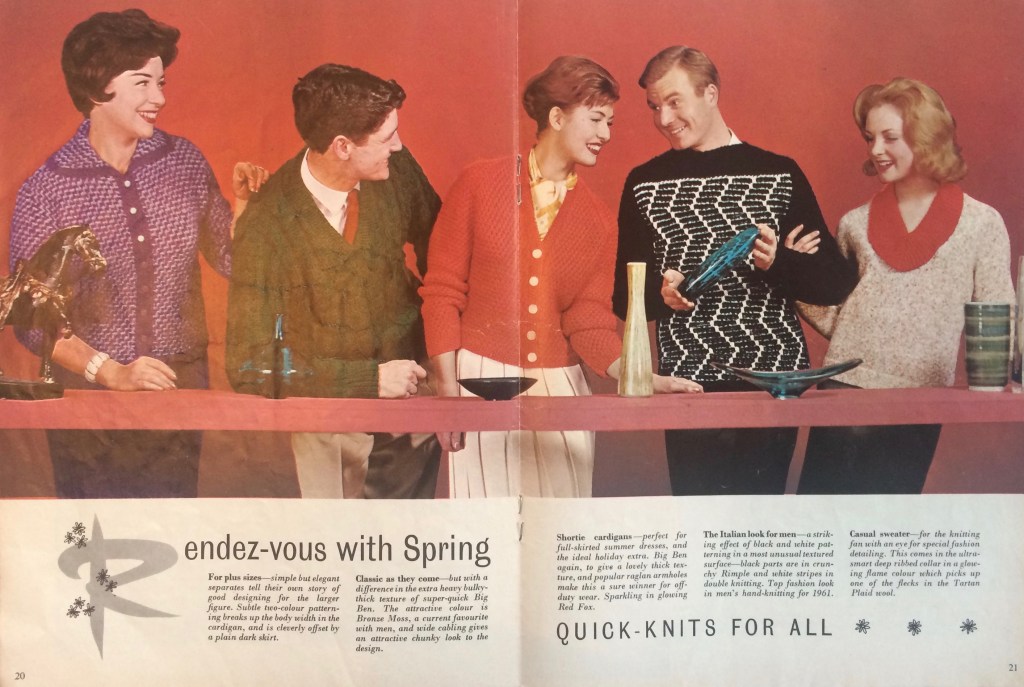




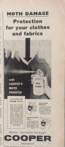 The ads are for the usual knitting machines and sewing fabrics… except for this one, for “Cooper’s moth proofer” spray, presumably made of
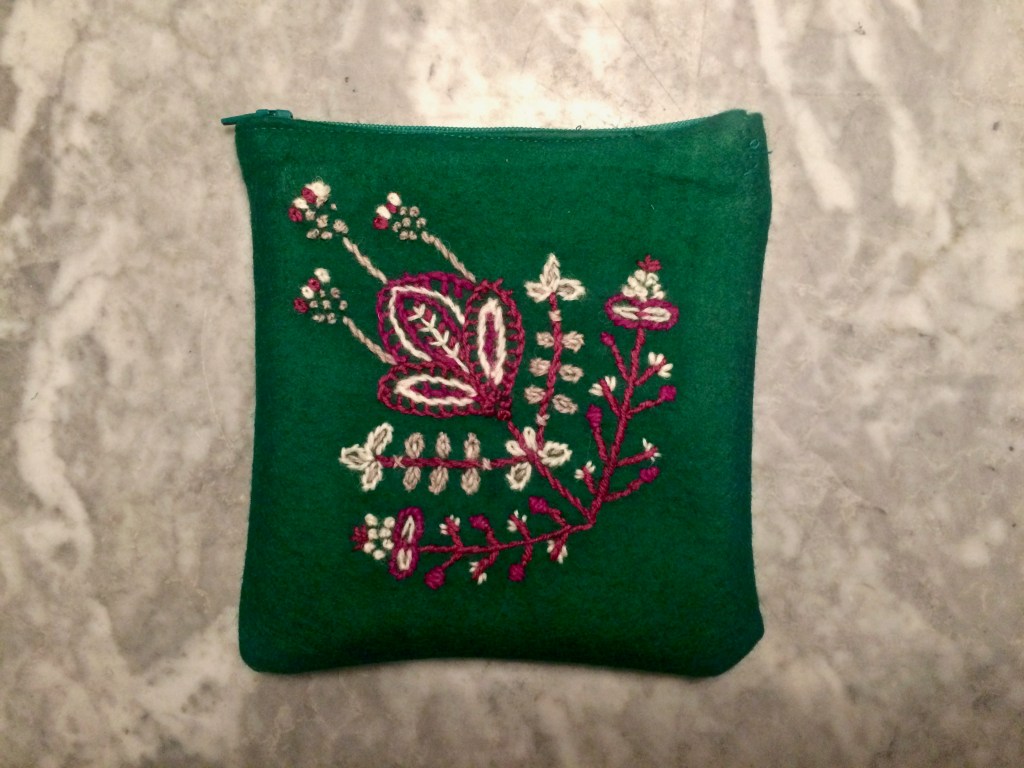
 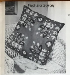 I really, really liked the idea of this embroidery project. Sadly, there was no colour photo, but the design is fun and very 1960 and I imagine the colours (Plum and Magenta with Cream and Fawn shades on deep green) to be quite striking. Working with tapestry wool instead of crewel cotton was (or would have been) another first, so all in all, I was eager to try it.


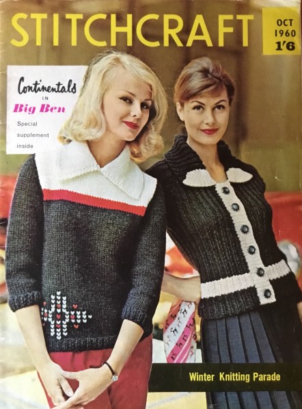 October and November are really the best months for knitting. The weather has gotten cold enough that you really want to wear and make warm, woolly things, and there’s the nice “surprise” of packing the winter clothes out of storage, and so remembering what nice hand-knitted pieces you made in other years. At least, that’s my experience.


 September’s issue had a fantastic design of blackwork fish on a cushion. Blackwork is a type of embroidery combining counted-thread patterns (the fillings) with regular crewel embroidery stitches for outlines and details. I loved the way it looked but had never tried it before, so this was another Stitchcraft Sixties debut.


 The pillow was easy to make up, as I didn’t use piping (I thought the design was bold enough that a plain edge would be nicer.) All in all, I love the look of blackwork but don’t like the effort. I guess it’s easier on a looser-weave fabric where you can really see the holes in the weave to count them. It was made as a gift for a friend who I think will really like and appreciate it, and I feel happy giving it to her, as I am quite satisfied with the final result.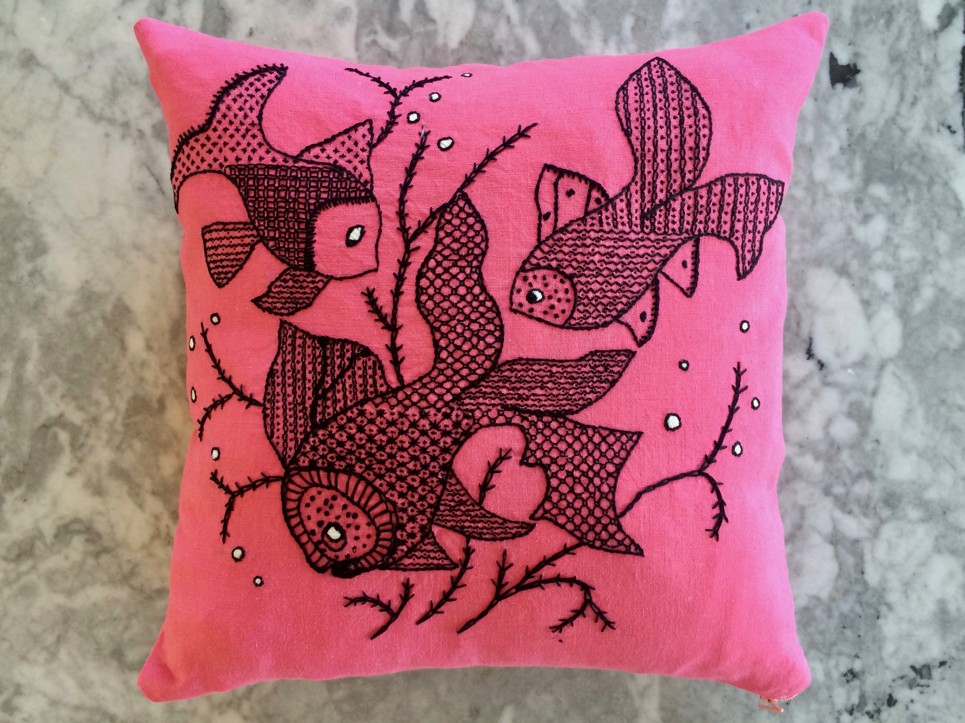
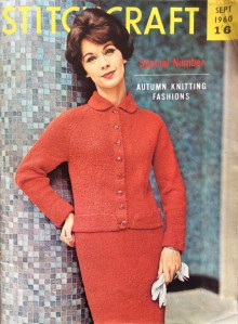 September 1960 is supposedly a “Special Number” of autumn knitting fashions. I’m not sure what exactly makes it so special, since it doesn’t seem to have any more, or particularly different, projects than the average issue. I guess it’s special in that September is finally a bit cooler weather-wise, so you can start to make some nice wool garments for the colder months — very appropriate in 2018, where we had the summer to end all summers. Things have cooled down a bit now, so I’m looking forward to wearing my (still unfinished) projects from July and August soon.


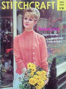 August is a weird month for knitting, as it’s often too hot to hold wool in your hands and hard to believe that autumn is around the corner. Appropriately, this month’s issue features easy embroidery and homewares, and seems to have fewer items than the average winter or “spring holiday” issue. But before we get into the contents, can we stop to admire this beautiful twinset on the front cover? I have been looking forward to making it since I started this blog! So much that I don’t care if the heat wave ever ends, or if I won’t be able to wear it until January. I am going to make it and love it.


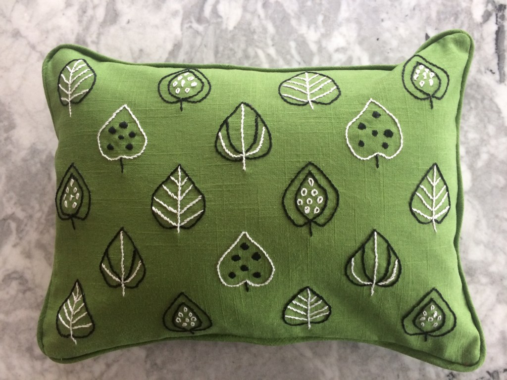
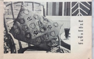 My second project from January 1960 was a sewn and embroidered cushion featuring “black and white leaves on bright red fabric”. One is encouraged to “keep to the black and white embroidery but choose background linen to match your room” and I chose a medium green. (The fact that it matches the houndstooth jumper is just a happy coincidence.)