June 1967: Overview

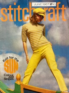
“Knit for the SUN” is the theme of the June 1967 issue of Stitchcraft, and our cover model gives us the best example of that in her striped and sunny yellow outfit.

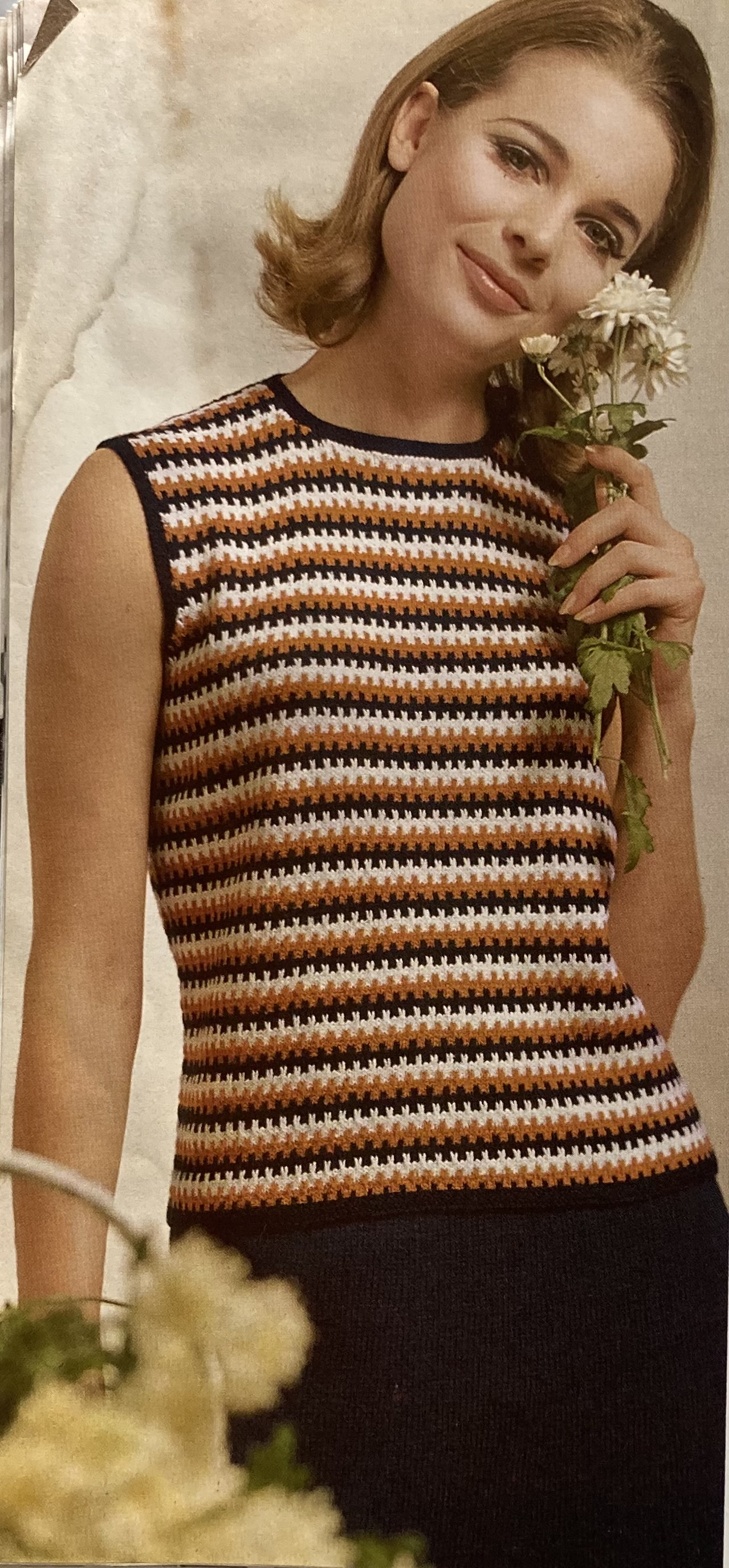
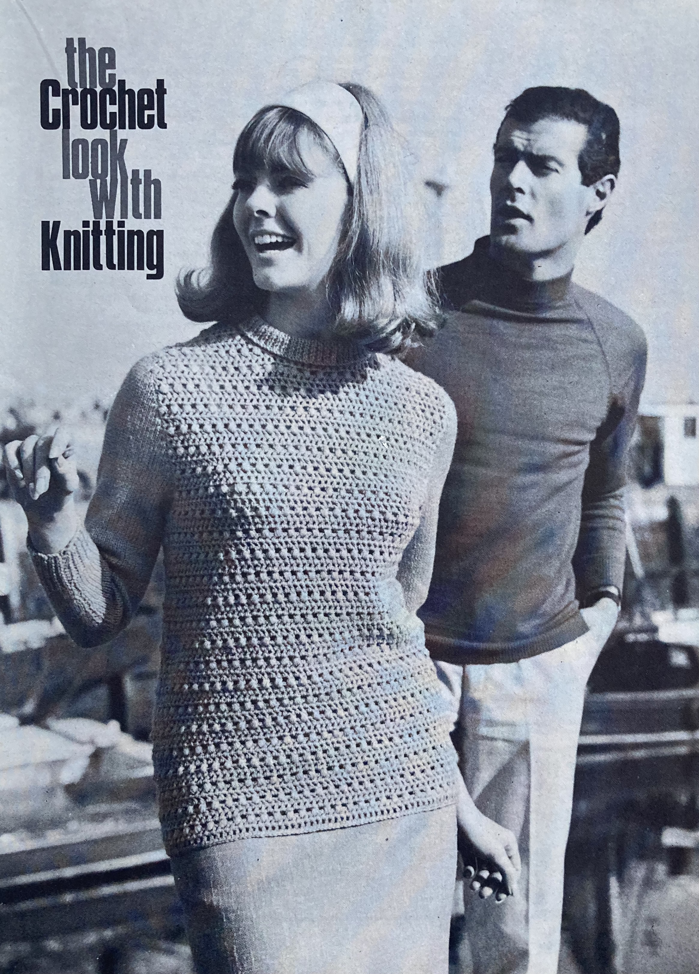
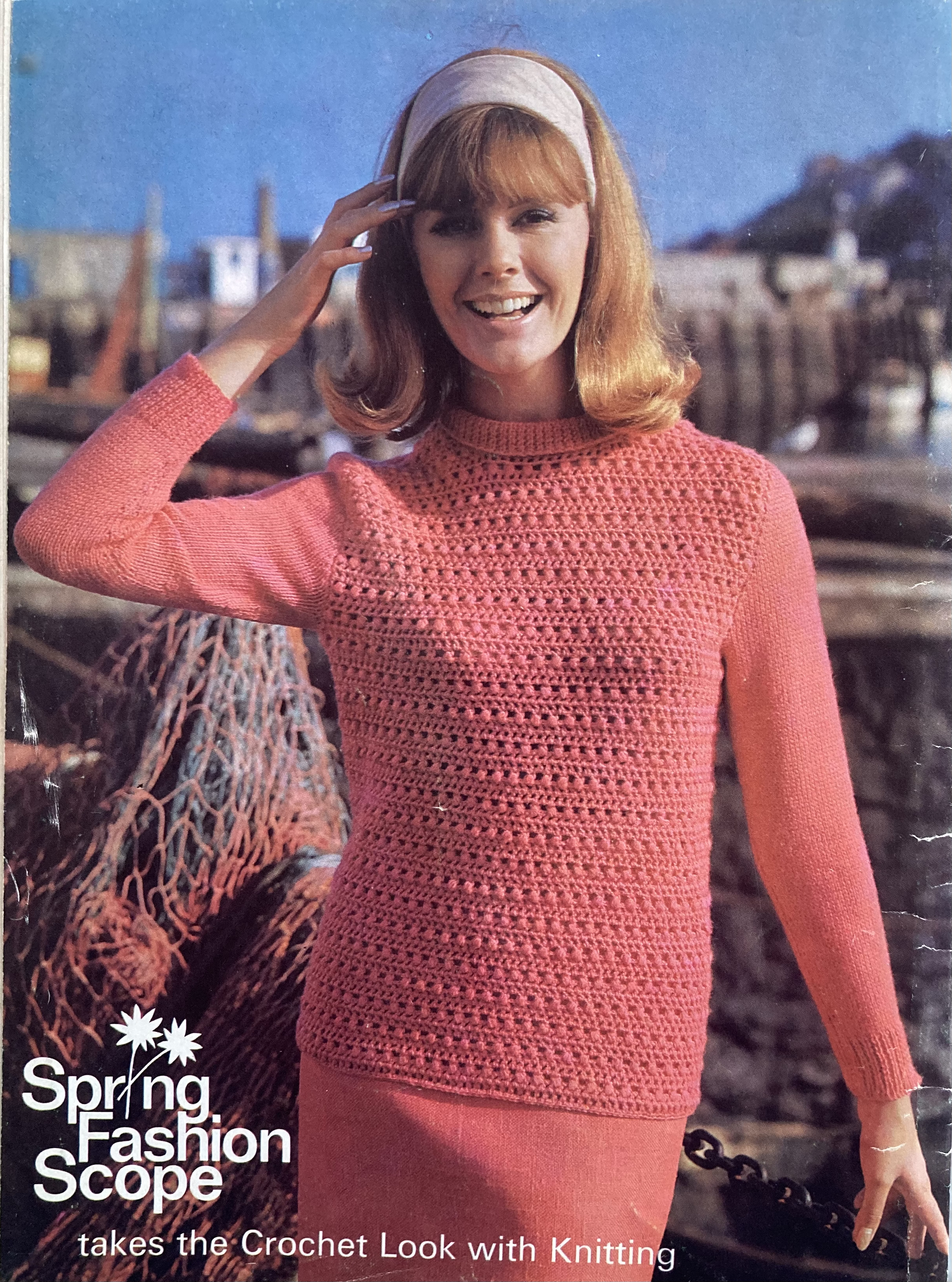
“Stripes and Colour” show up in different ways in this issue, combined with stitch patterns and stranded colourwork for novelty and texture. The pullover on the cover has normal stocking-stitch stripes on the front and back and a novel mini-cable pattern on the sleeves which mixes the four-row colour repetition with a two-stitch cable every four stitches on every fourth row, alternating left- and right- leaning cables for a zigzag effect. Another short-sleeved pullover has striped ribbing, but a plain body and sleeves. The “feathery lace” dress has vertical stripes implied by the ribbed lace pattern combined with plain horizontal colour stripes that look scalloped due to the stitch pattern. Love those sunglasses, too! And a sleeveless shell uses a slip-stitch pattern to make stripes with toothy ridges.

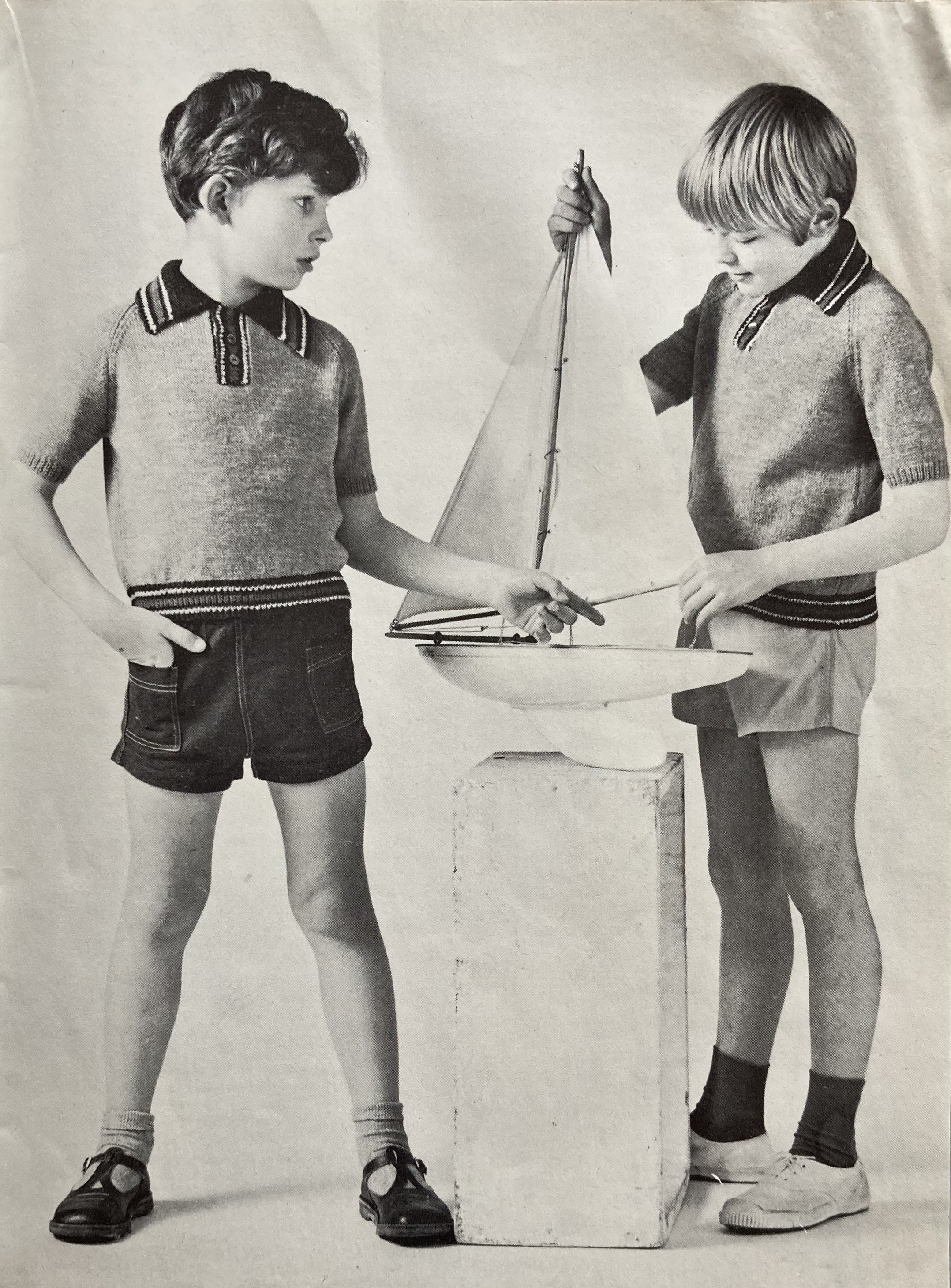
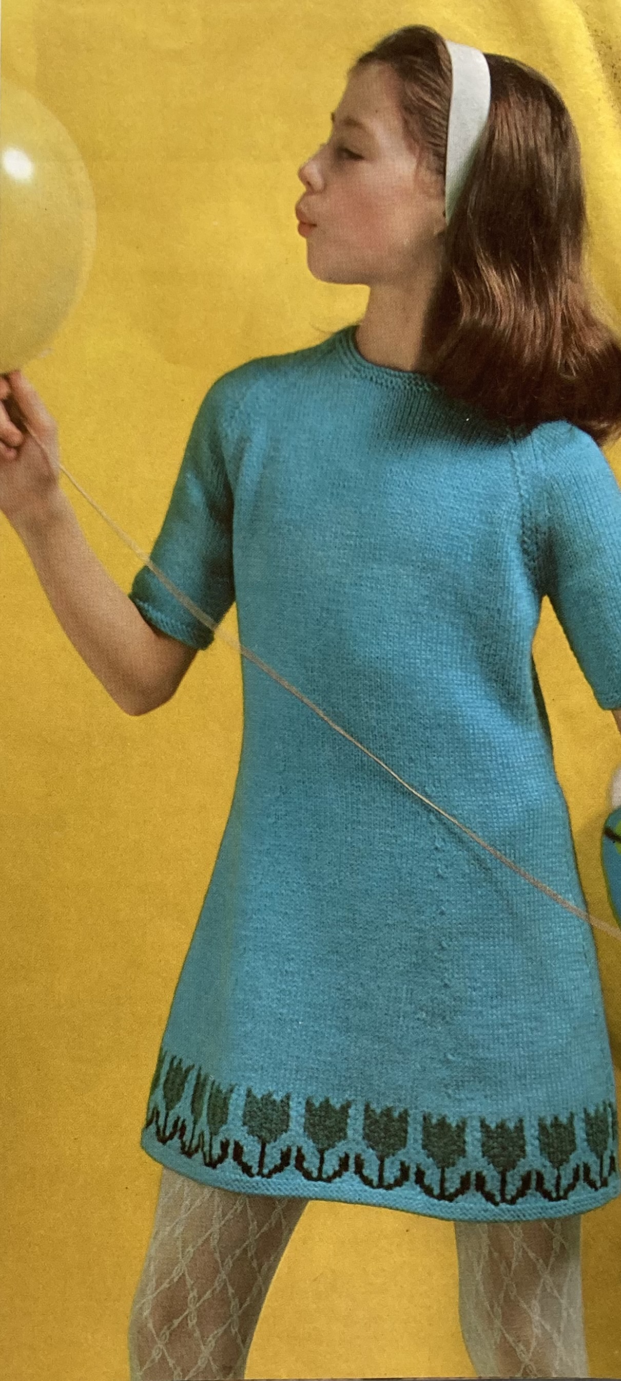
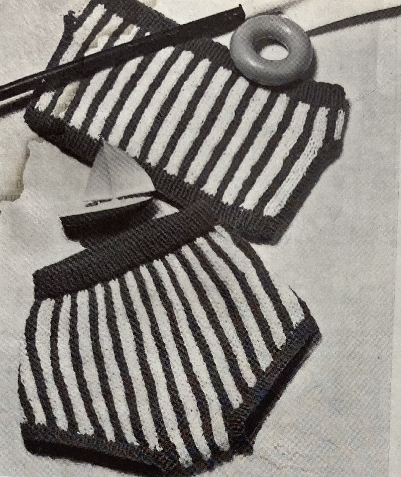
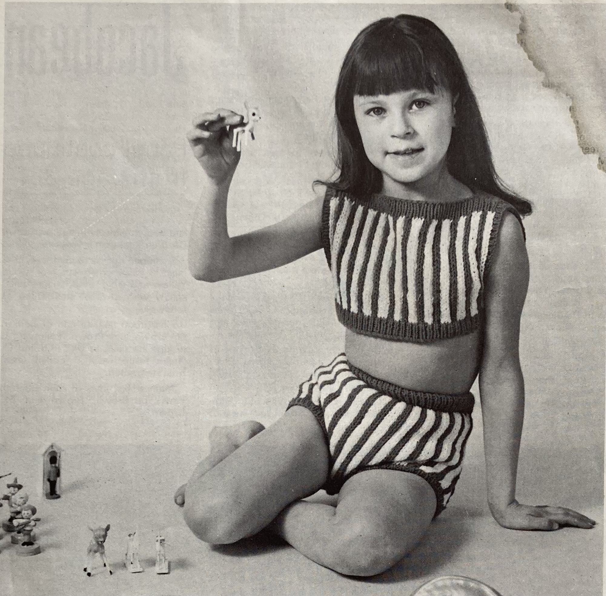
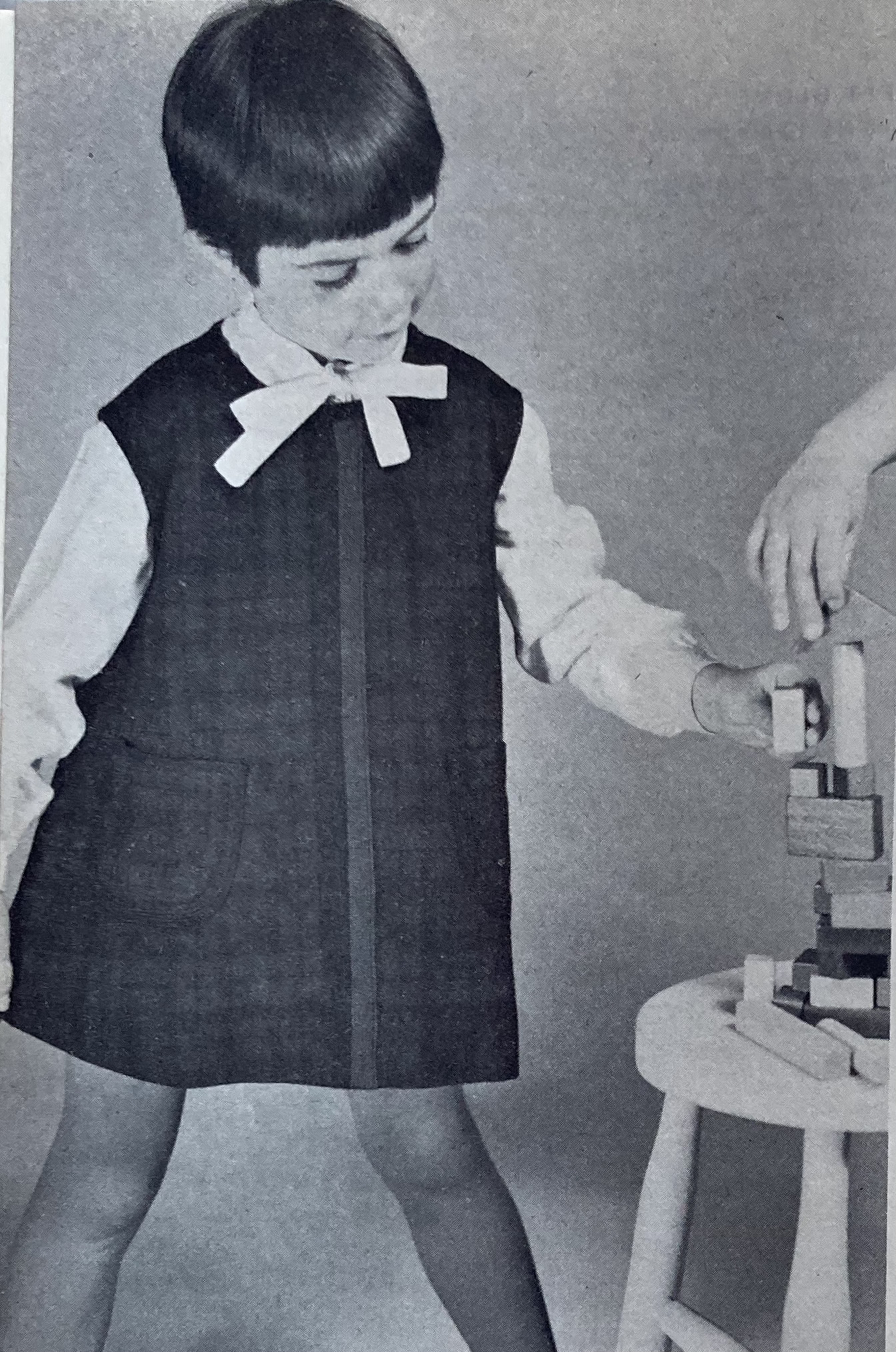
Fun stripes show up on the children’s garments too. There are shirts for boys with the same striped ribbing and collar, plain body and sleeves idea as the women’s top, and a dress for older girls with a stripe of colourwork flowers at the hem. “Junior” girls can “splash and paddle” (i.e. not really swim effectively) in a supposedly stretch-proof knitted bikini in vertical stripe stranded work — the strands should keep it from stretching too much horizontally in the water, but I’m not sure I’m convinced. The top is just two rectangles sewn together.

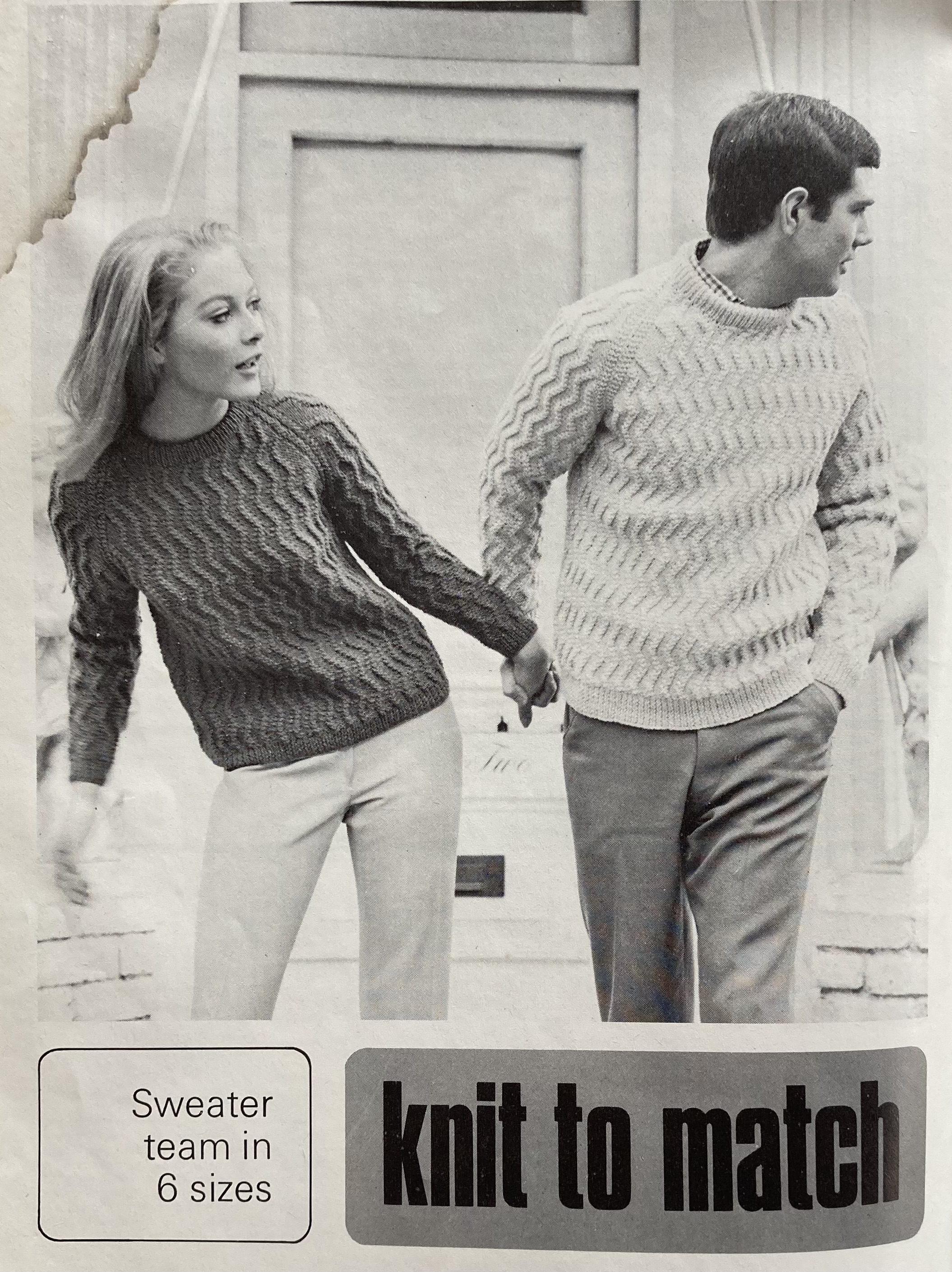
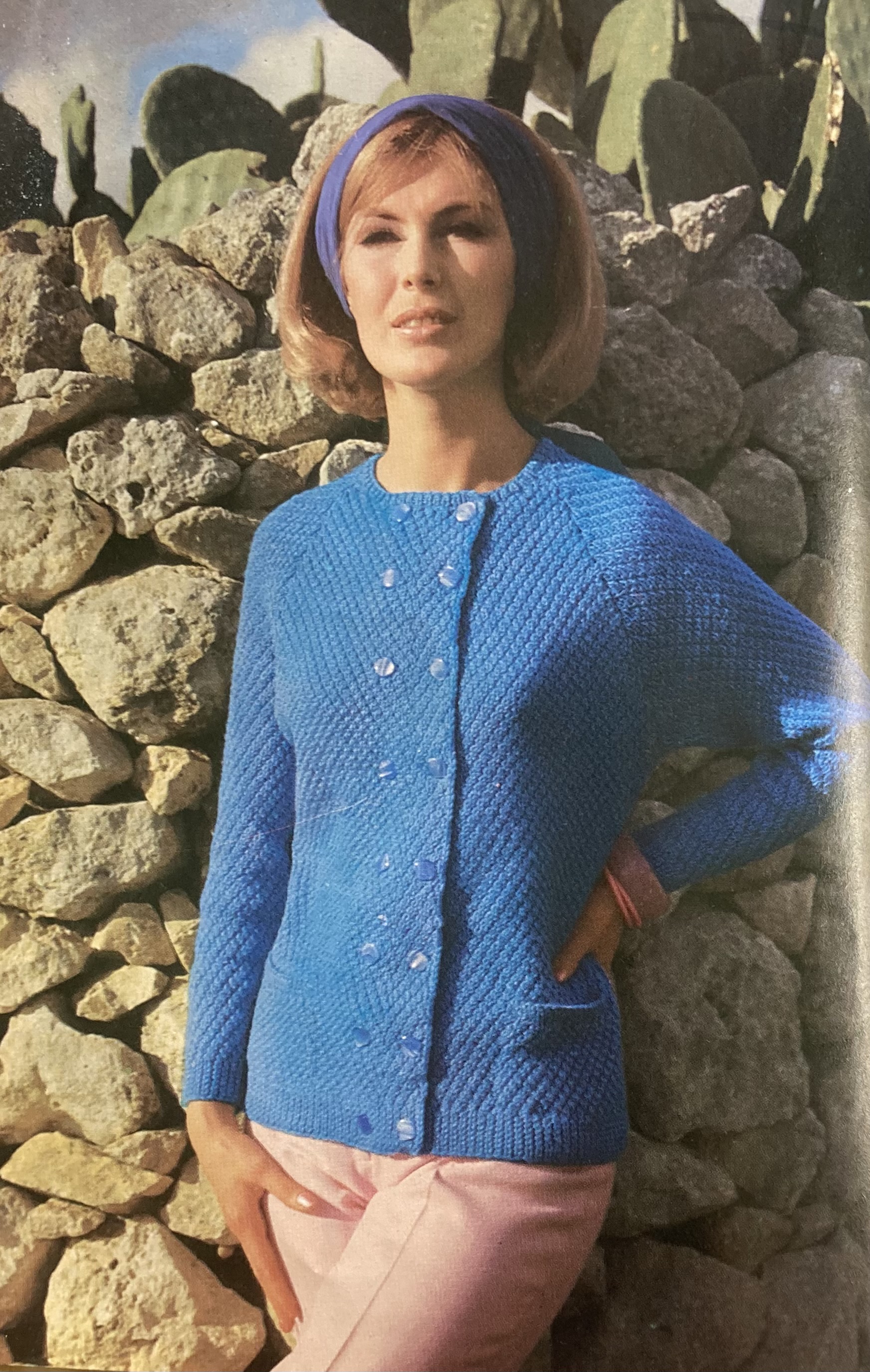
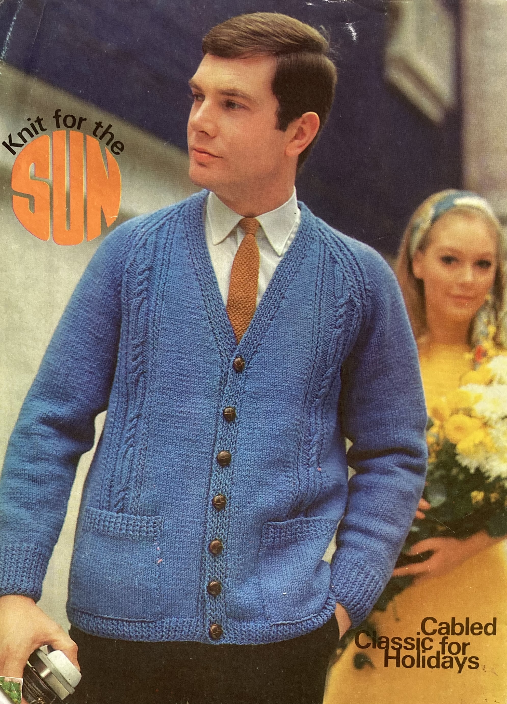
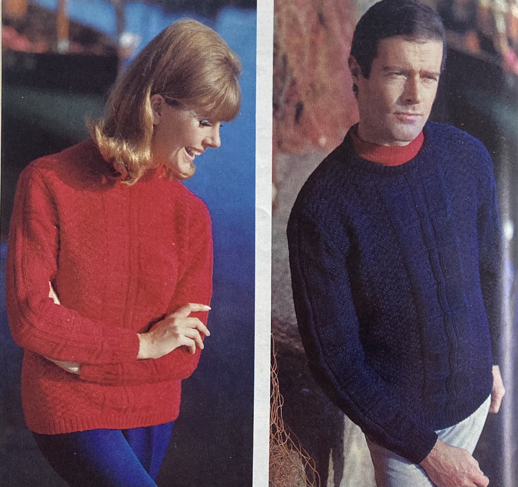
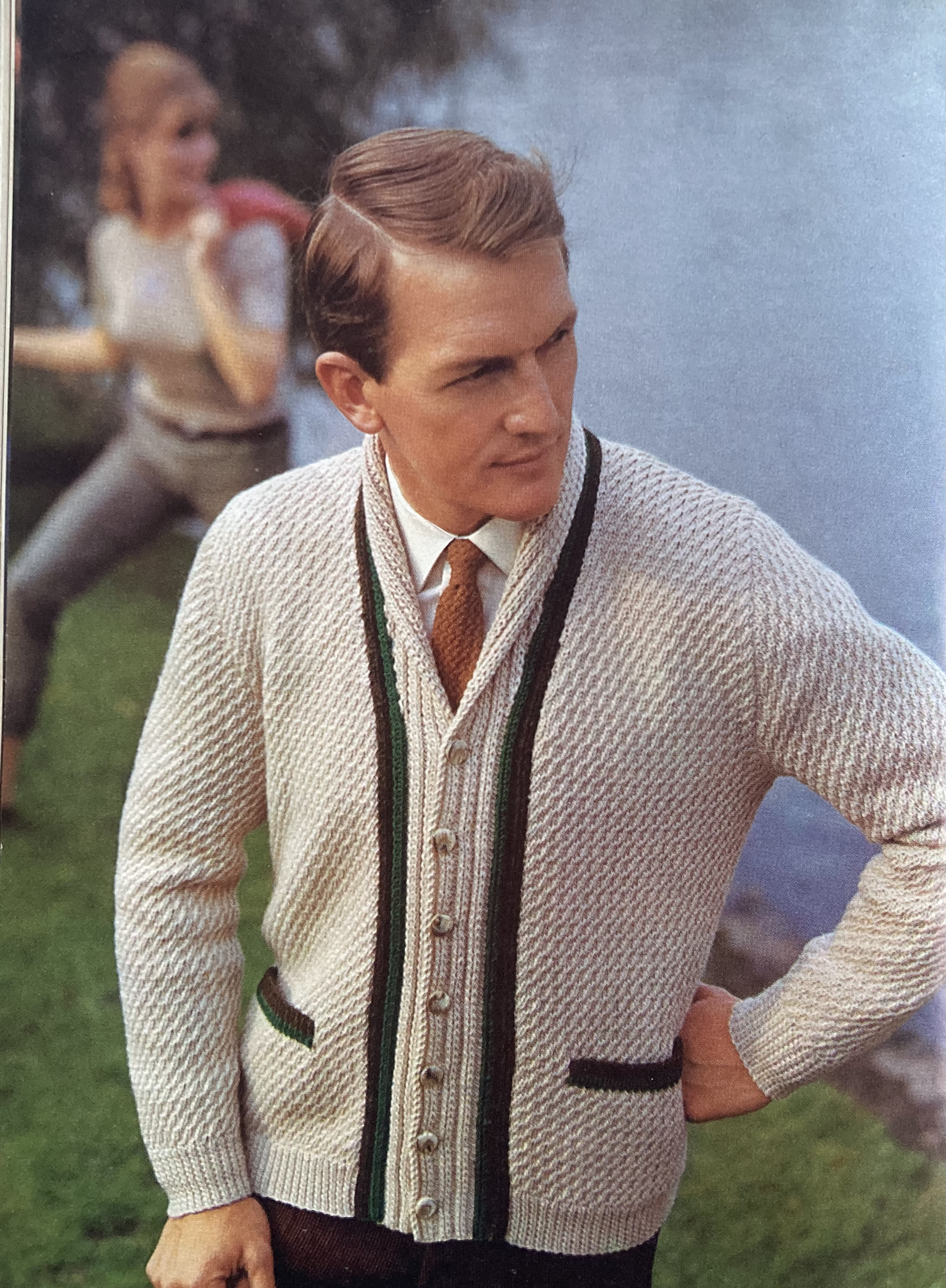
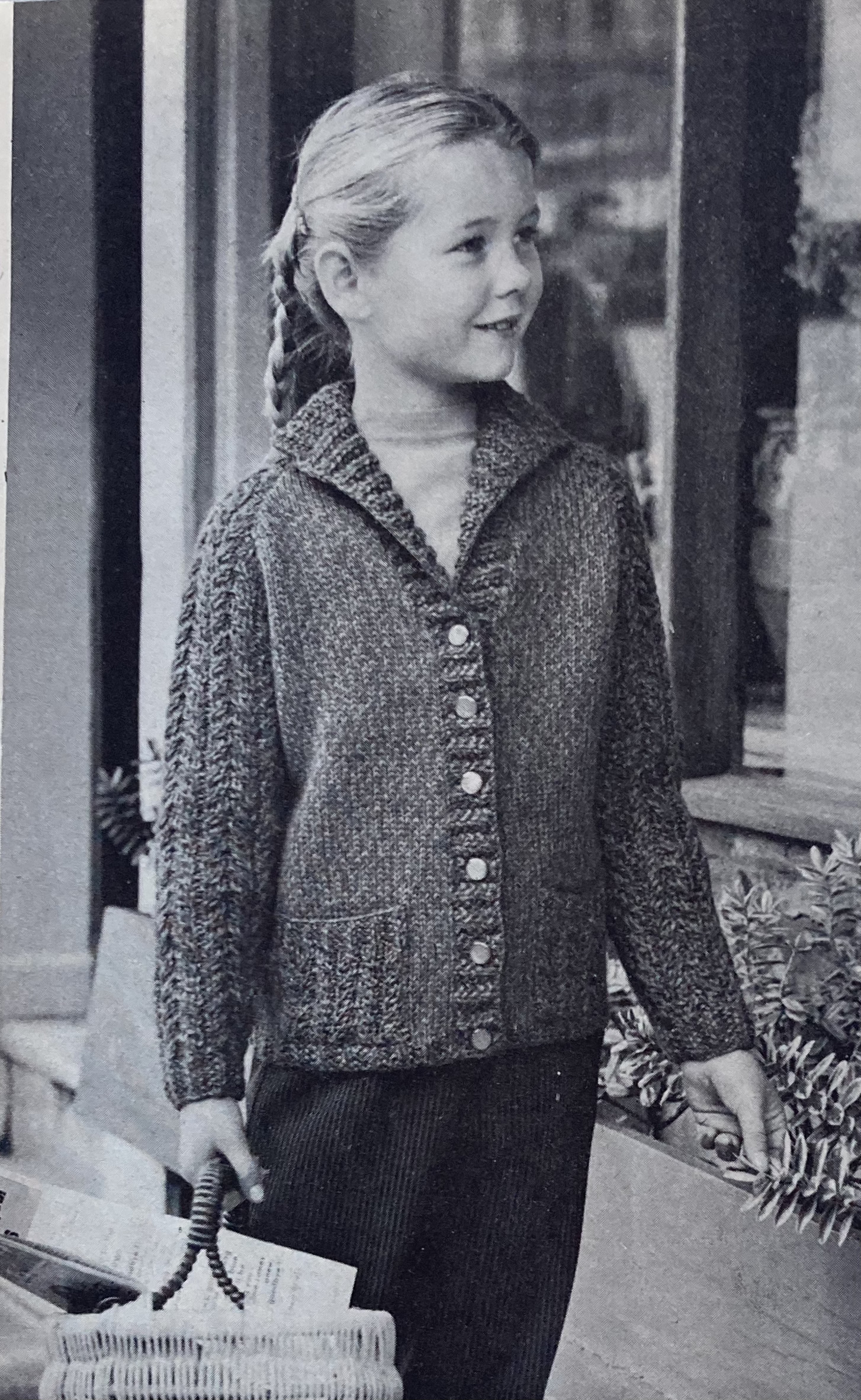
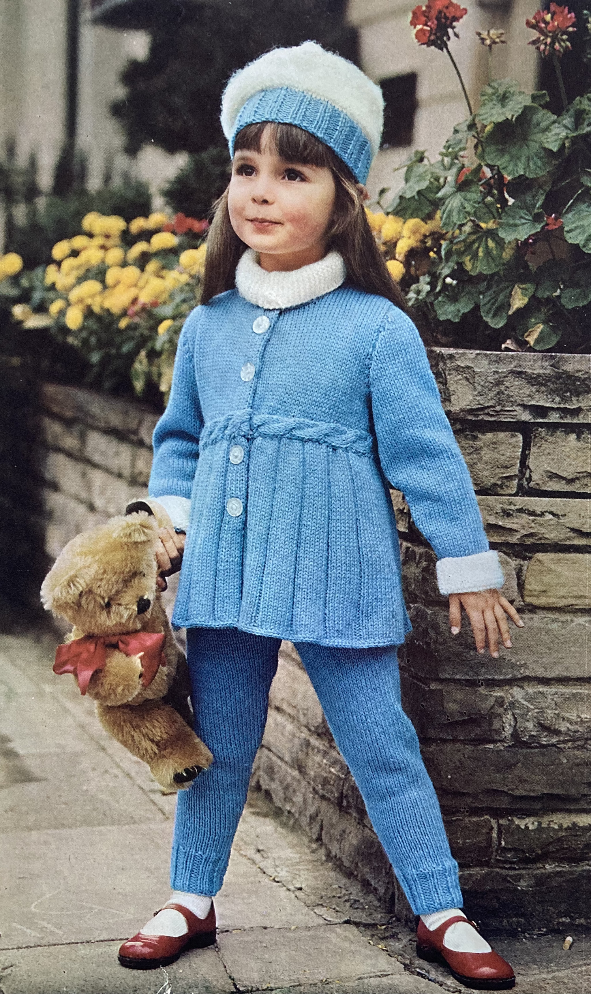
Stripes can be vertical or zig-zagged as well — either worked in colour as with the top on the cover, or in monochromatic stitch patterns. There are his-n-hers pullovers “knit to match” in a pattern similar to the sleeves on the cover design, but worked with 2-stitch twists instead of mini-cables, and a sleeveless polo in “Shetland mood” with a cable pattern on the front. (The caption says, “Janet sports her own jaunty beret, but Booklet 9775 is an easy one to knit — details on page 37.”) The two remaining garment designs, a cardigan and a blazer, have neither stripes nor zig-zags, but continue the theme of fun stitch patterns and this month’s trending colour of bright sky blue.

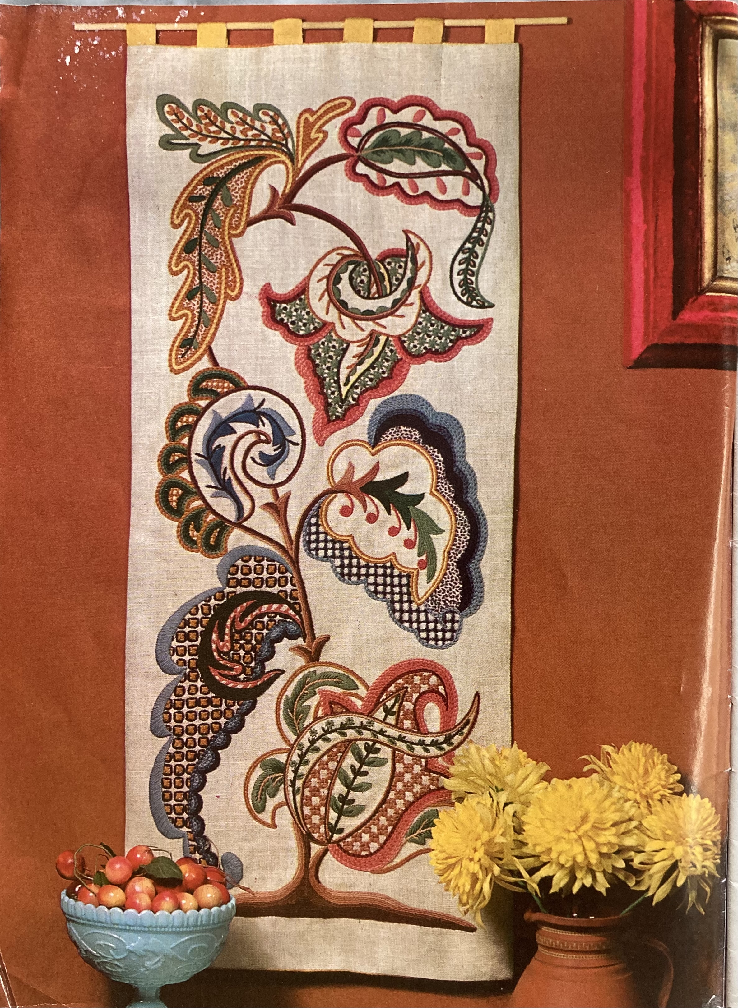
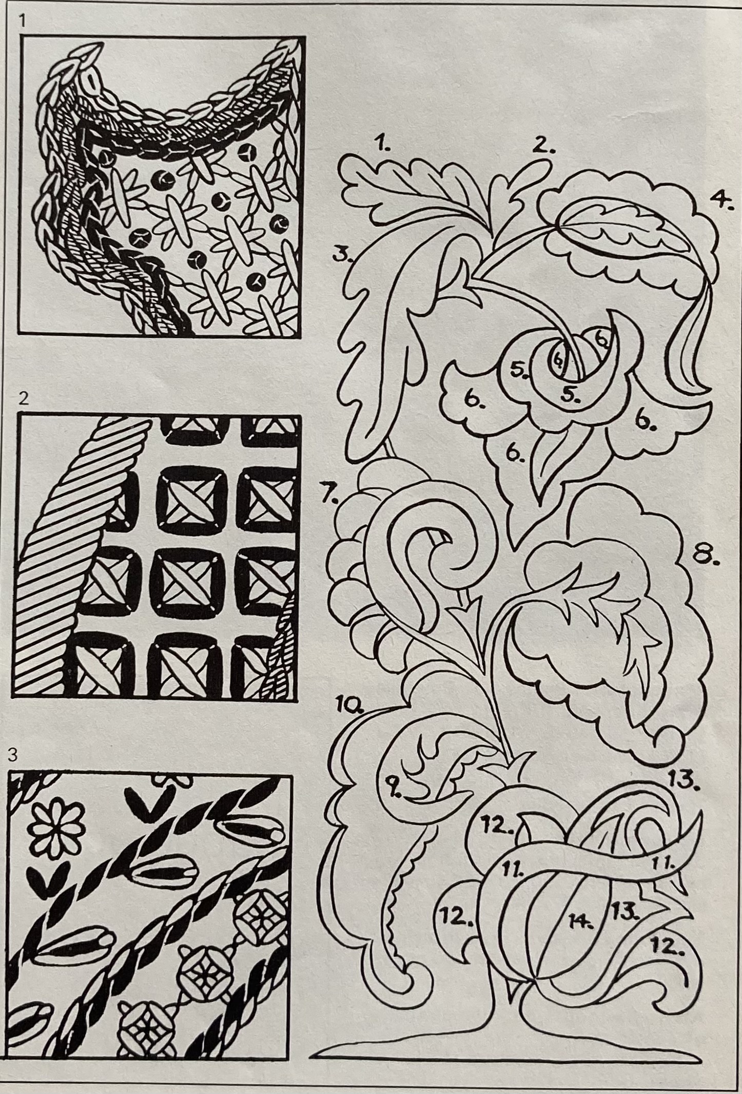
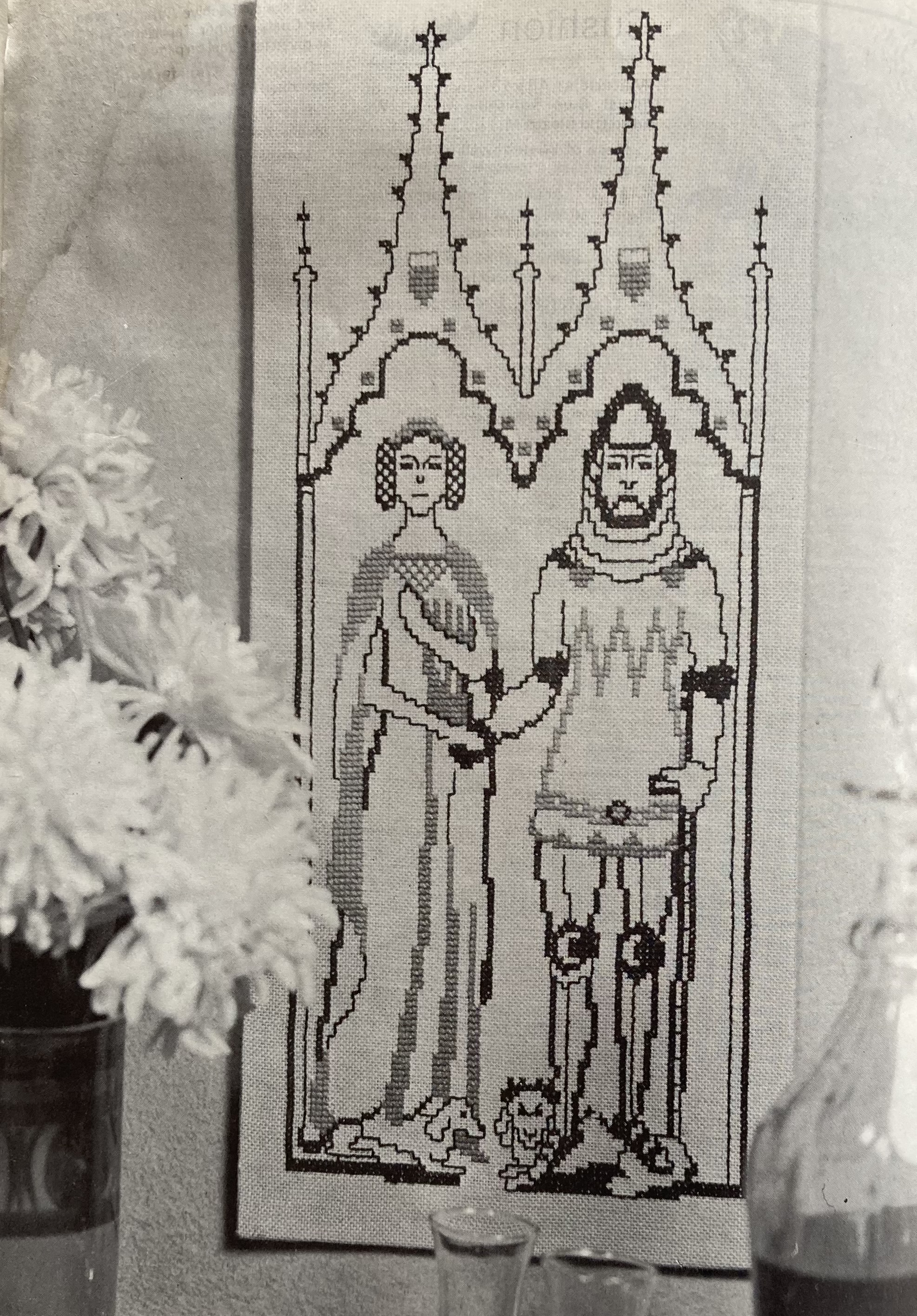
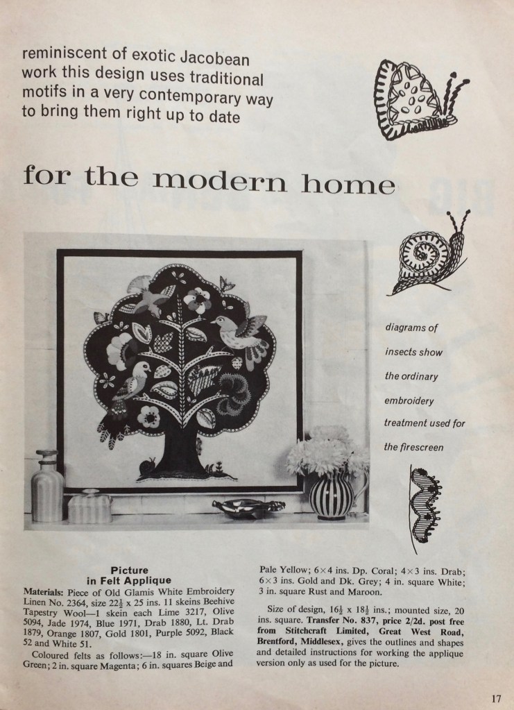
Homewares dive deeply into the Jacobean era, with an amazing wall panel that integrates complicated, historically-inspired stitch work and floral designs with a bold and oversized 60s aesthetic. Not Jacobean-inspired, but equally colourful and exotic, is the cross-stitch tropical bird. You can work it on a cushion or use it to cover a cake tin (appropriately, the name of the background colour is Biscuit.) For a real historical flair, you can make a cross-stitch wall panel adapted from a brass rubbing of Sir John Harsick, anno 1384, in Southacre, Norfolk. According to Stitchcraft, embroidery in the style of a brass rubbing “has become very popular over the last few years.” Interesting!

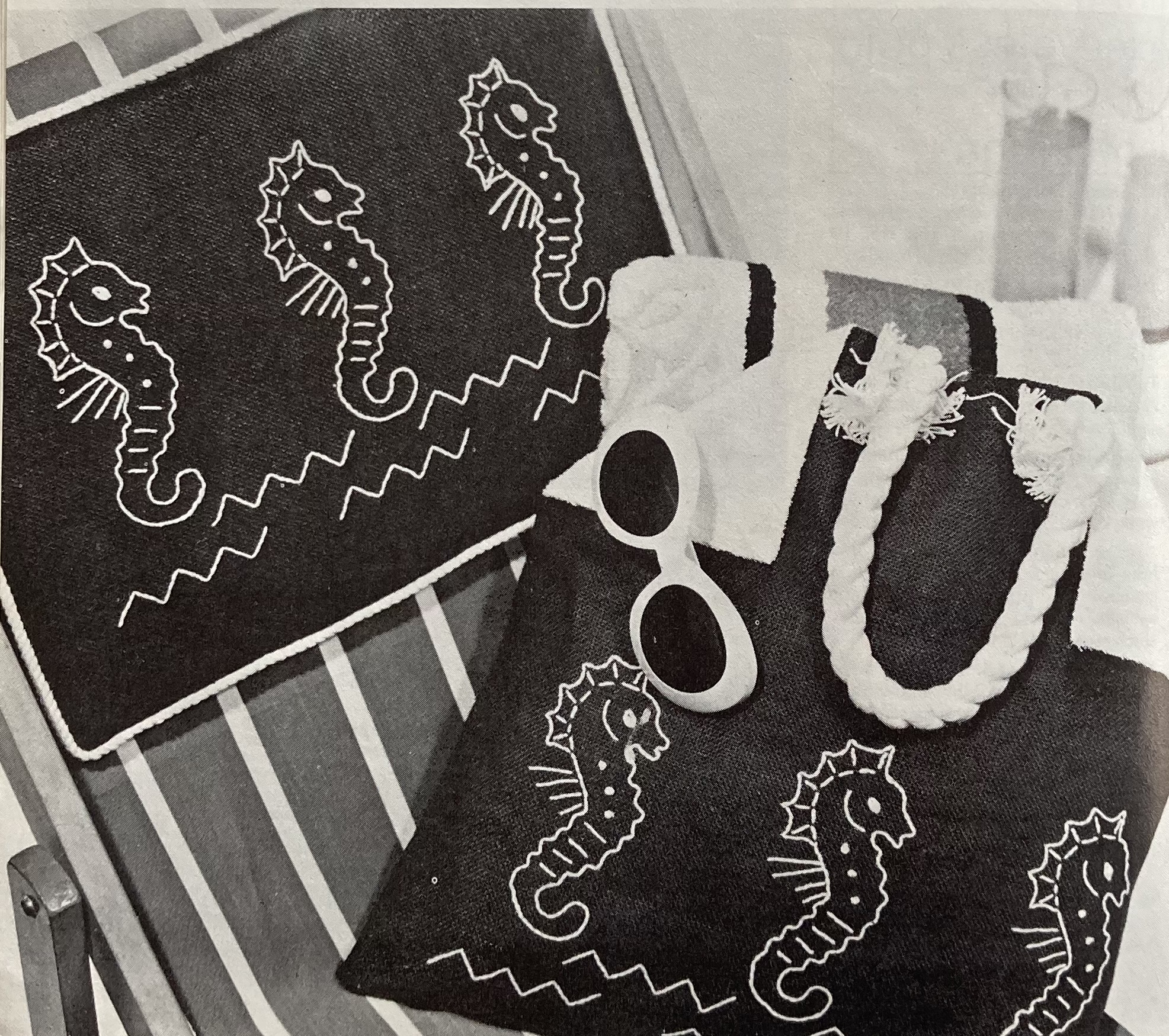
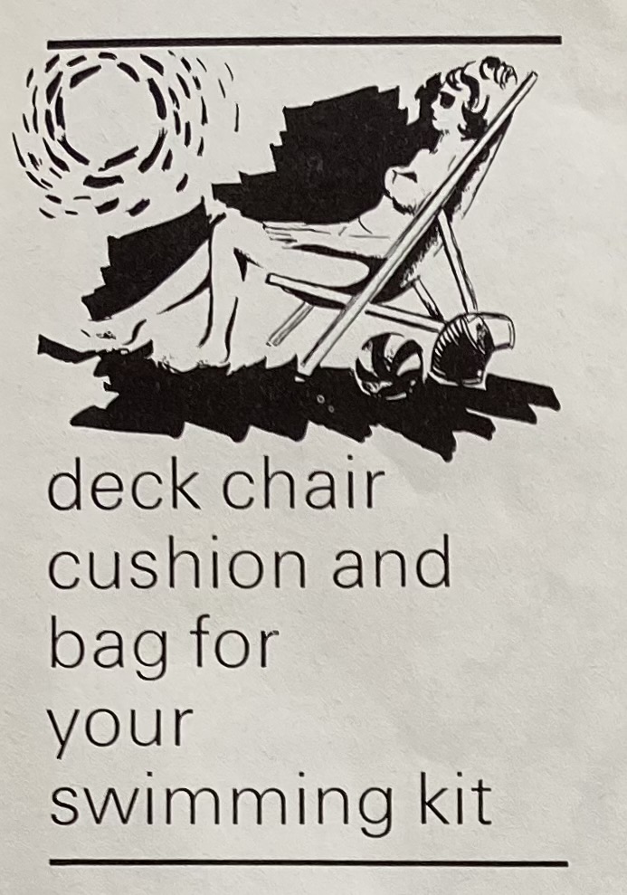
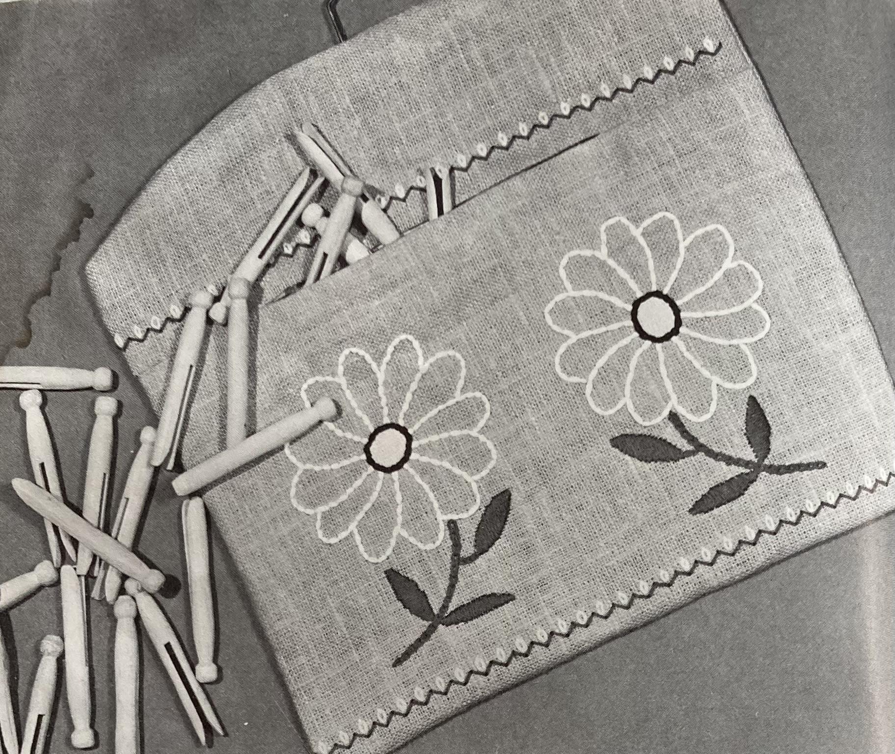
For an easier project, you can embroider sea-horses on a beach bag and matching deck-chair cushion (love the little aspirational illustration.) Or you can sew up a practical, and also cute and sunny, laundry-peg bag and matching apron and embroider them with big, cheerful daisies — “quick and gay to work on kitchen linens or for a bazaar.”

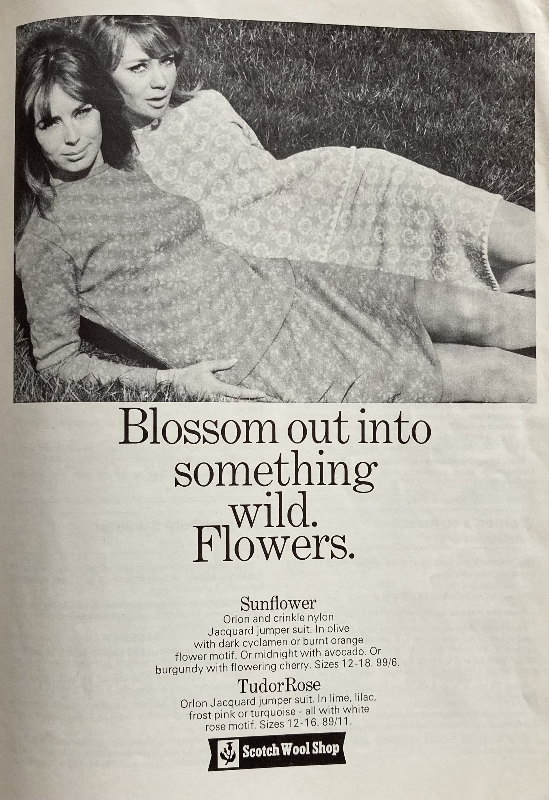
The Readers Pages reprint a striped knitted rug from the September 1964 issue, and the single full-page ad gives us another example of brilliant, yet meaningless, 1960s advertising copywriting and exceptionally 1960s colour combinations: the “Sunflower” Orlon-nylon jersey ensembles is available in olive/cyclamen, olive/burnt orange, midnight/avocado or burgundy/cherry. (A midnight avocado with olives, cherry and a nice Burgundy doesn’t sound half bad, if you took care not to burn the orange.)

I am tempted to make the brass-rubbing embroidery just for the weirdness of it, but realistically, my project will be the daisy-embroidered peg bag and apron. Have a sunny June!

November Excursion: Love Birds Jumper

EDIT December 26, 2024: Finished!

The November 1966 issue of Stitchcraft was perfectly nice, but the projects in it that interested me were either too much of an undertaking (i.e. an entire suit) or something I would like to knit later when I have more time to plan it out (the top-down round-yoke cardigan). I decided instead to make a project whose pattern and wool had been sitting around for a long time waiting for me to use them: the Bestway A2063 “Love Bird” jumper.

The booklet isn’t dated, but presumably from the 1940s. I got the pattern as a PDF from the wonderful Subversive Femme website. A few years ago during the horrible wildfires in Australia, Bex, who runs the site, offered a free pattern to anyone who donated to the fire relief fund. I did, and was very kindly given this pattern as a thank-you. The wool is “Darnie” by Studio Donegal, a fingering-weight lambswool in the perfect shade of green, which I bought in Galway while on a work trip to Ireland.

The original pattern has a tension of 8 sts/inch, which I don’t get even with the finest of wools and smallest of needles, but I am also larger than the 34 inch/stretch to fit 36 inch bust finished size. I have had good results in the past with making 8 sts/inch, 34-inch jumpers at 7 sts to the inch with the original stitch counts and just adding an inch or two to the waist-to-armhole length, but that didn’t work here. I love the wool — it’s quite soft and not at all scratchy, and the little bits of tweed catch the light beautifully — but it was impossible to calculate the tension even with a good-sized, blocked swatch. The wool is so lightweight that it stretches more in width the longer it gets in length, so the tension is variable even when knitted closely and evenly. So at some point around rib height, I had to rip back quite a lot and adjust the waist-to-armhole increases. I tried to keep it close to the original proportions, but make it fit me. That worked out pretty well, though I hoped it wouldn’t shrink or stretch too much in blocking.

The birds are worked in stranded intarsia, i.e. you use different short lengths of the colours for the four birds, and strand the light green main colour behind. I am very good at stranded work and not bad with intarsia, but I found the combination of the two very tricky! The yarns bulk up at the back and/or leave holes (in spite of twisting together and weaving in) and it is hard to gauge whether the strands are too tight or too loose. There are a hundred ends to weave in and they are all in roughly the same spot, so the back side is very “full” and doesn’t lie down flat easily. Presumably, it should block out?? Also, I should have used a larger needle for the bird section — too late!

Not to mention that the bird tails start BEFORE the armhole decreases, and since I didn’t read ahead (I know…), I had already finished the body to the armholes in the round and the entire back part above the armholes before I realised it. Yes, I should probably read ahead and also think ahead! Yes, I am also too lazy to rip everything back, especially since I had to re-do the upper back once already to get the sizing right. Oh yeah, and I also forgot, twice, to make an opening in the back neck to accommodate the close, high neck, AND since I started the birds at the armhole instead of below, the neck was even higher and tighter than it should have been. Sigh.

In spite of all of that, it looked good (even before blocking) and fit great (ditto). It does fit over my head and I don’t think it’s a problem that the birds sit a little higher than they should. I made the sleeves from the top down, picking up stitches around the armhole, and only had to restart them twice to get the decreases right.

It was so worth it, though! It blocked to exactly the knitted proportions without shrinking or stretching, and the birds flattened out well enough. (The tails, which I made in a different, slightly thicker red wool than the bird bodies, are still bulkier than the background. I will call it a “3-D effect” design feature.)

I am very happy with this jumper and it has gotten a lot of compliments already. Didn’t get the pose quite right for the photo re-creation — head tilted the wrong way! — but I thought the red curtain made a nice background.

February 1966: Overview

“This is the time to look ahead and start knitting for the first Spring days,” writes “editress” Patience Horne in the header notes to the February 1966 issue of Stitchcraft. I get that feeling in February too. Of course, it is still the middle of winter and one may be drowning in snow or battling freezing rain or waiting out the long grey darkness, but every once in a while (like today), the sun will come out and I can imagine that Spring will arrive at some point. The fashions in this month’s issue are appropriately cheerful and fun, with a special emphasis on “Junior Fashion” for small or school-age children.

The cover ensemble brings back houndstooth, which never really goes out of fashion in the 60s, but was last seen in this form in the earlier years of the decade. It’s a clever choice for a skirt, as the fabric is fairly firm, preventing all too much sagging in the back. The set can be complemented by a wonderful pair of matching-pattern knee socks. Or you can achieve the lastest stitch-pattern trend, namely “the Crochet look with Knitting”, with a sweater that is… well, crocheted, for the most part. Only the sleeves are knitted, in plain stocking-stitch; back and front are crocheted in a bobble-treble pattern. The silhouette for both outfits is long and unshaped, but not baggy: the sweaters have set-in sleeves and high necklines and the skirt sits just above the knee.

Fans of the knitted look with knitting can make a fluffy lace shell (what a terrible camera angle for the model’s nose), or a classic V-neck cardigan with bobble panels in larger sizes. With the exception of the angora-mohair shell, all are made in DK or slightly heavier wool — it is still winter, after all. Knitters looking ahead to the spring can make a fabulous lace-panel dress with matching cardigan in “Paris Pink” crepe 4-ply. The cardigan has a similar design to the large-size cardigan, just with a narrower bobble band on the fronts and a high-buttoning neck.

For men, there’s a “sailer with the traditional look” in guernsey style. Instructions are given for “a girl’s a size and a man’s size” (34-36 or 39-41 inch chest) for the partner-look. (Of course, when they say “girl”, they mean a grown woman who doesn’t mind being linguistically infantilised.) The guernsey is nice! There’s a jacket in thick “Capstan” wool for men, as well, which also gives a sort of sailor-y vibe. The interesting stitch pattern is made with twisted stitches set diagonally. Twisted stitches also feature in the men’s “Country Gloves” pattern, where I imagine the stitch pattern makes the gloves particularly warm and hard-wearing.

In addition to all that, this issue has some wonderful “Junior Fashion” children’s patterns. There’s a nice thick blazer for an 8-10 year old girl and a knitted shirt with knitted tie to “make a small boy feel very fashion conscious.” If you say so, Patience Horne! There’s a rare sewing pattern, too, for a simple pinafore dress. Best of all is the coat, leggings and hat set for a 3- or 4-year old. The white collar, cuffs and hat are knitted in the same wool as the rest — Shetland-mix “Fiona” — and then brushed with a teasle brush. Teasle or teasel brushes are used to felt and fluff knitted fabric and were often employed in home knitting at the time to give knitted blankets that furry “blanket” texture. Some earlier patterns in Stitchcraft say you should take the finished item in to the haberdashery store or send it away by post to get it professionally brushed; this one assumes that you can do the brushing yourself.

With all these great fashions, it’s no surprise that the homewares in this issue are a bit standard: embroidery for a tablecloth, tea-tray or cosy, embroidered dressing-table mats, or a runner for a Scandinavian-style long coffee table (in very 1960s colours of Tangerine, Coffee and Green), for example. Spring style shows itself best in the stitched rug in traditional floral design, or the birds-and-blossoms wall panel in cross-stitch.

In the Readers’ Pages, we have reached the conclusion of our delightfully silly story of “Two Brave Bunnies” searching the world for a real live rabbit. (For those who haven’t been keeping up: the brave bunnies are sentient sewn toys.) Not having found a real live rabbit anywhere in town, they make the sensible decision to search the countryside instead. Et voilà! They find a real live rabbit and invite him home to come live with them and their human family. A happy ending for everyone involved.

There are so many fabulous patterns in this issue that it’s hard to not spend the next few months making all of them. I love the houndstooth set on the cover and the lace dress with cardigan, the child’s coat, the knee-high socks, the twisted-stitch gloves… Thinking both aesthetically and pragmatically, my choice was the child’s coat and hat set. I have too many clothes for myself right now and don’t want to start a huge new project, and while there are always great fashions for adults in Stitchcraft, there aren’t always nice projects for children. And I happen to know someone with a daughter of the right age and size, who would like it. And since it is not huge, there is a good chance that it might get finished on time. Perfect!

Out of Order: Contemporary Embroidery, June 1961

EDIT December 31st, 2021: FINISHED!

July 1962’s issue didn’t have anything in it that particularly interested me, so I took the time to go back to the June 1961 issue, which had so many nice projects in it that it was hard for me to decide which to make. (I ended up making this lacy top and later, this child’s tunic-dress.)

I loved the extremely complicated, heavily embroidered, faux-neo-Jacobean felt appliqué “birds in a tree” extravaganza featured in colour on the back cover, but it was too daunting. For one thing, of course I didn’t have the transfer or pattern for the appliqué pieces, since I would have had to have sent away for them via postal order in 1962. For another, there weren’t even any instructions in the magazine — the design was offered as either an embroidery or an appliqué project (see photo), and the instructions in the magazine only covered the embroidered version in any detail. The appliqué version just gave a list of materials, size of finished design, and the address where one could order the pattern and instructions. And when it comes right down to it, my appliqué and especially, embroidery skills are really not very well developed.

Oh yes, and while felt is easy enough to buy, the materials included tapestry wool for the embroidery, which is impossible to find in stores anywhere near me and even difficult to order online in the right weight (very fine)! Luckily, last year I happened to be in the one city I know that houses the one shop I know that actually specialises in tapestry and sells the right kind of wool, so I was able to get that, at least.

I decided to make it as a cushion, not a wall hanging. The background tree was easy enough. Technically, the white branches and leaves should have been made by cutting holes in the green tree felt and letting the (white/beige) background fabric show through, but since I chose a blue background fabric, I appliquéd them as well. It was predictably difficult to make and cut out my own patterns for the little bits of felt for the birds and leaves, and after making the first two birds, I realised it was easier to just cut the pieces freehand. Since there were no instructions to follow, I went from the photo and the instructions for the embroidered version, which obviously didn’t give much useful information.

Such a detailed project took forever, of course. It needed many tools and materials, so I could only work on it at home at a table, and not during the winter months, as I needed natural light for the fine work.

I made two of the birds on the left first, wasn’t really happy with them, and realised why after making the first flower on the left. I liked the way the flower turned out — it’s much simpler! The birds seemed overdone in comparison. I thought about changing the design and realised at some point that, of course, the who idea of this neo-Jacobean, embroidered and appliquéd extravaganza is that it is supposed to be over the top.

And so, slowly and painstakingly, it got done, one piece at a time. (It also spent a lot of time in the cupboard in between bursts of activity.) The embroidery directions in the magazine were often quite different from the appliqué version, so I did a lot of guesswork and adaptation based on the (rather small) colour photo on the back cover, from which the colours had changed and faded in the 50 years since its printing.

I was determined to get it done before the end of 2021, and I did (on December 31st.) It was a huge milestone for me in my appliqué / embroidery learning process, and I am really, really happy with the way it turned out.

June 1961: Overview

IMG_2563
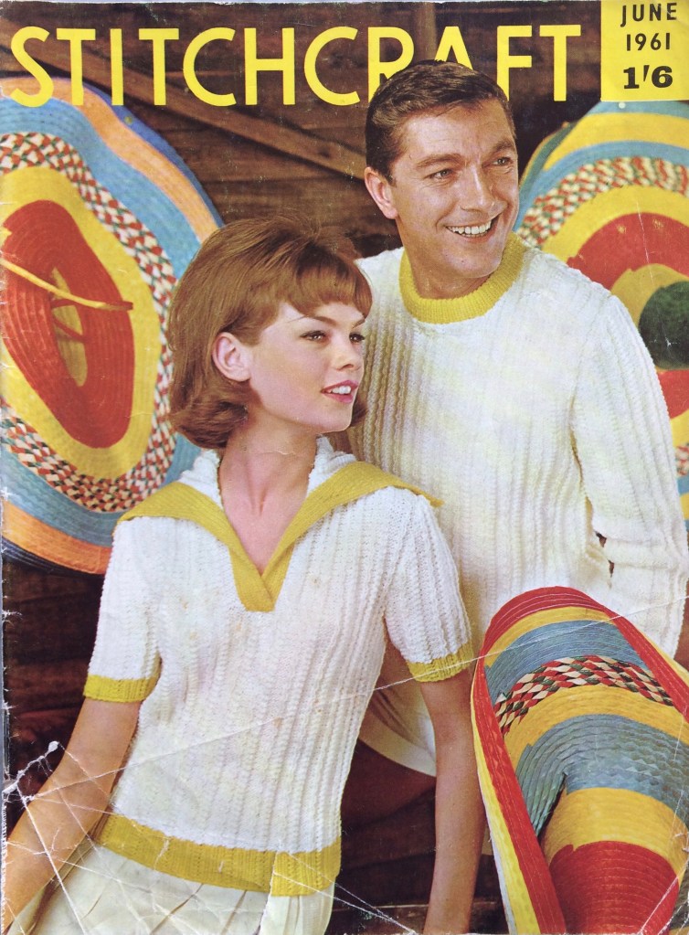
I love this cover. The yellow stripes on the hats, the yellow trim on the sweaters and the yellow sans-serif lettering all harmonise perfectly with the off-white garments in the center focus. Even the models’ hair colour looks like it was chosen to match the wooden wall. And we can see that typical 1960s hairdo coming into fashion, with more volume on the top and curled ends.

The rest of the photography in this issue is amazing as well. Let’s start with little Georgina in her beach dress, striking a Napoleonic pose from the back of her inflatableIMG_2566 
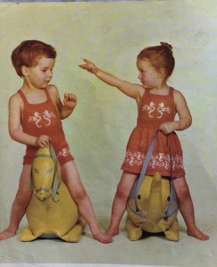
elephant! The dress is totally cute and definitely on my project list for this month, for my friend’s kid who just turned three. Those are seahorses, in case that wasn’t clear (the ones on the front panel of the dress and matching sunsuit look weird to me — I think I’ll fill in the bodies to make the shape more clear.)  The sunsuit and dress are made in wool-nylon blend Nylox, but I’ll be making the dress in cotton.

IMG_2585(Speaking of tiny children in goofy poses, am I the only one who finds this advertisement for next month’s Stitchcraft strangely funny? What is it about this baby that comes off looking so weird? Too much hair? The quasi-adult-looking face? The indescribable expression?)


Back to this month’s issue, somewhat larger children can get a pretty summer dress with an embroidered yoke. It wasn’t necessary to order a sewing pattern, as the skirt of the dress was really just a square with a little cut-out (shown with scaling grid in the issue) and the yoke outline was included with the embroidery transfer. Larger children than that (age 6-10) get a warm “Continental playtop” with a big collar in double knitting.


Big collars are still fashionable for adults, too, as we can see from the women’s version of the cover sweater or the “Husky Sailing Sweater” in bulky Big Ben wool. White or off-white and yellow are trending colours. The men’s garments both have round necks — I’m guessing designers assumed men would be wearing collared shirts under their pullovers no matter what they were doing, and “layering” big collars over each other didn’t happen until the 1970s. For warmer days or more elegant occasions, there’s a short-sleeved cardigan-jumper in 4-ply and a lacy cap-sleeve top in 3-ply wool. The cap-sleeve top is yellow and the buttoned blouse has a collar, so we’re right in fashion here too.


Homewares are fantastic this month as well, starting with some really easy garden cushions (padded with plastic foam to try and make them more damp-proof). We are still  in the year of the embroidered Zodiac signs, and June brings us a Gemini-themed beach bag.


IMG_2625
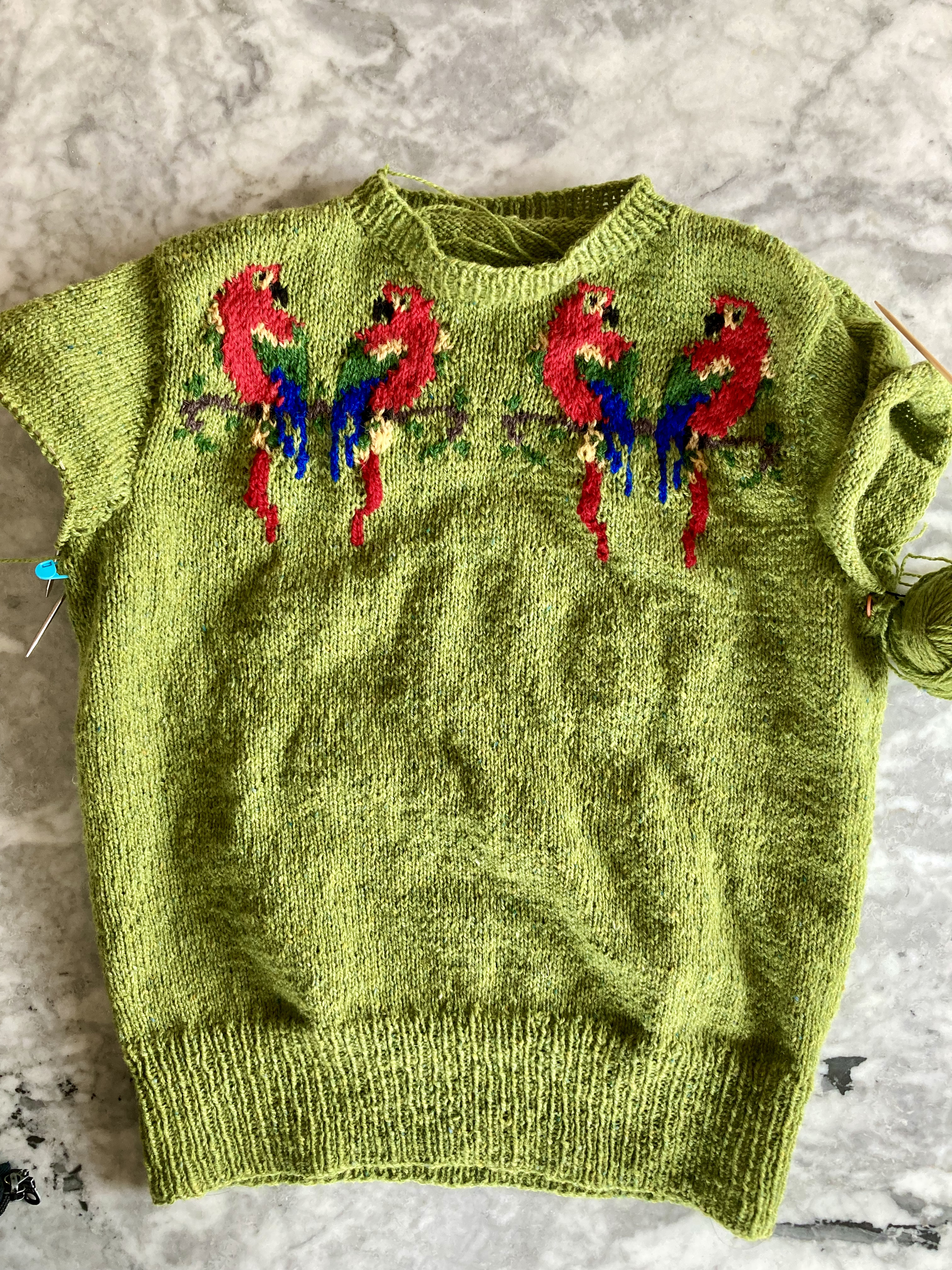
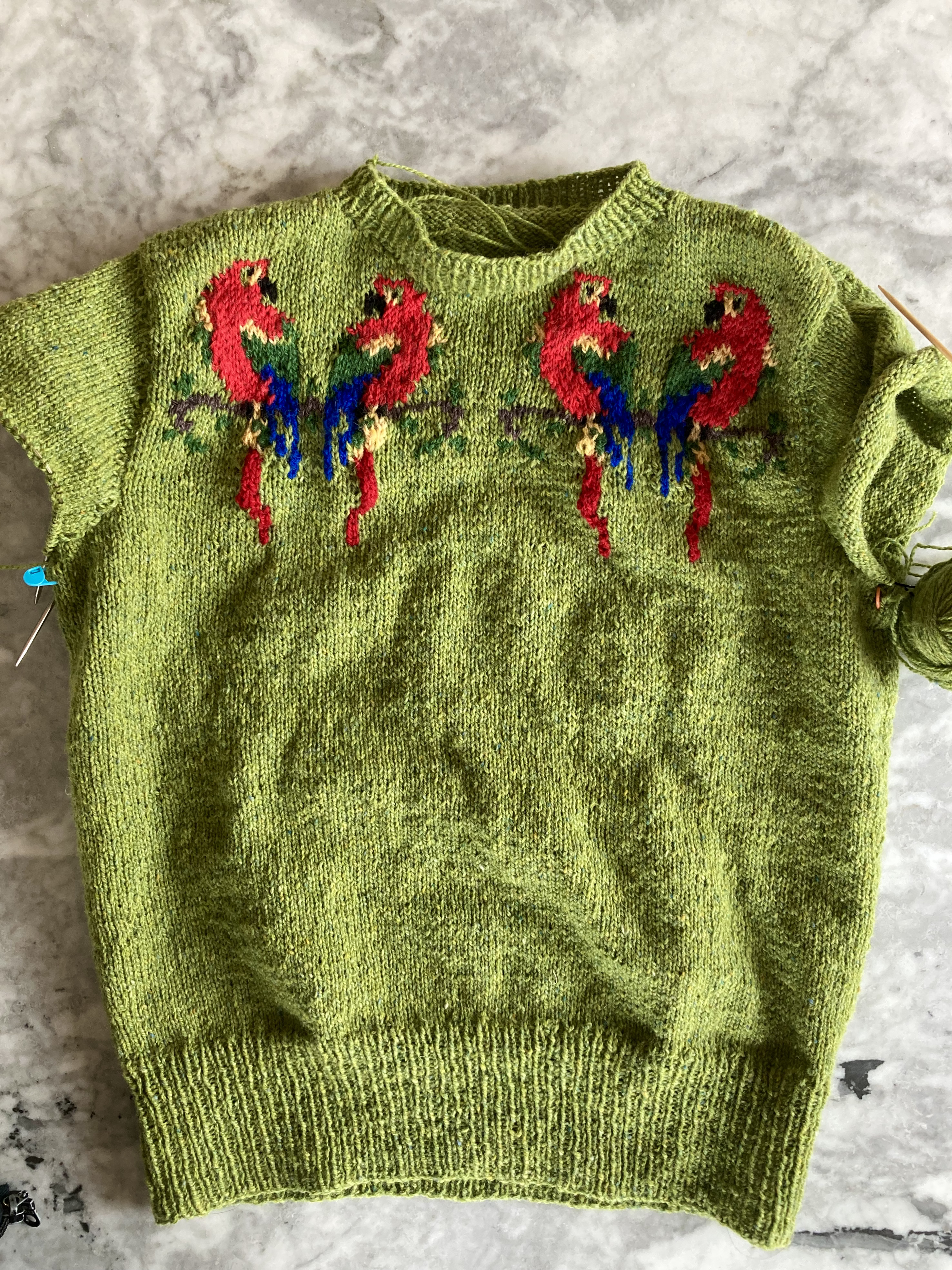
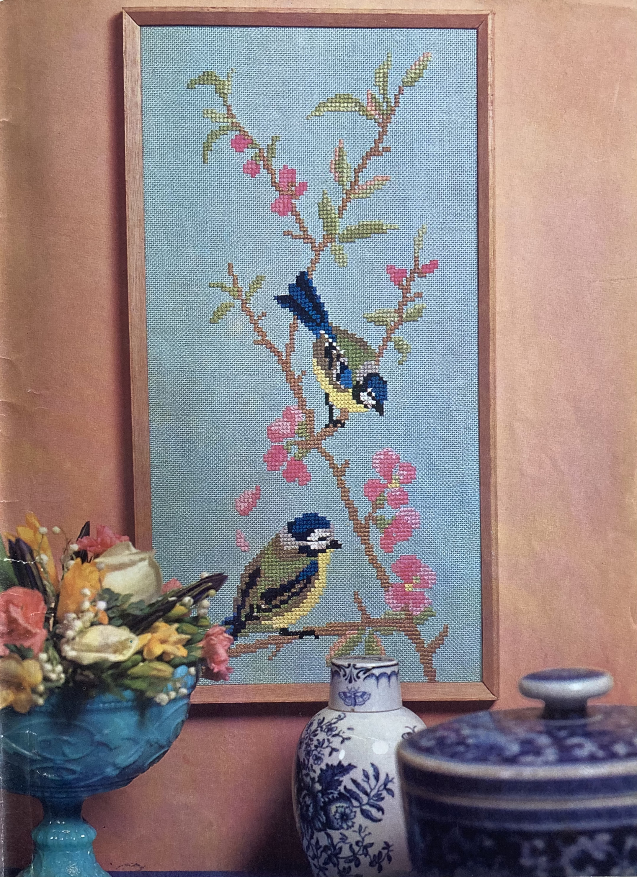
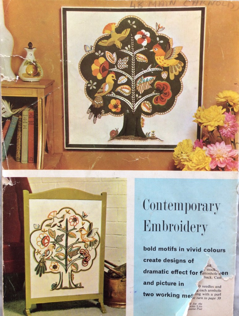
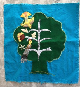
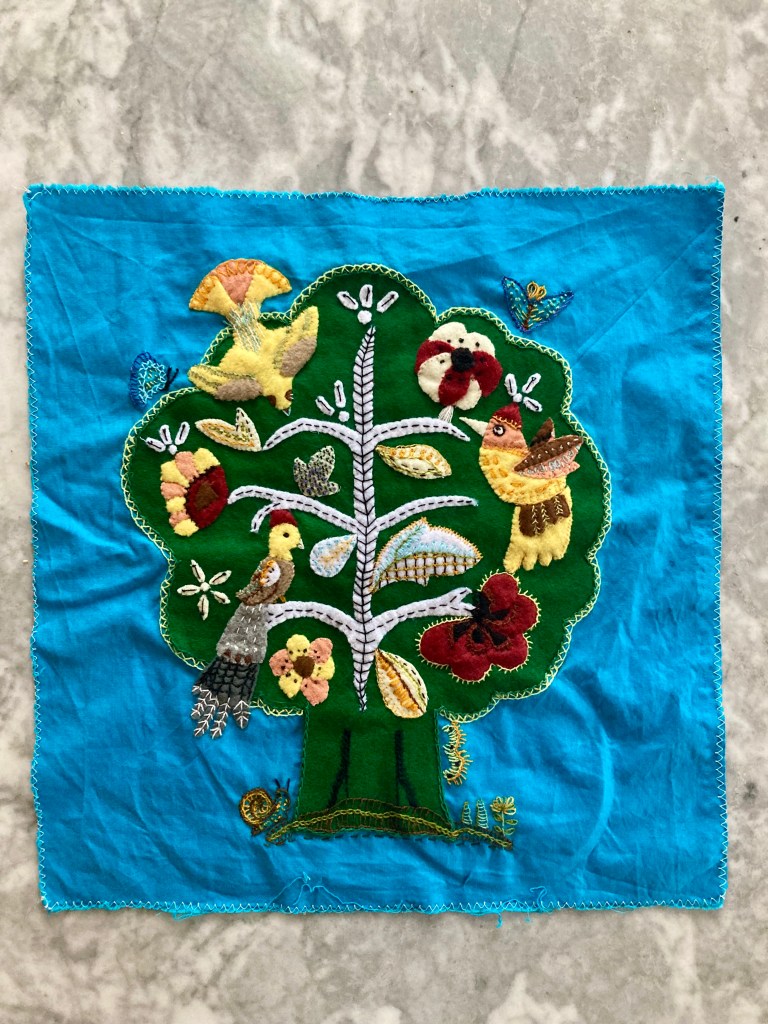
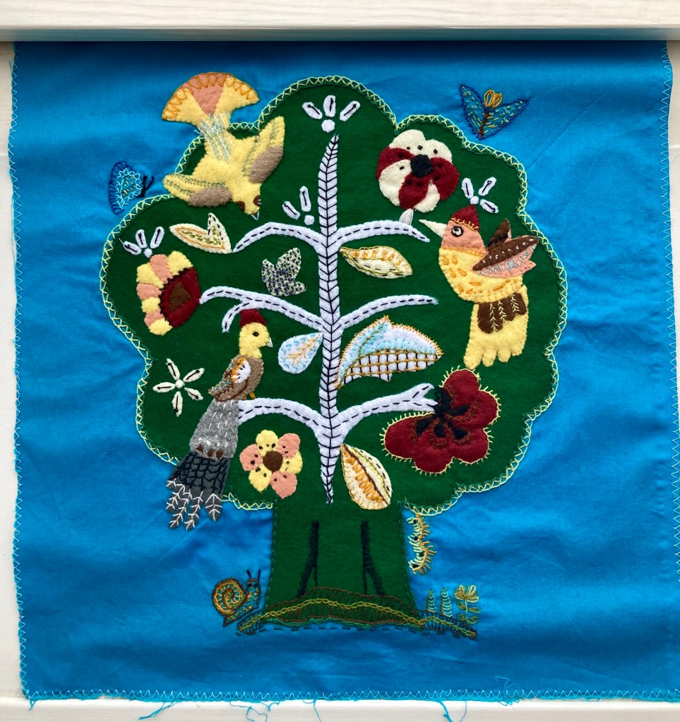
And then there’s this incredible birds-in-a-tree number, to be worked either in wool on linen for a firescreen or in felt appliqué with wool embroidery on linen for a picture. I’m normally not so crazy about 1950s and 1960s neo-Jacobean designs, but I love this one and definitely want to make the felt appliqué version as a cushion (with a more greeny green for the tree and not quite so much brown-orange-yellow in the appliqué work.) I imagine it might be tough without a transfer, but they gave us two very clear photographs including one in full colour, so what could go wrong?

IMG_2588
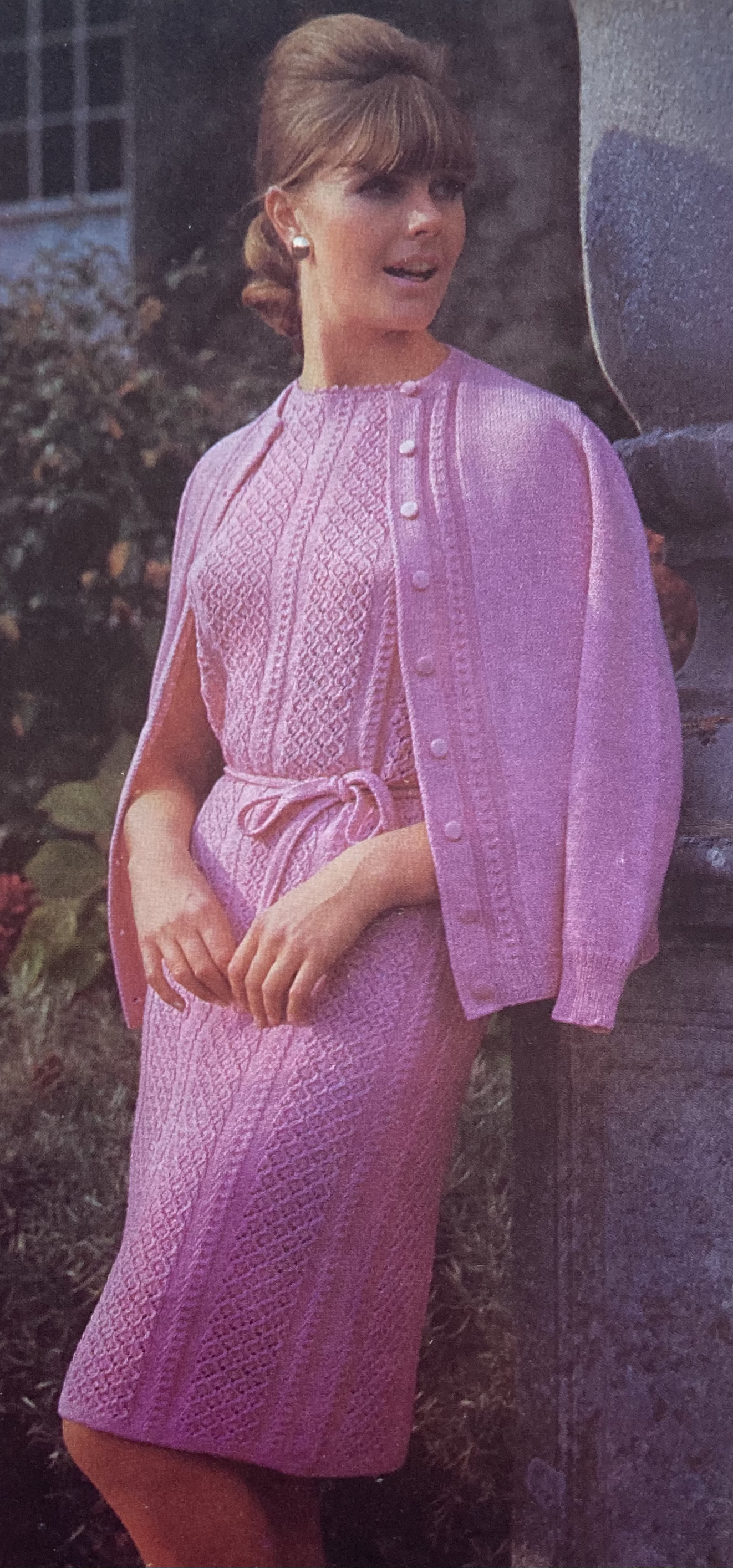
Last but not least, there’s a lovely, elegant two-piece suit in nubbly Rimple double knitting wool, featured in the most magnificent photo I have ever seen in any magazine, ever. If I remember correctly, I saw it in one of those Internet lists of “best/worst/weirdest knitting pattern photos” long before I started collecting vintage patterns. It’s definitely at the top of my list and if you haven’t seen it yet, you saw it here first!

There is nothing I can possibly add to that, so I’ll just get to work on that cap-sleeve jumper… and the little girl’s beach dress … and the garden cushions… and the Jacobean appliqué… Happy June, everyone!

June 1960: Fast Forward (March 1969)

IMG_1866
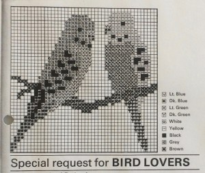
To be honest, the June 1960 issue didn’t really have any designs that enticed me. The little summer tops were nice, but I still hadn’t finished the little summer top I started in April,  the embroidery and tapestry designs didn’t excite me, and I have plenty of hats and don’t wear stoles. However, way in the back of the issue, along with the comic, the “teaser” ad for the July issue, and the “Suggestions from Readers” there was a little motif for a knitted or embroidered parakeet. Perfect, I thought — I can make a little cross-stitch picture as a cute wedding present for two friends who are getting married in August and love budgies. A parakeet and a budgie are the same bird, right? Just the American and British names for them? But wait — Stitchcraft is a British magazine. Why would they use the American word?

IMG_1863
June 1960 issue

And then I noticed that the parakeet in the motif is not a budgie at all, but an actual wild parakeet — like a smaller parrot. It’s cute, but not quite what I wanted. I thought I could use the motif as a starting point to create my own design that looked more like a budgie, so I made a copy and thumbed through my ideas notebook to see what I could do with it.

And what do you know — at some point in time I must have thought ahead and copied out a little motif from the March 1969 issue of Stitchcraft — a “Special Request for Bird Lovers” — and forgotten about it in the notebook! There are even two birds in the motif, so I didn’t have to try and mirror-copy a modified parakeet. So this month’s project is a sort of fast-forward to March 1969 in lieu of a project from June 1960.

IMG_1867
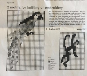
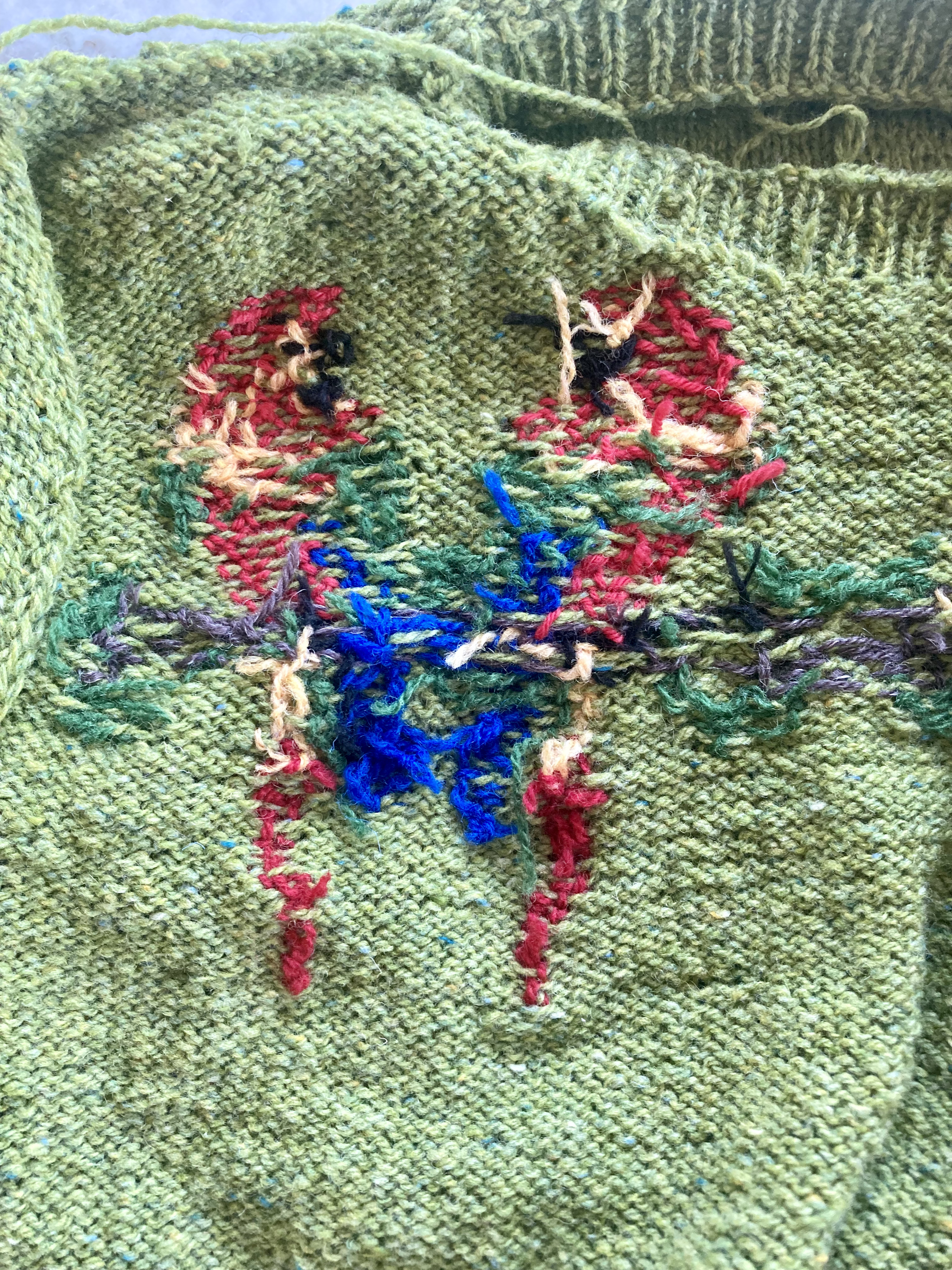
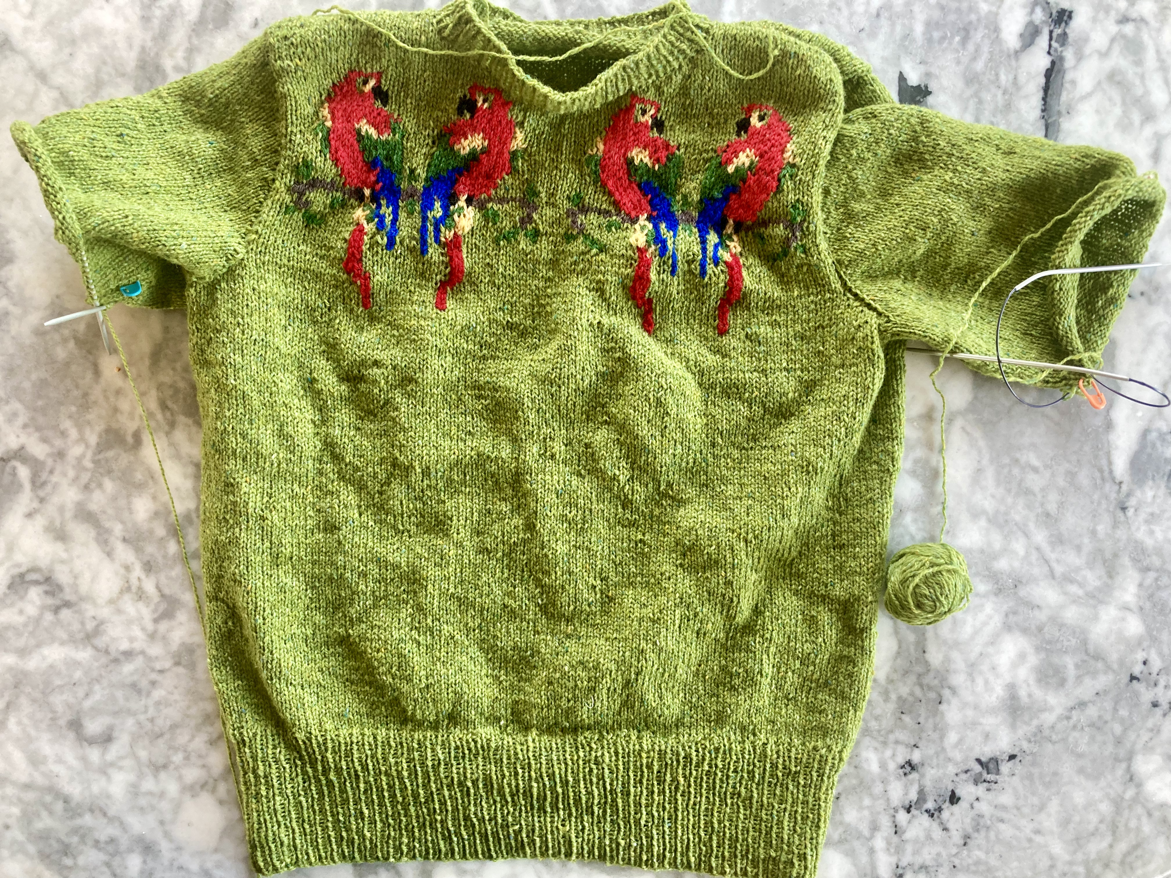
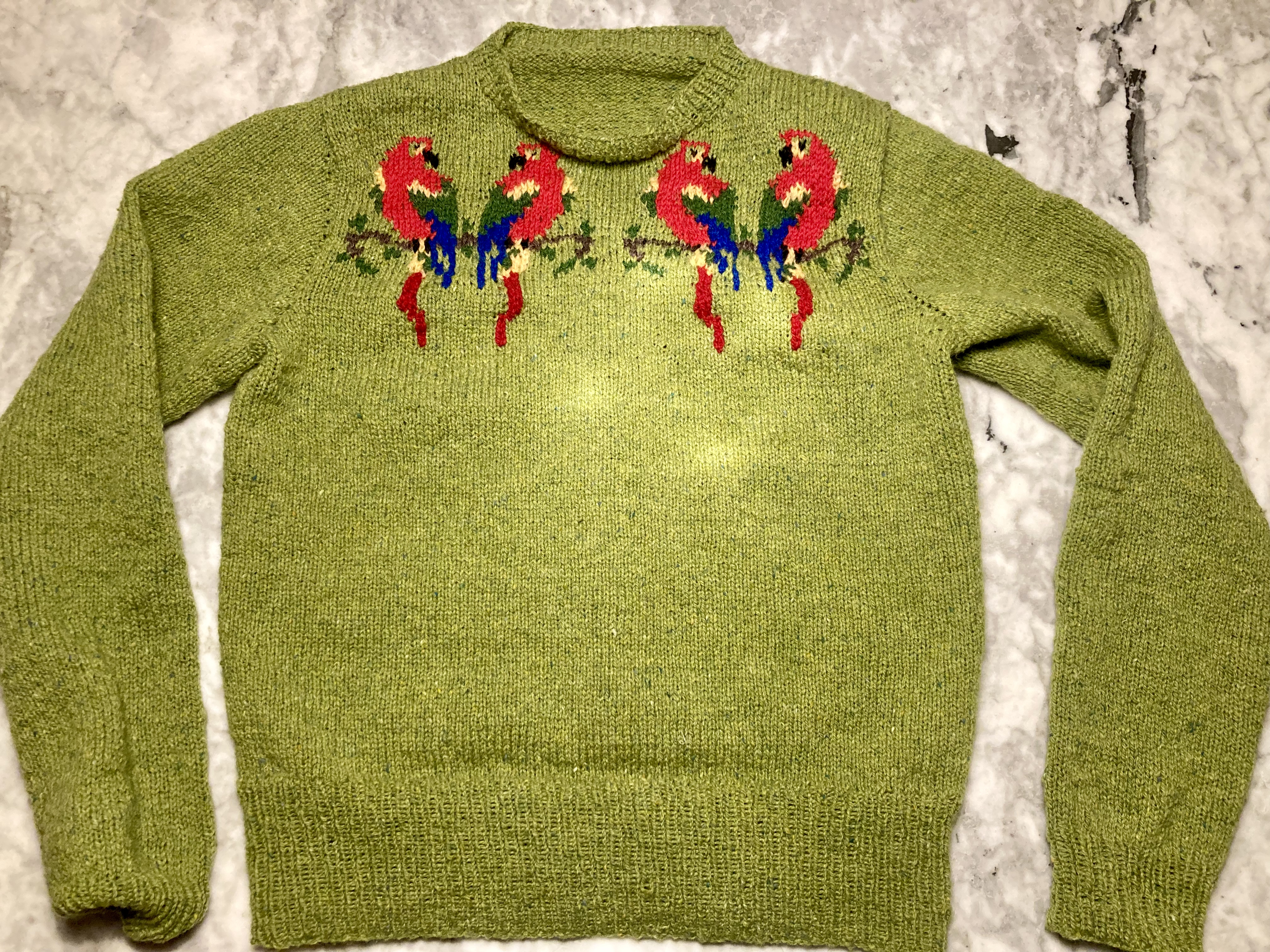
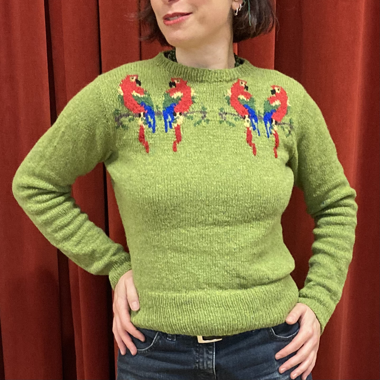
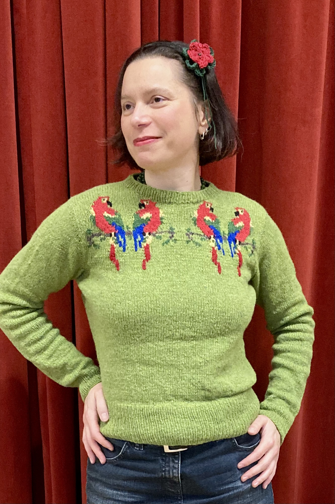
This was my first time working in counted cross-stitch and I thought it would be easy. You just have to count the squares and thread the embroidery cotton through the holes in an x, right? I was so, so wrong. First of all, I didn’t know what “gauge” fabric to buy, so I chose one that seemed medium-sized to me, where I could see the holes pretty clearly. I should have chosen a size bigger, since the holes were still absolutely tiny to my (perfectly good) eyes. Counting the holes was much more difficult than I expected, since they all looked the same and seemed to move around when I tried to count them.

To top it off, the fabric was too pale, so that the white in the blue-and-white bird didn’t have enough contrast to show up properly. Not wanting to buy more fabric, I tried dyeing the fabric slightly darker with tea. I simmered the fabric in a pot with the tea for about ten minutes, then rinsed it in hot water with vinegar to set the colour. It worked perfectly, so at least something about this project was easier than I thought it would be. Here is the original fabric (top) and the dyed fabric with practice stitches in pink and brown (bottom). The brown stitches are the beginning of the branch on which the budgies are sitting.

IMG_1877
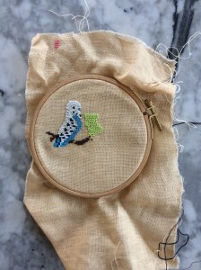
The embroidery itself was slow-going and not totally accurate, i.e. I do not think I always got the right number of threads (2×2 for each cross). Even when I did, the stitches were uneven and raggedy. (I did make sure that the stitches are all going in the same direction and the same top-bottom stitch pairing.)  Also, it was just plain no fun to work. What a pity — the idea was so good!

So I did what I had to do: quit and started over. On larger-weave fabric (Aida). Which was also too pale and had to be dyed. Where the dye didn’t take as well because the fabric was not 100% linen like the other. Where the design was obviously much larger than the first try and I actually preferred it smaller. But at least it worked! So fast, so easy! I embroidered one entire bird in a day! And it actually was fun to make.

budgiesback
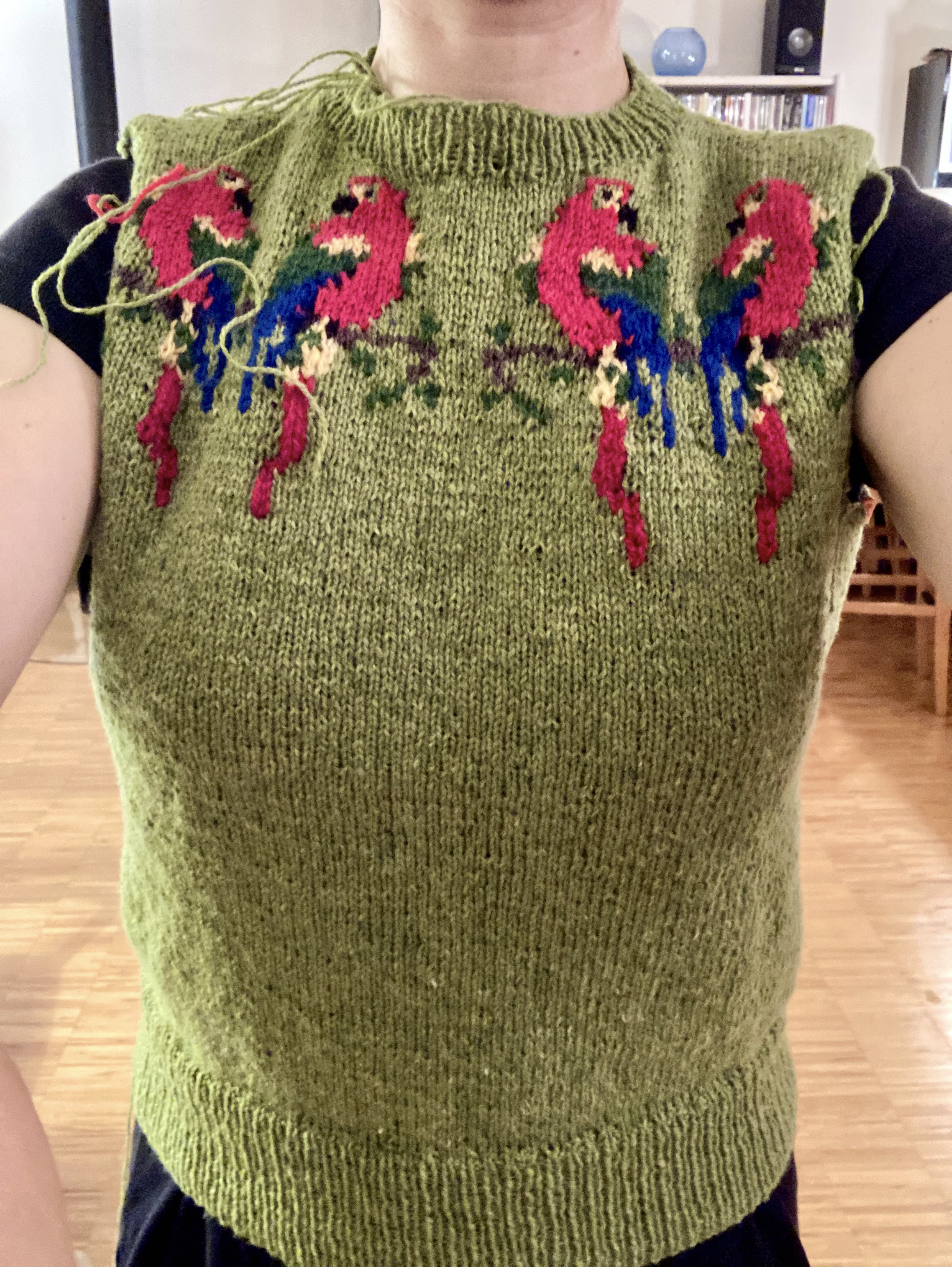
After I finished the birds, I embroidered the initials of the happy couple underneath in simple block letters (not that it was simple to get the right stitch count and center it) and framed it in an embroidery hoop with the help of this helpful YouTube video. I just happened to have some leftover fabric for backing that had a giant bird on it — how perfect! (The buttonhole-stitch framing is not perfect, but that’s life.)

So all in all, it was a long and difficult journey, but I learned a lot and am happy with the result. Also, I think my friends will like it, which is the most important thing.

budgiesFO

May 1960: “Summer Song”

cosy
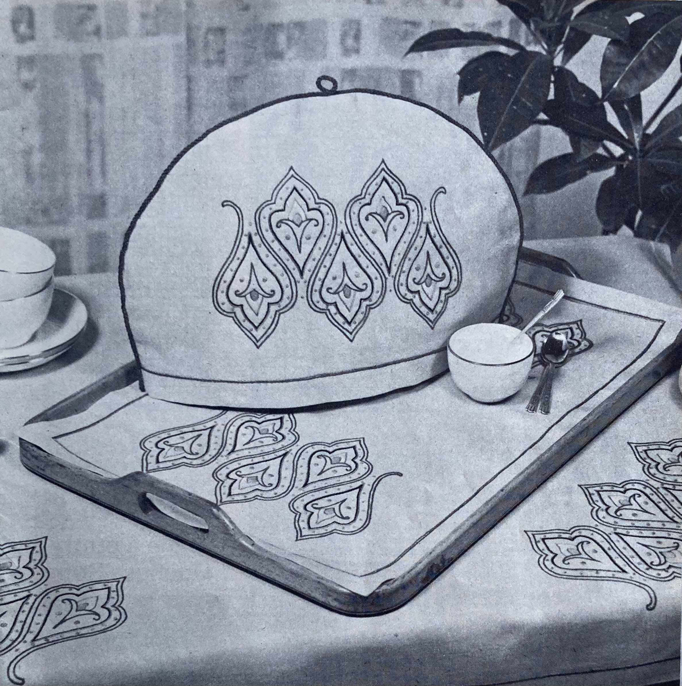
This is definitely a “cosy of unusual charm”! (Despite the ripped corner on the back cover photo.) It features appliqué and embroidery with different designs on each side and instructions to make it up into either a regular cosy to put over the teapot, or a “nest” to put the teapot into.

My version isn’t a teapot cosy of any kind, since I don’t use them or know anyone who does. Everyone needs a pretty little zippered bag or two, though, to put current projects in, or materials for crafting, or pencils or any kind of small “stuff”, so that is what this project is going to be.

I started with the “bird and strawberries” side. As always, the first question is “how to get the pattern onto the fabric and cut-out bits, since there is no existent transfer.” Remember, back in the day you had to write to Stitchcraft to get the iron-on transfer as a supplement! I used the same graph square technique previously used on the  leaf cushion  and the gay goslings. It was trickier in this case, since the only good photo was taken at an angle, but I got it to work somehow.


Then I copied the pencil sketch, cut out the individual shapes by pinning them to the felt bits, and pinned them out on the base fabric.


Stitchcraft gives pretty good instructions for the embroidery — which colours for what parts of the appliqué and how many strands. The embroidery work itself was not too difficult, using stem-stitch, Romanian stitch, loop stitches and French knots as well as a bird_straw_emb
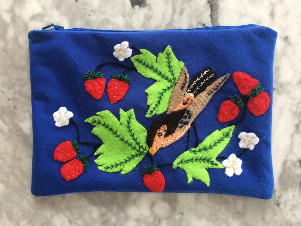
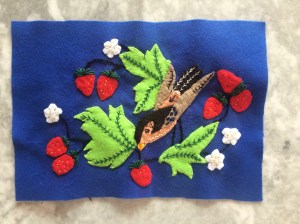
bit of herringbone and the tiny straight stitches in the strawberries. Still, it was more ambitious than any embroidery I have tried up until now. It doesn’t look quite like the picture and I did take a little bit of licence, but on the whole I was pretty satisfied… except for the legs. Oh dear, oh my, oh no, the legs. I did them three times and they still look weird. Either the angle is wrong, or the thickness, or I don’t know what, but I figured doing it again would only chew up the fabric more, so it is what it is.


Creating the template for the second side, “Bird and Blossom” presented an extra challenge, as there was only a tiny black-and-white photograph in the magazine, where the tea cosy “nest” was open and made the design appear at an angle. I am definitely getting the hang of this copy-grid-paste-and-cut method though, because it went quite quickly and easily and I think I matched the design pretty well — or at least made a decent interpretation of it.

Again, I sewed the pieces down (noticing along the way that I had forgotten one leaf, and adding it) and then did the embroidery as outlined in the instructions. Well, that was the plan at least, but the picture was so tiny and “unreadable” that I ended up doing most of the embroidery freehand. Winging it, so to speak…

Making the finished embroidered panels up into little bags should have been the easiest step, but it was oddly frustrating and nothing worked properly the first time around. The zippers are a mess. The lining of the “Bird and Blossom” catches and the ends of both zippers are not properly sewn into the top seam. Also, the embroidery is not bad considering my level of (in)experience, but I’m not as happy with it as I could have been. So I’m still deciding whether to keep both of the bags for myself, or give one or both away. What do you think? Here are the finished objects!

BirdStrawFO

BlossomFO