December 1966: Inspired-By-Stitchcraft Mitts

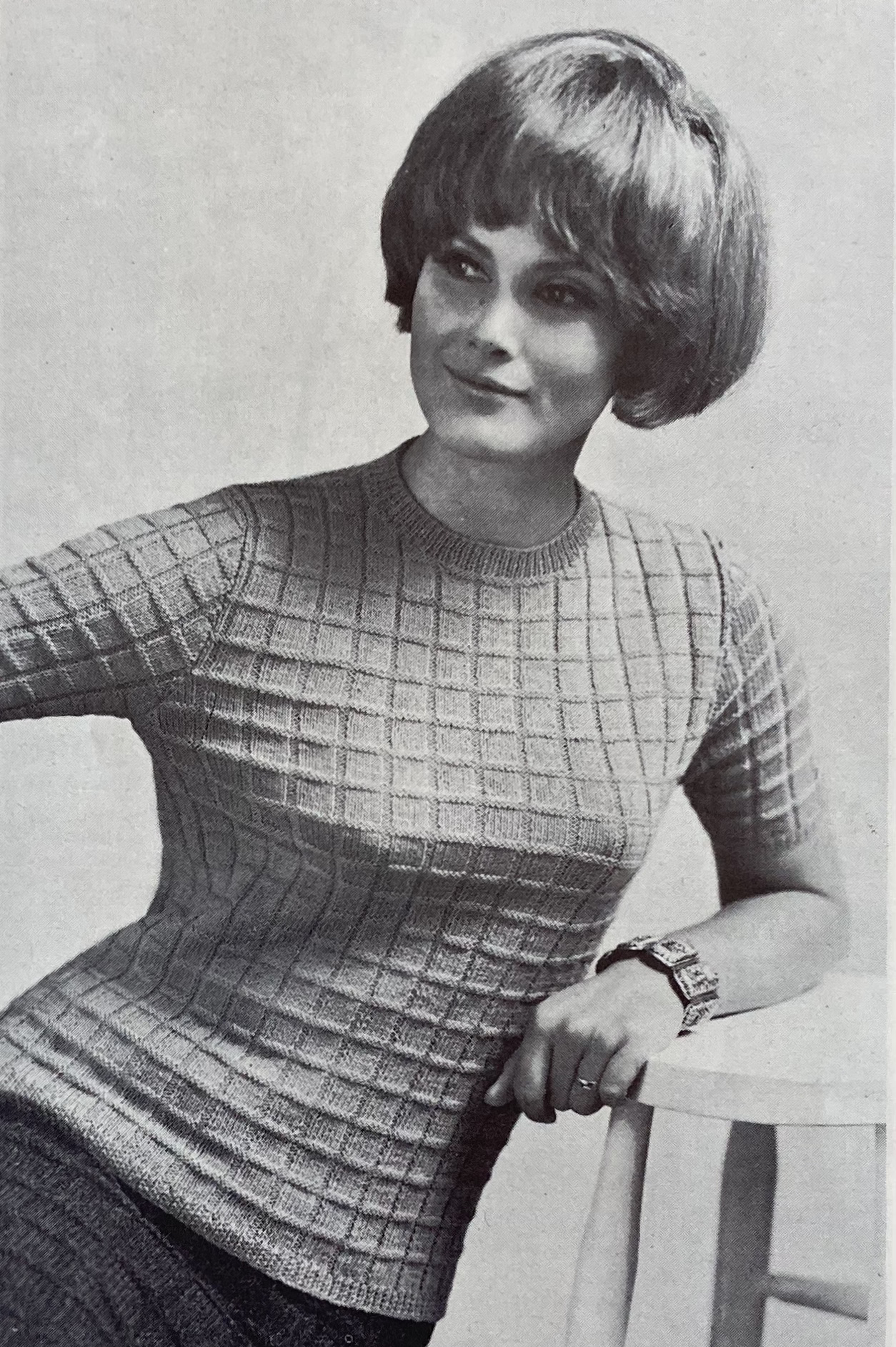
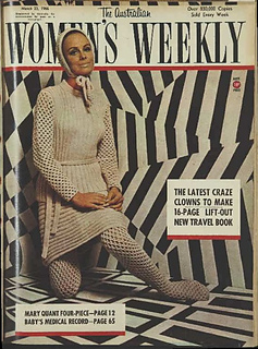
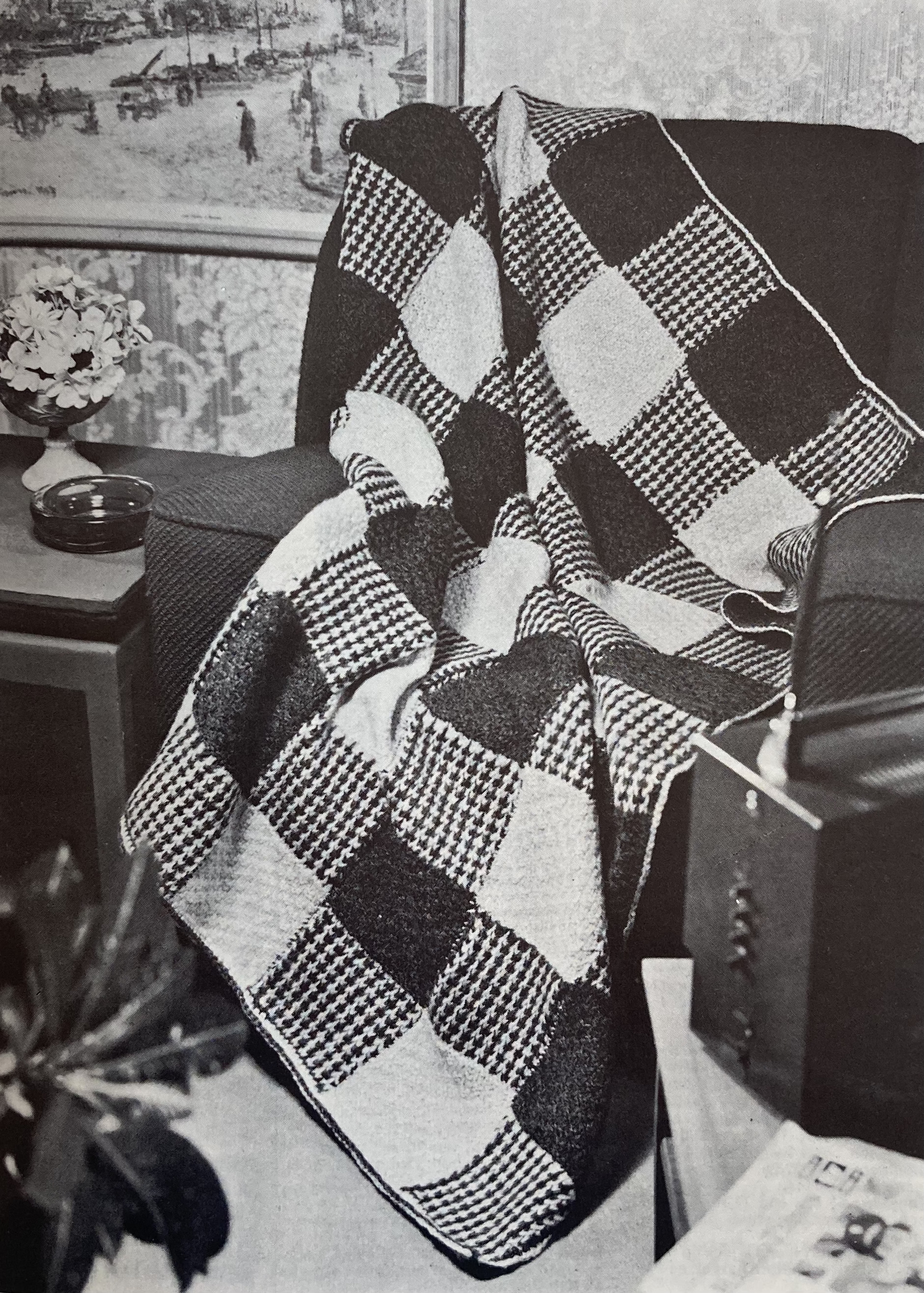
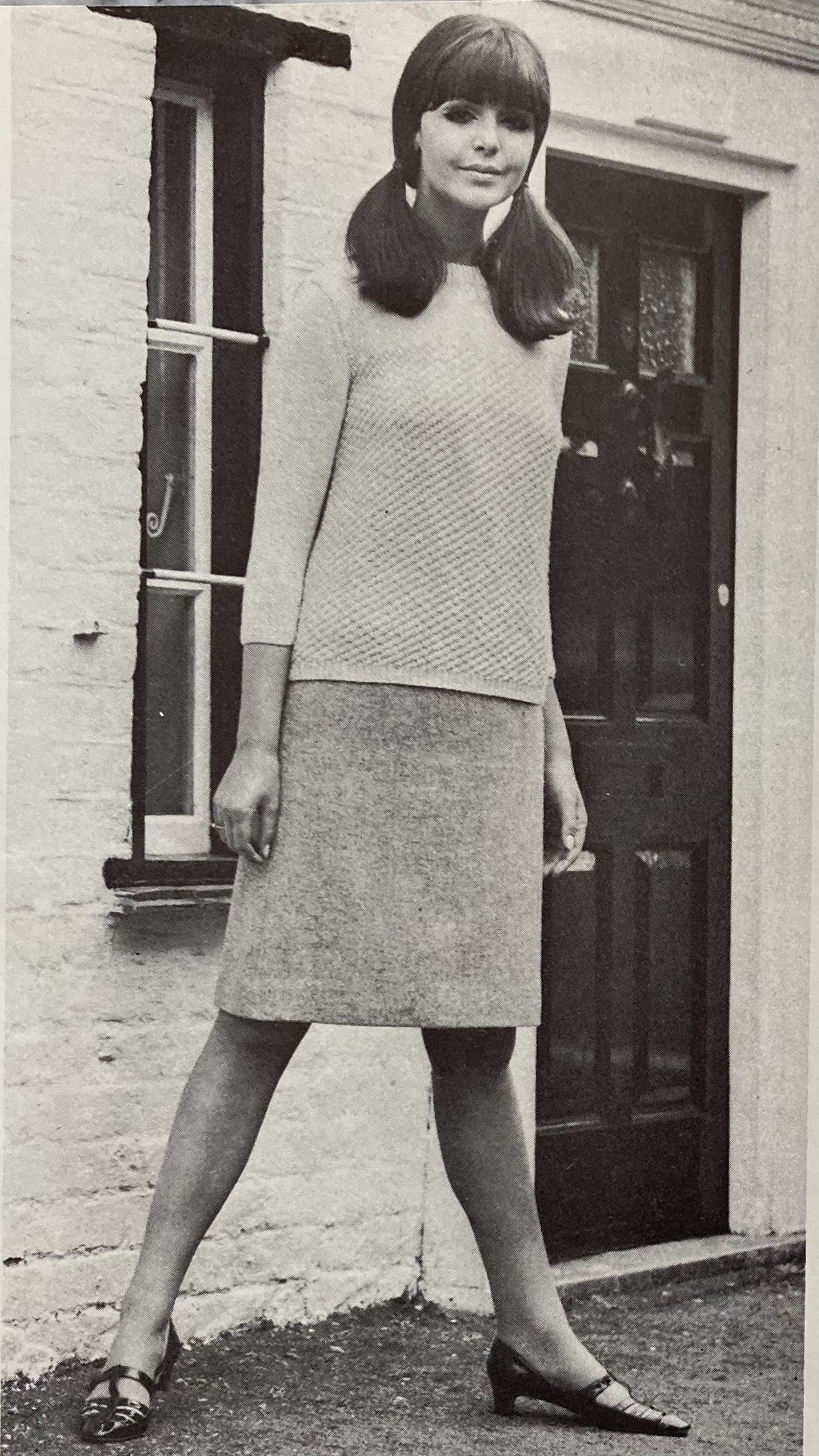
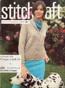
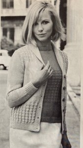
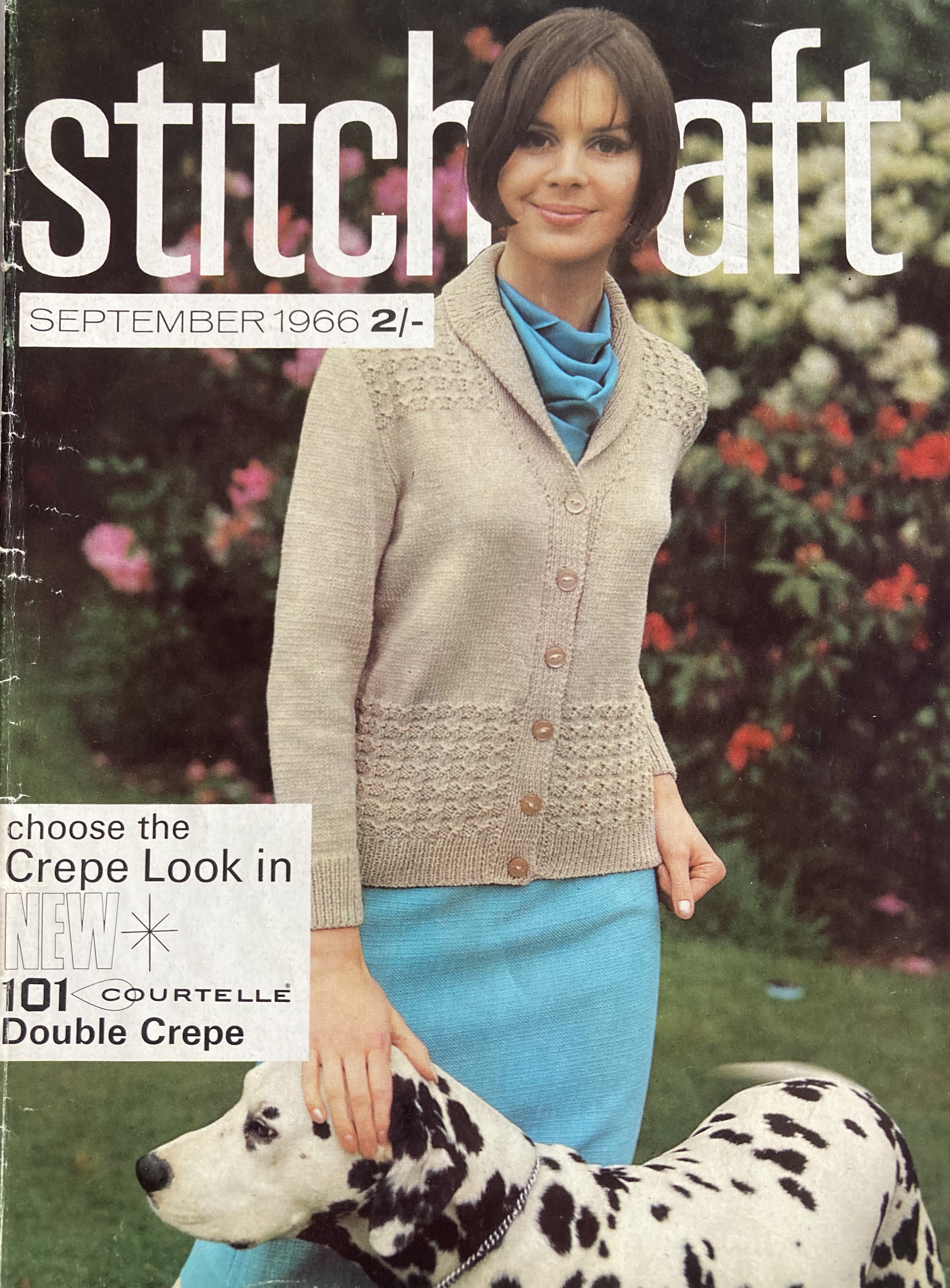
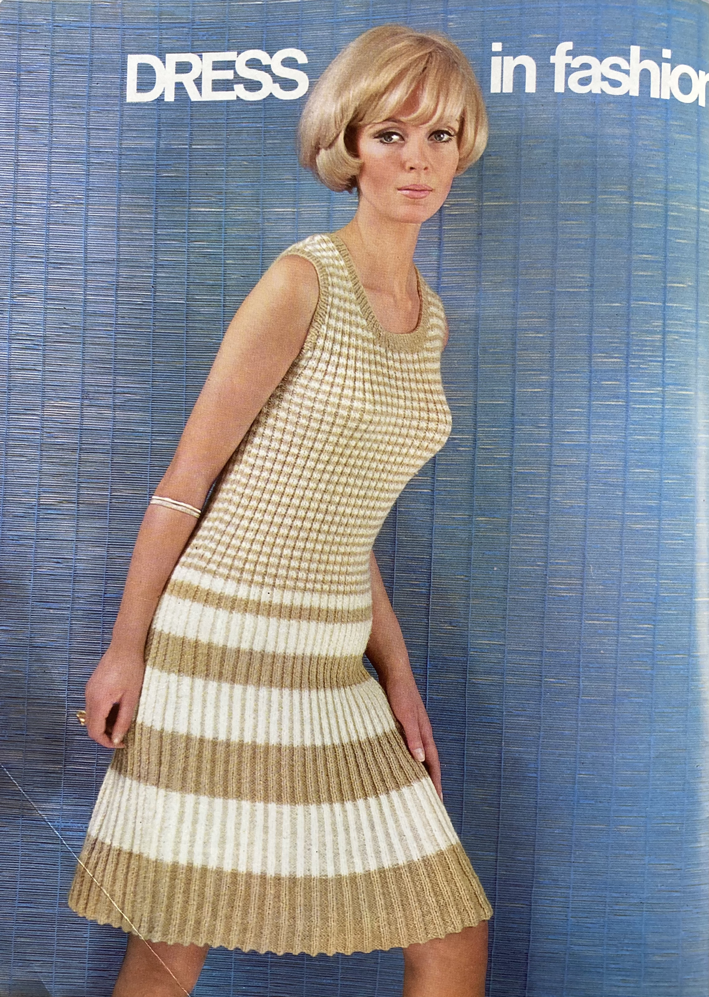
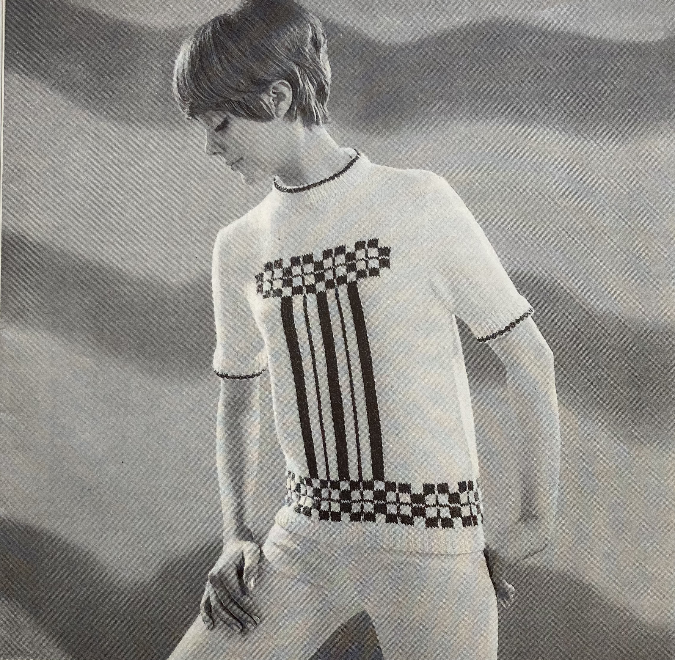
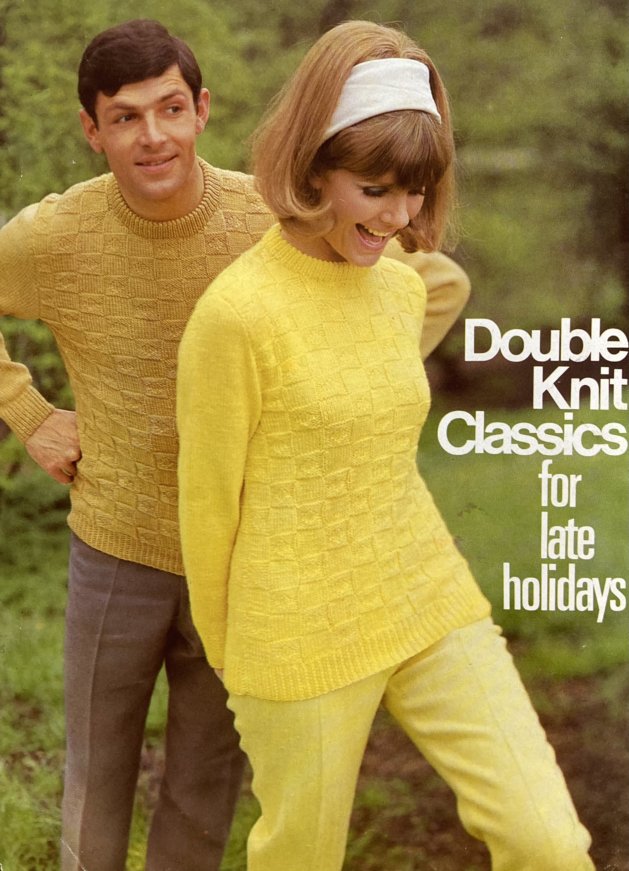
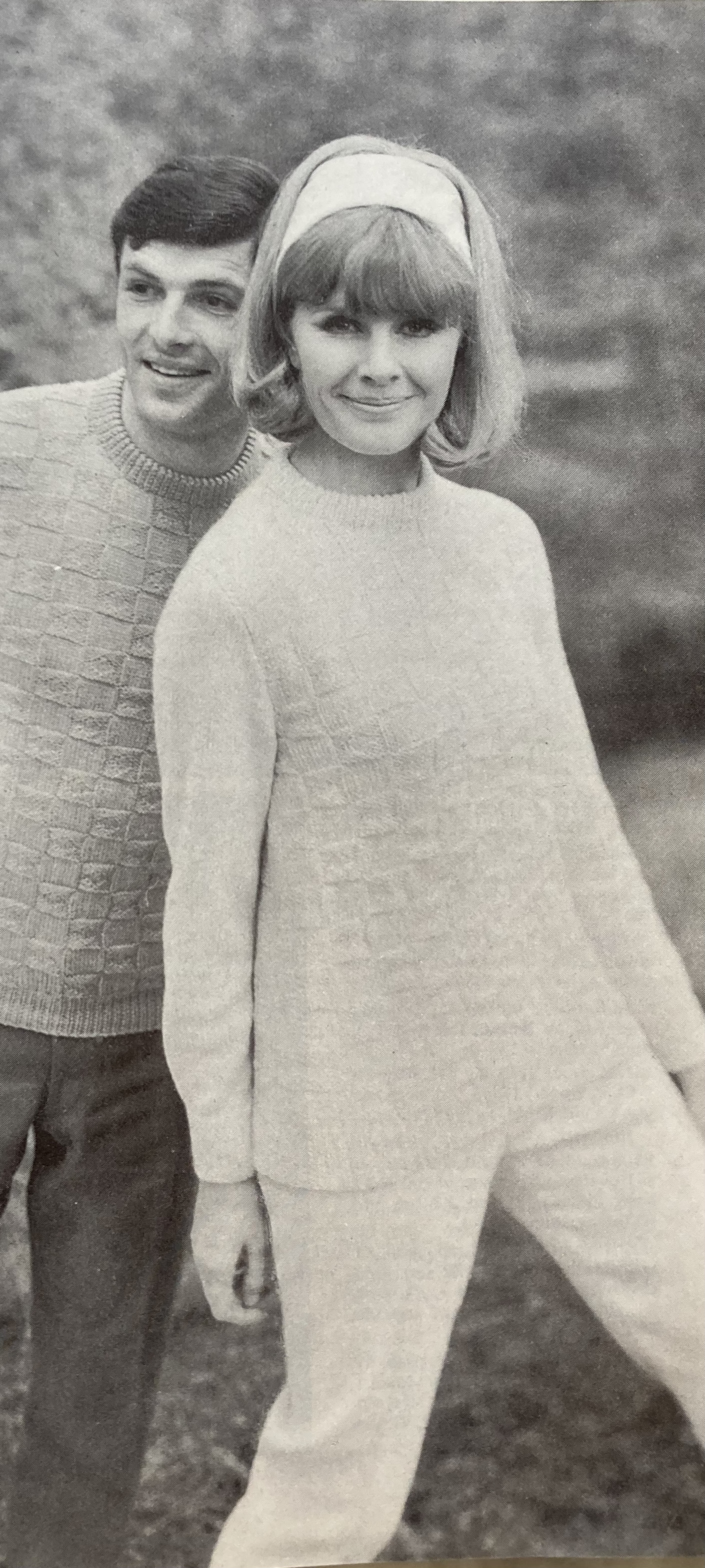
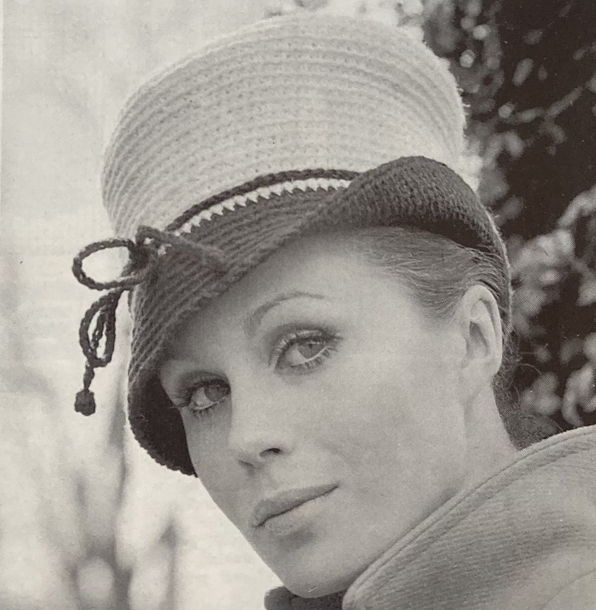
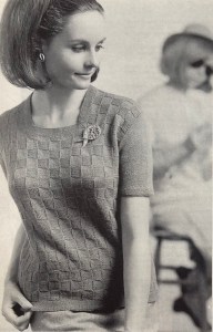
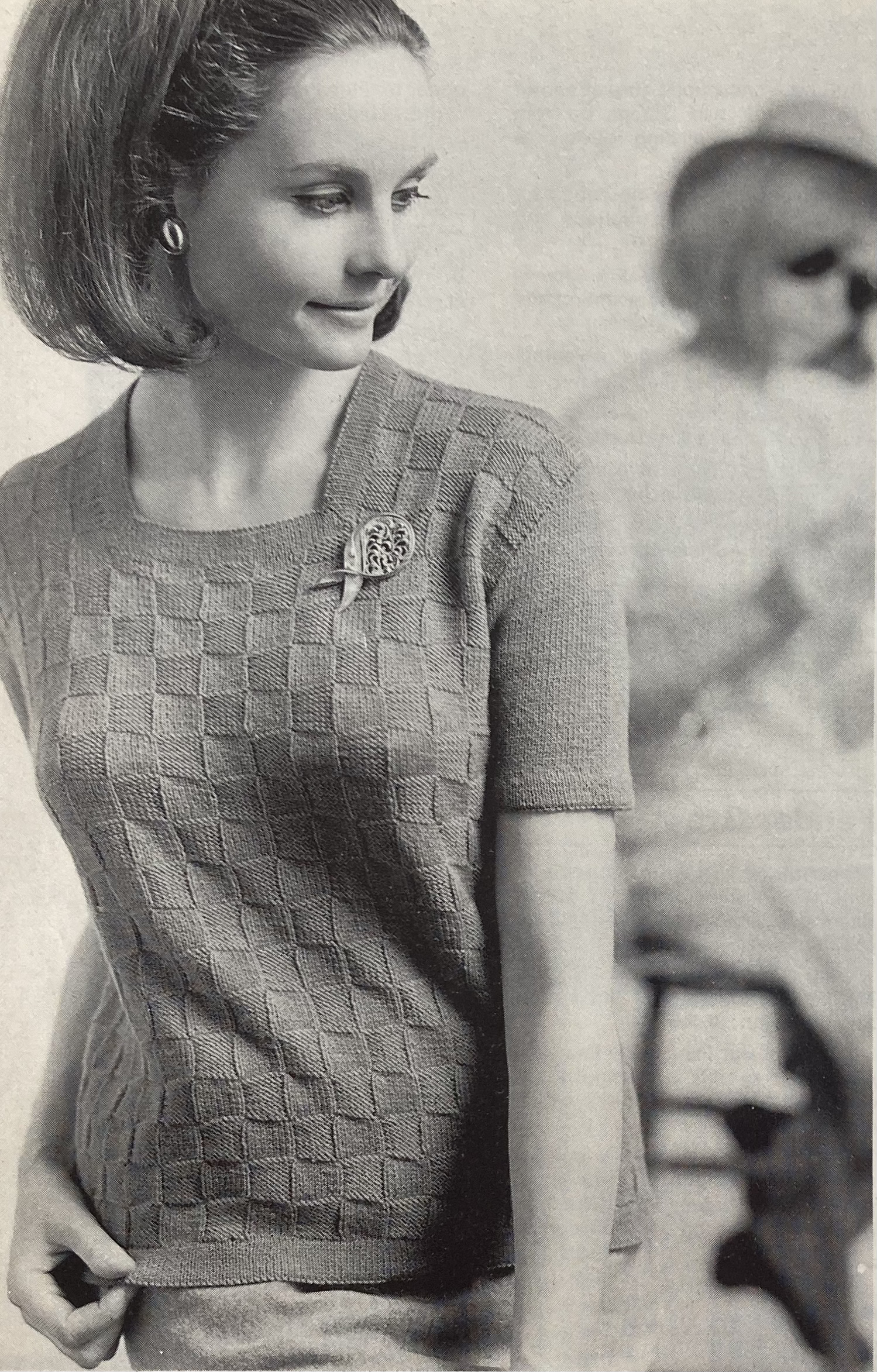
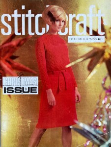
The December 1966 issue of Stitchcraft had some lovely items in it, but the ones I liked best were too time-consuming or impractical to make in the middle of a busy season. For example, I loved the dress on the cover, with its criss-cross stitch pattern on the bodice and sleeves, but didn’t have the time or energy to make a whole dress. I decided to adapt the sleeve pattern to make a pair of long fingerless gloves.

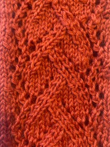
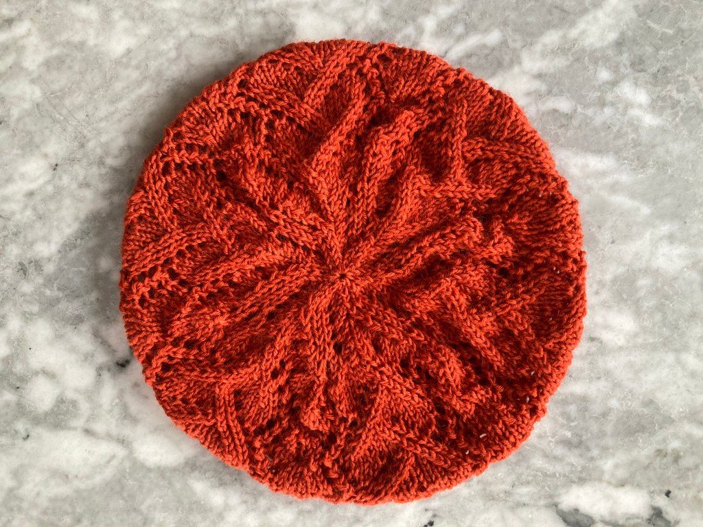
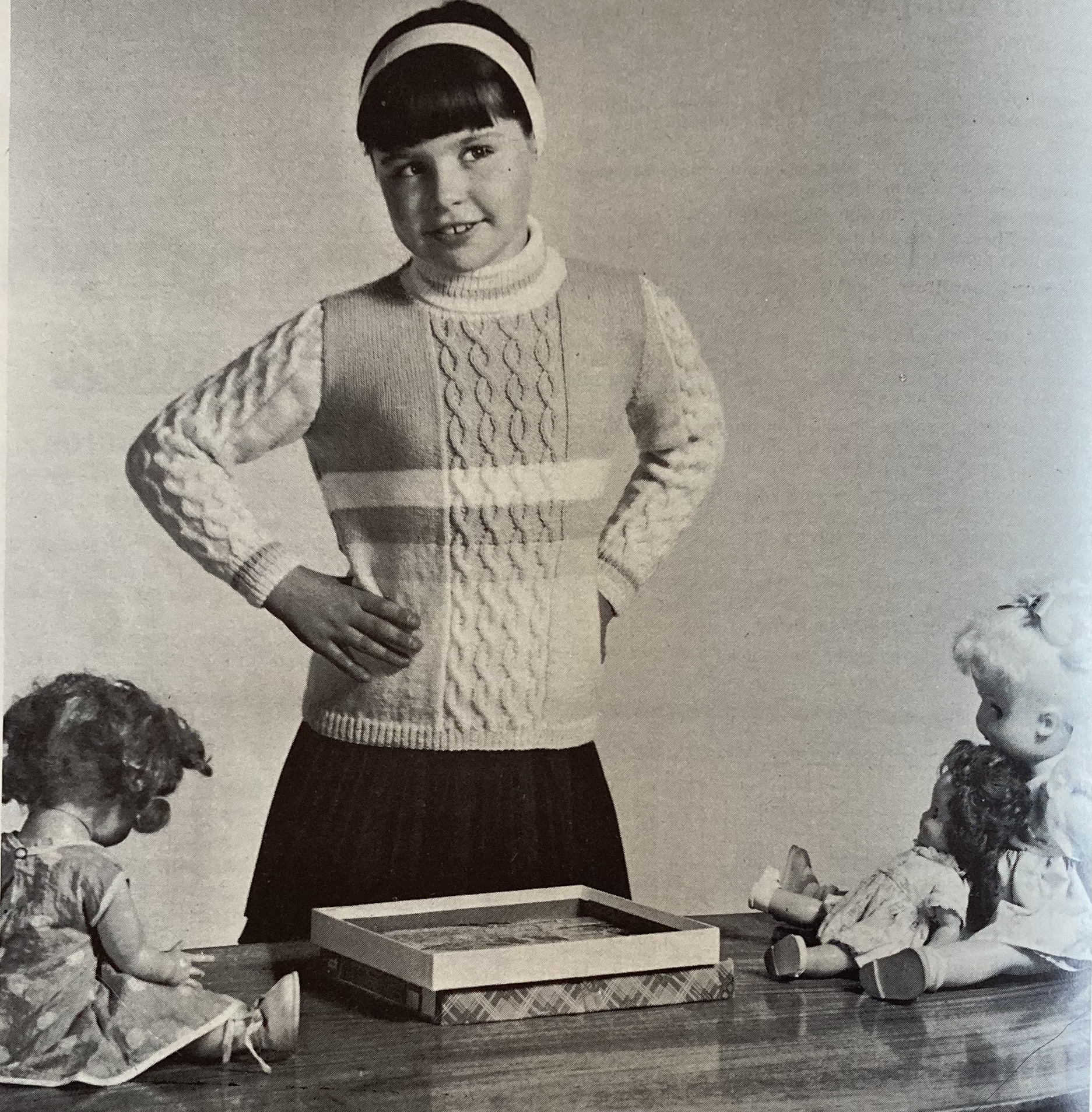
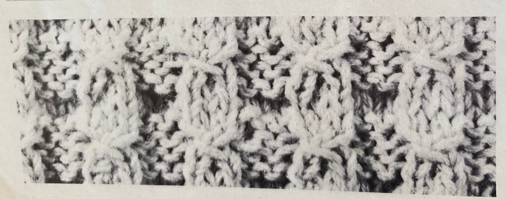
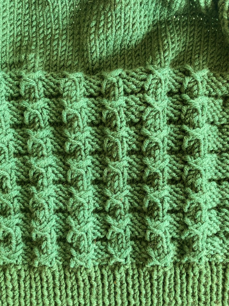
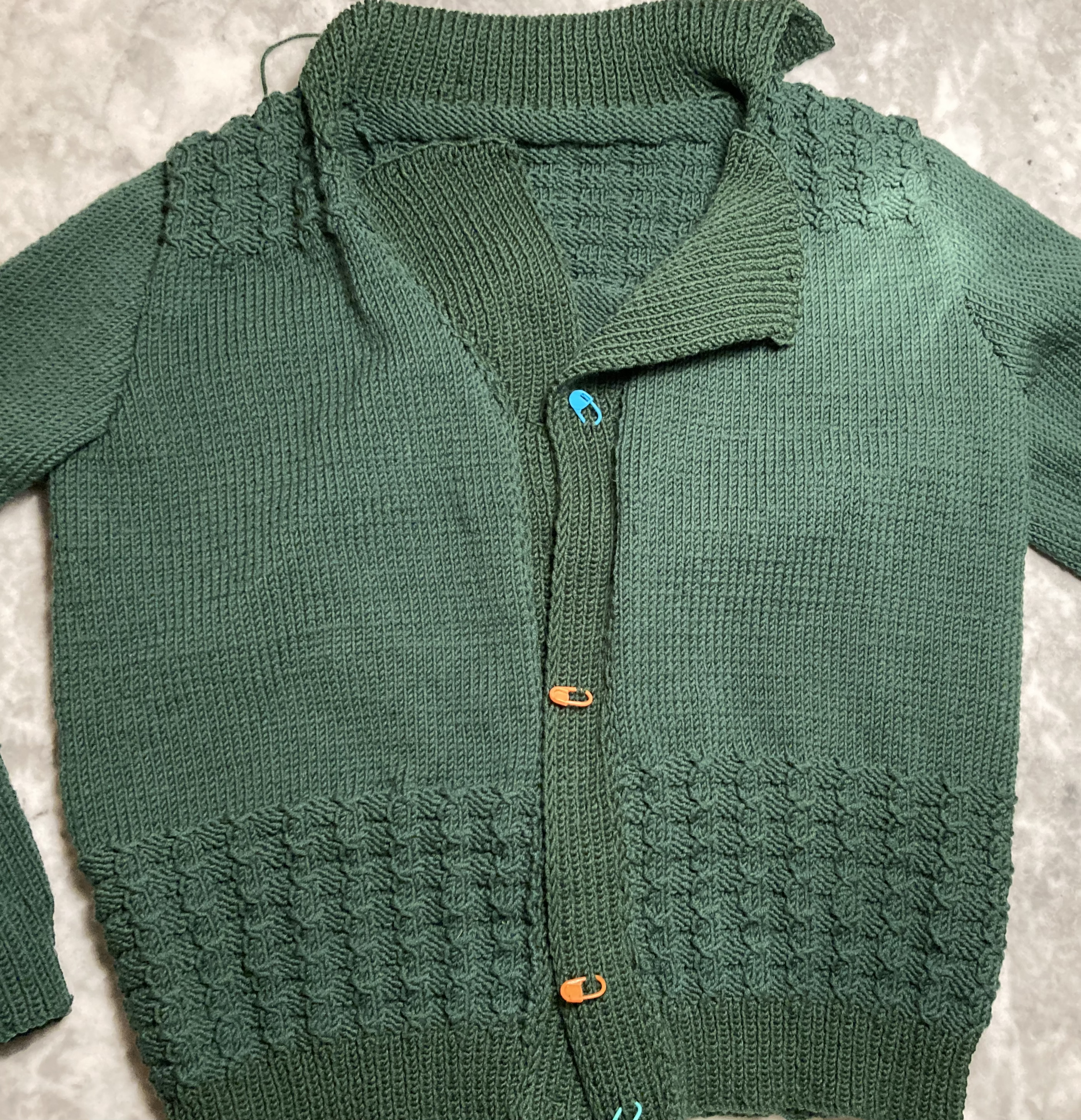
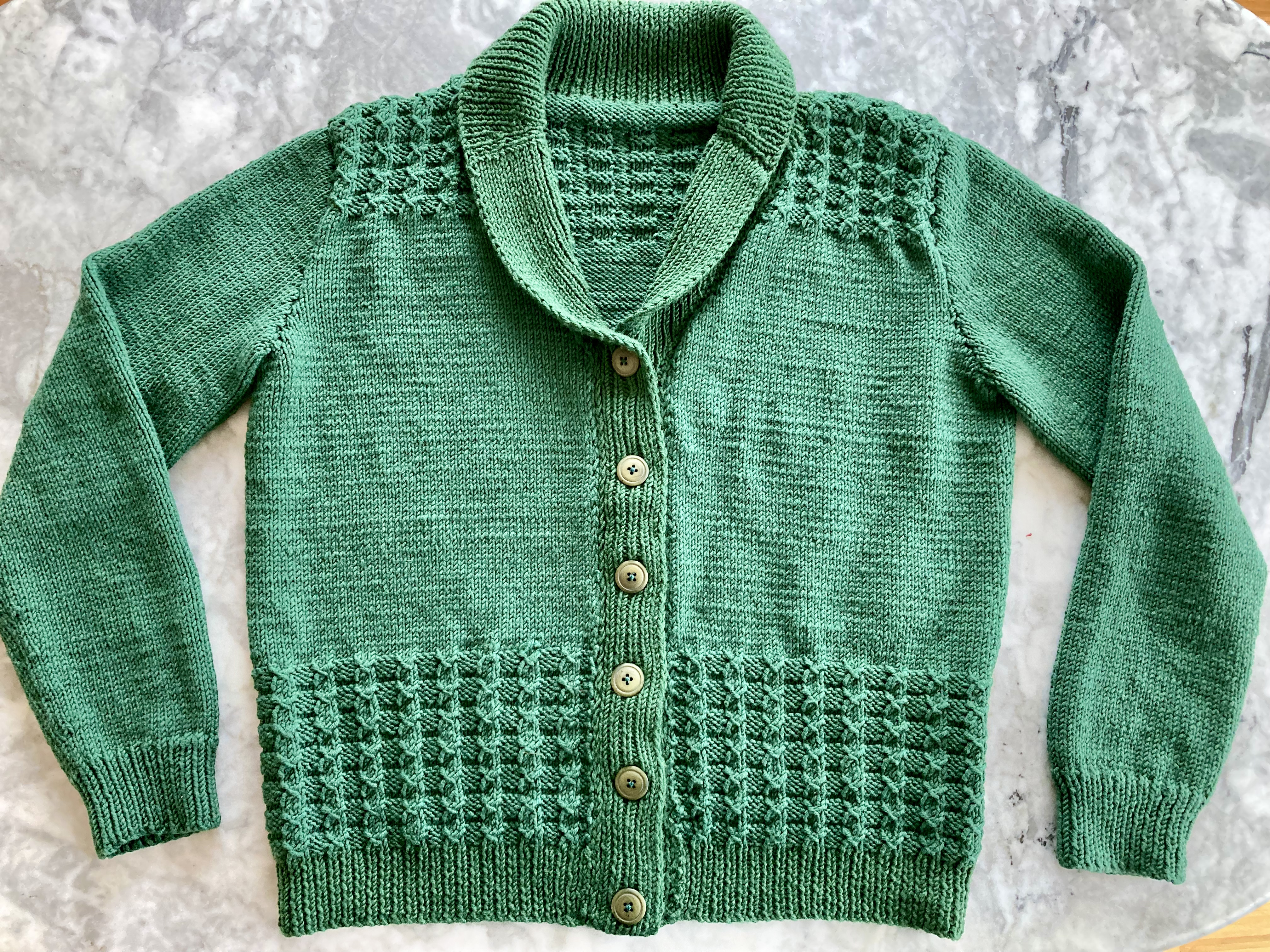
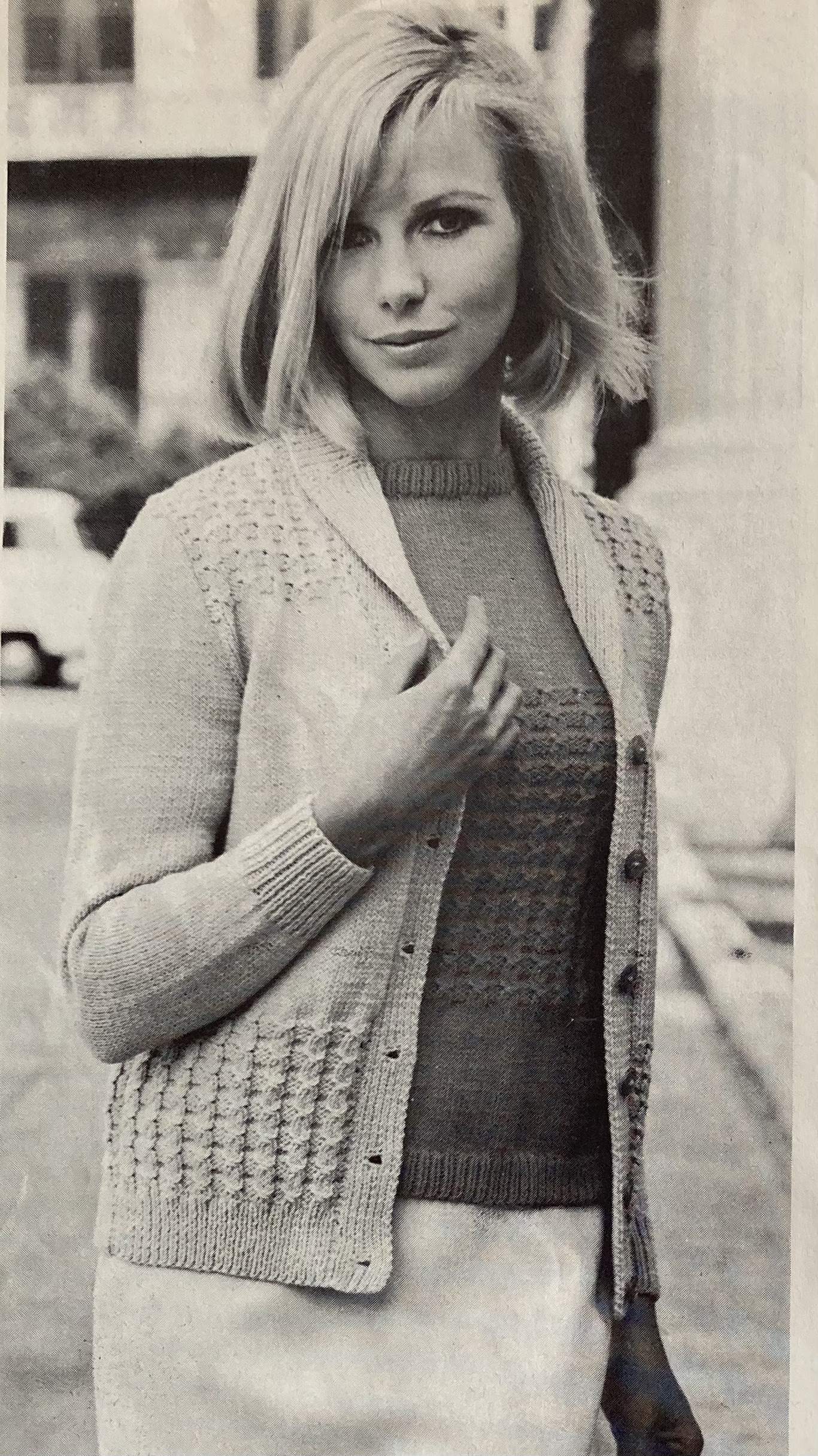
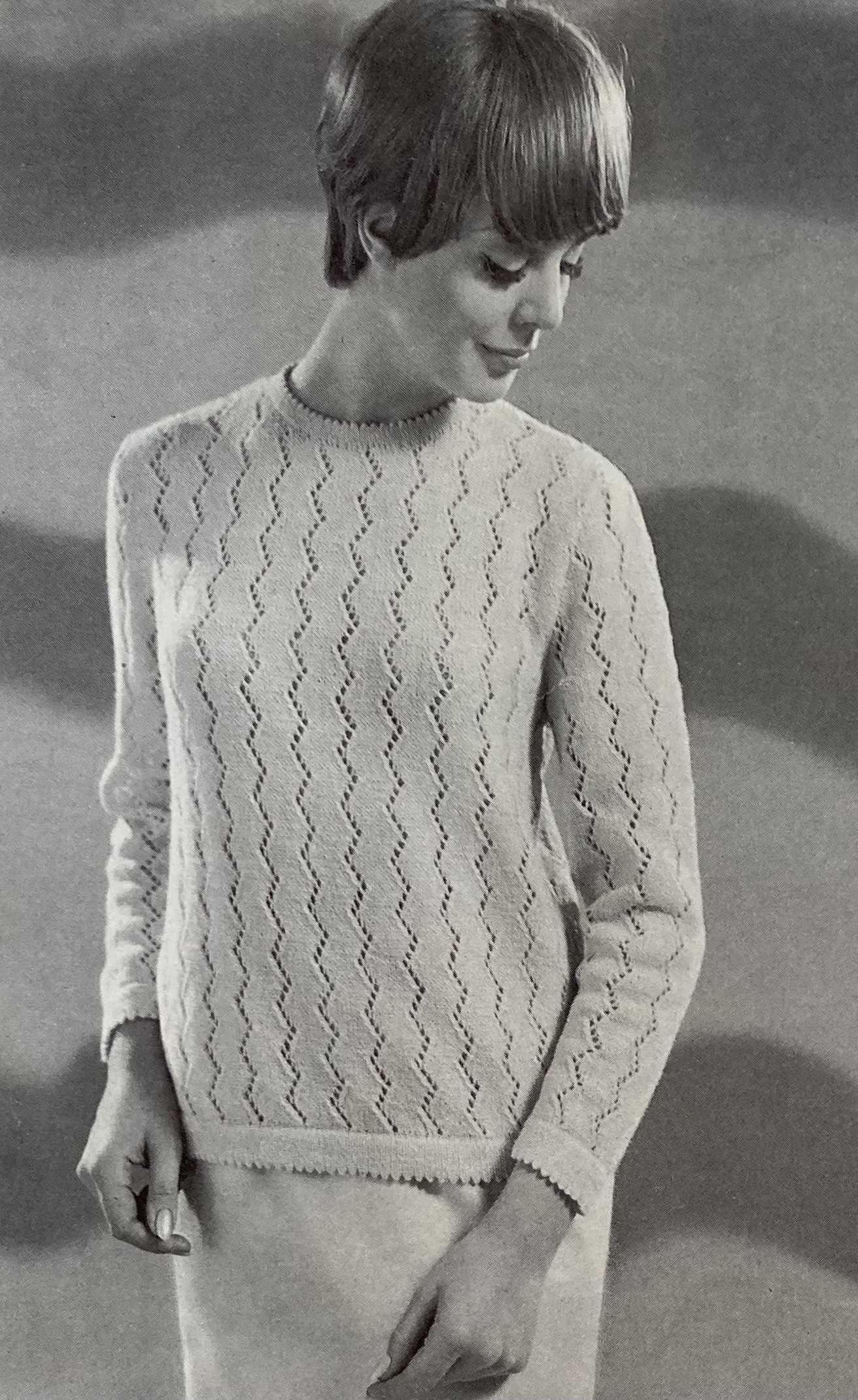
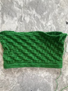
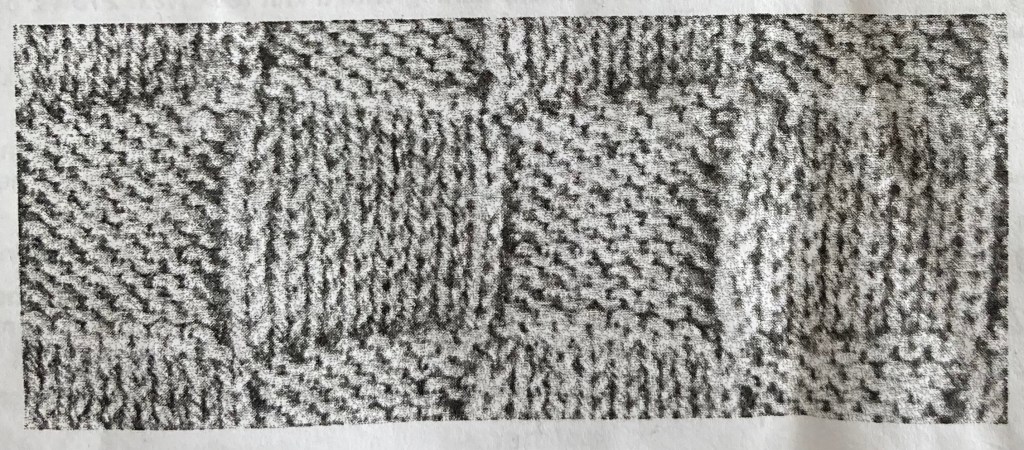
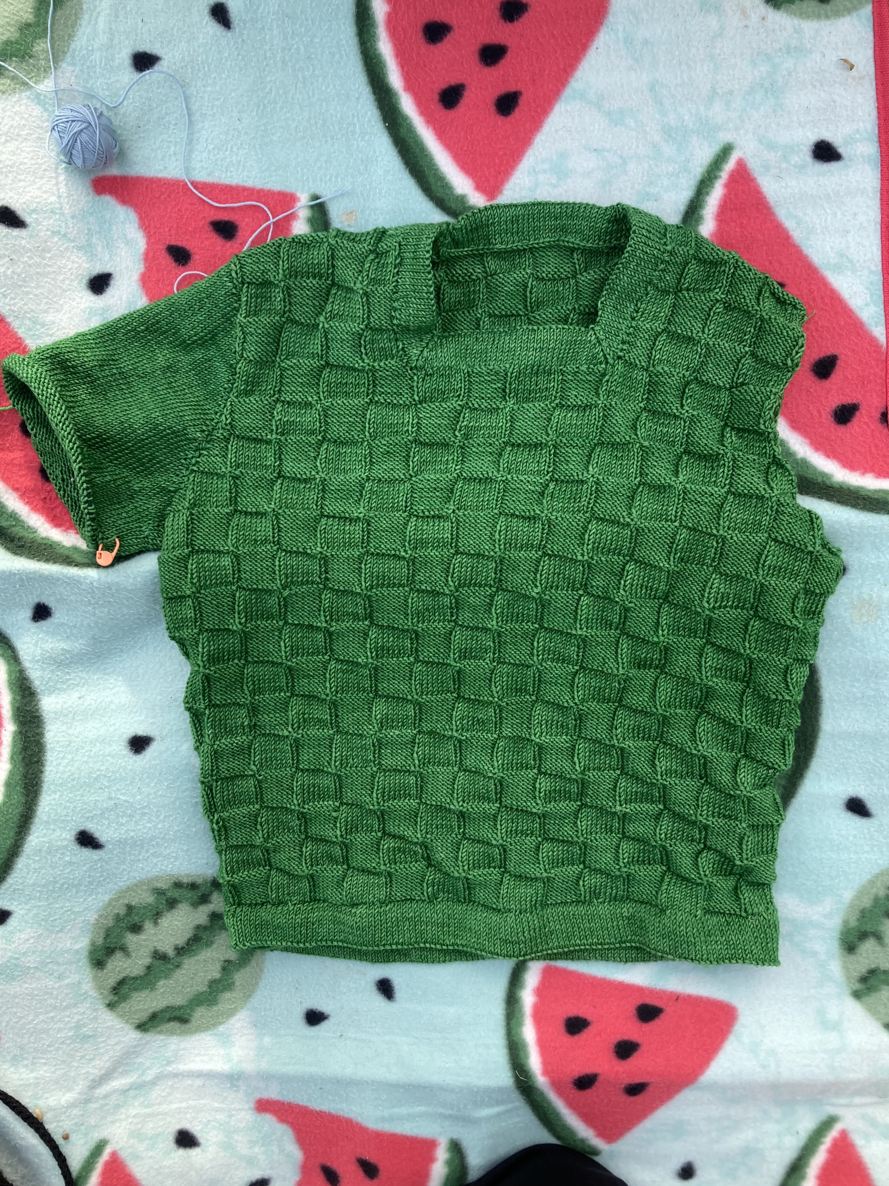
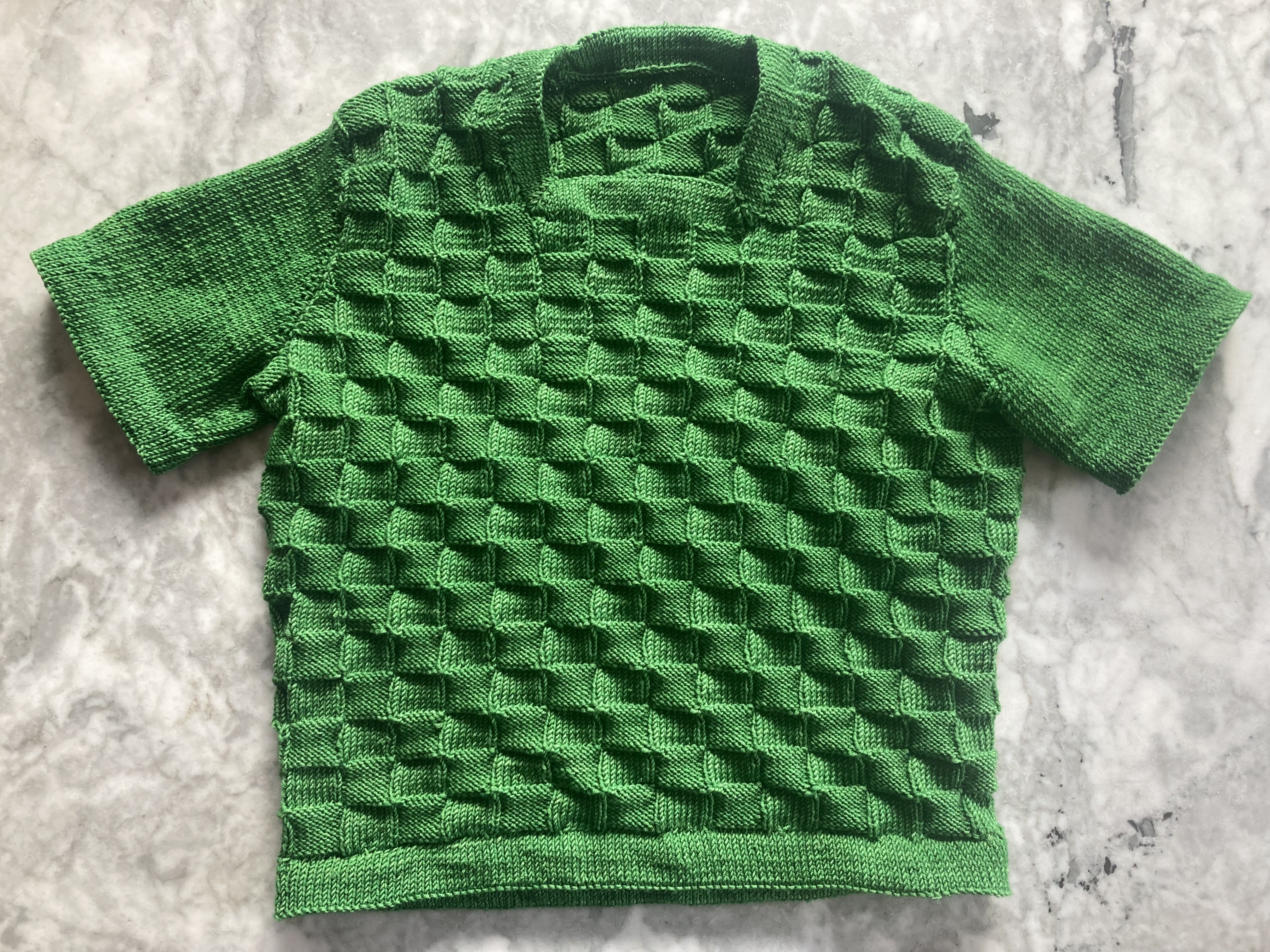
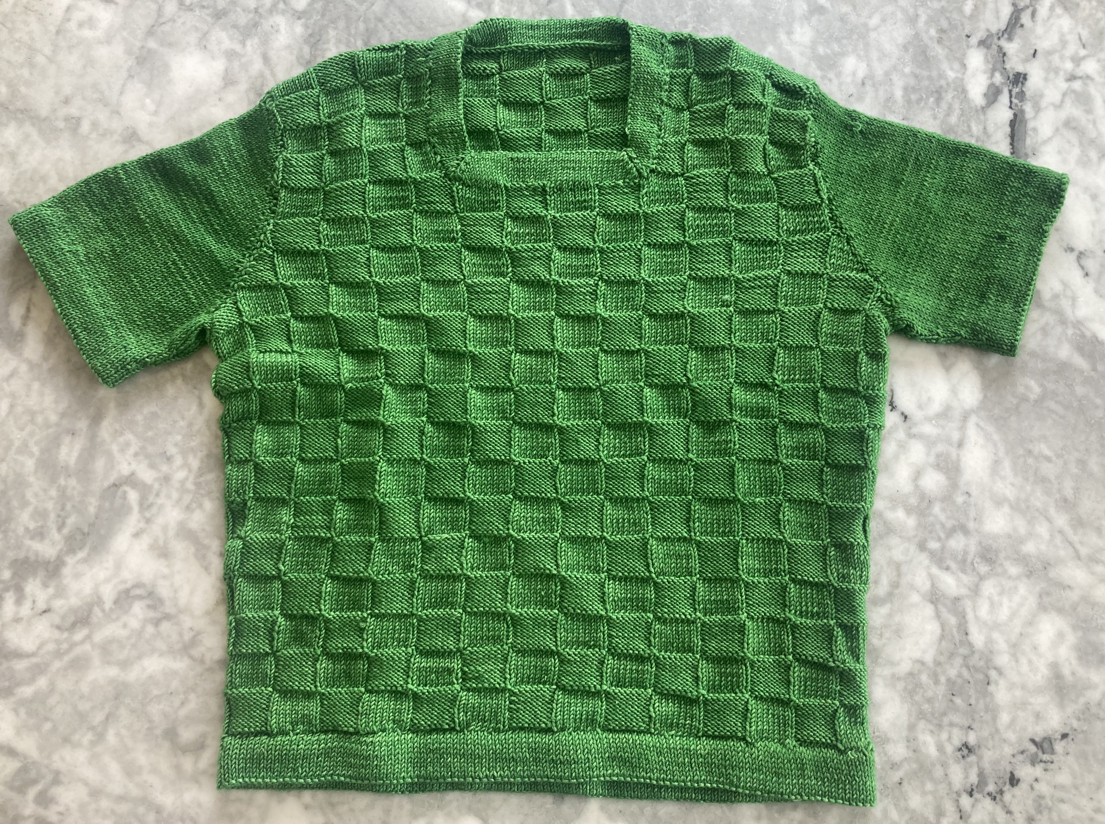
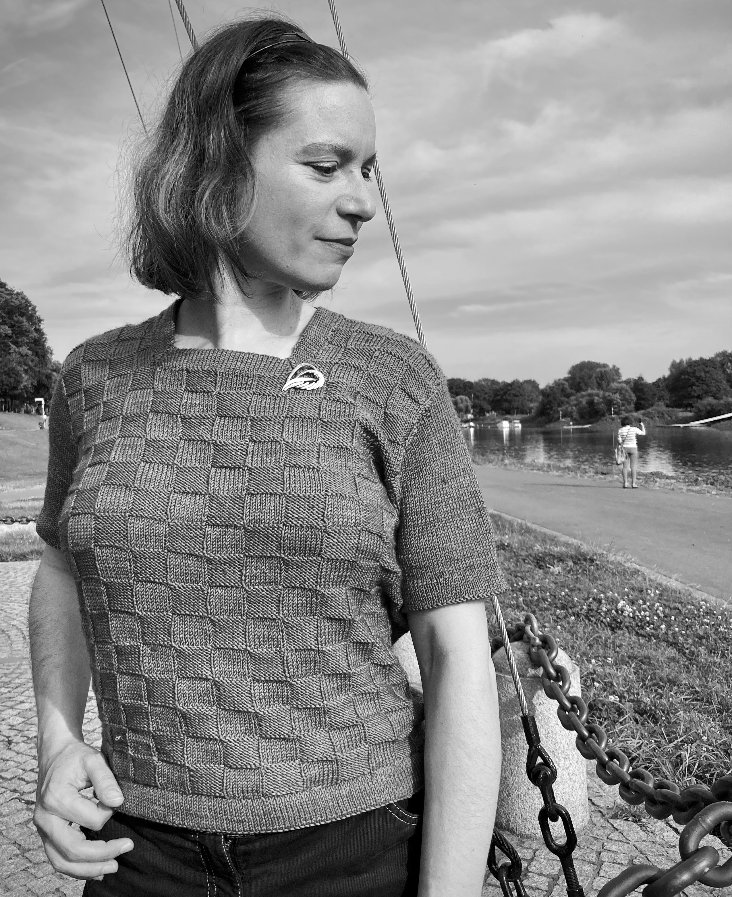
Two years ago, I made this pullover from the December 1964 issue, and still had plenty of wool left over to make a set of mitts. The pattern on the December 1966 cover dress (see close-up photo here) is quite different in appearance, but in a way similar to the December 1964 pattern in the fact that the stitches seem to twist and cross, but there are no actual cables nor even twisted stitches — it’s all done with regular knit and purl stitches, plus yarn-over increases and k2tog and s-k-psso decreases.

The leftover yarn that I used was G-B Jil — DK weight, 100% wool and corresponded well to the Shetland wool-and-acrylic-blend Patons “Fiona” from the dress. Actually, I think my wool was even better for this stitch pattern, since it’s worsted-spun and superwash — nice and smooth to make the pattern stand out well, as well as being non-scratchy and washable. I don’t know why this wool brand is not more popular where I live. I guess it’s too “plain”? Their brand slogan translates to “nice, reliable, and a good bargain for your money”, which, unlike most advertising claims, is both refreshingly humble and 100% accurate. It is perfect for everyday knits and wears well.

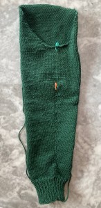
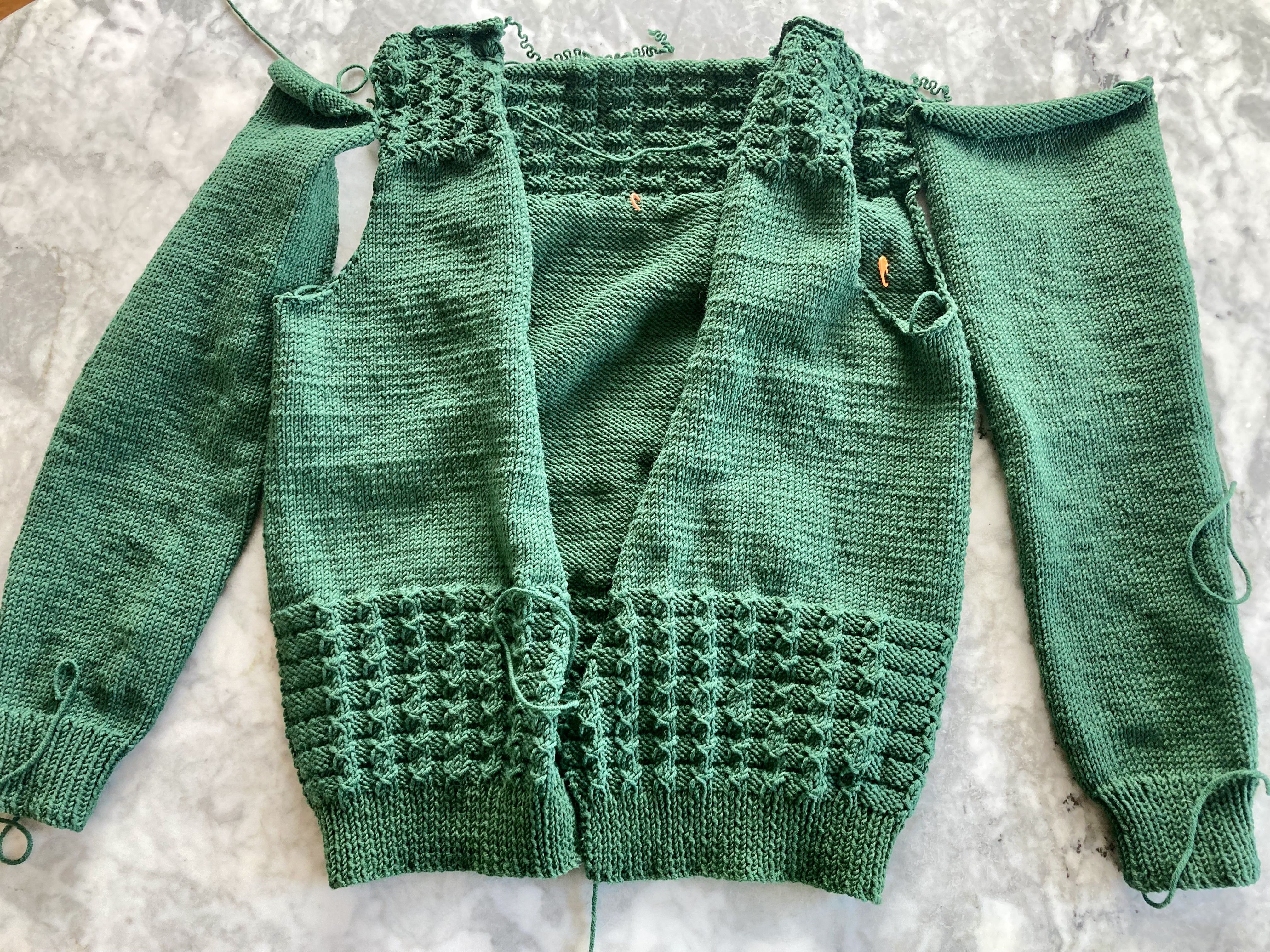
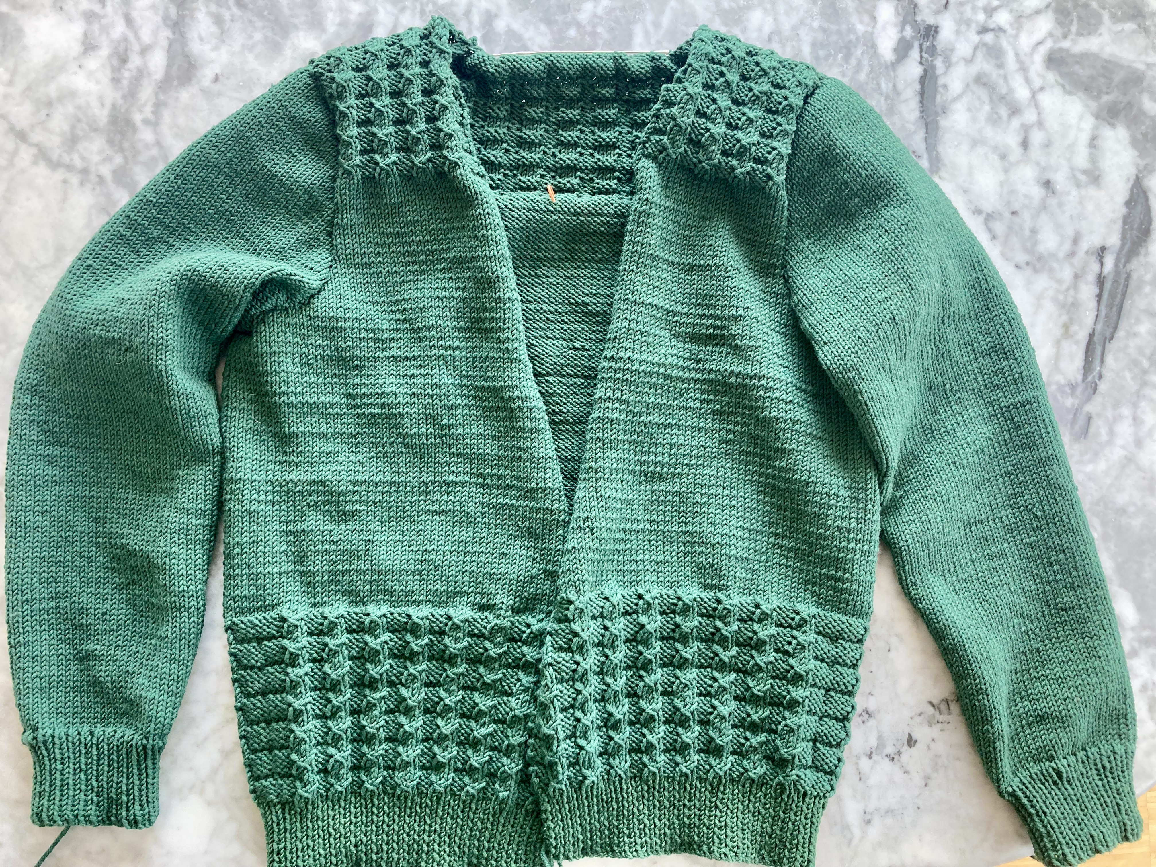
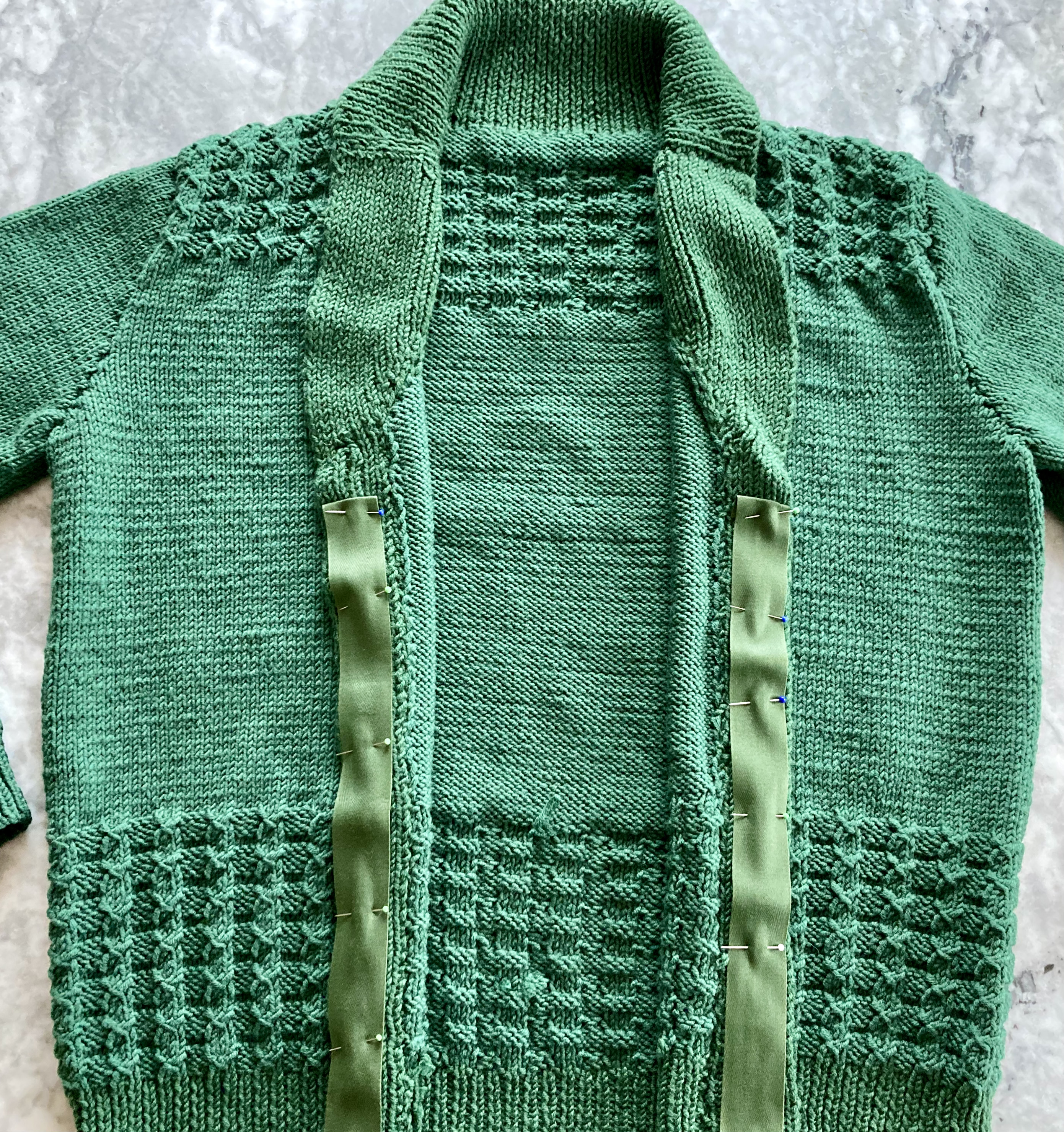
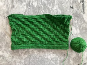
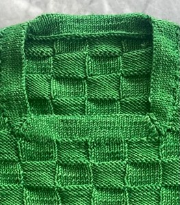
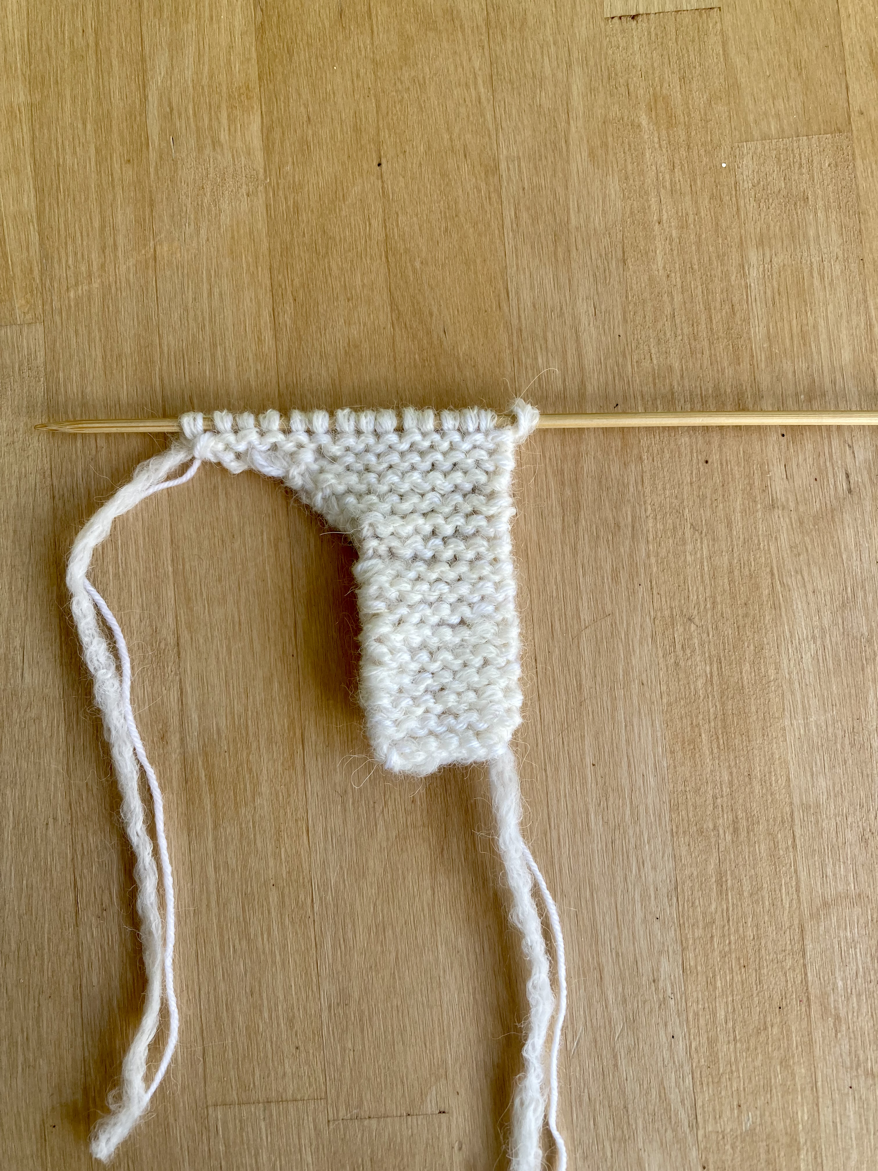
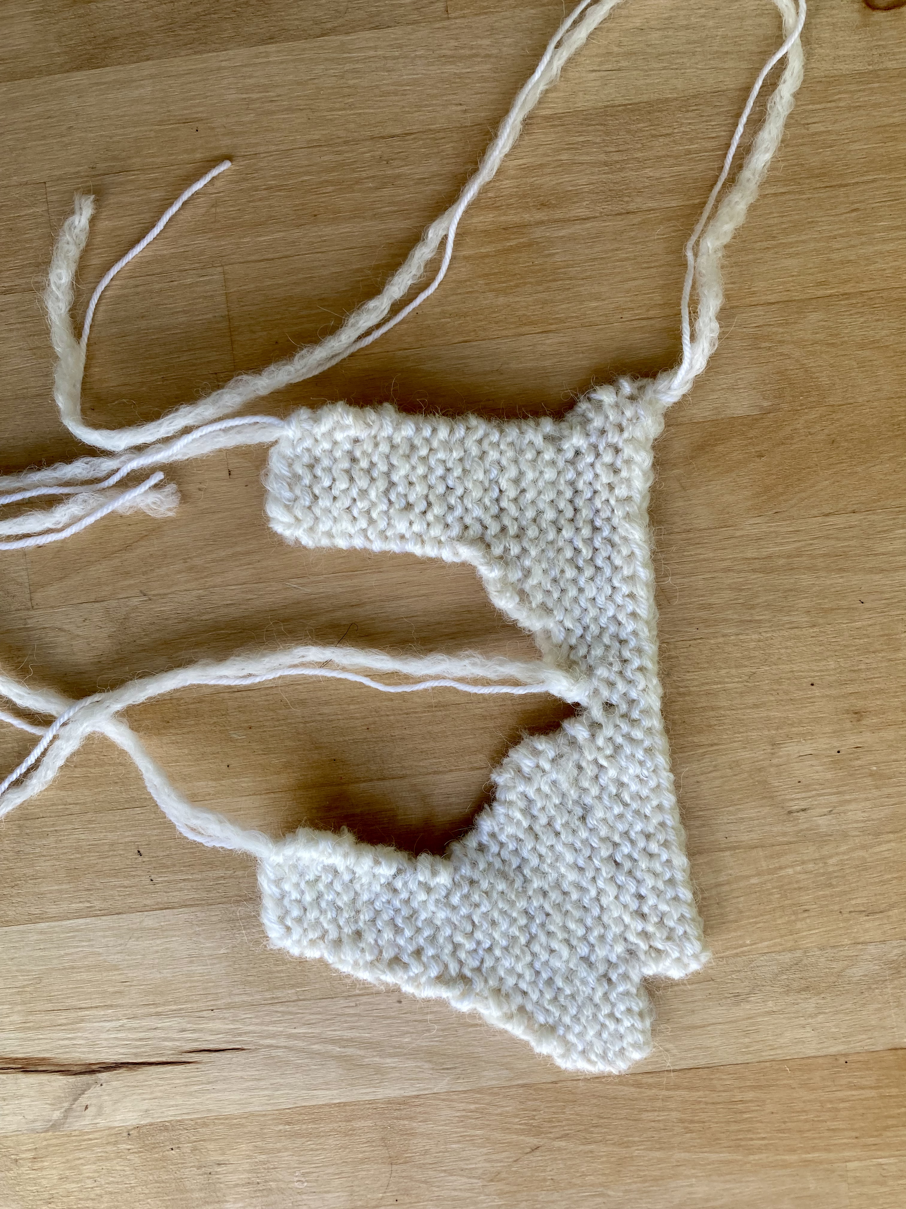
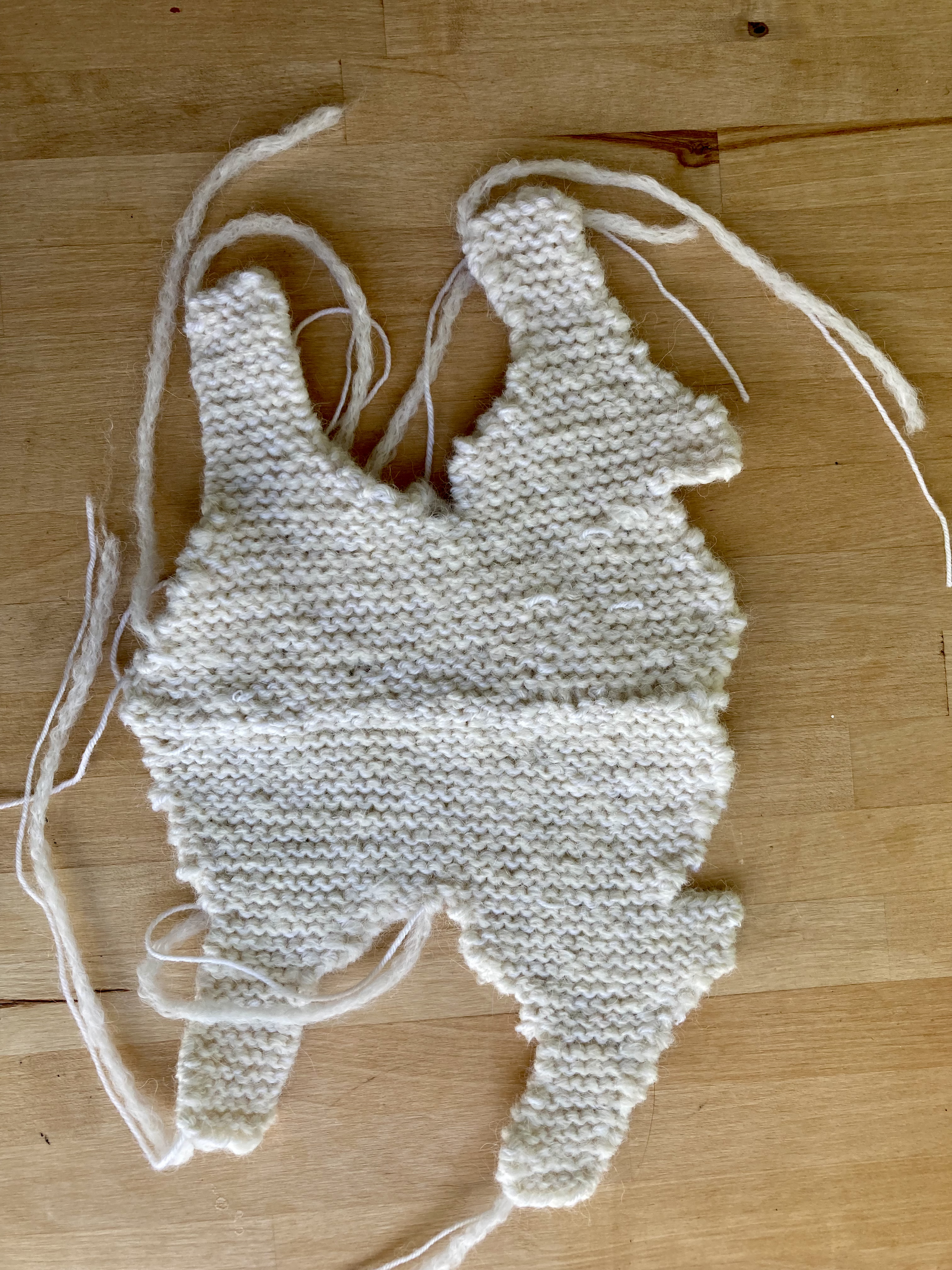
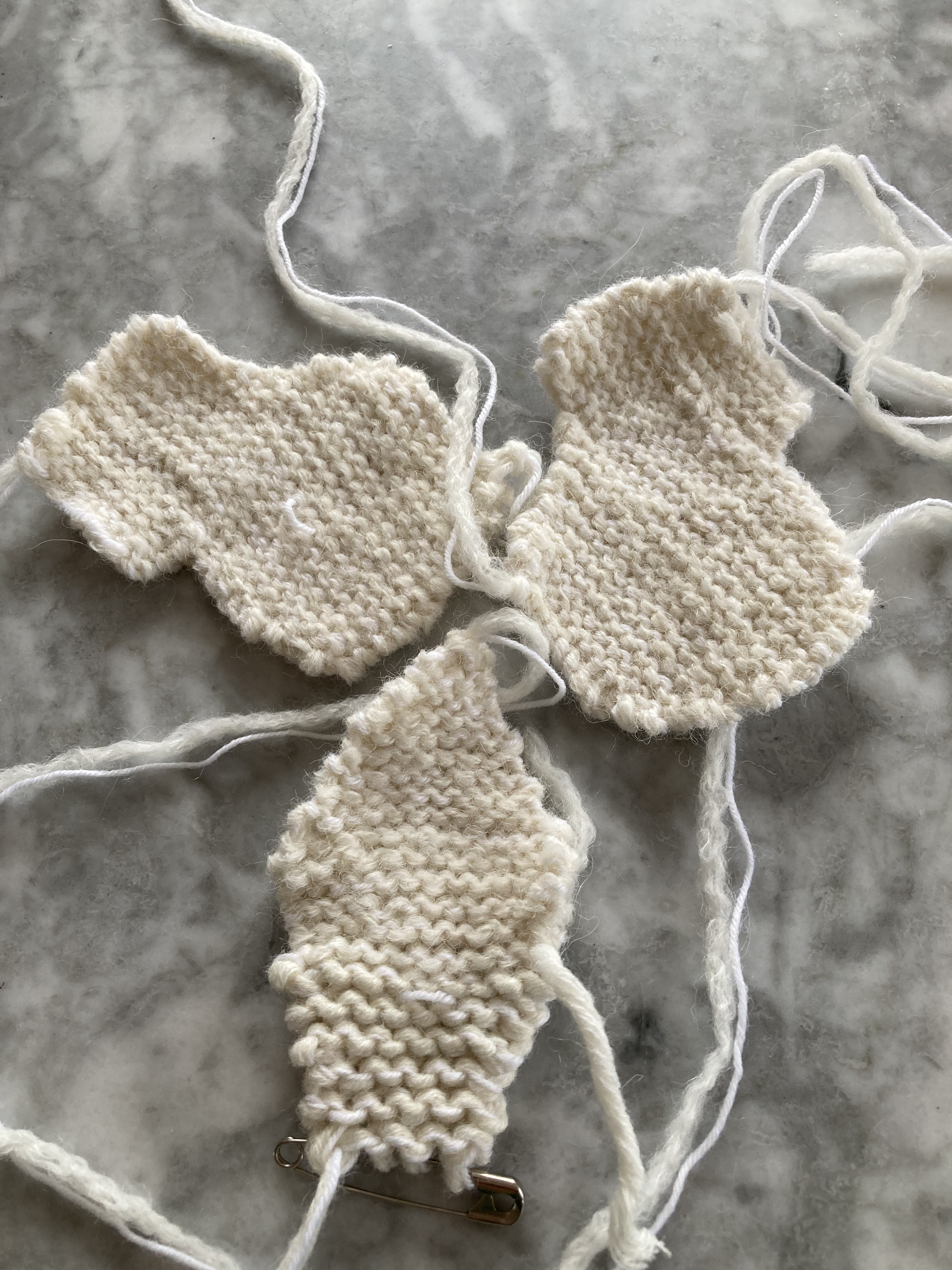
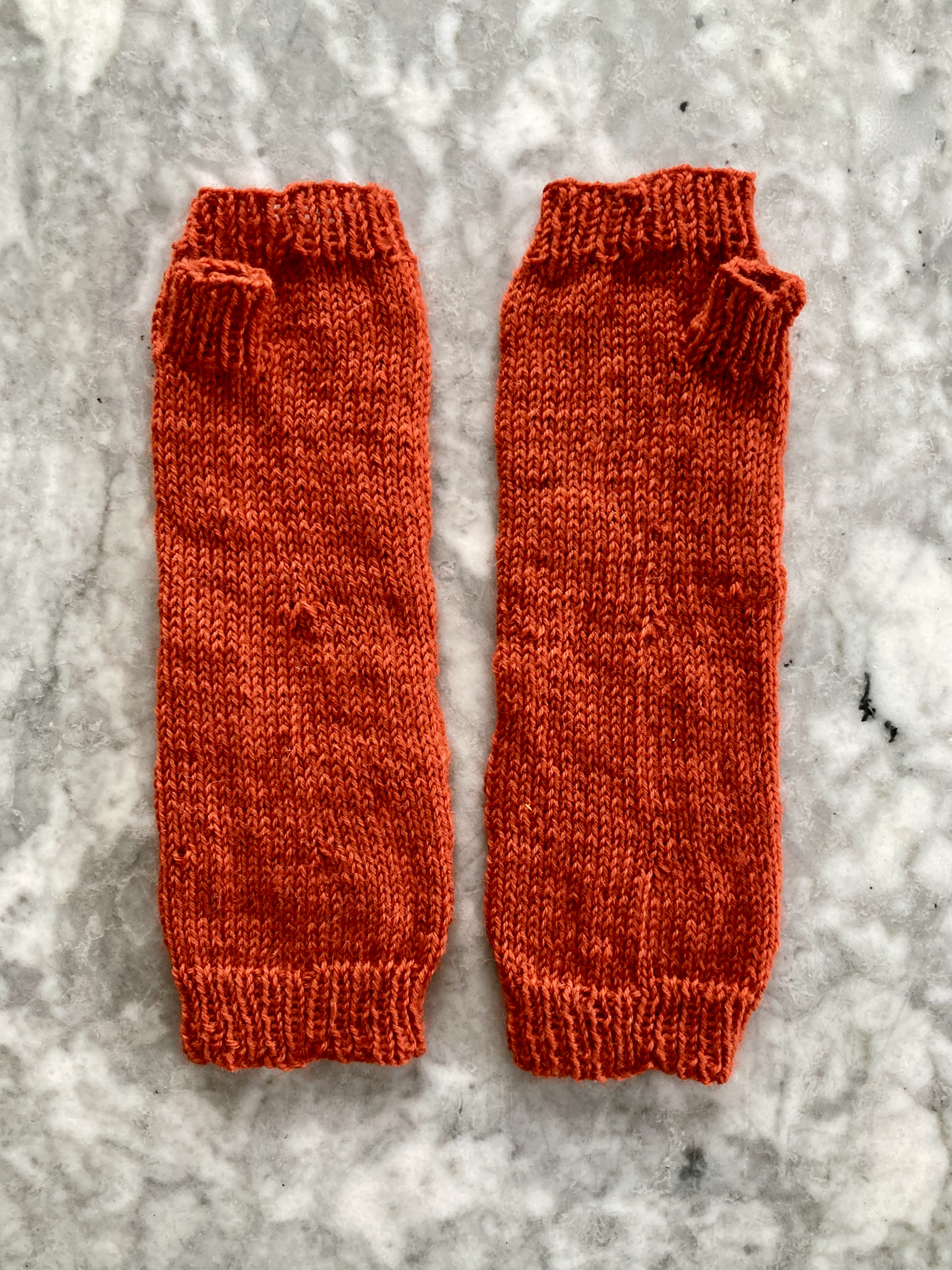
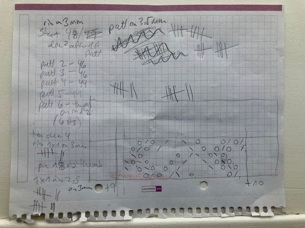
The dress pattern has sort of “bracelet” length sleeves, i.e. deliberately a bit too short, so I figured the mitt ribbing would rest at roughly the same spot on the arm as the cuff ribbing of the dress. I started the mitts there, at the arm, on 48 stitches (dress pattern has 49, but seamed — I made the mitts in the round) and worked toward the hand. After the first pattern, I decreased for the wrist to 46 stitches, then to 44 on the fourth pattern. I made an afterthought thumb on pattern repeat 6, then decreased down to 40 stitches for the hand ribbing. The thumb had 6 “afterthought” stitches top and bottom, and I picked up 6 more for a total of 18.

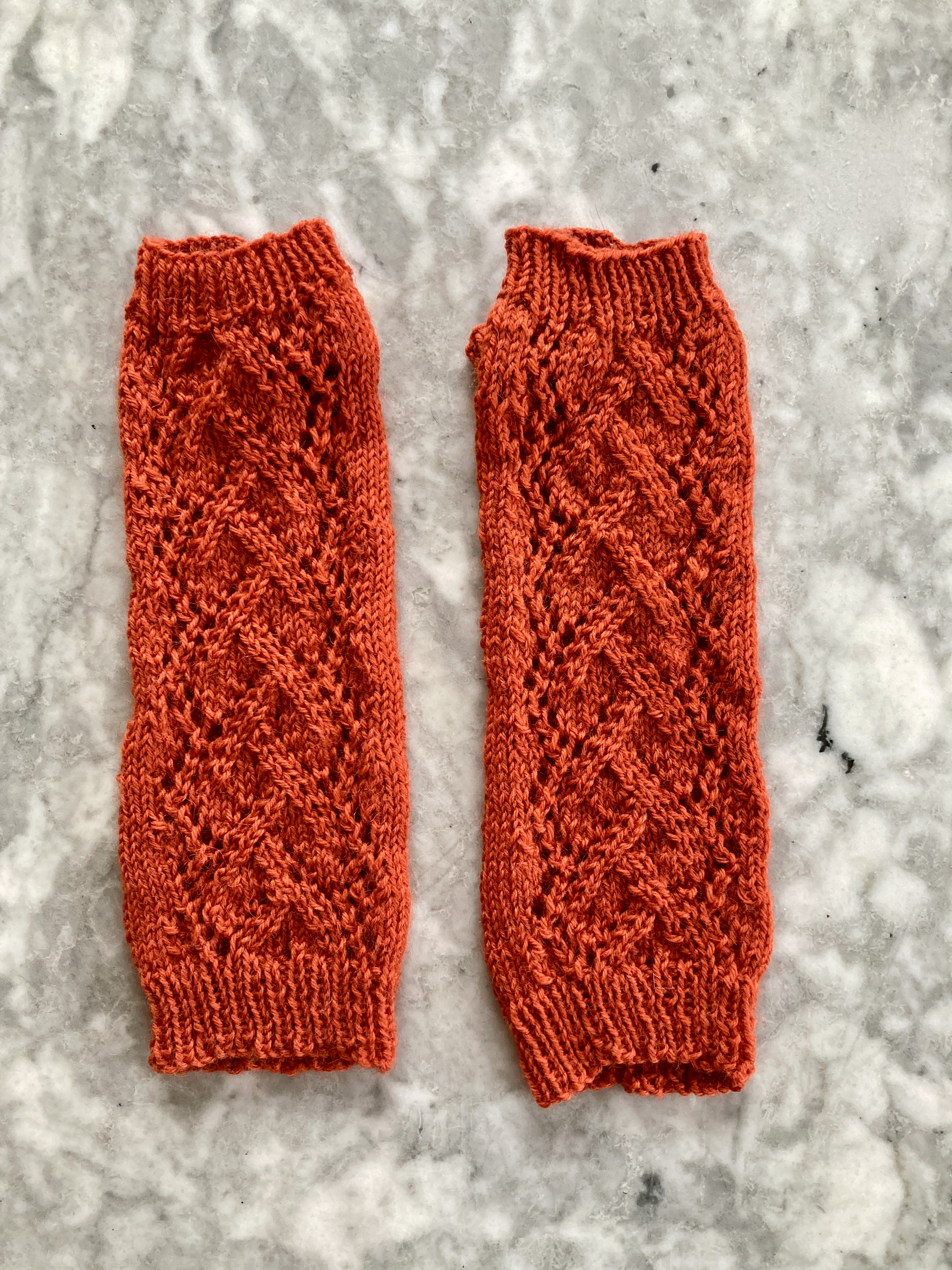
And that was it! Easy peasy. Well, almost. I admit that the the stitch pattern was more complicated and “illogical” (as in, in was hard to memorise or “instinctively” know what was coming next in each round) than I had expected. I charted it out, which helped — the pattern in the magazine is written out in words only and it is easy to get lost in a sea of “k2, yo, sl1, k1, psso, yo, k1, k2tog” etc. I am way too lazy to write this out as a proper pattern and try to sell it on Ravelry, but here are my scribbled notes, if anyone wants to make their own version. The hash marks show the number of rows in the ribbing – 10 at the beginning and 7 at hand and thumb — and the chart only shows the odd-numbered rows 1, 3, 5, 7, 9 and 11 –the even-numbered rows are all knit (in the round). The mitts fit fine on my size-8 hand. but of course, since the pattern is only on the top side of the mitt, you could easily add or subtract from the plain stitches on both sides to make them larger or smaller.

Happy New Year, and thank you all for reading my blog! Stay tuned for lots of fun designs and projects coming up from 1967, which was a great year for Stitchcraft.

EDIT January 1st, 2025: I made a tam to go with the mitts!

December 1966: Overview

Hooray, it’s the Christmas issue! Our cover model from the December 1966 issue of Stitchcraft sports a holiday-red knitted dress with a jaunty black velvet bow in her hair. Bright, cheerful colours, fun ideas for gifts and holiday parties, and the “Total Look” of a complete knitted outfit in one colour theme light up the pages.

The cover dress is made in Shetland-blend “Fiona” yarn and a diagonal criss-cross pattern that looks like cables, but is actually made entirely out of normal increases and decreases (yo, sl-k-psso, k2tog). The skirt is plain stocking-stitch and amazingly for 1966, still falls just above the knee. The two-colour suit with stranded “key” pattern in yoke and skirt hem is similarly demure. The two colours of lightweight “Cameo Crepe” wool are “Pearl Frost”, which I assume is the lighter one, and “Mastic” — I have no idea what colour “Mastic” is supposed to be. (I can only think of Mastix cosmetic glue, used for sticking on fake beards etc., which of course has no colour at all.) As an alternative, the magazine suggests to use Patons Beehive 4-ply in “Mink” and “Magnolia”, so I guess “Mastic” is a medium brown and the magnolia is white. Or the magnolia is dark pink and the mink has got its winter coat on. By the way, Stitchcraft‘s “editress” Patience Horne promises us in the notes to this issue that starting in January 1967, there will be more colour photos, so there may be less guesswork in the future.

The other patterns for adults include a lacy bedjacket, also in “Fiona”, that is pretty enough to wear as a cardigan, as well as a party jacket with Lurex metallic thread held together with the main crepe wool on the borders for extra holiday sparkle. There’s also practical heavy cardigan in reverse stocking-stitch with cable panels.

For the man in the family, an oversized shirt-sweater with angular pattern lines. Or you can make a his-and-hers set of “snow sweaters” in a typical all-over tiled Fair Isle pattern. Diagonal lines are a clear theme in this issue, whether made via texture, colour, or with angular cables.

For the kids, there’s a cute, warm 3-piece outfit of leggings, jumper and cardigan that is good for winter playtime (and finally, a girl can have warm legs and move around without worrying about where her skirt is flying. Look how happy she is!). The boys’ slipover features elements of the cable pattern and blocks of ribbing that we saw on the women’s cardigan. Finally, a bigger girl can enjoy the “Total Look” of tunic, tights and floppy pom-pom-trimmed hat, all coordinated in bright shades of “Lipstick Red” and “Strawberry Ice” double knitting. I’m glad they used a colour photo for this one!

The usual embroidery patterns for cross-stitch borders and easy cushions are supplemented by another big, fun appliqué wall panel: “Widdicombe Fair.” (Spelled with two “d”‘s in Stitchcraft.) I admit, I did not grow up in the UK and wasn’t familiar with it. For others who also weren’t in the know: it’s a traditional agricultural/livestock market fair that has developed into a more social gathering for traditional events, arts and crafts, and rural activities. Have any of you readers been there? Do they have knitting? Tell us about it in the comments! The wall panel shows a scene of happy (and presumably quite tipsy) fair-goers riding home on a pony after the fair. It is comic-like in style, but actually quite intricately worked, with close-fitted felt pieces embroidered and decorated after the appliqué is done.

And of course, it wouldn’t be Christmas without little handmade gifts and Christmas “novelties.” You can knit a hot-water-bottle cover and address it in embroidery to “Miss Miranda” in “Dreamland” (presumably other names and addresses would work as well) or knit some fireside slippers in an easy bobbly-lace pattern. While you’re knitting, make some cabled gloves with a contrasting-colour cable on palm and back of hand for “Father” and a kangaroo with baby for your littlest one. A crocheted hall runner is a “practical gift for the Home.”

The Christmas novelties run the gamut from elegant (an appliquéd panel of a poppy flower from which you can hang a tiny calendar), to cute and wintry (felt table mats with appliquéd stars, a “Father Christmas” sack to fill with gifts), to cute and silly (a knitting snowman made of cardboard, with the “snow” effect made by just pasting cotton wool onto the cardboard), to “what even is it” (little “mascots” made from the scraps of felt left over from the other projects. Apparently, they represent “amusing Bongle people”. I was very afraid to find out what that meant, but they seem to be a sort of fairytale gnome that have recently made a modern comeback in the video game Baldur’s Gate? Either that, or a slang term for copyright protection, lol. I’m guessing the Stitchcraft mascots are the fairytale gnome kind.)

The Readers’ Pages have a great little pattern for a potholder with a crocheted robin sitting on the handle of an embroidered spade. In the comic, schoolmarms Miss Prim and Miss Proper try to teach untidy piglet Higgledy Piggledy how to be neat and clean, but he is not having any of it. It’s the schoolmarms’ fault that he flies out the window, though, since they sat down too hard on the other end of the bench he was sitting on. To finish off the issue, there’s a thoroughly groovy ad for “Stop Red” and “So Dotty” lingerie from the Scotch Wool Shop.

That’s all for this issue! I have no idea what project I will make. Stay tuned, and happy holidays.

November 1966: Overview

Tweed, Crepe and the Total Look! The November 1966 issue of Stitchcraft brings together contrasting styles of nubbly tweed and smooth crepe wool as well as an entirely coordinated knitted outfit including hand-knitted stockings.

The cover design is not quite “total” (no stockings or accessories) but combines tweed “Bracken” wool with smooth “Cameo Crepe” for the edgings to make that boxy, double-breasted suit that everybody copied from Chanel. The pattern is very easy: k one row, single rib one row, purl one row, single rib one row. I imagine it gives a nice firm fabric that won’t sag too terribly in the skirt.

The “Total Look” is best exemplified by the other suit design: a square-patterned cardigan suit with jumper and stockings to match, in two shades of Double Knitting for the suit as well as lightweight Cameo Crepe for the jumper and stretchy, hard-wearing Nylox for the stockings.

The idea of complete coordination came into handknit fashion around this time and continued into the early 1970s. Mary Quant, for example, designed a four-piece outfit (jumper, skirt, stockings and “bonnet” cap) for the Australian Women’s Weekly in March 1966, using Patons Courtelle wool. There was originally an entire supplement in this month’s issue of Stitchcraft with more “Total Look” fashions in the same 101 Courtelle, but sadly, it was no longer there when I acquired it. If anyone happens to have this supplement, please let me know and/or post about it here! I would love to know what was in it.

The other fashions for adult men and women feature textured stitches in heavier wools for winter and a round-yoke cardigan knit from the top down in one piece. Although quite common today, that was still a very unusual construction method in the 1960s and was captioned as an “interesting design for the knitter who likes something different.” The men’s cardigan has a “Continental Pattern” made quite easily by combining knit, purl and knit-through-the-back stitches, and the women’s pullover has a unique cable-and-bobble pattern that makes a pretty shell design.

The “Junior Fashions” for girls consist of a bright, fun “Viennese Sports Sweater” in a bold Fair Isle pattern and a cabled and colour-blocked pullover in soft tones of white, blue and rose. The older girl has her fireworks ready, perhaps for Guy Fawkes Night on November 5th, while the younger one is content to play with her dolls.

Gearing up for the Christmas season, we have a double page of weird and/or wonderful little gifts to knit, sew or embroider. For some reason, Stitchcraft really likes Humpty Dumpty, who appears in many forms as a toy, puppet, doll etc. over the years. Here, he “tops a stocking”. There are tiny felt accessories for a doll, sewn and decorated pinafore bibs for a baby or toddler, or coasters with the signs of the Zodiac in embroidered felt appliqué.

Larger tapestry and embroidery projects include a tapestry evening bag in rosebud pattern, mats and cushion in counted stitch for a girl’s bedroom, drawn-fabric table linens or a cushion and matching tea cosy in a bright floral cross-stitch pattern. I seem to remember the rosebud bag from an earlier project in 1961 that had a similar design. (That project didn’t work out and I don’t think I’ll be making another tapestry handbag anytime soon.)

To finish it all off, you can knit a warm afghan for the coming winter evenings by the fireside, or crochet a practical potholder as many of us did in school. In the children’s comic, untidy piglet Higgledy Piggledy ignores the instructions given to him by the magicians who are supposed to change him into a tidy clean piglet, mixes the wrong potion and turns into a pink and green mouse. Good for him, I say! I am a neat and tidy person myself, but I have to admit I am rooting for Higgledy Piggledy in this comic. Will Higgledy Mouse escape the authoritarian rule of cleanliness? Tune in next time to find out!

October 1966: Jacobean Embroidery

EDIT November 19, 2024: Finished!

My October 2024 project was an embroidered panel in “Jacobean” style from the October 1966 issue of Stitchcraft.

Real Jacobean embroidery was an elaborate, mostly floral style of wool-on-linen work that was popular in the early 17th century. It featured heavy, filled stitches and complicated couching, often in multiple colours and with a high level of skill and artistic virtuosity. The style enjoyed a revival in the mid-20th century, and many home embroideresses made Jacobean-inspired designs to decorate home furnishings such as cushions and wall panels.

This finished panel is intended to be used as a chair-back and / or sofa-back, with the sofa-back incorporating the panel twice. Chair-backs and sofa-backs were a popular way to extend the life of upholstered furniture by keeping it clean and protected from sun damage. You don’t see them much nowadays, except in the casual form of throwing a blanket or quilt over the sofa back to hide faded or worn spots. I could actually use a sofa-back, since my sofa sits under a window and the sun does fade the dye quite a bit over time, but my sofa is already so cluttered with hand-made cushions. I decided to make the panel first and then decide if it should become a cushion, laptop case, decorative wall panel or other use.

The pattern is written for wool embroidery on furnishing linen. I had no trouble finding an appropriate background fabric — although mine is thick cotton muslin, not linen — but fine embroidery wool is difficult to find. I know one store in Paris and a Ravelry friend just let me know about another (also in France.) I could have ordered from either one of them, but I happened to be in a store that sold mending wool in a variety of colours, and decided to give that a try instead. The colours in the pattern were light green, green, dark green, peacock, dark peacock, rust and light rust, which I found with an extra alternative-light-blue and slightly-more-blue-green for variety. It worked well!

The most difficult and time-consuming part of all these vintage embroidery patterns, as always, was getting the design onto the fabric. Back in the Stitchcraft days, you had to send away for the iron-on transfer by post. These days, old transfers occasionally pop up for sale on ebay, but of course not exactly the one I want to work on right at that moment, so I have to recreate them myself. I do it the old-fashioned way, by drawing a grid over whatever photo or schematic is in the magazine, then drawing a proportional grid over a piece of paper in the correct size, and enlarging by copying square for square. Then I go over it with marking pen, and transfer it to the fabric via “lightbox” (i.e. taping it to a window) or dressmakers’ carbon paper. I used carbon paper for this one.

I’m sure there are computer programs that could do all of that a lot faster, but then I would have to take the time to learn the computer programs… and I like keeping the handwork aspect of the craft alive.

The embroidery itself was not nearly as difficult as I had expected, considering that the design looks very complicated. It’s really just lots of satin, buttonhole and stem stitch. The fancy couched parts were a lot easier to do than the buttonhole areas, in my opinion! They are worked by laying down threads in crossing diagonal lines and tacking them at the corners, then working French knots or tiny crosses in the squares.

It went quickly and although it is was not quite done by the end of October, I did get the embroidery finished at the beginning of November. The I was traveling for work and didn’t get a chance to make it up into anything without my sewing machine.

In the end, I decided to make it into a cushion — simple and period-appropriate. I made a separate cushion for inside the embroidered cover to make washing easier and fastened it with a button flap this time instead of a zipper this time. That was it!

The finished size is about 18 x 11.5 inches (47 x 29 cm), which corresponds to the width of the original chair-back design. It’s perfect, and since I don’t have space for more cushions and like making people happy, I arranged to give it to a friend.

October 1966: Overview

Autumn is here, and Stitchcraft‘s October 1966 issue celebrated it with warm, cosy sweaters in bold colours and textured stitches. Our cover pair sports not-quite-matching partnered pullovers in bright “Golden Willow” with a thick stripe in “Woodland Green.” The stripe on the man’s sweater is diagonal and made in intarsia. “Her” pullover has a broken-zigzag stitch pattern and the stripe running horizontally under the bust line and across the sleeve. Both are made in smooth Totem Double Crepe wool.

Bold colours, textures and diagonal stripes (whether made with colours or stitch pattern) are on trend for many of the other garments in this issue as well, for example, a ridge-pattern women’s pullover in “Gemini Turquoise” in Courtelle Double Crepe (like Totem, but 100% synthetic), or a “car coat” for larger sizes in bulky, bright red Capstan with a flattened cable pattern. There’s a rust-red zipped cardigan for men, too, in Patons Flair wool and diagonal herringbone stitch.

For a more elegant look, there are two garments in lighter, 4-ply wool: a dress in “French Green” with an intriguing “shadow check” pattern or a classic V-neck cardigan for larger sizes (colour: “Blue Streak”). I have never seen either of the stitch patterns before. The “shadow check” is particularly intriguing, as it seems quite simple, but makes a very cool sort of large waffle-check effect. The first two rows are stocking-stitch, to make the horizontal line, then the squares are made with 1 row of k1 tbl / p1 tbl “ribbing” separated by 2 purl stitches and one row of k2, p9, repeated to the end of the “block” (14 rows in all). The pattern on the cardigan is even simpler: Row 1: k3, p1; Row 2: k1, p1. If you have any wool left over, you can make a diagonally-striped (or plain) knitted tie.

For the little ones, there’s a cardigan with checked front panels in “Fuzzy Wuzzy” angora wool that are knitted separately and sewn on to the front+back piece before adding the ribbed trim, and a nice warm tweed coat in “Moorland” wool. Well, at least the upper half of this poor tot’s body will be warm — if he goes out dressed as he is in the photo, I worry that he will literally freeze his arse off. (Doesn’t seem to bother him — I’m guessing it was warm enough in the studio). There’s a huggable stuffed elephant and a winter outfit for a doll to knit, as well.

The homewares are pretty standard, but offer a range of different techniques: a crocheted cushion, a counted-stitch cushion and chairback, a practical stitched rug, or huckaback embroidery for various practical linens. Advanced embroideresses can make a stunning chairback set in Jacobean-style wool embroidery with plenty of intricate and multi-coloured stitches.

But wait, there’s more! Or not, sadly. This issue apparently had a supplement of nine designs “to knit for the family in Patons Brilliante qualities”. It must have been carefully removed from this particular issue at some point and separated from it, since there is no trace of it in my magazine, not even in the centre fold where it was presumably stapled in, and all the regular pages are intact. If you happen to have this supplement, please feel free to write in and let us know what’s in it!

In the “Readers Pages”, there’s a reprint of a pattern for machine-knitted wool “slacks” (I guess we would call them leggings today) and Part 2 of the comic adventures of Spick and Span, the two very neat and tidy teddy bears. They meet a very untidy bear named Higgledy Piggledy and seek out the services of two magicians, “Lo” and “Behold”, to magically turn him into a tidy bear. I sense a certain pedagogical overtone in this story, which is perhaps why it is less fun and interesting than some of the other ones.

That’s all! I don’t know what to make from this issue. I offered to knit my father the red zippered cardigan, but he claimed to not need another cardigan, and nothing else really speaks to me except for the Jacobean embroidery. But what to embroider it on? I have so many cushions and I don’t need a chairback. New laptop case? Black felt skirt? We’ll see! I still have to finish my September 1966 project, anyway.

September 1996: Cover Cardigan

EDIT October 22, 2024: Finished!

My September project was the cardigan from the twin-set in “crepe look” featured on the cover of the September 1966 issue of Stitchcraft.

The original version is made in Patons 101 Courtelle Double Crepe, a “new” (in 1966) 100% synthetic yarn. I prefer real wool and chose Schachenmayr Merino Extrafine 120, a smooth, tightly-plied merino that gives the “crepe look” very nicely. It seems to be a bit thicker that the Patons 101 Courtelle — the wool is supposed to have a tension of 5.5 stitches to the inch on (old UK) number 8 needles (4mm / US 6) and I got 5.25 stitches to the inch. I didn’t want to use a smaller needle, as the 4mm needles felt right for the wool and gave a good texture, so I made the smallest size (35-36 inch bust) instead of the otherwise-correct second size (37-38 inch bust) in the longest length (22.5 inches from shoulder).

I started with the sleeves, which I prefer to do in order to 1) check how size, tension and fit are going and 2) get the boring part out of the way first. The sleeves are made in plain stocking-stitch and I made them in the round to work faster and avoid seams. The sleeve length from underarm is supposed to be 16 inches for all sizes and judging from the photos, hits at about “bracelet length” i.e. not quite long to the wrist. I prefer long sleeves to go all the way to the wrist, but I have also made sleeves longer than required and had them turn out too long after blocking, or because the underarm depth was larger than expected. These finished sleeves fit before blocking just above the wrist at the expected underarm depth, and there was enough width to adjust if necessary.

The body of the cardigan features an interesting twisted-stitch pattern both on the fronts and back between hem ribbing and low waist, and at the top of the yoke.

The pattern is

  • 1st row (RS): p3, *k3, p3* to end
  • 2nd row: k3, *p3, k3* to end
  • 3rd row: *p3, take wool to back, sl1 knitways, k next 2 sts tog without taking them off the needle, then k 1st of those sts, slip off needle and pass sl st over 2 rem sts*, rpt to last 3 sts, p3
  • 4th row: *k3, p1, pick up horizontal loop below next st and purl it [i.e. m1 in the lower horizontal “bar”], p1* rpt to last 3 sts, k3
  • 5th row: K
  • 6th row: P

The twist rows are much easier to do than the description makes it sound. When you see the stitches on the needle, it’s quite clear. The background makes horizontal bands of rib and stocking-stitch and the overall effect is pleasantly squishy and nubbly.

After seven patterns, you switch to stocking-stitch, and that is where I found myself as of September 27, 2024, when I first wrote this post. I made the fronts and back in one piece and had a few long train trips since then, so it went quickly enough.

Unfortunately, there wasn’t enough yarn of the right colour in the store when I bought it, so I had to order more and of course, the new balls of yarn were from a different dye lot. I hardly ever have a problem with that, as many brands have very consistent dye lots, but of course the one time it’s a problem, it’s a problem! The new yarn had a much yellower-browner tinge than the old. I planned ahead to make the ribbing and collar in the new yarn and hoped to have enough of the old to make the complete body and sleeves minus ribbing. That actually worked, after unraveling the original swatch, and I had only a tiny little ball of the old yarn left over.

The ribbing and collar are mostly made separately, picking up stitches on the back neck for the back collar part only. The ribbing is knitted in vertical bands and sewn on, the collar horizontally and then you sew them together “with a very neat seam”. Hahahaha well, I did my best. The back collar has a couple of short rows at the end, to give it a nice roll. I added facing bands to the ribbing to help it keep its shape, and found some nice matching buttons.

(N.B. The real colour is more like the photo on the upper left. My computer and I are not good at colour correction).

The finished cardigan fit OK after blocking, just a little stiff and scrunchy. It stretched way out with blocking. The yarn is not labeled “superwash”, but it says on the band that it can be washed in the machine at 40 degrees C, so I’m guessing it is superwash-treated and they just didn’t say so. It certainly behaves like superwash in its stretchiness. I actually liked it better when it was a little stiff, but as it is 100% wool, it will always shrink a little with subsequent washings. And it is nice and soft, I’ll give it that!

The finished fit was fine. I prefer more fitted clothes, but that’s not the 60s style. The colour is beautiful — hard to reproduce in a photo, but a nice woodsy green. It will match many dresses in my closet. And the two-tone effect from the different dye lots worked out fine — I mean, you definitely see that the colours are different, but it looks deliberate. The sleeve length was just a little bit on the long side, but that will change with subsequent washings, I am sure, and I can always fold the cuff back. So all in all, I am quite happy with this project.

As always, we tried to reproduce the photos… with neither a real park by daylight, nor a dog. I think I nailed that sultry look from the black-and-white photo, though!

That’s all for this project! Time to start the October one…

September 1966: Overview

The September 1966 issue of Stitchcraft doesn’t have an introductory paragraph by “editress” Patience Horne, but it does have a lot of looks: the “Crepe Look”, the “Country Look”, “Carefree Sweaters for a gay look” (you would think that by 1966, they would have noticed that the meaning was changing), and my personal favourite, a “Fuzzy Look for a Party Extra”. Let’s take a look!

The “Crepe Look” is the smooth finish and good stitch definition that you get when you knit with a tightly-plied and/or long-fibre yarn. In this case, the yarn in question is Patons 101 Courtelle Double Crepe, a 100% acrylic yarn in DK weight. It’s used to make the cover cardigan, which is part of a twin-set, as well as a men’s pullover, a men’s cardigan, and a women’s pullover. The twin-set and the men’s garments make use of the good stitch definition with twisted stitches, cables and ribs. The women’s pullover (pictured two paragraphs down) is knitted in plain stocking-stitch, but sideways for easy placement of the vertical stripes. Cool and neutral colours are back: beige, grey, and white, with blues and browns for the colour accents. The only exception is the bright red jumper of the twin-set.

The “Country Look” features sturdy and tweedy garments for indoor and outdoor wear, with textures inspired by Aran and/or alpine knitting styles. The tweed suit on the inside cover is made in multicoloured “Glenora” wool and the Aran jacket in undyed “Capstan“. Capstan in the UK at this time was 100% wool; I’m not sure if Glenora was wool or a wool-synthetic mix. The boxy suit styling with collars and pockets shows the Chanel/Bernat influence, but dressed down a bit for “country living”. Those who want a little more fashion in their country life could make a trellis-and-rib pattern cardigan in Shetland-mix “Flair“.

Those who want even more fashion fun can knit one of the “Carefree Sweaters for a gay look” — like a fringed DK pullover in “Rose Petal” pink double knitting wool. Unlike many of the designs around this time, it’s shaped from the hem to the waist and the waist to the bust. The fringed edging is made by knitting a 9-stitch wide strip to go around the neckline, then casting off 7 stitches and frogging the remaining two stitches down the length of the long side, leaving loops. Then the strip is sewn into place to prevent further loss of stitches. That certainly sounds faster an easier than any other method I could think of! The other carefree, gay sweater is the sideways-knit pullover in “crepe look”. (Why limit yourself to just one look? The man’s twisted-stitch pullover is also both “crepe look” and “country look.”) Of course, your “Look” doesn’t have to fit in a category at all. It can just be a fun, nice design, like this “Charleston style” dress in emerald-green double knitting, or these absolutely wonderful children’s outfits in bright red with white bunny motifs.

The “Fuzzy Look for a Party Extra” design is also for a child — a fluffy vest made in “Fuzzy-Wuzzy” wool-angora mix. Best Patons yarn name ever! Speaking of party planning, how about a handmade hobby horse as a child’s birthday present? It’s made of felt stuffed with kapok, mounted on a broom handle and trimmed with ric-rac braid and fringe. The rings in the harness are curtain rings.

With that, we’ve moved on to the housewares, which are standard, but also showing a more modern flair. There are rugs in Soumak stitch or cross-stitch, or a somewhat abstract “sun” design for a cross-stitch cushion and chairback. The sun pattern doesn’t stand out much in a black-and-white photo, but I can imagine it would be very striking if made in the colours in the pattern: yellow, gold, olive, red, orange, black, scarlet and green. Even more striking (and continuing the yellow-orange-green colour scheme) is the felt appliqué wall panel commemorating the 900th anniversary of the Battle of Hastings. Love the photo styling — they really went all out finding the perfectly colour-coordinated wall and accessories.

The “Readers Pages” give us a reprint of a little tapestry handbag from May 1961. I tried to make this handbag. Spoiler: it was not a success, and made me realise that I don’t like doing tapestry as much as I think I should. We’ve also got a new comic, “The Story of Higgeldy-Piggeldy” in which we are introduced to two very neat and tidy teddy bears who are going to get the shock of their life in the next issue, when they meet an untidy bear in a house that is all higgeldy-piggeldy! Oh no! Whatever will they do?

The ads are fun — you can tell the Scotch Wool Shop has been working with a modern advertising agency lately, with that swinging singer-songwriter and the slightly goofy copywriting. The “Fabrics & Threads” book makes reference to those new synthetic fabrics, and the ad for Patons 101 Courtelle shows the “Crepe Look” in a well-styled photo.

This is a wonderful issue. There’s more than one project I would like to make — the bunny jumpers, the “Charleston” dress — but I would like a new cardigan most of all, so I’ll be making the one on the cover from the “Crepe Look” twin-set. Just the cardigan this time — I feel like I have enough short-sleeve jumpers at the moment, and I don’t see the point of a thick, warm DK jumper with short sleeves. I’ve already started (cheating, I know), so maybe it will be done by the end of the month? Who knows? Stay tuned and find out.

August 1966: Flower Design Veggie Bag

Lovely sparkling colours of simple flower heads, show up beautifully on dark linen. Just a circular cluster of the flowers look very effective on a cushion or workbag.

My August 1966 / August 2024 project was this fun and easy embroidery design featuring a flower whose name, at least, was unfamiliar to me: the tongue-twisting Mesembryanthemum. The name encompasses an entire genus of plants, native to southern Africa, of which some species are succulents and others more “flowery” types. The species that inspired the embroidery is presumably M. crystallinum, aka “iceplant”, which I have encountered without knowing what it was called. Now I know!

The pattern is for a cushion or workbag, and the flowers are meant to be worked in wool embroidery on black linen. I have too many cushions and workbags already, so I adapted the design to make another little bag to buy and transport unpackaged fruits and vegetables from the farmers’ market, organic supermarkt, etc. (Here’s an overview of previous embroidered bag projects.) I bought a bunch of old money bags at an antique sale a while ago, which I upcycle and decorate for this purpose.

The flattish flowers with slender petals translate well to easy embroidery — the flowers are all worked in straight stitches, with French knot centres, and the little leaf details are loop stitches. I used scraps of cotton floss instead of wool, since the bag will be used and washed frequently. N.B. the tangled mess in the box of embroidery thread is not my doing! I inherited a big handful of embroidery cotton scraps from someone downsizing their elderly relative’s home. It proved very useful for this project, as I was able to match the colours from the pattern (white, maize, orange, mauve, violet, light pink, light magenta, magenta, spice pink, and plum, plus olive for the leaves) fairly accurately without having to buy anything new. Also, “spice pink” is listed in the materials section, but not included anywhere in the instructions. The colours in the photo are not accurate, either — what looks like sky blue and light turquoise is actually navy blue (my version of “violet”) and white.

The positions and colours of the individual flowers are given on a separate page in the magazine, which was practical as of course I didn’t have (or would have been able to use) a transfer. I had to adapt it anyway to fit the rectangular bag, but kept to the schematic as well as possible. Looking back, I could have balanced it out better by making the second flower from the bottom on the left side purple or orangey-pink instead of white, but whatever. I used my approximation of “plum” plus a sort of brick orange and medium brown for the French knot centres, using up the colours I only had little bits of. I finished off the bag with a button — always nice to find a use for that interesting, but singular button from the 10-cent random button bowl.

And that’s it! This was the perfect upcycling project — I made something useful and sustainable from 100% re-used and/or vintage materials. I love using these bags and can’t wait to show this new one to the cashier at the organic supermarket who always takes a second to admire them. I should make the next one for her.

August 1966: Overview

Dress in fashion for the height of summer! August is, as Stitchcraft‘s “editress” Patience Horne writes in this issue, a tricky month. Autumn is around the corner and it wouldn’t make much sense to keep knitting for warm weather, only for the season to change just as a project was finished. On the other hand, if it’s hot and muggy, you don’t want to hold warm wool in your hands. Stitchcraft‘s solution for August 1966? Sleeveless and short-sleeved garments in double-knitting weight that can be layered for cooler weather or worn in the evening on warmer days, plus some fine-knits and quick summer accessories to be worn right away.

The “striped holiday tunic” on the cover strikes a good balance: made in Totem Double Crepe, it’s warm enough for sailing or windy-day wear, but the fresh white and turquoise stripes make it unquestionably a summer garment. The pattern is made by slipping the contrasting-colour stitches on the purl rows. More cool-warm fashions in DK wool are explored with a sleeveless, ribbed dress, a “racing stripe” jumper, and a short-sleeved twisted rib blouse “for cooler days” The ribbing on the dress gives a “pleated” effect to the skirt. Stripes and checks on white are a clear fashion trend.

The more elegant designs are made in lightweight wools: a “skinny rib” twin set which promises to be flattering for both young and older women, with pearl buttons and a peplum-like “skirt” in ribbed lace, or a lace blouse with zig-zag motifs in both the lace and the picot hems. Here, the “stripe” trend is interpreted via pattern instead of colour.

Continuing the stripe/check theme for men, there’s a nice V-neck waistcoat in a very 1960s-typical colour combination of charcoal and mustard (don’t eat it). The pattern is made stranded, and very easy, and the front and hem borders are made in one long strip, sewn in position as you go along. I have personally never had much success with this method, as you are supposed to stretch the strip “slightly” while sewing on and I find it difficult to get exactly the right, and same, amount of tension on both sides. There’a also a “his and hers” unisex pullover in a similar basketweave stitch as the short-sleeved blouse that I made from the June 1966 issue. Apropos unisex: this issue features a record number of women wearing slacks, and the short “pixie” or “five-point” cut has finally made it to the pages of Stitchcraft.

There’s nothing for babies or toddlers in this issue. Older kids and pre-teens get casual cardigans for layering or as outdoor garments. The stripe trend lives on in the boy’s zipped jacket, made in nautical colours of navy blue, red, and white. The girl’s tennis blazer is more subdued, in a neat spot-stitch pattern with moss-stitch revers. Top it off with a fun crocheted hat in the current “tall” style.

Those who do not like to hold wool in summer are always well served by the summer homeware designs, which tend to be small and easy — to pack in your holiday luggage and work on in your beach chair. There’s the usual page of bazaar items and “novelties”. I can’t make the bizarre-bazaar joke this time, since they are actually quite cute and nice. The fancy knitted lace mats are a more elaborate, but still portable, project, or you can embroider Mesembryanthemums on a cushion or workbag. I had never heard of this type of plant, hence the Wikipedia link in case you haven’t either.

The other homewares are more suited to making at home. There’s a cross-stitch cushion and/or chairback in a traditional Greek pattern (says Stitchcraft — I cannot confirm or deny authenticity) and a rug in a matching colour scheme. For churchgoers, there’s a tapestry kneeler with a pattern inspired by stained-glass windows. The stripe-check trend that we see in the garments appears again in the woven-tapestry wool cushion and knitting bag.

The “Readers Pages” give us a reprint of a July 1963 design for two little cross-stitch pictures, some helpful hints on mounting tapestry designs (mount it on cardboard with pins or threads and check that the tension on the right side is even), and the conclusion of our latest children’s serial comic, “The Adventures of Eustace”. For those who haven’t been keeping up (including myself; this story was not one of the more interesting ones), Eustace is an elephant who went on some very tame adventures (highlights: eating buns for tea, looking through glasses the wrong way) with his friend Mark, the mouse. Mark calls an end to the adventure and the comic, and they go home and have a nap. That sounds like my kind of summer adventure.

I will leave you with this ad for “pretty natural” underwear from the Scotch Wool Shop. The underwear is made from extremely synthetic Bri-Nylon and is intended to shape one’s body in directions it doesn’t go by itself, so the only “natural” thing going on here is the colour, if you have pale beige skin. But it is quite pretty.

Enjoy the rest of your summer! My project will be the mesembryanthemum embroidery on a vegetable bag.

June (July) 1966: Garden Cushion

The June 1966 issue of Stitchcraft had multiple projects that interested me and the July 1966 issue not really any, so I made another project from the June issue this July. It was one of those designs that I have been looking forward to for a long time and was thrilled to finally make it — a cushion “for sunny days in the Garden”. Very bright, very psychedelic (is this what Stitchcraft meant when they wrote “Get ready for High Summer”?) and very, very 60s! I love it! Here’s some music to listen to while you read this post!

It’s made with felt appliqué on hessian fabric in orange and magenta with purple facial features. I really wish the magazine had a colour photograph. There was no need to send away for a transfer even at the time, as the dimensions of the cut-out circles and wedges are clearly described in the instructions and there’s a little schematic in the back pages to help. You simply cut paper patterns for circles in different diameters (7 cut in half, then 3, 1 1/4, 3/4 and 1/2 inches), plus a long triangle wedge pattern (3 1/2 inches long by2 1/2 inches wide at the base). The measurements of mouth and nose are described carefully as well, and there you have it. Here are my paper patterns, arranged to look like a spaceship entering a very well-organised solar system, and the cut-out felts, arranged to look like a 1980s new-wave pizza.

The appliqué is supposed to be done on the machine. I weighed the time factor of stitching by hand versus the bother factor of making bobbins in 3 colours that I would not otherwise use and switching them out constantly, and decided to stitch the felts on by hand with a small back-stitch. It was actually quite relaxing and probably didn’t take a whole lot longer than if I had dome it on the machine.

The hessian background is 17 inches in diameter. You were supposed to use a contrasting linen for the back piece, but I had plenty of hessian and no suitable backing linen, so I made both sides in hessian. Always the up-cycler, I also finally had a use for the old (well-cleaned) shower curtain in the craft drawer. I flat-lined the hessian with it, making the background fabric stronger and less see-through and, more importantly, protecting the inside of the cushion from getting damp in my rainy climate. Stitchcraft actually occasionally recommends lining “outdoor” projects with plastic in some other issues, and I had been looking forward to trying it out.

The inner pad is a piece of foam rubber that I ordered in a block and cut into a circle of the proper size with a carpet knife. It was not as easy to cut as I had imagined! I had to saw away at it quite a bit and the finished edge looked rather chewed, but it worked. As far as sewing it together… now, if I were really smart, of course I would have made the back circle in two pieces with an overlap in the middle, so the cushion would be removable. (It didn’t say to do that in the instructions, but it would have been smart!) Alas, I did not think of that option in time, so I kept the opening as small as possible and sewed it up by hand after putting the foam cushion in.

And it was done! WAIT, NO! After it was all finished, I took another look at the big photo in the magazine and saw that there was supposed to be a lot more decorative stitching on the “cheeks” and “rays”. Oh well! The cushion was finished and sewn up, so there it was. Note to self: if I make it again, I’ll stitch the appliqué on the machine with the decorative bits and organise the cushion back better. Still 100% happy with it, though.

I don’t have a garden, or even a balcony, so this will be a present for a friend.

P.S. Does it remind anybody of this classic anti-nuclear power sticker? (Though the logo design is later, from 1975.)

P.P.S. It was so cloudy and overcast the day after I finished the cushion that I had to wait another day to photograph it — there wasn’t enough light to get a good picture. As I write this blog, we’re having a thunderstorm. So much for sunny summer! At least the cushion gives me all the light and warmth I need.

Edit 15. August 2024: Here’s a photo of the cushion in its new home!

July 1966: Overview

It’s all about teamwork in Stitchcraft’s July 1966 issue: two-piece sets for casual, sport or city wear as well as matching designs for all members of the family. Appropriately for the theme and the season, the emphasis is on sports and leisure, with casual, loose-fitting designs.

Our cover ensemble pairs a checked, sleeveless top with a skirt whose pleated insets match the check pattern. The check pattern is stranded, and I hope the navy blue didn’t bleed into or show through the white at the first washing. It’s the dressiest of the designs in this issue, but still keeps a casual air with its loose, unshaped top and shorter skirt (hemlines are finally rising at Stitchcraft, long after the miniskirt became popular everywhere else) and the check pattern, which is reminiscent of a race-car flag. The “favourite continental look for casual wear” is a team of “overpull” (oversized pullover) and short-sleeved blouse with a polo (turtle) neck in matching colour.

For warmer days, there’s a trio of lightweight and/or sleeveless blouses: in a lacy striped pattern or textured rib in 4-ply, or a mini-top in eyelet rib. Pink, white and turquoise are fun ice-cream colours for summer and harmonise well with the maritime blue of the checked suit.

A high-buttoning cardigan in heavier DK is good for cooler weather. Twisted stitches are the summer knitting trend, seen in the cardigan as well as in the eyelet rib and the striped lace tops. Our male model teams up with a horse to show off his cleverly designed “Viennese sports pullover” in tan DK wool with white cable stripes going up and down the front and back as well as down the sleeves.

The ultimate 1960s team is, of course, the nuclear family, and this issue offers a design for (almost) everyone: a simple, casual pullover with a trellis pattern in three sizes. The trellis is formed by making a k2tog or sl-k-psso at the right point in the pattern with a yo right before it to keep the stitch count even. The purl stitches on the wrong side are worked into the back of the “made” stitches to close the yo holes even more and make the trellis stitches stand out. Here too, summery ice-cream pastels and neutrals are in: “Banana Cream” for him and light green “Linden” for her and the daughter.

I did say “almost” the whole family, right? The youngest members have their own designs. Junior’s play jersey in blue and white echoes the women’s check suit, but here the check pattern is made by slipping stitches and/or letting them drop and picking them up a few rows later. The baby gets its own “teamwork” set of matinee coat and bootees in pretty lace and moss stitch.

The homeware designs are pretty standard, but numerous and cover all the home bases. There are some easy floral cross-stitch and pulled-thread mats, a cushion and/or stool top in tapestry (a check design, once again) or a stitched rug in Florentine design. More ambitious tapestry fans can make a wall panel of boats at Norfolk Broads.

And for once, the “Summer Bazaar” designs are not weird! There’s a simple crochet tea cosy, crocheted lace coaster mats, or an apron and/or potholder set appliquéd and embroidered with cute images of vegetables. In the “Readers Pages”, there’s a reprint of a 1961 pattern for a knitted pram blanket, and Eustace the elephant gets very startled when he tries on a pair of spectacles and suddenly sees Mark the mouse in larger-than-life size.

That’s all for this issue! Since I didn’t get around to making the sun cushion last month, I’ll make it this month. (Technically, it’s sort of part of this issue as well, since it photo-bombed the picture of the ribbed polo blouse.) And nothing else from this issue really called to me. Sunny days ahead, and may your team always win.

June 1966: Basket Weave Blouse

EDIT July 17th, 2024: Finished!

My June 2024 / June 1966 project was going to be the goofy garden cushion with the smiling purple and magenta felt appliqué sun, but I was traveling the first two weeks of June and it was easier to have a knitting project with me than an appliquéd cushion on hessian fabric. I loved the 3-ply blouse in this “Pattern texture from Paris” (note: I do not think the basket weave knitting pattern stitch was specifically invented in Paris, but whatever sells your magazine…) and a lovely colleague had given me a ball of Lana Grossa Cool Wool Vintage yarn in my favourite shade of green just the week before, so I was inspired to make it instead.

The pattern is written for Patons Nylox 3-ply, which existed in an earlier version with 80% wool and 20% nylon, and a later version with 60% wool and 40% nylon. This pattern would have to be written for the earlier version, as the later version was sold in 25-gram balls and UK wool weights didn’t change to metric until the early 1970s. It was 3-ply, so quite lightweight, and meant to be knitted up at a tension of 8 stitches to the inch in stocking-stitch. Cool Wool Vintage is more like regular 4-ply / fingering-weight wool, or even a little more on the “sportweight” side. The pattern also only offers one size — to fit 35-37 inch bust — which would fit me snugly at 8 sts / inch in stocking-stitch but surely be too large at the 6.7 sts/inch that I got in the pattern-stitch swatch, so I adjusted the stitch count and number of pattern repeats.

As usual for mid-1960s garments, there is no shaping from hem to bust, but unshaped garments always look like a sack on me. I started with a reasonable amount of positive ease at the hem (literal hem: the blouse features stocking-stitch hems at the bottom edge, sleeve edge and even at the neck edge) and increased up to a more or less zero-ease bust. It won’t have that authentic shape, but I will like it a lot better. The yarn was quite springy and holds its shape well, which is great, especially considering that a basket-weave pattern tends to stretch wider and shorter.

It went quite quickly. I made it in the round to the armhole openings. It was a bit snug when trying on, but I was sure it would stretch with blocking.

I made the back and front above the armholes, then sewed the shoulder seams and made the neck edging. The edging is a square hem just like the bottom edge and sleeves, but with mitred corners. In the pattern, you are supposed to make all four edges separately (picking up stitches from holders or knitting up on the neck sides, then decreasing and increasing at the corners) but of course I made them all together to avoid seaming. I put a purl ridge on the turning row as well. The neckline was weirdly small and not as low-cut as in the photo, even though I made it according to pattern / adjusted for gauge difference. It still fit over my head just fine.

I didn’t know if I would have enough yarn or not — even with 300 grams — so I made the sleeves from the top down, picking up stitches around the armhole and working the pattern so to speak in reverse order. Even adjusting for gauge, the first sleeve was wide and a bit wing-like (the hem doesn’t pull the fabric in nearly as much as ribbing, of course). I recalculated and made the second sleeve narrower, which was better, so frogged the first sleeve and made it again. I did end up having to buy one more ball of yarn, too — I thought about making very short cap sleeves, but it was worth the extra ball of yarn to get the right length.

It was sweater-girl snug before blocking but as expected, it stretched out quite a lot in all directions. I put it in the dryer for a short spell when it was almost dry even tough technically the wool is not superwash. That was perfect and it turned out comfortably loose, but not sack-like. I even had a brooch that was similar to the one worn by the Sitchcraft model!

I love this top and am very happy with how it turned out.

June 1966: Overview

Colour for High Summer! The trending colour in Stitchcraft’s June 1966 issue is turquoise, and “High Summer” means casual, easy knitwear in washable synthetic yarns for holiday travel. Let’s dive in!

The knitted fashions are high-necked but loose-sleeved, knitted mostly without shaping in textured stitch patterns. Our cover cardigan is made in turquoise “Courtelle” synthetic wool with a pattern made by increasing and decreasing in the same stitch to create a sort of flattened bobble over multiple rows. There’s a white pullover with a bold intarsia turquoise flower, a his-and-hers white cabled rib for seafaring holidays, or sporty numbers for playing tennis in a dress shirt and tie. The colourwork pullover is also made in turquoise and white, and the sleeveless men’s tennis top in blue.

For warmer days, there’s a heavy-knit, but sleeveless and lacy, “jaunty beach top”, or a choice of two pretty T-shirt tops. The basketweave-patterned top is also blue, and the diamond-patterned top in “Banana Cream” beige — the colour trends are very clear. The last two tops are made in finer, 3- or 4-ply wool, but also make use of synthetic yarns like the wool-nylon “Nylox” three-ply used for the basketweave top. You can complete the outfit with one of two crocheted hats: pillbox style or with a corded brim, both in heavy “Capstan” wool.

Children can enjoy their holiday in a striped play-shirt with matching “overpull” or a bobbled cardigan and pleated skirt (though the skirt, like so many fashions for little girls, is quite impractical for any kind of actual playtime.) The cardigan features an interesting two-colour pattern made by dropping a yellow stitch down three rows and picking it back up together with three white loops. Interestingly, the children’s patterns feature neither turquoise nor blue of any kind, but are made in bright yellow and white or more subdued stripes of grey and light red.

Homewares are fun and easy, starting with a knitted “World Cup Willie” car rug. The 1966 FIFA World Cup football (soccer) tournament was held in England in July 1966, and “World Cup Willie” was its official mascot. England won the trophy that year, beating West Germany in the final match 4-2, so I guess Willie was indeed a bringer of good luck. Personally, I am much more interested in the Stitchcraft model’s dress, hat and shoes than Willie or the World Cup — I want that entire outfit! The rug is made in heavy “Big Ben” wool and a sturdy moss-stitch pattern, with the “Willie” motifs worked in intarsia technique from a chart included in the magazine issue.

Moving on, there’s an embroidered wall panel to commemorate the 900th (plus a year) anniversary of the consecration of Westminster Abbey — we haven’t had a commemorative wall panel for a while, so that’s a nice plus. As always, there are chair-accessories and cushions, this time with delicate embroidered satin-stitch poppies in wool on linen, or a very 1960s happy smiling sun worked in felt on Hessian/burlap fabric for tough use in the garden.

You can also make a beach bag from towelling material gathered with “Rufflette” curtain tape, or sew an easy sundress for a small child — basically a big rectangle of fabric gathered and sewn at the shoulders — and embroider a lucky fish on the pocket. Speaking of lucky fish, how about this masterpiece of 1960s advertising copywriting that accompanies a photo of a woman “caught” in a fish net? It’s all happening at your local Scotch Wool Shop.

That’s all for high summer! My project will be the sunny garden cushion, and possibly also the basketweave top.

May 1966: Cushion For the Nursery

My May 1966/May 2024 project was based on an adaptable project “for the nursery” featuring cute little animals and flowers. The pattern as offered in the magazine could be used to make either a wall hanging in felt appliqué, or a cushion in wool embroidery. I chose to use elements of both designs and made a cushion in felt appliqué.

As always, the transfer was not included in the magazine — readers had to send 1/10d to Stitchcraft and received the transfer post free by mail. Obviously, that would not work now, as Stitchcraft is no longer published. Happily, the animal and flower shapes are quite easy to copy and individual illustrations of the dog, bunny and mouse are printed in the magazine.

Both the appliquéd animals in the wall hanging and the embroidered outlines on the cushion are intended to be made with non-realistic colours (the rabbits are blue and magenta, the donkey gold, the cat jade green, the dachshund magenta, and the mouse bright pink). I chose more realistic colours based on what I had in my felt-scrap stash, and I like cats, so I made two grey cats looking at each other over their shoulders. I had enough purple, magenta and yellow felt left over from the last appliqué cushion I made to make the flowers. I made the cushion cover itself in a natural-coloured linen, as intended in the pattern, and the inner cushion in leftover white and beige fabric from other projects.

The appliqué work was quite easy and pleasant, even the tiny leaves of the flowers. The flower stems are embroidered in stem-stitch. I was nervous about making the cat’s eyes (white felt embroidered in black) as the expressions can be very tricky, but I think they turned out quite nicely. Since I was on the road for most of this project and didn’t always have access to my sewing machine, I put in the zipper by hand, which worked out fine.

And there it was! I love making cushions and would make more of them if I knew what to do with them after they were done. I have more cushions than space already for myself, and this particular design, although extremely cute, is a bit childish even for my playful decorating style. Luckily, I have friends with small children, and this cushion will go to one of them, who is currently decorating her three-year-old’s room. I hope he likes it! I am certainly quite happy with my happy cat cushion and I think he will be too.

May 1966: Overview

It’s finally Spring!

We had a terribly cold April where I live, with rain and gloom and the sense that spring would never come. I had switched out my winter and summer clothing as part of spring cleaning last week and it all felt wrong. Then, all at once, two days ago, winter ended, the sun came out, and temperatures doubled. Perfect timing for the “Summer Plans” in the May 1966 issue of Stitchcraft!

The May to August issues always have lots of projects for travel and holidays: little summer tops, quick bulky jackets and sweaters for cooler weather or sailing holidays (aka normal summer in a temperate/maritime climate) and easy homewares to make in a deck chair while lounging about. The pullover on the cover is made in DK wool, so relatively warm, but with a lacy front to keep it airy. The photo is also almost an exact copy of the March 1966 cover photo! Apparently yellow is still trending.

Other women’s garments include a ribbed and a plain polo-neck jumper designed on “skinny lines” — the ribbed number is a special design for extra-slim Twiggy figures with a 30, 32 or 34 inch bust. For “figure-plus” sizes, there’s a summer blouse in bouclet wool with a wide, rolled collar and chequerboard lace pattern. There’s a plain DK cardigan in a range of average sizes to round out the tops, and an easy crochet dress with “practically no shapings”. High necks and clean lines are in, and stitch patterning is kept to a minimum in favour of little details of colour and finishing — see the smock-like embroidery on the “skinny” jumper, or the twists of colour on the collar and cuffs of the polo-neck. Colours are light but bold — light blue, white, green, yellow and pink.

The other members of the family are well served in this issue too. There’s a men’s “country pullover” in a zig-zag stitch pattern, as well as a bouclet “tennis shirt”, both in neutral colours of “Alabaster” and “Brandy” — even the names of the colours fit the image of 1960s masculinity. The “young fashion” set can have fun in a striped and belted mini-dress. Stitchcraft informs us that the “Young Colour Choice is mid grey and white”, which is interesting, considering that the adult women’s fashions are all quite a bit more colourful. Younger tots can make “Seaside Plans” in a t-shirt-and-trunks set for a boy or a little knitted dress and head scarf for a girl. (Why no trunks for the girl, whose dress is going to fly up over her as soon as she starts digging in the sand with that bucket?)

There are some nice child-appropriate homeware designs as well, starting with a thick, warm pram blanket in blue and yellow (to match the mother’s jumper!) The pattern is a herringbone tweed alternated with cable panels and the finished blanket is edged with satin ribbon. Then there are some wonderful decorations “for the nursery” featuring friendly animals and flowers. You can work them in felt appliqué on a wall panel, or in wool embroidery on a cushion. The animals are so cute! I love how the cat is both guarding its mouse and disdainfully looking away from the dog on the cushion. Whoever designed this obviously had a cat.

The normal homeware items are, well, normal: two different flower tapestries for a wall panel, the smaller of which can be used for a spectacles case; a tapestry chair seat, a stitched rug and waste-paper bin cover in an easy geometric pattern, a beach bag with beachy motifs (anchor, shell, beach grass) to embroider, or, for people who don’t like to relax on their holiday, a pair of intricately crocheted trolley cloths in a star design.

Saving the best for last, there are designs for two oversized, tall hats. The knitting itself is very easy, but the making-up is complicated, with lots of stiffening in the lining to make the hats stand up off of the head. It feels like Stitchcraft is finally getting into the “fashion fun” era of the 60s, albeit a little late and still pretty conservative.

In the back pages, there’s a teddy-bear motif to knit or embroider and instructions on how to make a pom-pom (two cardboard circles). Eustace the elephant from the children’s comic has eaten delicious buns for tea and helps a mother duck encourage her son to learn how to swim. Finally, “Slip Into Orbit” with these “deliciously private-eye-catching” undergarments from the Scotch Wool Shop! The space age has arrived and we are going to celebrate by wearing pretty underwear.

My project this month will probably be some variant on the animal/flower appliqué or embroidery. Enjoy the Spring!

April 1966: Knitted Lamb

My Stitchcraft project from the April 1966 issue was actually a reprint from the March 1957 issue: a knitted lamb as an “Easter gift for a toddler.” Knit a little lamb for your knitting friend who is about to have a baby, they said. It will be fun and cute and use up leftover bits of wool, they said…

My first clue should have been the fact that there is no accompanying photo of the finished lamb in the 1966 issue. Either the original issue didn’t have a photograph (I don’t have the 1957 issue in my collection) or they just didn’t reprint it along with the pattern, since the latter version only has a drawn illustration. Why would the editors not want to show a lovely photograph of the lovely finished knitted lamb? Why indeed?

I admit the next step was “my fault”. Since the pattern called for 4-ply yarn held single, and I mostly had fluffy DK-or-thicker alpaca left over from the tot’s coat in February, I chose to adjust the stitch counts for a stitch-per-inch gauge and try to make the lamb turn out the same size as in the pattern. I did the math correctly, but I suspect something may have been off in the row gauge . The pattern starts with the legs and the main body (top part) in multiple pieces (1/2 each of back and front leg) and involves a complicated series of increases and decreases for the shaping. The “corner” on the back legs seemed odd to me, but I know I followed the pattern. Surely it will all come out right when sewn together, I told myself. After all, I successfully grafted the top back “spine” instead of sewing it! Obviously I was good at this! And it did pretty much look like a sheep’s pelt when laid out flat.

The next piece in sequence is the under-body, which is almost the same as the top, just shorter/narrower. I sewed it to the main body as instructed and stuffed it well, as instructed. The back legs were longer than the front ones, and what was with those weird “hocks” now? Shouldn’t they be sort of… attached to the rear end of the animal instead of just hanging off into space?

No matter, I made hooves. I guess the hooves were fine. Then the head, which was made in three parts: two sides and the “head gusset” for the “chin” and neck. I sewed them together as instructed, and it looked like Frankenstein’s lamb. The head was … not as round as in the illustration, and the neck strangely proportioned. Had I done the math wrong? Was it supposed to fit onto the opening of main and under-body? It didn’t really, but I persevered.

Eyes. The lamb needed to have eyes, as well as a symbolic nose and mouth. This was the part I had been dreading. Ever since I tried to knit some decorative stuffed birds that ended up looking sad, psychotic and/or dead (see photo), I have been afraid to embroider eyes on a toy. The eyes in the illustration look like the lamb is rolling its eyes in high annoyance (at all the knitters who fail at embroidering faces, no doubt.) Not wanting to even attempt that, I had the brilliant idea to make “closed” eyes. Just a little upside-down “u” and a smiling mouth! Hurrah, it worked! Little Lamb is so happy not to have been eaten for Easter supper!

Side note, marijuana was legalised in Germany on Easter Monday, one day after I finished this lamb. Perhaps the lamb was celebrating early. In any case, it’s really, really happy.

At this point I was torn between giving up entirely or just seeing it through. Oh, and I had also run out of the alpaca yarn, so when I decided to just roll with it and finish the project, I switched to some mystery something that was also sort of off-white for the ears and tail. The ears looked nothing like the ears in the illustration, but I was getting used to that by now.

I sewed all the bits together and strangely, the head stayed up by itself. And the lamb could almost stand on its own, depending on what position you bent it into and how widely the legs were splayed out. (I do feel like that’s kind of accurate as to how real lambs look when they learn to walk, says the person who has never lived anywhere near the countryside or raised sheep.) The lamb’s “necklace” as given in the pattern was a complicated bit of braiding, knotting and embroidery, to which I said “nope” and made a little green collar with an easy yellow flower instead. (Thank you, Frankie Brown, for writing and publishing a great pattern for the flower. I donated to the Children’s Liver Disease Foundation and can promise you that I am not going to try to sell this lamb!) Luckily, the collar conveniently hid the awkward seams at the neck. Otherwise I would have had to go full Frankenstein and put in some screw-bolts.

And there it was! Behold the finished lamb, in all his / her / its glory. It is so wonky. The more you look at it, the more weirdness you see. But also, the more you look at it, the happier you feel. I love this lamb so much and challenge all of you to look at it and not feel happy with me. I almost want to keep it for myself instead of giving it to the baby… Maybe it can stay with me just a little while longer?

May all your imperfect projects bring you such joy.