EDIT December 31st, 2021: FINISHED!
July 1962’s issue didn’t have anything in it that particularly interested me, so I took the time to go back to the June 1961 issue, which had so many nice projects in it that it was hard for me to decide which to make. (I ended up making this lacy top and later, this child’s tunic-dress.)
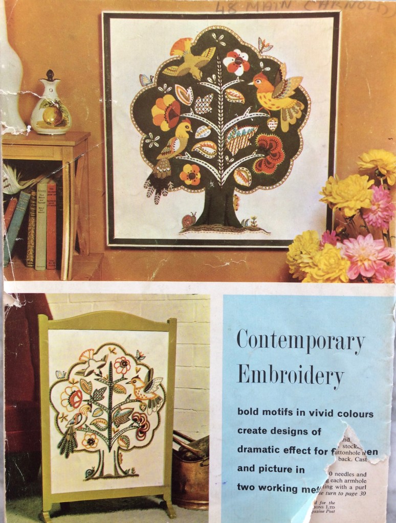
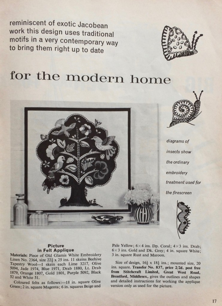
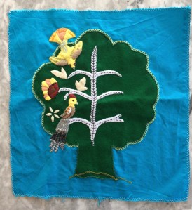
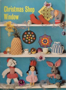
I loved the extremely complicated, heavily embroidered, faux-neo-Jacobean felt appliqué “birds in a tree” extravaganza featured in colour on the back cover, but it was too daunting. For one thing, of course I didn’t have the transfer or pattern for the appliqué pieces, since I would have had to have sent away for them via postal order in 1962. For another, there weren’t even any instructions in the magazine — the design was offered as either an embroidery or an appliqué project (see photo), and the instructions in the magazine only covered the embroidered version in any detail. The appliqué version just gave a list of materials, size of finished design, and the address where one could order the pattern and instructions. And when it comes right down to it, my appliqué and especially, embroidery skills are really not very well developed.
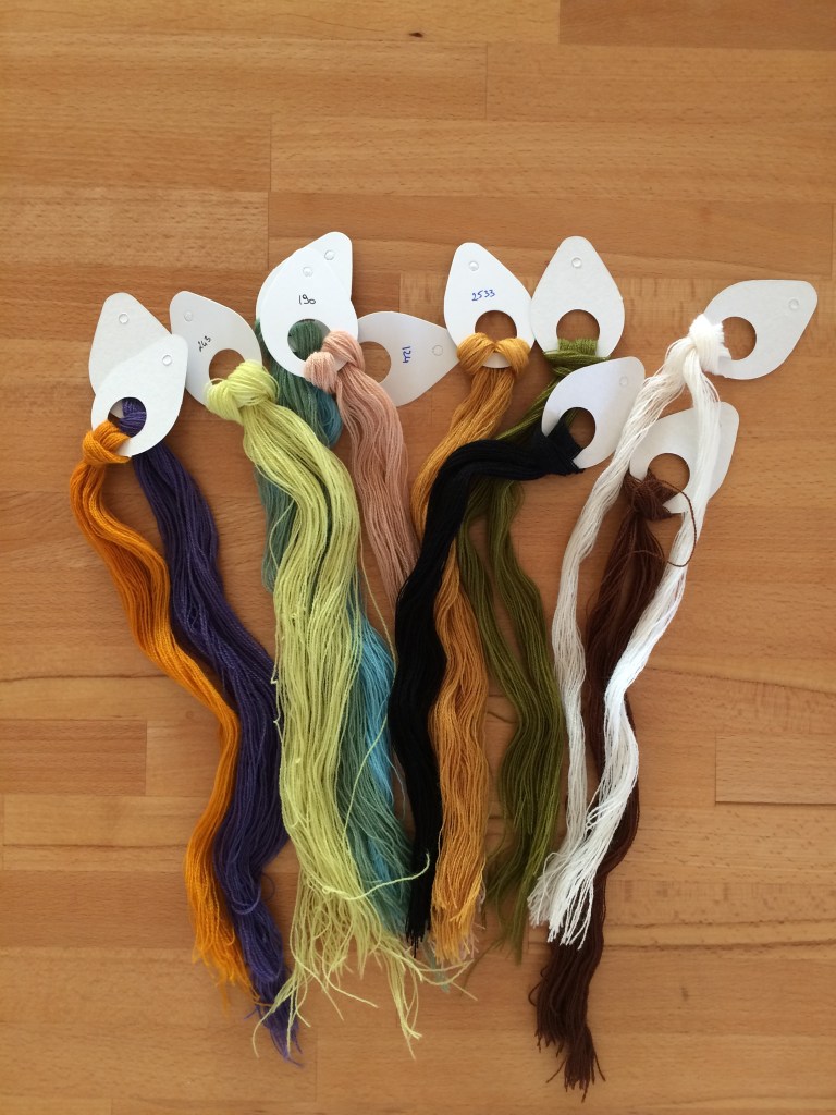
Oh yes, and while felt is easy enough to buy, the materials included tapestry wool for the embroidery, which is impossible to find in stores anywhere near me and even difficult to order online in the right weight (very fine)! Luckily, last year I happened to be in the one city I know that houses the one shop I know that actually specialises in tapestry and sells the right kind of wool, so I was able to get that, at least.
I decided to make it as a cushion, not a wall hanging. The background tree was easy enough. Technically, the white branches and leaves should have been made by cutting holes in the green tree felt and letting the (white/beige) background fabric show through, but since I chose a blue background fabric, I appliquéd them as well. It was predictably difficult to make and cut out my own patterns for the little bits of felt for the birds and leaves, and after making the first two birds, I realised it was easier to just cut the pieces freehand. Since there were no instructions to follow, I went from the photo and the instructions for the embroidered version, which obviously didn’t give much useful information.
Such a detailed project took forever, of course. It needed many tools and materials, so I could only work on it at home at a table, and not during the winter months, as I needed natural light for the fine work.
I made two of the birds on the left first, wasn’t really happy with them, and realised why after making the first flower on the left. I liked the way the flower turned out — it’s much simpler! The birds seemed overdone in comparison. I thought about changing the design and realised at some point that, of course, the who idea of this neo-Jacobean, embroidered and appliquéd extravaganza is that it is supposed to be over the top.
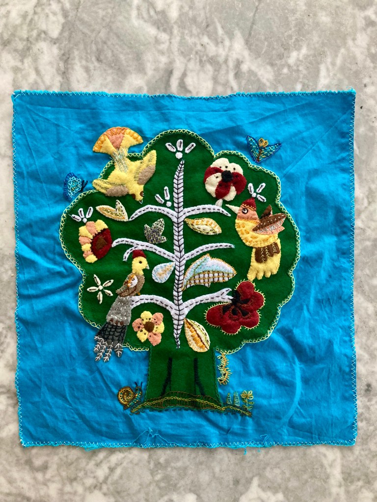
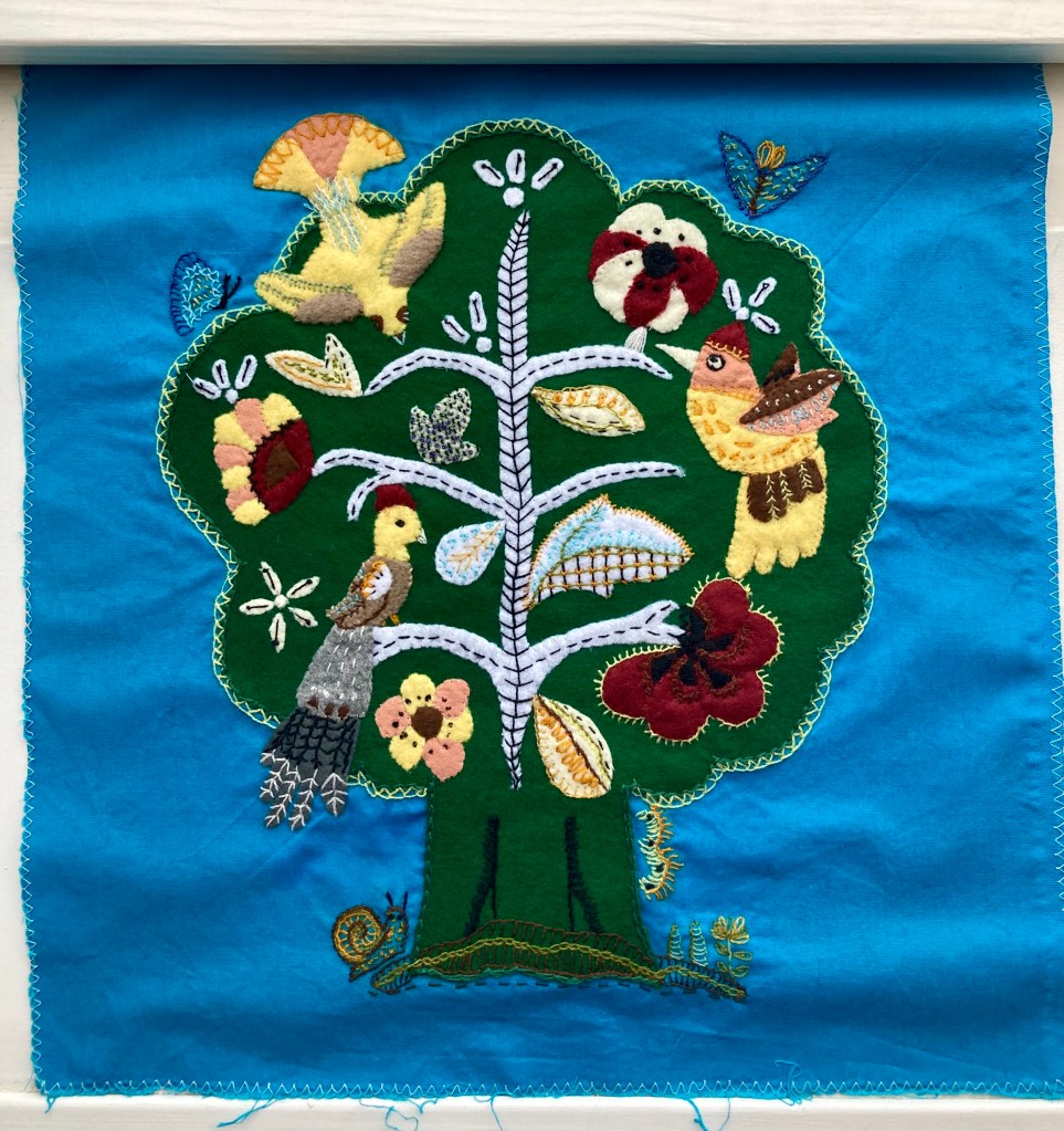
And so, slowly and painstakingly, it got done, one piece at a time. (It also spent a lot of time in the cupboard in between bursts of activity.) The embroidery directions in the magazine were often quite different from the appliqué version, so I did a lot of guesswork and adaptation based on the (rather small) colour photo on the back cover, from which the colours had changed and faded in the 50 years since its printing.
I was determined to get it done before the end of 2021, and I did (on December 31st.) It was a huge milestone for me in my appliqué / embroidery learning process, and I am really, really happy with the way it turned out.

 Technically, it was more of a “star-spangled burlap bag”, but that doesn’t have quite the same ring to it. Happy December, everyone! The 1961 festive holiday season, as envisioned by Stitchcraft magazine, involved at least a couple of glamorous parties and evenings out, for which this white satin drawstring clutch bag could be the perfect accessory.
 wink, and who knows if they had been treated with some kind of additional preservative chemical), I drew the motifs onto the bag with a wax embroidery-transfer pen, tracing around different sizes of button to get the circles, and embroidered them using leftover bits of pink and green embroidery cotton. I decided to forego the pearls and sequins and just made French knots instead. I also didn’t care too much about perfect symmetry or absolutely “clean” lines — I wanted it to look a little bit rough and homemade.


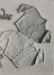
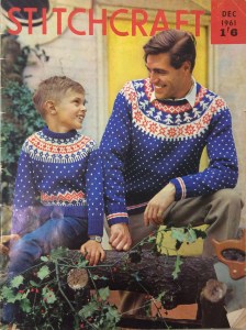 It’s that time of year again and December 1961’s issue has a lovely festive cover photo featuring matching father-son jumpers and a freshly-cut-down Christmas tree with holly branches. The jumpers are meant to be made in flat pieces with only the yoke worked in the round, but everything about them other than that is in the traditional Norwegian style, with a small snowflake pattern on the body and sleeves and a round yoke with tree and star patterns. I like that the jumpers’ pattern theme and colour choice are not so very specifically Christmas-y that they couldn’t be worn at any other time, or by people in our more diverse and modern times who don’t celebrate or don’t care much for Christmas and would just like a nice warm jumper with a wintery flair.


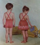
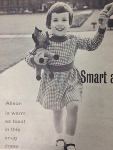 Children of all ages can look forward to practical, yet stylish winter garments — a knitted outdoor play-suit for toddlers in warm, bulky Big Ben, a smart fine-knit twin-set for girls of varying ages (sizes from 26-30 inch chest) and a wonderful knitted dress in a two-colour slip-stitch pattern that fits right into the tweed trend. The photo caption claims that Alison (the young model) is “warm as toast” but of course, her legs are going to be cold! She still seems pretty happy, though.
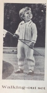


 Post updated on December 28, 2019: Finished!
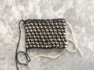 The pattern calls for Patons Rimple DK (nubbly wool with synthetic) in black and Patons Totem DK (smooth “crepe” wool) in “Oakapple”. I admit I had never heard of an an oak apple before and looking at the black-and-white photo, it’s it’s hard to tell what exact colour was used — but it’s obviously some kind of whitish-beige. Which, as it turns out, is pretty much the colour of at least some kind of real
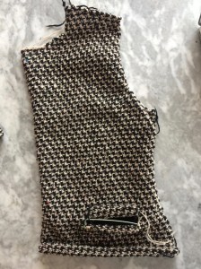 The knitting itself was a dream, though — so nice to work in DK after the fingering-weight projects of recent months past. It knitted up fast and easily and the fabric feels good in the hands. The pattern is quite clear and simple. Even the set-in pockets with flaps and the buttonholes (such a nightmare, always) were successful and the buttonholes evenly spaced. (I used the method that Stitchcraft always suggests: make the side without buttonholes first, then mark the button positions with pins and make the buttonholes to correspond. With a repeating pattern like this one, you can count the rows between buttonholes quite accurately.)
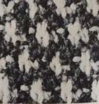 After putting it together and blocking, the back piece had stretched width-wise, the sleeves had stretched length-wise and the sleeve cap didn’t fit well. Also, the shoulders were too wide. What to do? I didn’t want to cut the knitted fabric, nor do everything over. My solution: I re-sewed the sleeve caps in where the shoulder and sleeve line should have fallen, then tucked the resulting extra fabric in towards the neck on the front piece to make a sort of built-in shoulder pad. I normally hate shoulder pads and rip them out of everything I buy, but in this case it turned the droopy, sloppy-looking shoulder into a crisp, tailored-looking one. I’m so sorry I forgot to take a “before” picture — the change was pretty dramatic.
 To fix the back width, I added two vertical darts. That wasn’t as elegant as it could have been if I had knitted them in, but it was fine. The sleeve-cap changes pulled the sleeves in a little shorter, so I just finished the cuffs with the same binding that I used for the rest. The buttons are modern, but aren’t they perfect? I even remembered to buy a few extra.
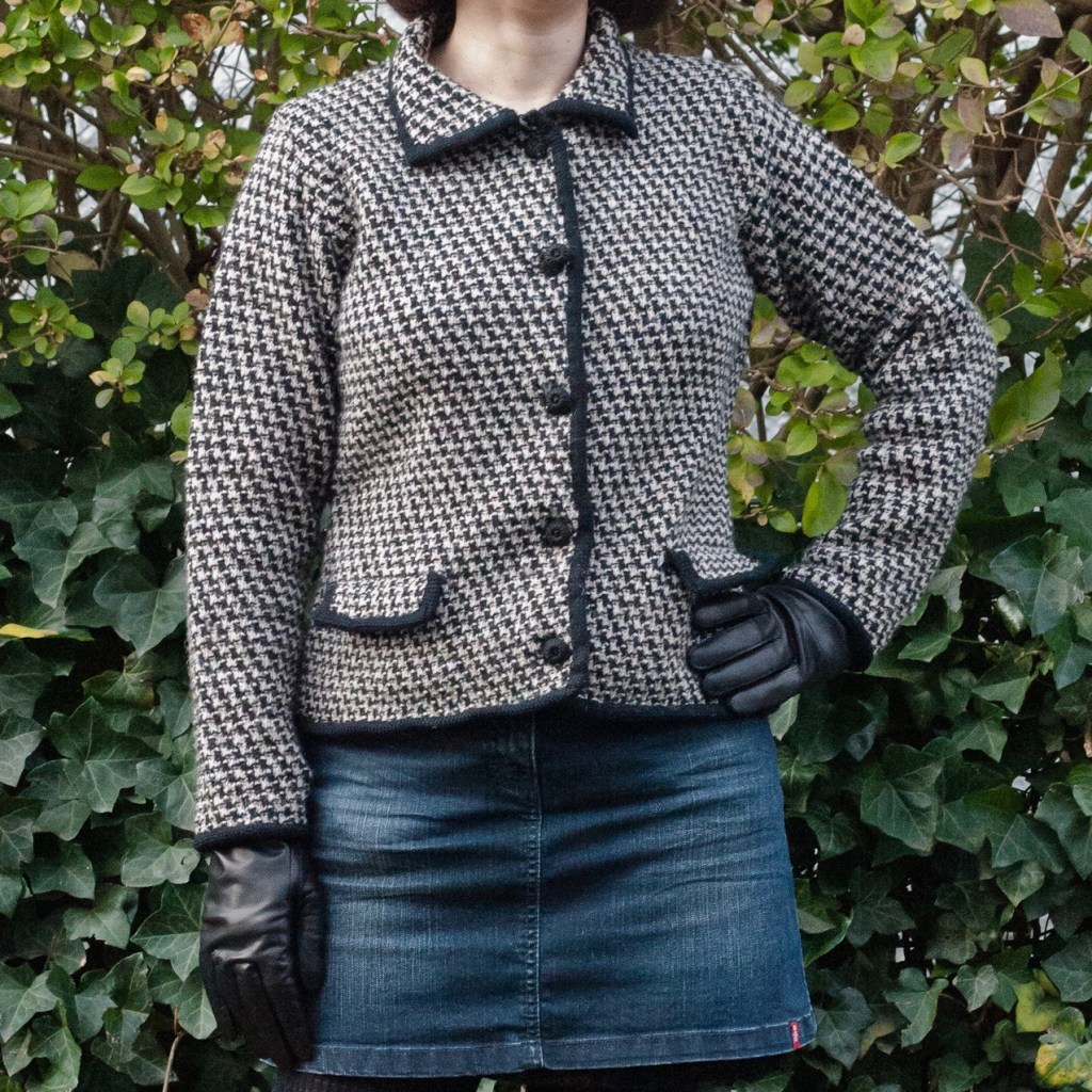
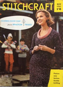 November is such a grey month, so it’s nice to see that Stitchcraft‘s November 1961 issue has the theme “Colour Flair”, featuring speckled yarns and a center page in colour. The issue showcases “Bracken Tweed”, Patons’ new double knitting wool. Bracken Tweed was one of the early multicolour yarns, mixing flecks of a lighter colour in with main strands of a darker colour to achieve a tweed effect. At its debut in 1961, it was 100% wool; with the change from ounces to grams in the late 1960s, the fiber content was changed to 60% wool and 40% acrylic.


 There’s always somebody having a baby, and I do try to make something nice for all my friends’ and colleagues’ newborns. Sometimes I don’t manage to finish something until they are out of the newborn stage, which is why it’s nice to have patterns for larger babies! This dolman-sleeve cardigan, made in the smaller size, should fit a 22 inch chest, which should be fine for this particular eight- or nine-month old.
 The little leaf motifs up the front sides are quite easy and don’t require any cabling or special fuss. You just work into one stitch 5 times on one row, then work those 5 stitches in stockinette (on the reverse-stockinette background) for a few rows before closing off the leaf with decreases. The lace strips on the sides are plain yo, k2tog alternating with k2tog tbl, yo, worked on the right-side rows.
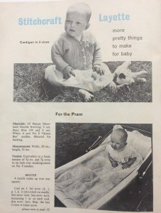 I used Jamieson’s wonderful Shetland Spindrift from a multicoloured stash that I had bought from a nice person on Ravelry. Some may say that Shetland wool is too tough for babies, but it does get softer with washing and since it won’t be worn against the skin, I think it will be fine. The colour — Buttermilk — is really beautiful, a pale yellow ever-so-slightly marled with shades of pink and winter white.
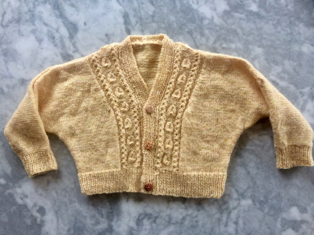
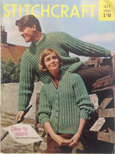 October 1961 gives us “Colour for autumn” with “special fashion features” and a great center spread with colour photos. “I always think October is a nice friendly month,” writes “editress” Patience Horne on the facing page, and I have to agree.
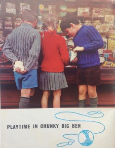 stitches play a prominent role in this month’s issue, starting with the partner-look pullover and cardigan on the front cover. Both are made in the same drop-stitch rib pattern — basically 2×2 ribbing, but you drop a stitch down 3 rows every 4th row and pick it up again in the next row to make a long vertical rib. Children get twisted-rib raglan pullovers to keep their upper bodies nice and warm while their legs freeze in tiny shorts and mini-skirts, typical for the era.


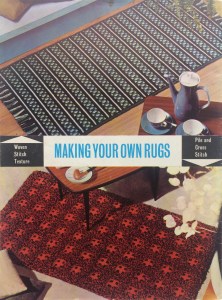


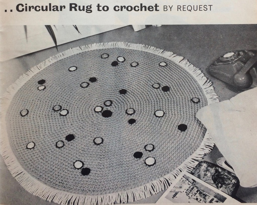
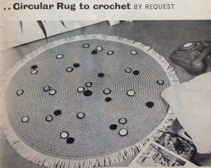 September’s project (finished only one day late) was this extremely 1960s crocheted green rug with black, white and orange embroidered spots (they “add a modern touch”) and fringe. Loved it!
 Felting wool, like rug wool, is bulky, mostly unprocessed, coarse and strong, so that was my first thought… but would it felt with use or washing? I decided to take the chance, since it’s easy to find, inexpensive and there happened to be some in the perfect colour at my local yarn shop. It’s the exact same shade of green as
  The crochet part was easy — just rounds of double crochet with regular increases — and went very quickly. You can see that the wool I ordered was from a different dye lot than the first skeins from the store, but I don’t mind. The embroidery was a bit tedious and the fringe posed a new problem: this type of old-fashioned cotton sew-on fringe is very much not in fashion and hard to find in stores these days. I hate buying things on the Internet, so I asked my friendly wool-shop owner from the store where I bought the wool what she thought, or if it could be ordered through the store. She suggested hand-knotting the fringe with cotton yarn in a similar colour to the rug. (the fringe in the original seems to be white or a lighter colour). I was eager to get the thing done and not wait for more elements to arrive, so I did it. I like the result! It’s stringier than the original, of course, but it makes the rug look like a sort of friendly amoeba. I like that.
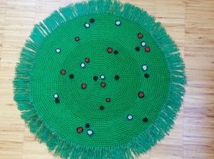 Wash-blocking it gently in cold water worked well and did not felt the wool. Also, it is going to live under my coffee table where it won’t get much foot traffic, so I’m not worried.
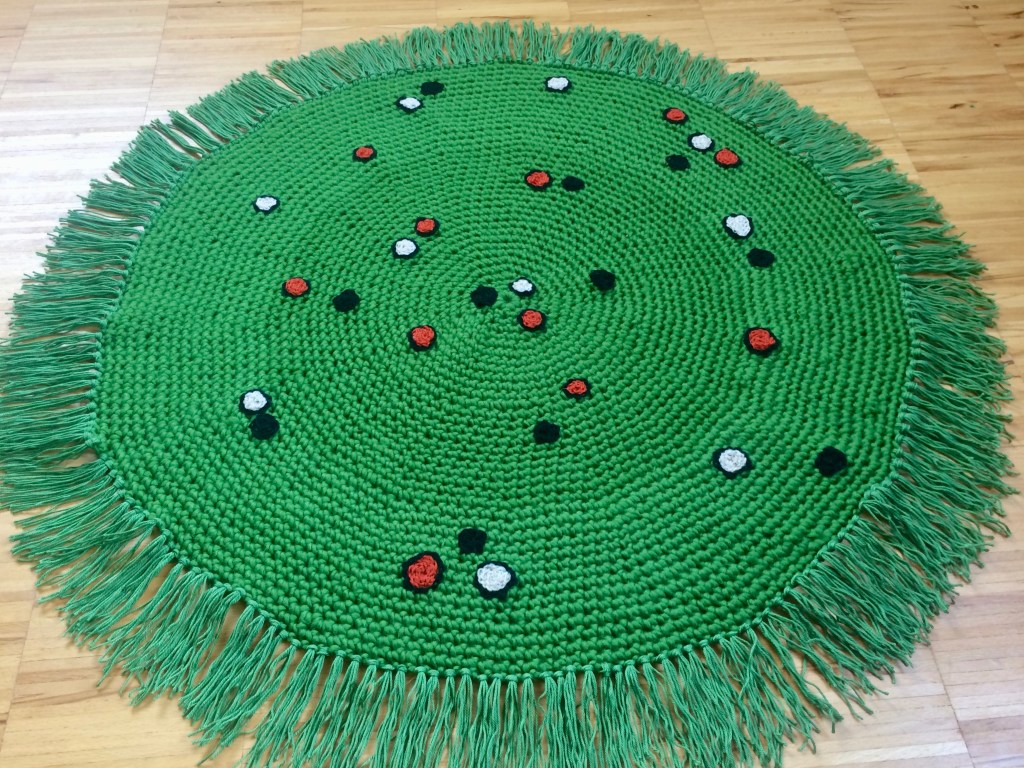
 “Knitting with an Autumn Theme” is the motto of this month’s Stitchcraft from September, 1961. Knowing that September is the month where many knitters take up their needles again after not wanting to handle wool in the hot summer, I would have expected a “bumper issue” with extra ideas, new fashions from Paris, more colour photographs and so on. Not the case! It has more or less the same mix of “chunky”, bulky garments and easy homewares that we saw in the summer issues.
 probably will never be my style). The kid’s coat looks cosy and fun to wear, and the “gay sweaters for him and her” in a Norwegian-style pattern are warm, practical and unisex. I imagine the boatneck collar on an unshaped front must scratch horribly across the neck, though.


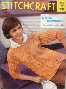
 Stitchcraft‘s August 1961 “Late Summer” issue had multiple cute, easy embroidery and tapestry projects. Mine was this little set of rose sprays. To show the versatility of the designs, the magazine usually had directions for and photos of the designs made on different items: a cushion and/or tray cloth, for example. Overall, there was a huge range of homewares that could potentially be embroidered: an apron, a place mat, a chair-back, a wall hanging, a “nightie case”, a project bag, a finger plate, a fire screen, even a room divider or a waste-paper basket cover. This issue added a new idea to the mix: the rose-spray design on a lampshade, complete with a pattern to cut out, sew and fringe the lampshade cover itself.
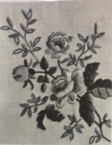
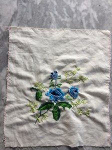 Of course, they don’t have to be embroidered, but why not? Cotton embroidery floss is machine-washable even at high temperatures and I have plenty of scraps and bits of plain linen or cotton materials that can be put to good purpose. The bag I made for this August project was made from a piece of linen from shoes, yes, shoes that a friend bought (the shoes came wrapped in this piece of fabric in the shoe box instead of in paper.) I had enough embroidery floss on hand, so this was an almost 100% up-cycled / didn’t have to buy anything new project. (I say almost because I bought the cord for the drawstrings — then realised I could have made monks’ cord or i-cord from leftover cotton yarn. Next time…)
 The design is of
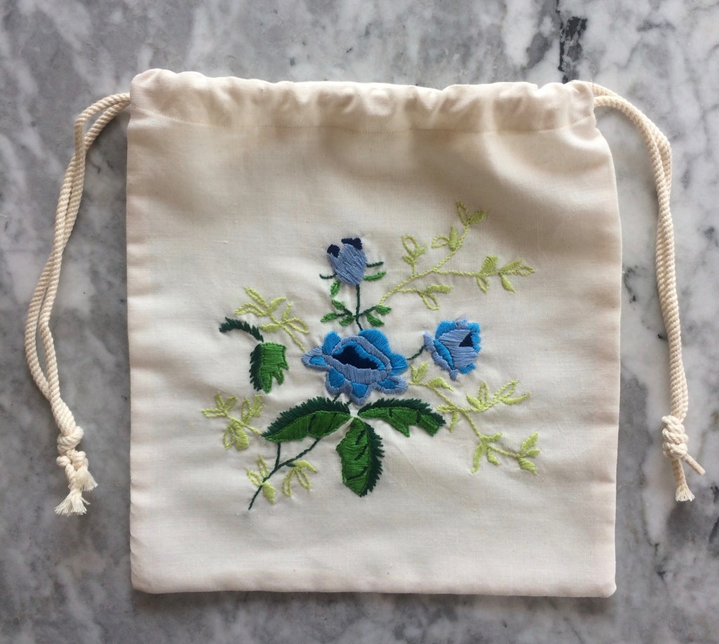
 June 1961 was the issue with too many great projects in it and not enough time to make them all. My “official” project was
 I decided to make it in cotton instead of Nylox (Patons wool-nylon mix from the 1960s) or a modern equivalent. It is always, always a problem to find non-mercerised cotton that is fine enough to give 7 stitches to the inch. Thick, mercerised dishcloth cotton is always available, mercerised crochet cotton is always available, but what passes as 4-ply or fingering weight non-mercerised cotton is just too thick. I decided on Natura “Just Cotton” which is non-mercerised, soft, pretty and supposedly free of harmful substances (Oeko-Tex certification). The label says it gets 27 stitches in 4 inches but that is illusory. The yarn is 8-ply! I don’t know why they don’t use 4 strands, thus making it a true 4-ply fine cotton for soft, light garments. I got 6 1/2 stitches to the inch with some effort, but the resulting fabric is a bit stiffer than I would have liked.


 “August is an issue that needs special thought and planning” writes Stitchcraft‘s “editress”, Patience Horne, in the introduction to the August issue, pointing out that it is “rather an “in-between” month for needleworkers” — often too hot to want to wear or make heavy sweaters and too late in the year for fine-knits. At the same time, reminding people that “Autumn is around the corner” can be “a little depressing” to people enjoying their late-summer holiday.


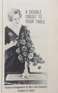
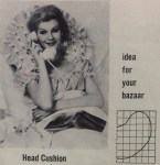 My favourite, though, is this sewing project: a head cushion that lets you recline charmingly in bed with your hair and makeup perfectly done, your satin nightie on, a book on your lap and your telephone on your ear. It’s glamorous leisure and lifestyle advertising personified, and though they say it’s an “idea for your bazaar”, I would bet the Stitchcraft readers who made this in 1961 did not make it to sell.
 Apropos lifestyle advertising, the early 1960s Stitchcrafts show a rise in full-page ads for Patons and Baldwins wools. That’s obviously not surprising considering the magazine was published for the Patons wool company, but the full-page ads that “tell a story” are a new trend: the late 1950s and 1960s issues up to now had little celebrity testimonials. This one caters to grandmothers and the message is clear: Knitting is not only a rewarding pastime on its own, but earns you the love and affection of the grandchildren for whom you knit. (But only if the kid likes it, and that’s only guaranteed if you use P&B wools, of course.) The 1950s and 1960s saw a huge shift in advertising methods towards a psychologically-based system, which is a huge topic that I won’t start with here, but suffice to say there will be more of these ads, and that they are representative of changing advertising styles.
 In 1961, Stitchcraft had a nice running feature they called “Stitchcraft Layette”: a set of matching baby clothes and accessories with a pattern in each issue for a few months running. The first was a light, warm dress in
 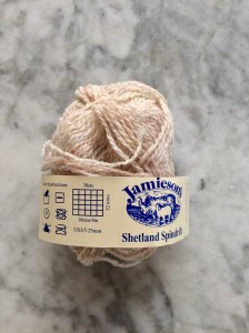 I made the project in
 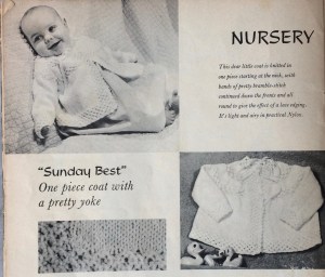 I was happy with the result and it reminded me of another pattern I had seen somewhere… in another Stitchcraft... oh right, it was this “Sunday Best” from April 1960! Bramble and stockinette stitch: always a good choice for baby stuff.
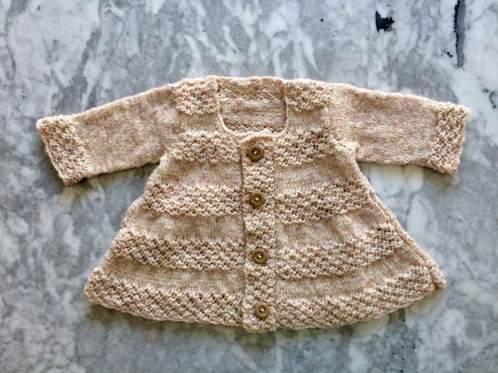
 The motto of the July 1961 issue is “Sew through the Summer” and indeed, there are a lot more sewing projects than one would normally find in Stitchcraft, summer being a time when many people do not want to hold wool in their hands or think about colder weather to come. There’s more emphasis on homewares and small, fun projects to make and use on holiday. The farm photos were taken in Hertfordshire and the boating photos in “the heart of London’s Little Venice”. Doesn’t that sound like fun? Let’s dive in!
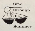 a really pretty basketweave blouse with that V-neck-plus-collar design that we saw so much of in 1960 and the last years of the 1950s, not to mention just last month on the cover of the


 June’s project was this lovely sleeveless top in a leafy lace pattern, touted as a “very wearable and useful jumper to make for your holiday.” It looked pretty and elegant and suitable for my summer climate, which is generally not too hot — a lightweight wool garment in lace with no sleeves should be perfect most days.
 orange non-vintage clothing.
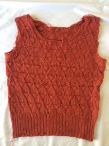 Then I ran into trouble with the weather, which was suddenly 34-36 degrees Centigrade with no chance of a cooler room either at work, home or on the move. My hands were too sweaty to hold wool and I had to take a break for a few days until we returned to our regularly scheduled 18-20 degrees. Then I finished the body and moved on the the neck and armhole edgings, which took forever! It’s actually an interesting design, which I haven’t seen before: You knit a strip of stockinette stitch with 3-stitch garter stitch border on one side, then fold the strip in half lengthwise like a sort of hem under the garter-stitch bit and sew it onto the neck or sleeve edge with the garter stitch facing out. It’s a like a separate hem sewn on, and the front neck strip has some cleverly thought-out short rows to make it fit the curve of the neck. But oh does it take a long time to make the strips.

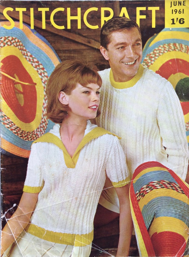
 I love this cover. The yellow stripes on the hats, the yellow trim on the sweaters and the yellow sans-serif lettering all harmonise perfectly with the off-white garments in the center focus. Even the models’ hair colour looks like it was chosen to match the wooden wall. And we can see that typical 1960s hairdo coming into fashion, with more volume on the top and curled ends.
 (Speaking of tiny children in goofy poses, am I the only one who finds this advertisement for next month’s Stitchcraft strangely funny? What is it about this baby that comes off looking so weird? Too much hair? The quasi-adult-looking face? The indescribable expression?)


 And then there’s this incredible birds-in-a-tree number, to be worked either in wool on linen for a firescreen or in felt appliqué with wool embroidery on linen for a picture. I’m normally not so crazy about 1950s and 1960s neo-Jacobean designs, but I love this one and definitely want to make the felt appliqué version as a cushion (with a more greeny green for the tree and not quite so much brown-orange-yellow in the appliqué work.) I imagine it might be tough without a transfer, but they gave us two very clear photographs including one in full colour, so what could go wrong?
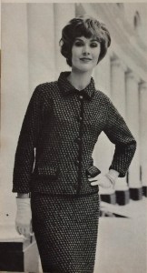
 Last but not least, there’s a lovely, elegant two-piece suit in nubbly Rimple double knitting wool, featured in the most magnificent photo I have ever seen in any magazine, ever. If I remember correctly, I saw it in one of those Internet lists of “best/worst/weirdest knitting pattern photos” long before I started collecting vintage patterns. It’s definitely at the top of my list and if you haven’t seen it yet, you saw it here first!